
How to use Table Widget of Sky Addons for Elementor
Table is a flexible data table widget for Elementor that lets you build beautiful comparison tables, feature matrices, pricing grids, and spec sheets without writing a line of HTML. Define header columns and body rows with simple repeaters, add icons or images to any cell, merge cells with col span and row span, link cells, and color individual cells. On small screens the table can switch to a horizontal scroll view so your data stays readable everywhere. This documentation will guide you through the process of using the Table Widget to present structured data on your website.
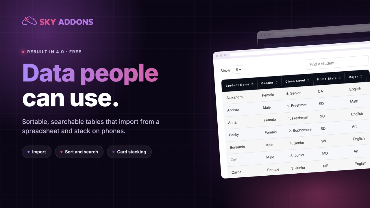
Features:
- Repeater-Based Builder: Add header columns and body rows/cells visually, with no HTML or shortcodes.
- Icons & Images in Cells: Any header or body cell can carry an icon or an image with size control.
- Cell Merging: Col Span and Row Span let you merge cells for complex layouts.
- Linkable Cells: Turn any cell into a link, with dynamic tag support.
- Per-Cell Styling: Override background, text, and icon color on individual cells.
- Zebra Striping: Separate even/odd row backgrounds and text colors, in normal and hover states.
- Mobile-Friendly: Optional horizontal scroll view with word-break control for small screens.
Insert Table Widget
- Open Elementor Editor. In the Elementor panel, search for “Table” under Sky Addons.
- Drag and Drop the Widget to the desired location on your page / editor.
Choose a Data Source
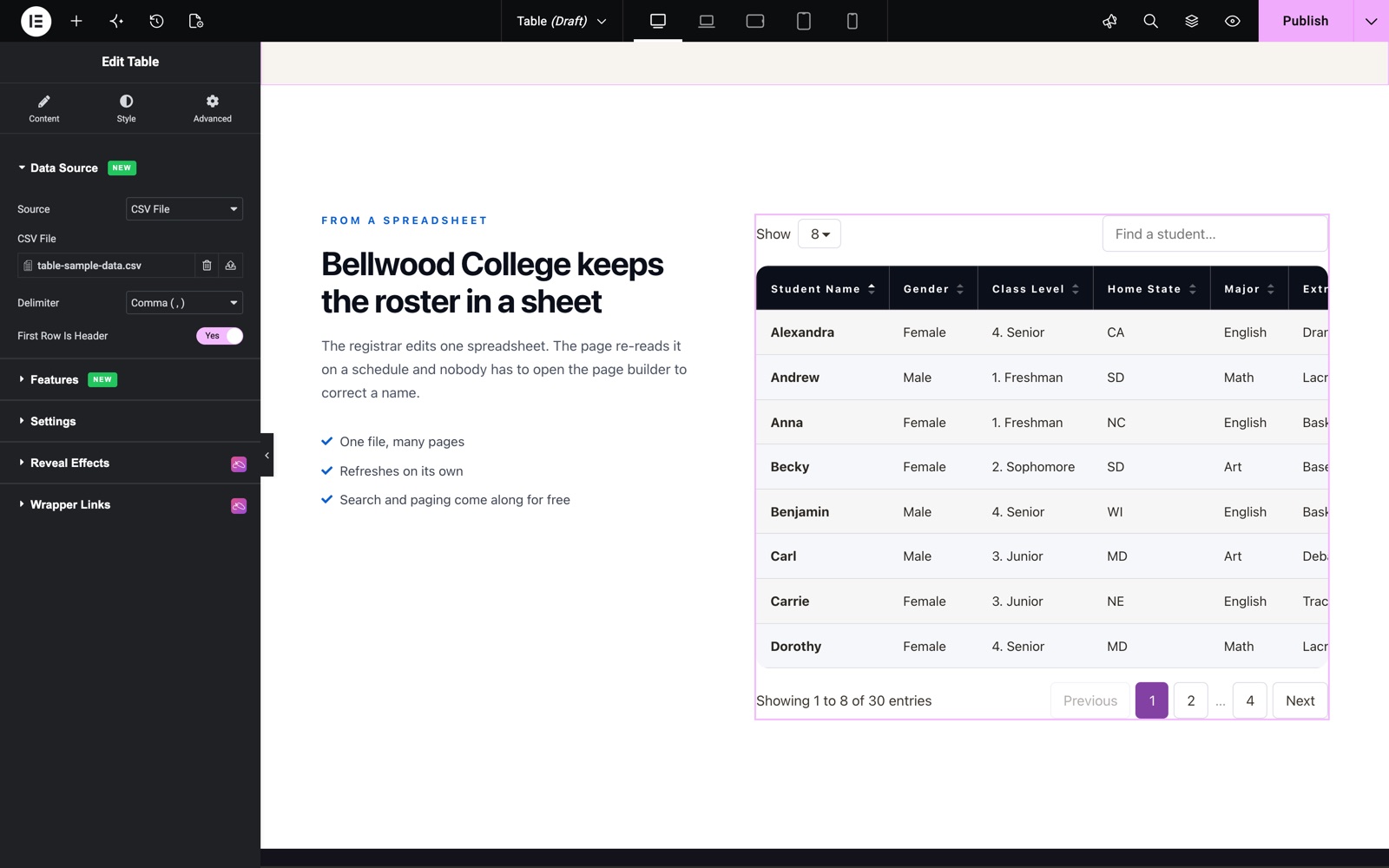
The Data Source section (new in version 4.5.0) decides where the rows come from. All five sources are in the free plugin.
- Manual (Repeater): Build the head and body with the repeaters described below. This is the default.
- HTML Rows: Paste one
<tr>per row. A first row of<th>cells becomes the head. - CSV File: Upload a CSV file from the media library.
- CSV URL (Remote): Enter the address of a CSV file. It is fetched on the server and cached.
- Google Sheet: Paste the link of a sheet shared as “Anyone with the link can view”. Sheet Tab and Range are optional.
For CSV and Google Sheet sources you can also set Cache Lifetime (no cache, 5 minutes up to 24 hours, default 1 hour), the Delimiter and First Row Is Header.
Configure Table Head
The Table Head section defines your header columns. Each column item has a Content and a Style tab:
- Title: The column heading text (dynamic tags supported).
- Col Span: Merge the heading across multiple columns.
- Media: None, Icon, or Image. Add an icon from the library or an image with a size preset next to the title.
- Icon Color (Style tab): Per-column icon color override.
- Alignment & Icon Position: Align header text left/center/right and place the icon left, right, top, or bottom of the title. Both are responsive.
Configure Table Row / Body
The Table Row / Body repeater builds the body. Each item is either a Row marker or a Column (cell):
- Row/Column: Add an item set to Row to start a new table row (“Row Starts”), then add Column items after it. Each one becomes a cell in that row.
- Title & Link: The cell text (dynamic tags supported) and an optional URL to make the cell clickable.
- Col Span / Row Span: Merge the cell horizontally or vertically.
- Media: Add an Icon or Image to the cell, with an image size preset.
- Per-Cell Style tab: Background Color, Text Color, Icon Color, and Icon/Image Size for that one cell, useful for highlight cells like “Best Value”.
- Alignment & Icon Position: Responsive text alignment and icon placement for body cells.
Sort, Search, Paginate and Export
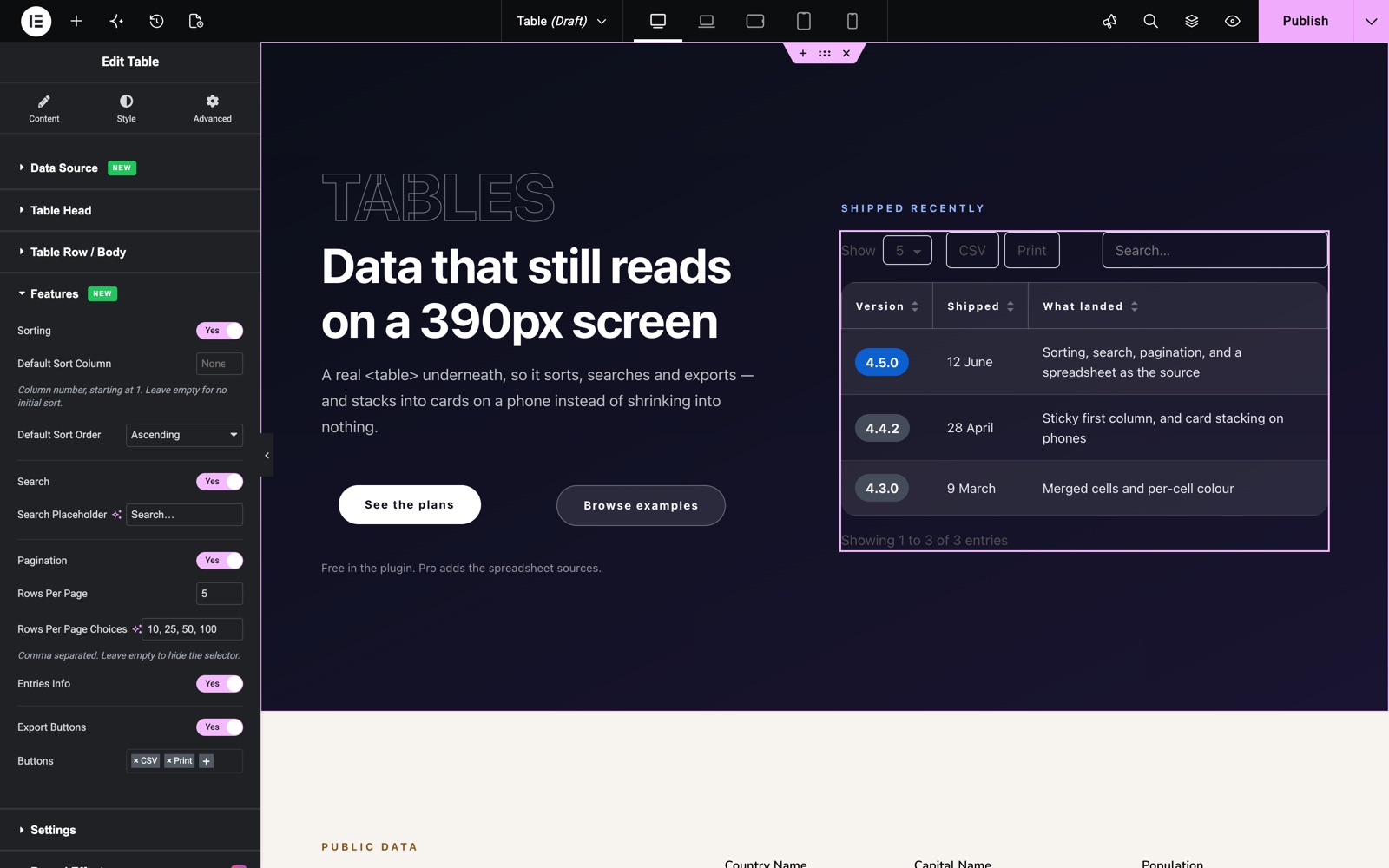
The Features section (new in version 4.5.0) turns the table into an interactive data table.
- Sorting: Visitors click a column head to sort. Default Sort Column (a number, starting at 1) and Default Sort Order set the first sort. Each head column has its own Sortable switch.
- Search: Adds a search box with your own placeholder text.
- Pagination: Splits the rows into pages. Rows Per Page is 10 by default, and Rows Per Page Choices (10, 25, 50, 100) adds a selector. Entries Info shows a line such as “Showing 1 to 8 of 30 entries”.
- Export Buttons: CSV, Copy and Print buttons above the table.
Body cells also have a Cell Type: Text, Badge, Button, Progress Bar or Star Rating. For Progress Bar the Value runs from 0 to 100; for Star Rating it runs from 0 to 5.
Configure Settings
- Horizontal Scroll View: Off by default. When it is off, the table turns into stacked cards below the Switch Below breakpoint (Tablet by default). Turn it on to scroll the table sideways instead.
- Disable Word Break: Available with scroll view on (enabled by default). It keeps words whole on mobile instead of breaking mid-word.
Settings also holds Caption and Caption Display (visible, or for screen readers only), First Column Is A Header, Repeat Head As Footer, Sticky Header with Sticky Offset, and Sticky First Column.
Style Your Table
Customize the table to match your design aesthetics effortlessly. Borders, stripes, hover states, and media sizing are all covered:
- Table:
Outer border, border radius, and a classic or gradient background for the whole table. - Table Head:
Header border, border radius, background, typography, text color, plus icon size, icon color, and image border radius for header media. - Table Row:
Cell borders and zebra striping with separate Even/Odd background colors and Even/Odd text colors in both Normal and Hover states, a dedicated Link Color, and sizing controls for cell icons and images.
Save and Preview
- Once you’ve customized and styled your table, click “Publish” or “Update” to save your changes.
- Preview the page to ensure the table looks and reads as desired.
Best Practices
- Keep cell counts consistent: Give every row the same number of Column items (accounting for spans) so the grid lines up.
- Use zebra striping for long tables: Alternating even/odd row colors makes wide data much easier to follow.
- Accessibility: Maintain strong contrast between text and row backgrounds, in both normal and hover states.
- Testing: Check mobile with Horizontal Scroll View on. Wide comparison tables almost always need it.
Troubleshooting
- Cells in the Wrong Place: Make sure each row begins with a “Row” item in the repeater. Column items attach to the most recent Row marker.
- Layout Broken After Spanning: A Col Span or Row Span reduces how many remaining cells that row/column needs; remove the extra cells the span replaced.
- Table Squeezed on Mobile: Enable Horizontal Scroll View in Settings, and leave Disable Word Break on to keep labels readable.
Frequently Asked Questions
How do I create a comparison table in Elementor without HTML?
Add the Table widget, define your header columns in Table Head, then build the body in Table Row / Body: insert a “Row” item to start each row and “Column” items for its cells. Everything (text, icons, links, colors) is set through repeater controls, no markup required.
Can I merge cells in the Elementor Table widget?
Yes. Every cell has Col Span and Row Span number controls (header cells support Col Span), so you can stretch a cell across multiple columns or rows just like a spreadsheet merge.
How do I add icons or images inside table cells in Elementor?
Set the cell’s Media option to Icon or Image. Icons come from the icon library with per-cell color control; images use a selectable size preset. Icon position (left, right, top, bottom) is adjustable per breakpoint.
How do I make a wide table responsive on mobile?
Turn on Horizontal Scroll View in the Settings section. The table keeps its full width and visitors swipe sideways. The companion Disable Word Break switch stops labels from breaking mid-word.
Can I highlight one column or cell with a different color?
Yes. Open any Column item’s Style tab and set its own Background Color, Text Color, and Icon Color. This is the standard way to spotlight a “Recommended” plan in a pricing comparison.
Related Documentation
Conclusion
The Table Widget by Sky Addons for Elementor gives you spreadsheet-grade structure with full design freedom: spans, icons, links, per-cell colors, and mobile scroll handling included. Build comparison and pricing tables that actually convert. For further assistance, consult the Sky Addons support team. Enjoy organizing your data!
Need help? Our team is happy to answer questions on the Sky Addons support page.