
How to use Momentum Slider Widget of Sky Addons for Elementor
Sky Addons Momentum Slider is a dynamic and visually appealing slider widget for Elementor that allows users to create professional-looking image carousels with smooth, momentum-based transitions. The widget features elegant slide animations with customizable titles, numbers, and navigation, making it perfect for portfolios, product showcases, or featured content sections on your website.
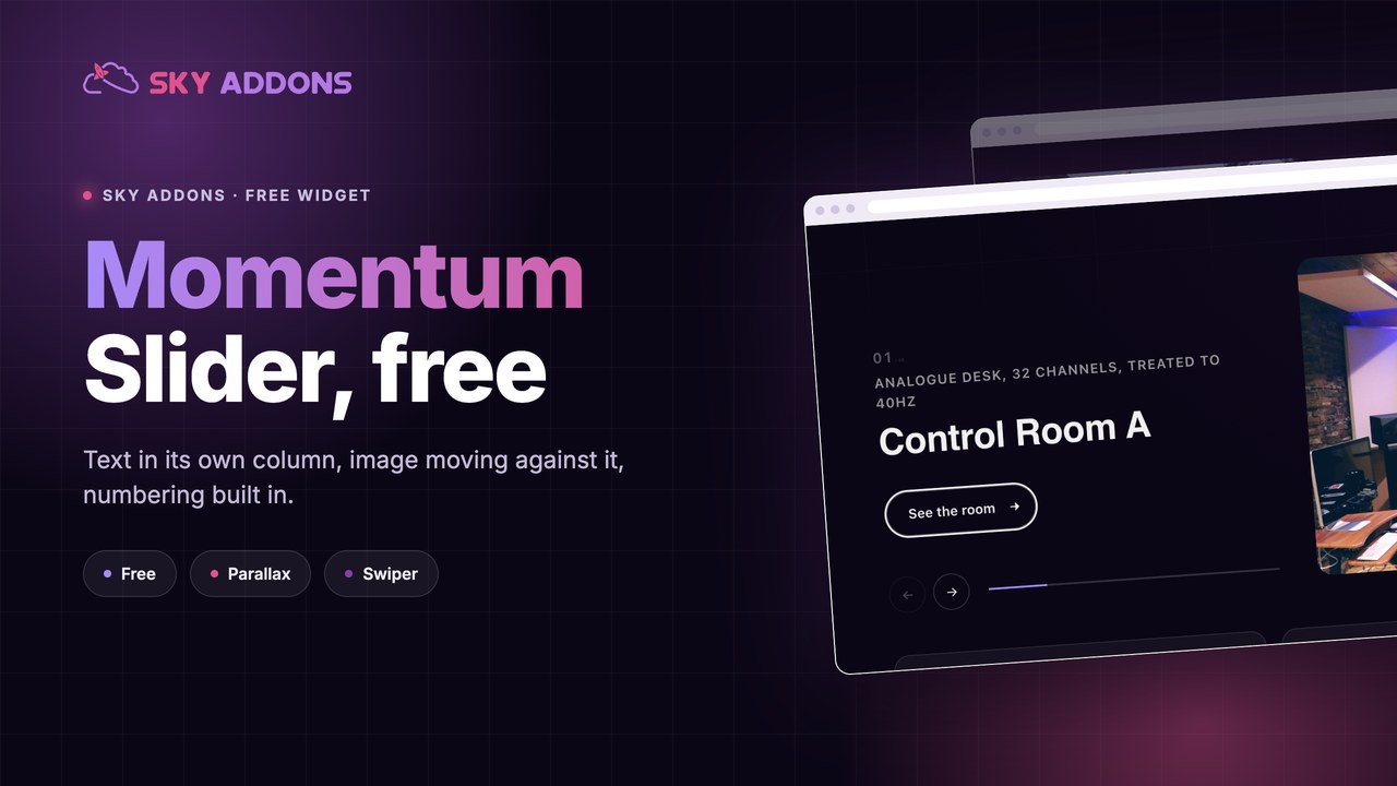

Key Features:
- Smooth momentum-based sliding animations for a premium user experience
- Fully responsive design that adapts perfectly to all screen sizes
- Customizable slide elements including titles, numbers, and navigation
- Optional button/link for each slide with custom styling options
- Highly configurable visual settings for colors, typography, and spacing
- Built-in pagination system for easy navigation between slides
How to Insert Momentum Slider Widget
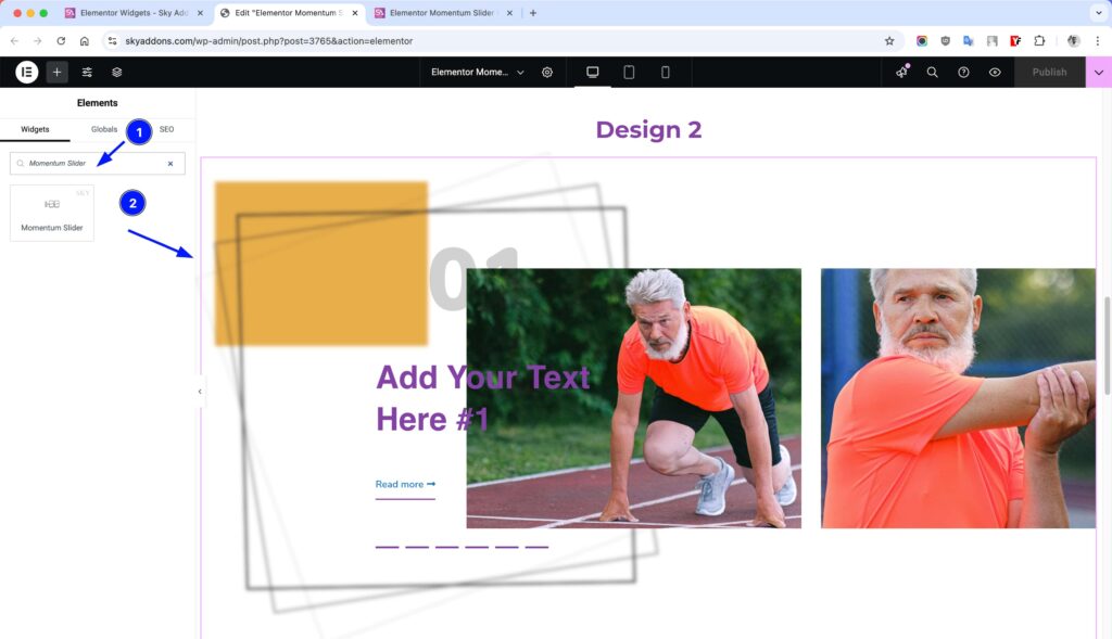
- Open Elementor Editor. In the Elementor panel, search for “Momentum Slider”
- Drag and Drop the Widget to the desired location on your page / editor.
Momentum Slider Content Section
This section allows you to configure the basic slider content and functionality.
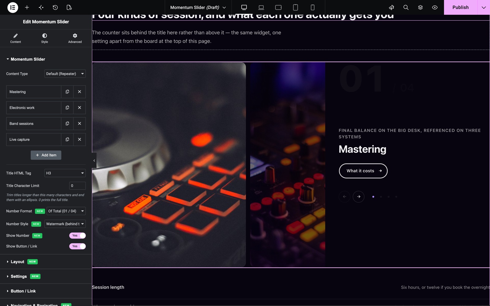
- Content Type – Default (Repeater) to add slides by hand, or Dynamic Posts to fill the slider from a post query in the Query section.
- Slider Items – Add slides by clicking the “Add Item” button. Each slide can have a title, a subtitle, an image and a link.
- Title – Add a descriptive title for each slide that appears prominently on your slider. This title not only displays on the frontend but also helps you identify slides in the Elementor editor. You can customize the appearance of titles through the dedicated Title Style section.
- Slider Image – Upload or select a high-quality image for each slide from your media library. The slider supports dynamic content, so you can pull images from custom fields or other data sources. Images form the visual foundation of your slider and can be customized with specific dimensions, opacity, and visual effects.
- Link – Make your slides interactive by adding custom URLs. Each slide can link to any internal page or external website. You can control whether links open in a new tab or the same window, perfect for directing visitors to related content or product pages.
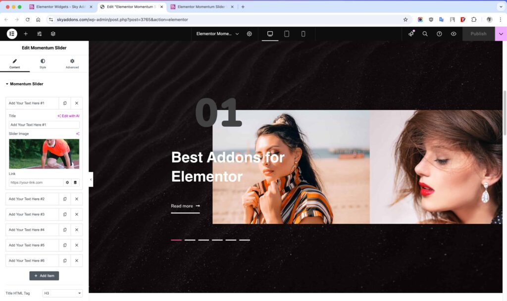
The repeater interface makes slide management intuitive – reorder slides with simple drag-and-drop, duplicate existing slides to maintain consistent styling, or remove unwanted slides with a single click. By default, the widget includes four sample slides to help you get started quickly.
To add more slides, simply click the “+ Add Item” button at the bottom of the repeater section. There’s no limit to how many slides you can create, giving you complete freedom to showcase all your important content.
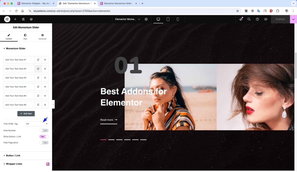
- Title HTML Tag – Choose the HTML tag for your slide titles (H1-H6, div, span, etc.).
- Show Number – Toggle the slide numbers. Number Format is Padded (01, 02) or Of Total (01 / 04), and Number Style is Stacked (above the title) or Watermark (behind the title).
- Title Character Limit – Trims long titles with an ellipsis. 0 prints the full title.
- Show Button/Link – Enable or disable the button/link for each slide.
- Show Pagination – Now in the Navigation & Pagination section, together with Show Navigation.
The second slider in the Momentum Slider demo has four slides. Number Format is Of Total and Number Style is Watermark, so a large faded number sits behind each title.
Layout Section
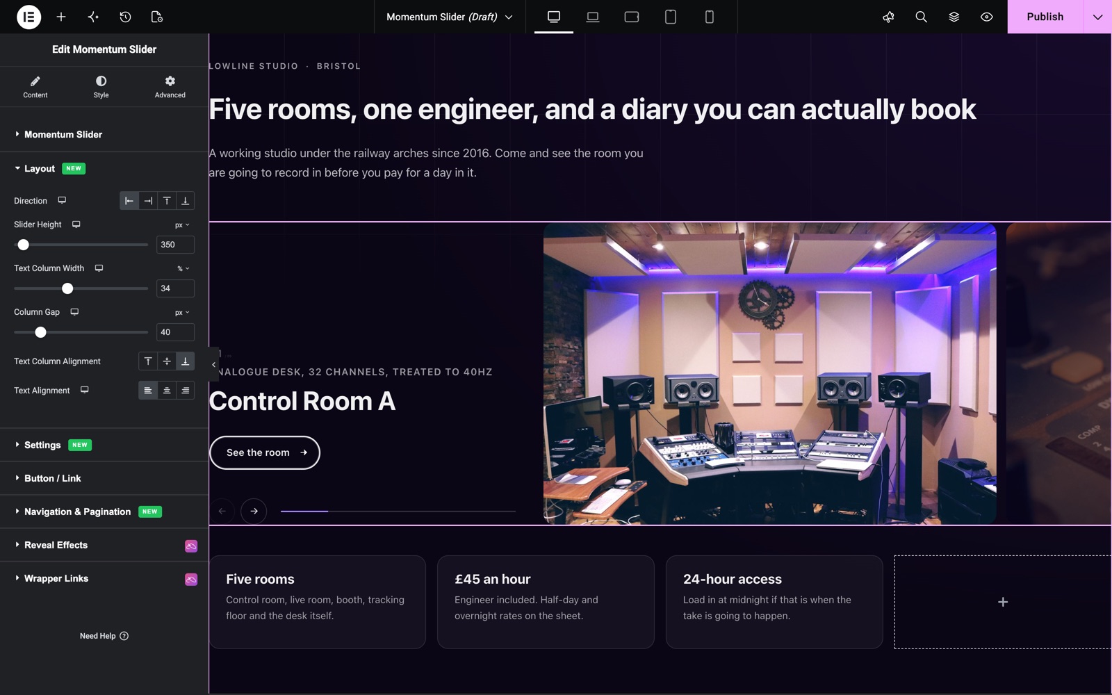
The Layout section places the text column next to the images.
- Direction – Text Left, Text Right, Text Above or Text Below.
- Slider Height – The height of the slider, set per device.
- Text Column Width and Column Gap – The width of the text column and the space between text and images.
- Text Column Alignment – Top, Middle or Bottom (default Bottom), and Text Alignment – Left, Center or Right.
Settings Section
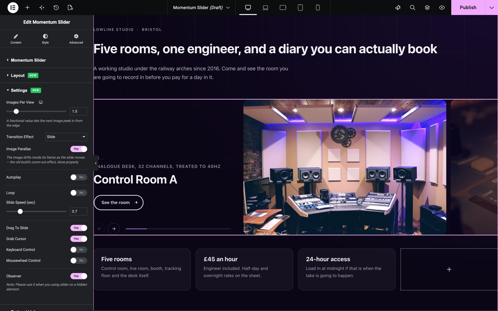
- Images Per View – How many images show at once. A fractional value such as 1.5 lets the next image peek in from the edge.
- Transition Effect – Slide (default), Fade or Coverflow.
- Image Parallax – The image drifts inside its frame as the slide moves. On by default.
- Autoplay, Autoplay Speed (sec), Pause On Hover, Loop and Slide Speed (sec) – Control the motion.
- Drag To Slide, Grab Cursor, Keyboard Control, Mousewheel Control and Observer – Control how visitors move the slider.
Navigation & Pagination Section
- Show Navigation – Shows the previous and next arrows. Pick your own Previous Icon and Next Icon.
- Show Pagination – Shows the progress line under the slider.
Button/Link Section
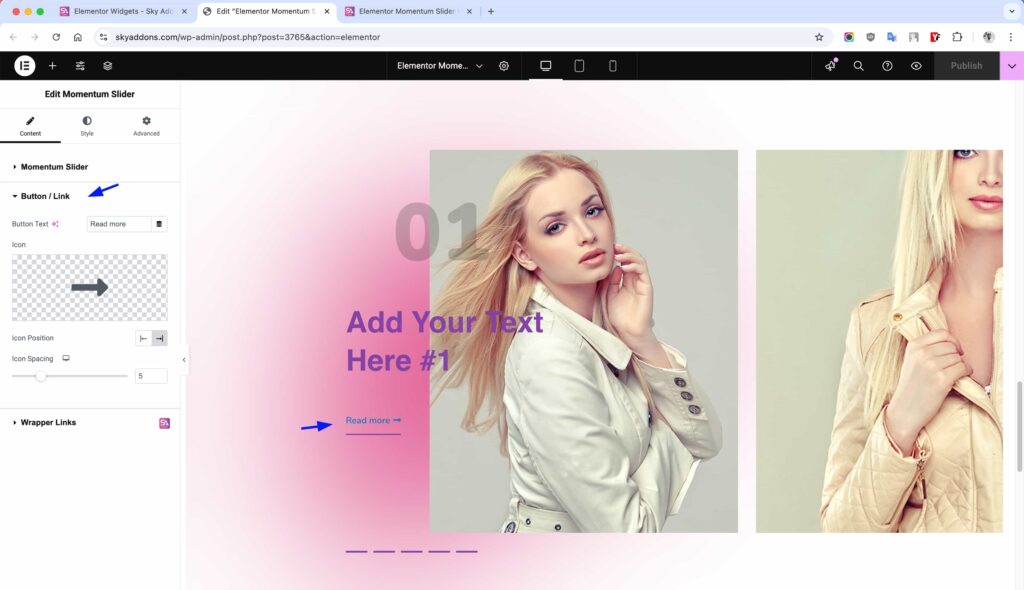
Configure the button or link that appears on each slide when “Show Button/Link” is enabled.
- Button Text – Set the text to display on the button (default: “Read more”).
- Icon – Choose an icon to display with the button text.
- Fill Color and Hide Icon – Set the button fill, or hide the icon. Leave Icon empty to use the built-in arrow.
- Icon Spacing – Adjust the space between the icon and text.
Style Customization
The Momentum Slider offers extensive styling options to perfectly match your website’s design. Customize everything from colors and typography to spacing and animations.
Momentum Slider Style Section
- Slider Height – Now set in the Layout section, per device.
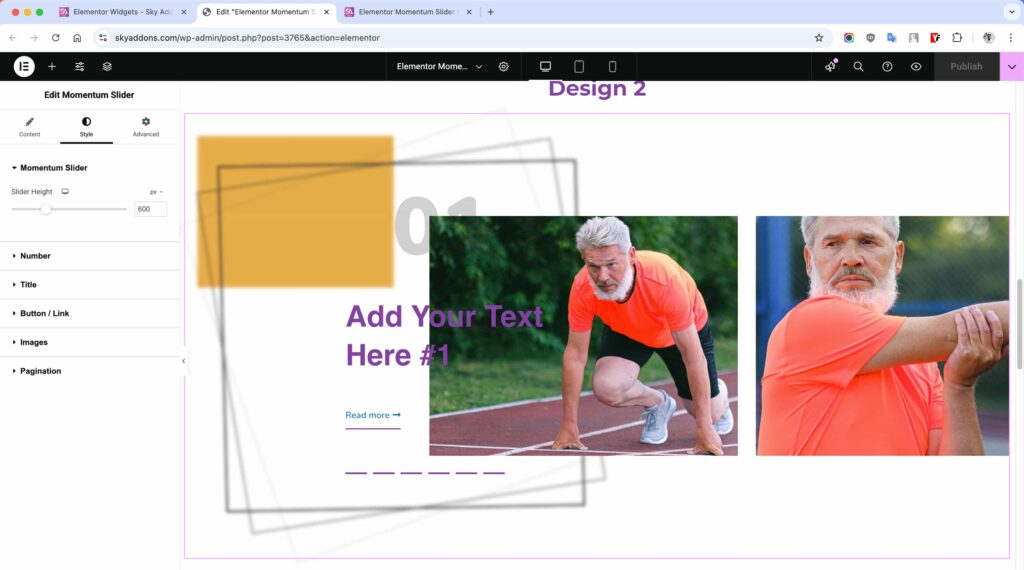
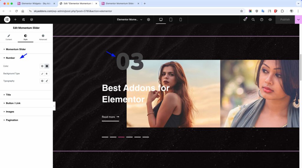
Number Style Section
- Color – Change the text color of the slide numbers.
- Background – Add a background color or gradient behind the numbers.
- Typography – Customize the font family, size, weight, and style of the numbers.
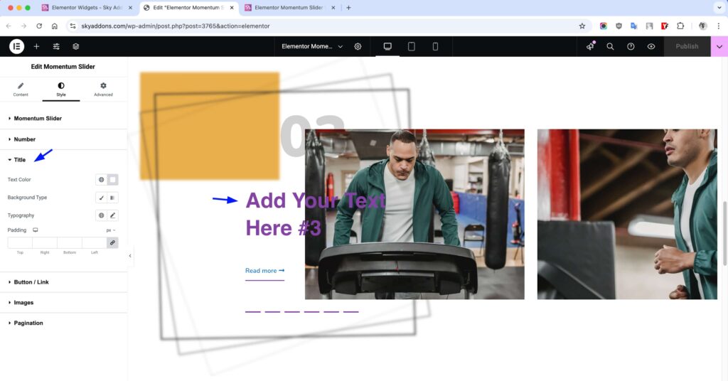
Title Style Section
- Text Color – Change the color of the slide titles.
- Background – Add a background color or gradient behind the titles.
- Typography – Adjust the font properties of the titles.
- Padding – Set padding around the title text for better spacing.
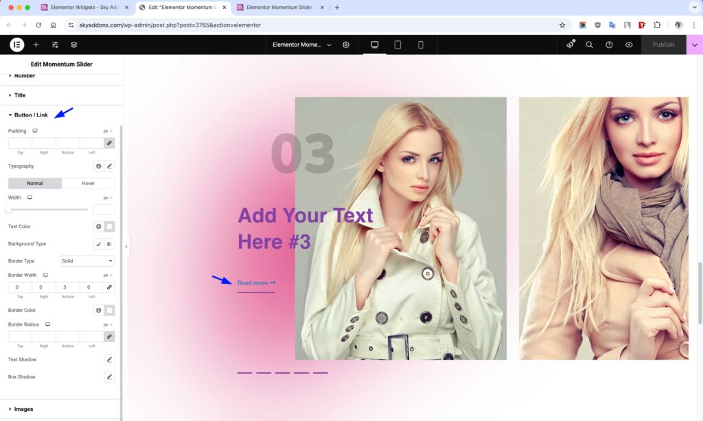
Button/Link Style Section
- Padding – Control the internal spacing of the button.
- Typography – Customize the font appearance of the button text.
- Width – Adjust the width of the button.
- Colors – Set normal and hover state colors for text and background.
- Border – Add and style borders around the button.
- Border Radius – Control the rounded corners of the button.
- Shadows – Add text and box shadows for depth.
Images Style Section
- Width – Set the width of the slide images.
- Height – Control the height of the slide images.
- Opacity – Adjust the transparency of the images.
- Space Between – Set the spacing between slides.
- CSS Filters – Apply visual effects like blur, brightness, contrast, etc.
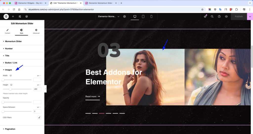
Pagination Style Section
- Height – Adjust the height of pagination indicators.
- Width – Set the width of pagination buttons.
- Color – Change the color of inactive pagination indicators.
- Active Color – Set the color for the active pagination indicator.
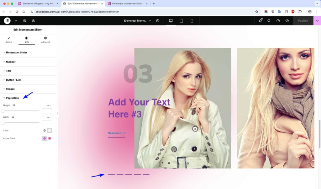
Save and Preview
- Once you’ve customized and styled your momentum slider, click “Publish” or “Update” to save your changes.
- Preview the page to ensure the widget looks and functions as desired.
Troubleshooting
- Images Not Loading – Ensure your images are properly uploaded and the URLs are valid. Try using different image formats if issues persist.
- Slider Animation Issues – If animations aren’t smooth, try reducing the number of slides or optimizing your image sizes.
- Mobile Responsiveness Problems – Check the slider height settings and adjust them for mobile devices if the slider appears too large or small.
- Button Links Not Working – Verify that you’ve entered valid URLs for your button links and that they include the proper protocol (http:// or https://).
Conclusion
The Momentum Slider widget is a powerful tool for creating engaging, dynamic content presentations on your website. With its smooth animations and extensive customization options, you can create professional-looking sliders that capture visitors’ attention and effectively showcase your content.
If you have any questions or encounter any challenges while using, please don’t hesitate to reach out to our dedicated support team at https://wowdevs.com/support/ where our expert team is ready to provide prompt and helpful assistance.