
How to use Info Box Widget of Sky Addons for Elementor
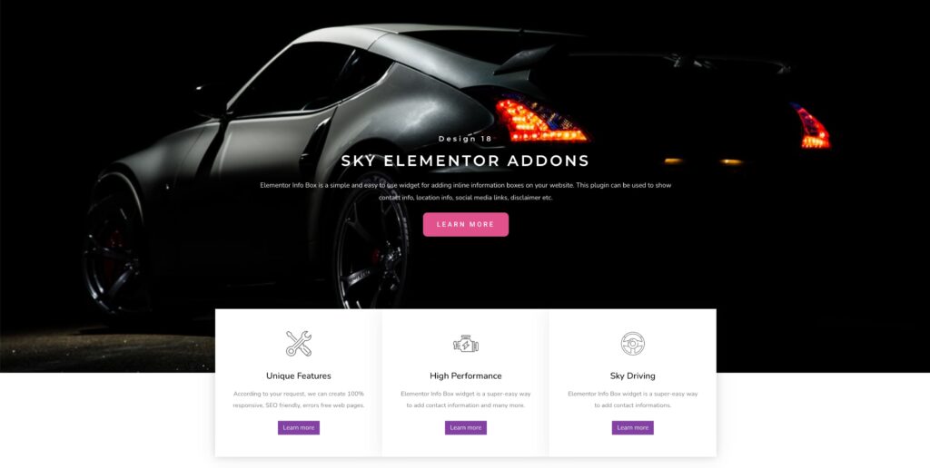
The Info Box Widget is a versatile tool for displaying key information with an icon/image, title, description, and an optional button. Perfect for features, services, highlights, and call-to-actions, this widget fits seamlessly into any website style. It is a powerful tool to show additional information about any item you add to the page. It can be used in many different ways and it will suit any kind of website.
Features:
- Icon or Image Support – Choose between an icon or image to visually represent your info box.
- Flexible Layouts – Display content horizontally or vertically with left, top, or right media alignment.
- Button Integration – Add a custom button or link with full styling and icon support.
Insert Info Box Widget
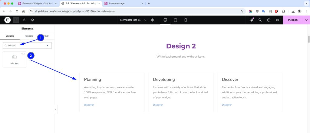
- Open Elementor Editor. In the Elementor panel, search for “Info Box” under Sky Addons.
- Drag and Drop the Widget to the desired location on your page / editor.
Customize Layout
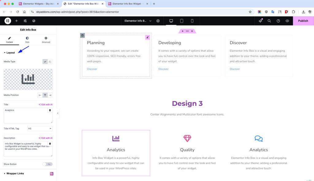
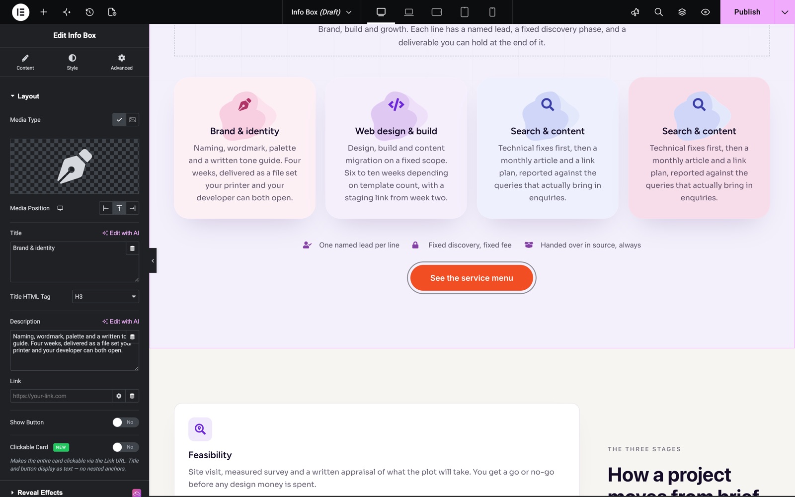
Layout Section
- Media Type – Choose to display an icon or an image.
- Media Position – Set icon/image alignment: Left, Top, or Right.
- Vertical Alignment – With Media Position set to Left or Right, align the media to the Top, Center or Bottom of the text.
- Title – Add a custom heading for your Info Box.
- Title HTML Tag – Select heading level (H1–H6) for SEO and structure.
- Description – Add supporting text below the title.
- Show Button / Link – Toggle to show a clickable button or link.
- Clickable Card – Make the entire card clickable through the Link URL. The title and button render as plain text so there are no nested links.
Button Section
- Link – Set the button URL or anchor link. This field is in the Layout section.
- Button Text – Add custom text for the button label.
- Full Width? – Stretch the button to the full width of the box.
- Icon – Add an icon beside your button text. Icon Position places it Before or After the text (default After), and Icon Spacing sets the gap.
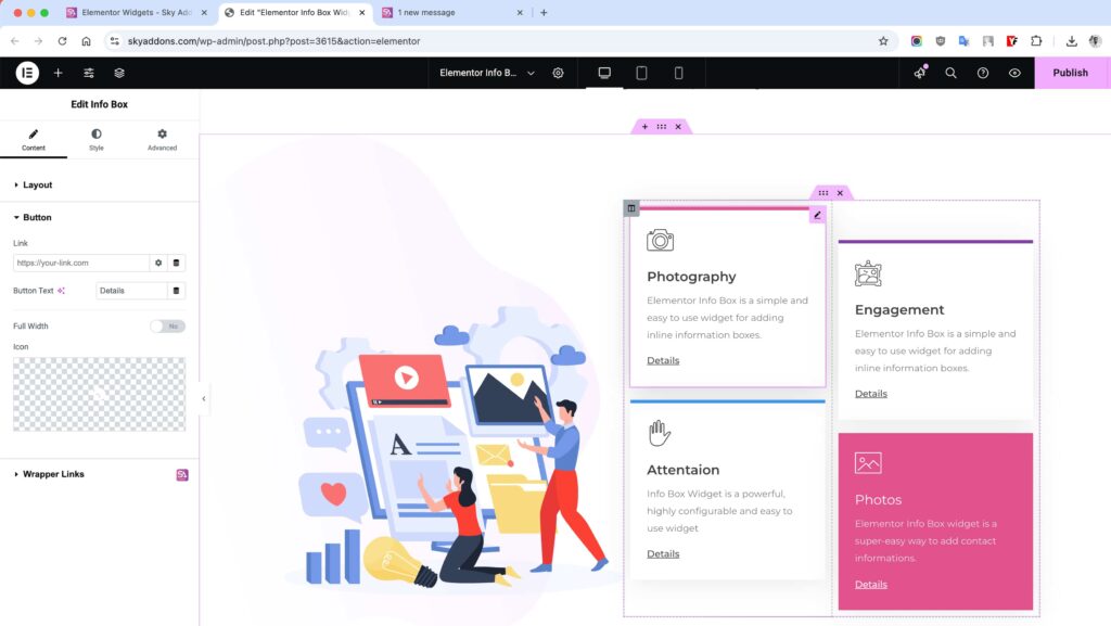
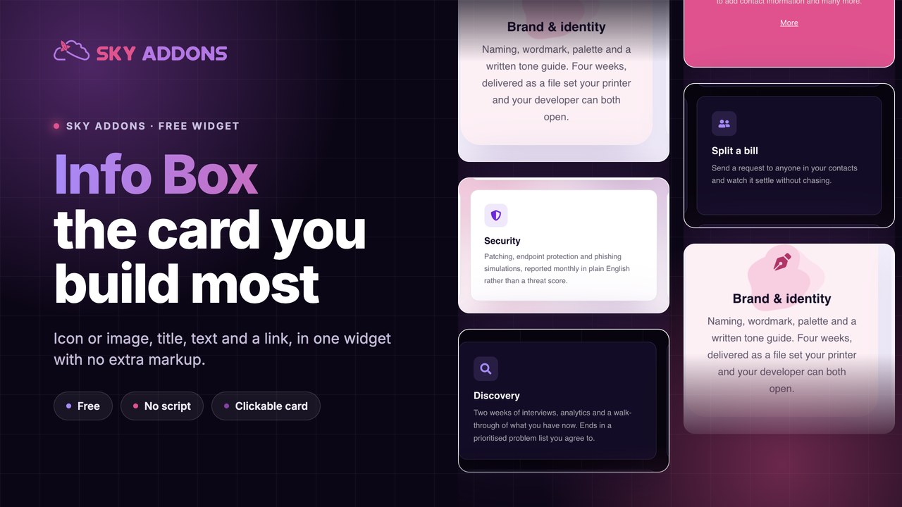
The cards in the Info Box demo use an icon with Media Position set to Top. Show Button is off, so each card is an icon, a title and a short description.
Style Customization
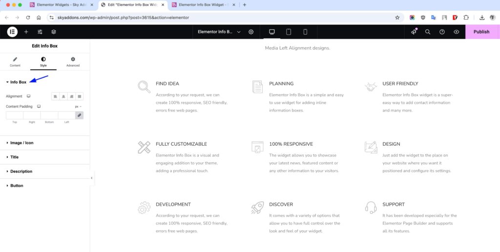
Info Box Section
- Alignment: Align content Left, Center, Right, or Justify.
- Content Padding: Add spacing inside the info box wrapper.
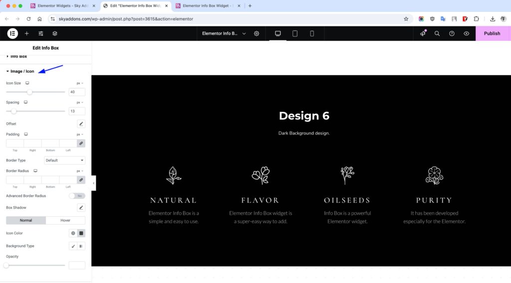
Icon/Image Section
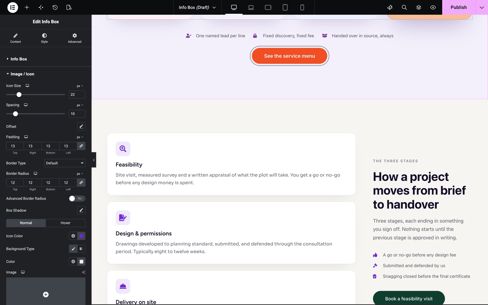
- Icon Size: Adjust the size of the icon or image.
- Spacing: Space between icon/image and content.
- Offset: Switch to Custom to set a Horizontal Offset, a Vertical Offset and a Rotate value for the icon or image.
- Padding: Add space around the media.
- Border, Radius: Apply border and corner radius.
- Advanced Border Radius: Control each corner separately.
- Box Shadow: Add depth with shadow.
- Icon Color: Set icon color.
- Background: Customize background color or gradient.
- Opacity: Control media visibility (normal & hover).
- Hover Animation: Apply an entrance/hover animation to the icon or image, with an adjustable transition duration.
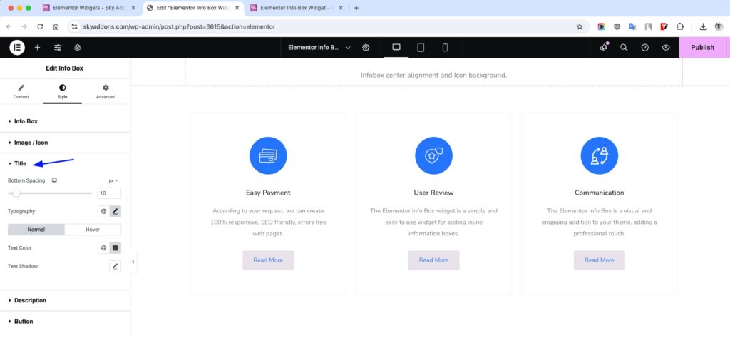
Title Section
- Spacing: Adjust space below the title.
- Typography: Control font style, size, and weight.
- Color: Set text color.
- Shadow: Add text shadow (normal & hover).
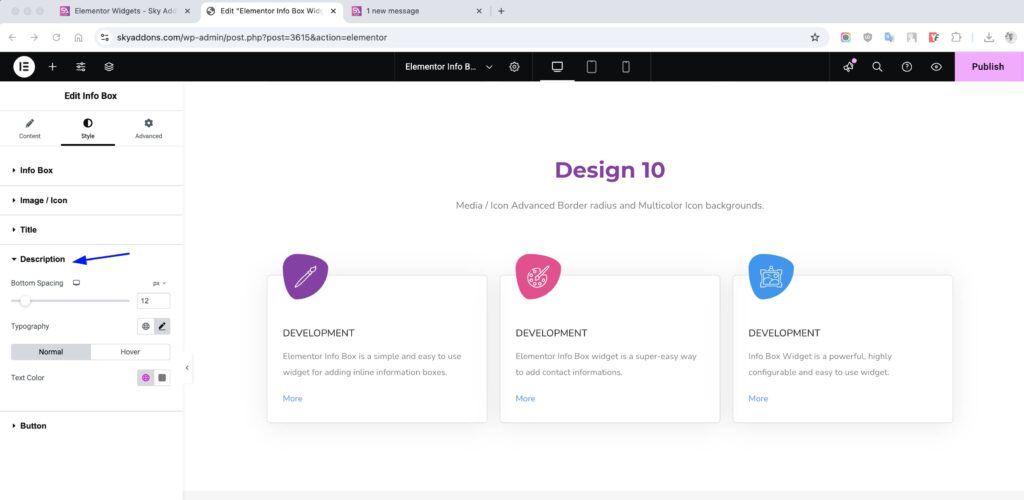
Description Section
- Spacing: Space below or above the description.
- Typography: Customize font settings.
- Color: Set normal and hover text colors.
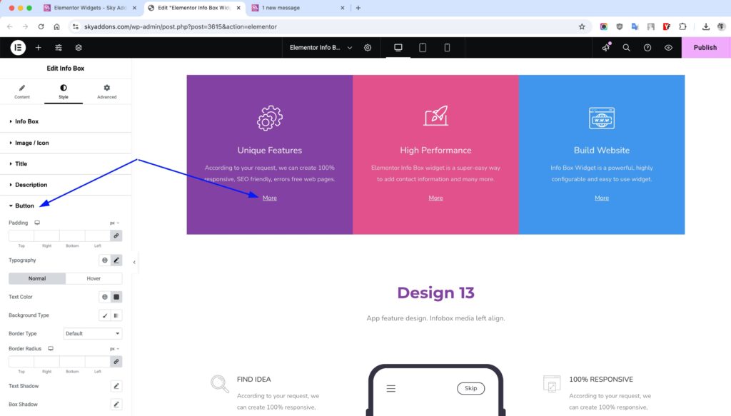
Button Section
- Padding: Adjust inner space of the button.
- Typography: Customize button font styles.
- Color: Set text color.
- Background: Define the button’s background.
- Border & Radius: Add borders and round corners.
- Text Shadow: Add shadow to the text.
- Box Shadow: Apply shadow to the button.
- (All in Normal & Hover)
These cards place a small icon on a tinted square. Icon Size is 22 px, Spacing is 16 px, and the media has 13 px padding and a 12 px border radius.
Save and Preview
- Once you’ve customized and styled your info box, click “Publish” or “Update” to save your changes.
- Preview the page to ensure the widget looks and functions as desired.
Troubleshooting
- Icon/Image not showing? Make sure you’ve selected a valid media type and uploaded an image or chosen an icon.
- Layout looks broken? Check padding and alignment settings in the Style tab.
- Button not clickable? Ensure the link is set and “Show Button” is enabled.
Conclusion
The Info Box Widget offers a clean, customizable way to present important information on your site. With full control over layout, icons, content, and styling, it’s an essential building block for dynamic Elementor pages.
Need help? Our team is happy to answer questions on the Sky Addons support page.