
How to use Advanced Tooltip features of Sky Addons for WordPress
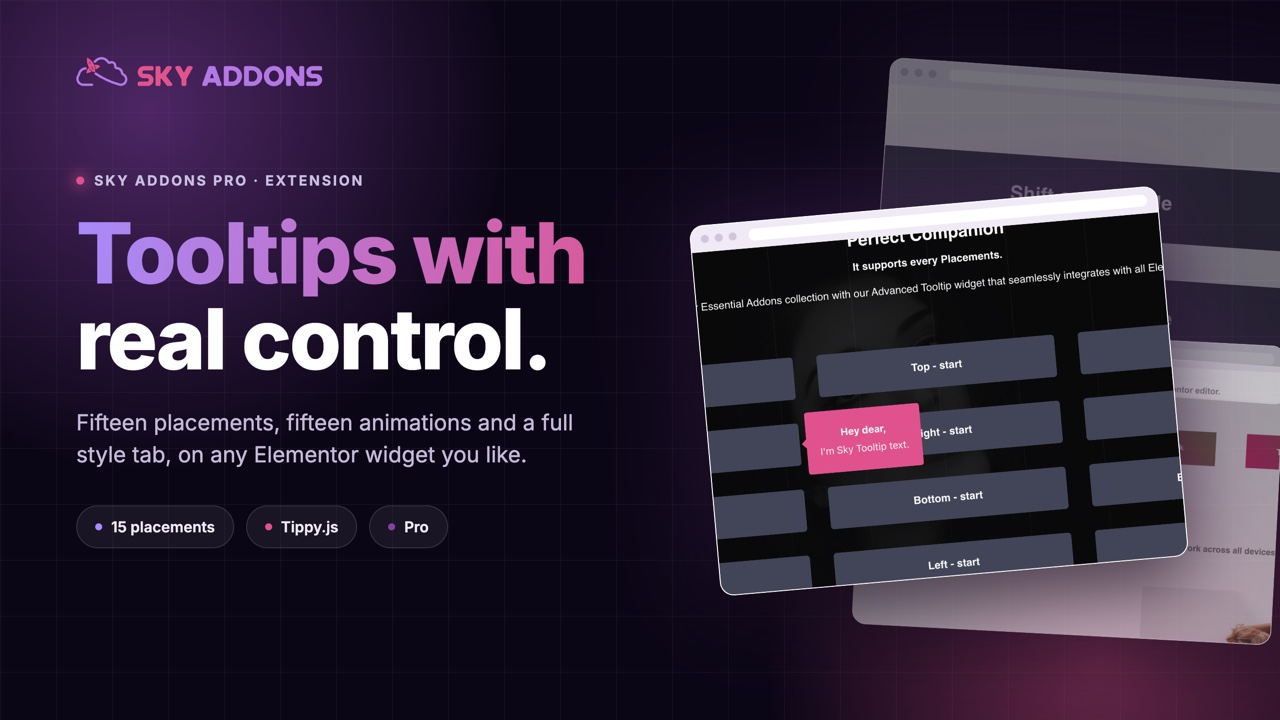
Sky Addons Advanced Tooltip Extensions enhances user interaction by adding customizable tooltips to any Elementor widget with powerful positioning and styling options. Perfect for providing additional information, explanations, or context without cluttering your design. This feature-rich module gives you complete control over tooltip appearance, animation, and behavior.
Key Features
- Flexible Placement Options – Position tooltips in 15 places around elements
- Customizable Animations – Choose from 14 eye-catching animation effects
- Interactive Tooltips – Allow users to hover and click inside tooltips without dismissing them
- Follow Cursor Option – Make tooltips follow the user’s mouse movement
- Custom Triggers – Display tooltips on hover or click events
- Extensive Styling Controls – Customize colors, typography, borders, shadows, and more
Activate Advanced Tooltip
To enable the powerful Advanced Tooltip functionality in your Elementor site:
- Navigate to your WordPress Dashboard and locate “Sky Addons” in the left sidebar menu
- Click on the “Extensions” tab within the Sky Addons dashboard area
- Find the “Advanced Tooltip” option in the extensions list
- Toggle the switch to the “On” position to activate this feature
- Make sure that your changes are saved.
Once activated, you’ll be able to add tooltips to any Elementor widget through the Advanced tab in the element editor.
Insert Advanced Tooltip Extensions
- Open Elementor Editor. Edit any widget where you want to add a tooltip.
- Go to the “Advanced” tab in the Elementor panel.
- Find the “Advanced Tooltip” section and enable it.
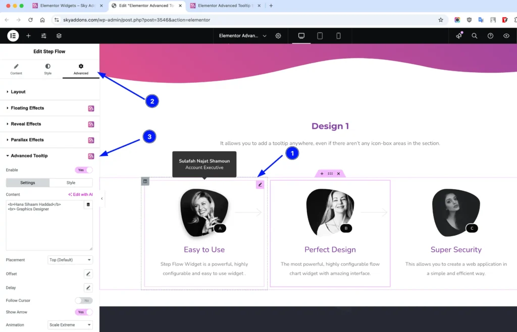
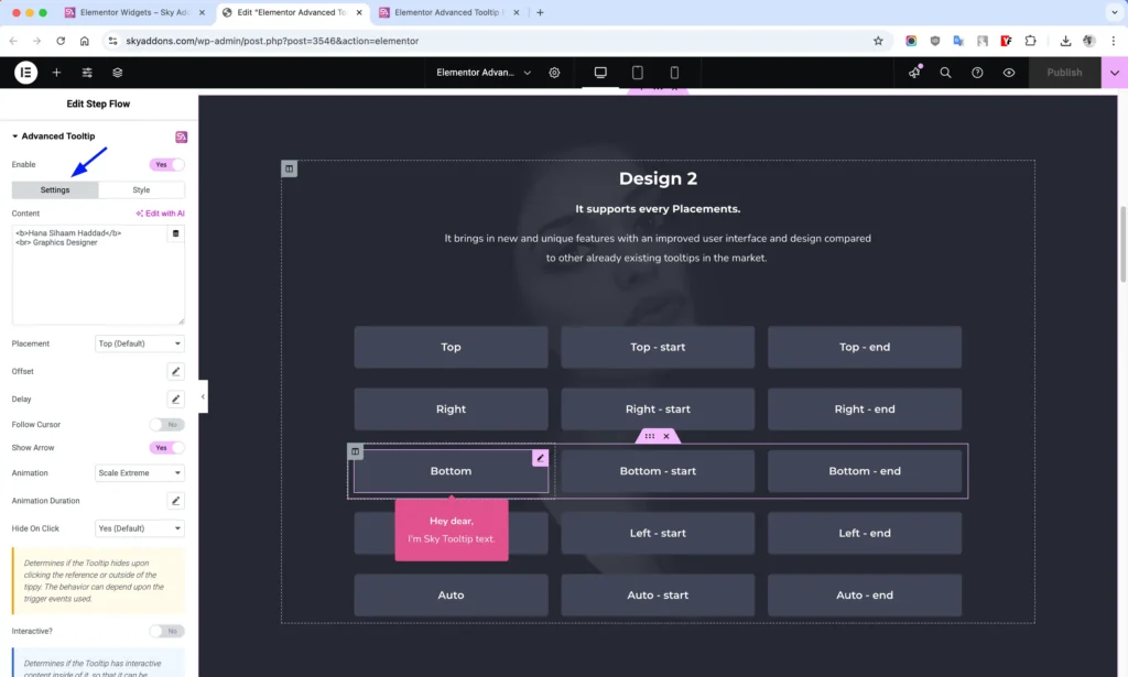
The Advanced Tooltip section appears on the Advanced tab of every widget. It does not appear on containers, so to add a tooltip to a group of elements, put it on the main widget inside the group. The section has two tabs: Settings and Style. In this Step Flow example, the Content field uses a little HTML to show a name in bold and a job title below it.
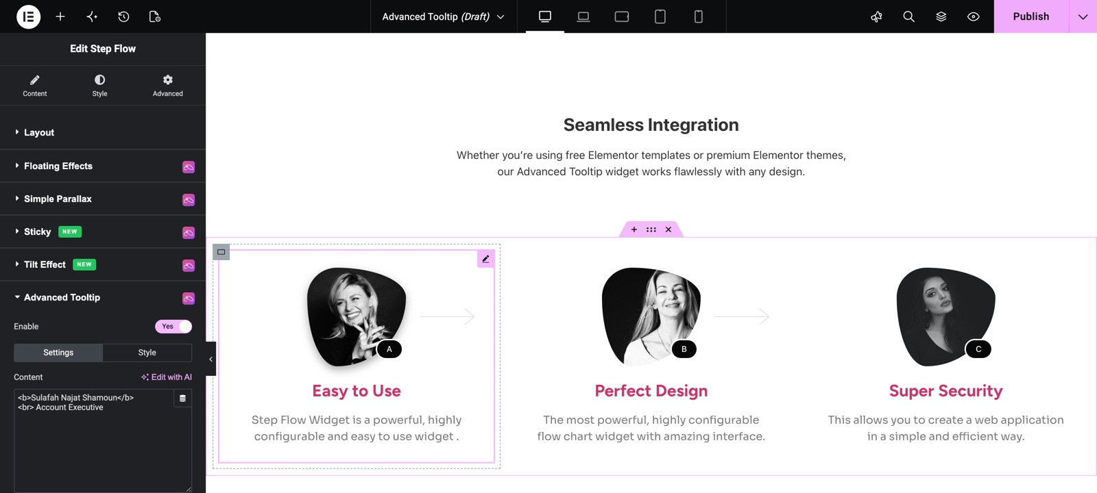
Settings Section
This section provides all the configuration options for your tooltip:
- Enable – Activate the tooltip functionality for the selected element.
- Content – Add your tooltip text or HTML content.
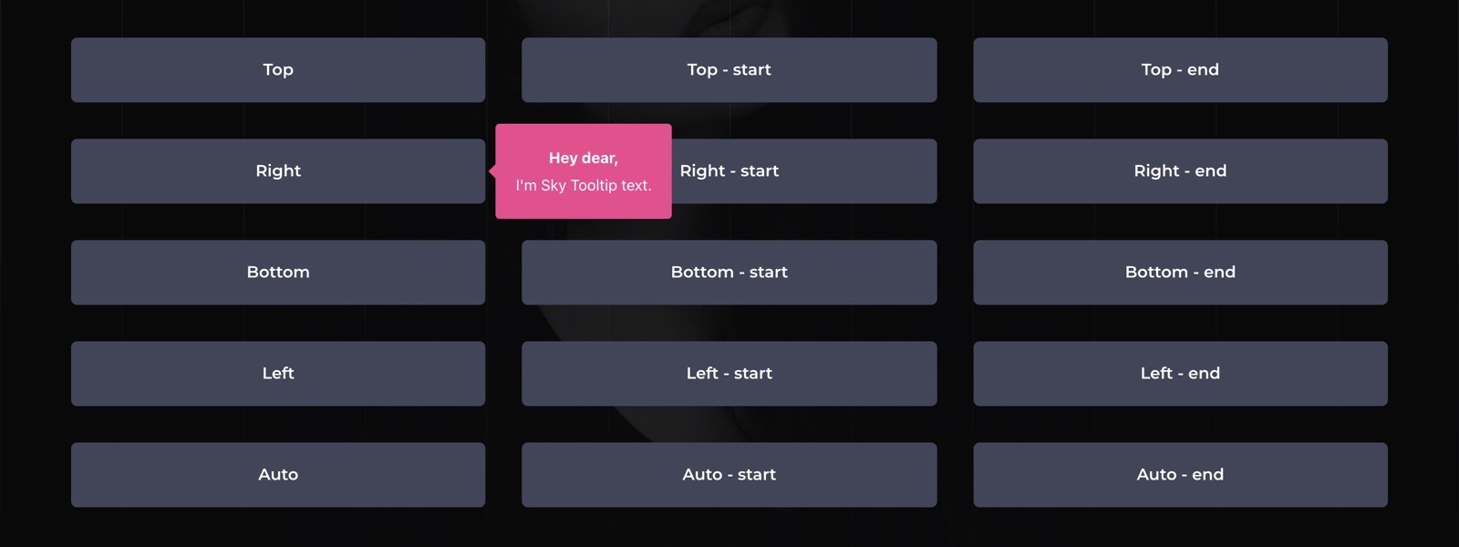
- Placement – Choose where the tooltip appears: top, right, bottom or left, each with start and end variations, or Auto, Auto-start and Auto-end. Top is the default.
- Offset – Control the distance between tooltip and element with X/Y coordinates.
- Delay – Set custom show/hide delays for smoother user experience.
- Follow Cursor – Make tooltip follow the mouse cursor movement.
- Show Arrow – Display a directional arrow pointing to the trigger element.
- Animation – Select from various animation styles like fade, shift, scale, perspective.
- Animation Duration – Control how long tooltip animations take to complete.
- Hide On Click – Configure tooltip hiding behavior when clicked. Choose Yes (the default), No or Toggle.
- Interactive – Allow users to interact with content inside the tooltip.
- Trigger – Choose Hover (the default) or Click to activate the tooltip.
- Custom Trigger Elements – Target specific elements to trigger the tooltip using CSS selectors.
This demo has one button for each of the 15 placements. The visitor is pointing at the Right button, so its tooltip opens to the right with the arrow pointing back at the button.
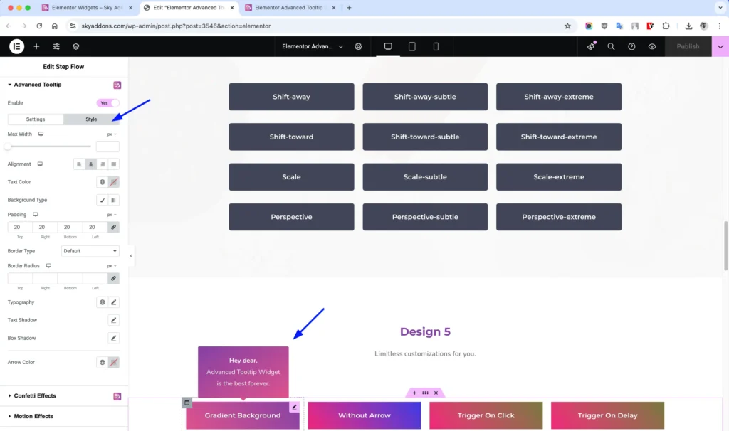
Style Customization
Completely customize the appearance of your tooltips with comprehensive styling options:
- Max Width – Control the maximum width of your tooltip.
- Alignment – Align tooltip text (left, center, right, justify).
- Text Color – Customize the tooltip text color.
- Background – Apply solid colors or gradients to your tooltip background.
- Padding – Control internal spacing within the tooltip.
- Border – Add and style borders around your tooltip.
- Border Radius – Create rounded corners for your tooltip.
- Typography – Control font family, size, weight, and more.
- Text Shadow – Add depth to your tooltip text.
- Box Shadow – Create shadow effects for the entire tooltip.
- Arrow Color – Customize the color of the tooltip’s directional arrow.
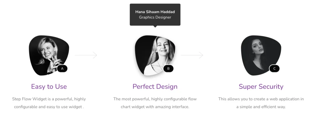
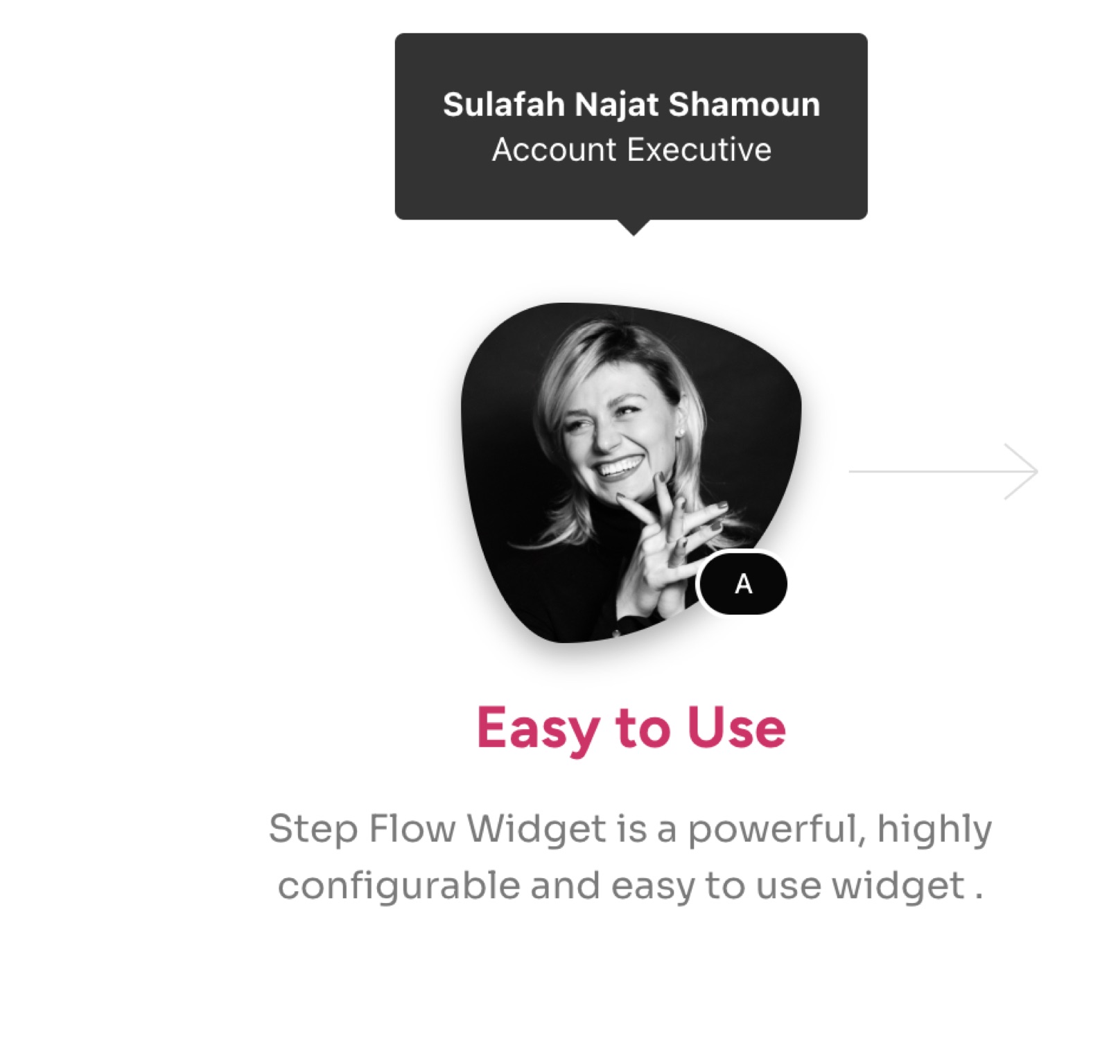
Here is the Step Flow tooltip on the live page. It opens above the image, shows the name and job title, and has an arrow because Show Arrow is on.
Save and Preview
- Once you’ve customized and styled your tooltip, click “Publish” or “Update” to save your changes.
- Preview the page to ensure the tooltip looks and functions as desired.
Troubleshooting
- Tooltip Not Appearing – Check if the “Enable” option is activated and ensure your content isn’t empty.
- Positioning Issues – Try different placement options or adjust the offset values for better positioning.
- Interactive Mode Not Working – Ensure your tooltip size is large enough and try increasing the animation duration.
- Custom Triggers Not Working – Verify your CSS selectors are correct and the targeted elements exist on the page.
- Animation Appears Choppy – Adjust the animation duration settings for smoother transitions.
Frequently Asked Questions
Is Advanced Tooltip free?
No. Advanced Tooltip is a Sky Addons Pro extension.
Can I put links or images inside a tooltip?
Yes. The Content field accepts HTML. Turn on Interactive? so visitors can move the mouse into the tooltip and click a link without the tooltip closing.
How do I show a tooltip on click instead of hover?
Set Trigger to Click. This works better on touch screens, where there is no hover.
Related Extensions
- Floating Effects: add gentle motion to any widget.
- Wrapper Link: make a whole widget or container clickable.
Conclusion
The Advanced Tooltip extensions is a powerful addition to your Elementor toolkit, allowing you to enhance user experience by providing contextual information in an elegant way. With its extensive customization options, you can create tooltips that perfectly match your website’s design while improving usability and engagement.
If you have any questions or encounter any challenges while using, please don’t hesitate to reach out to our dedicated support team at https://wowdevs.com/support/ where our expert team is ready to provide prompt and helpful assistance.