A before-and-after image comparison for Elementor with a draggable handle — retouching, renovations, product revisions.
Drag the handle and the second version appears in place — same crop, same second, nothing reloading underneath. It is the quickest way to make an edit visible to someone who was not in the room when it was made.


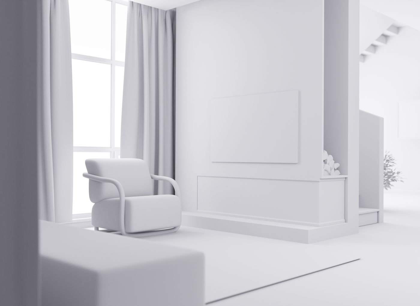
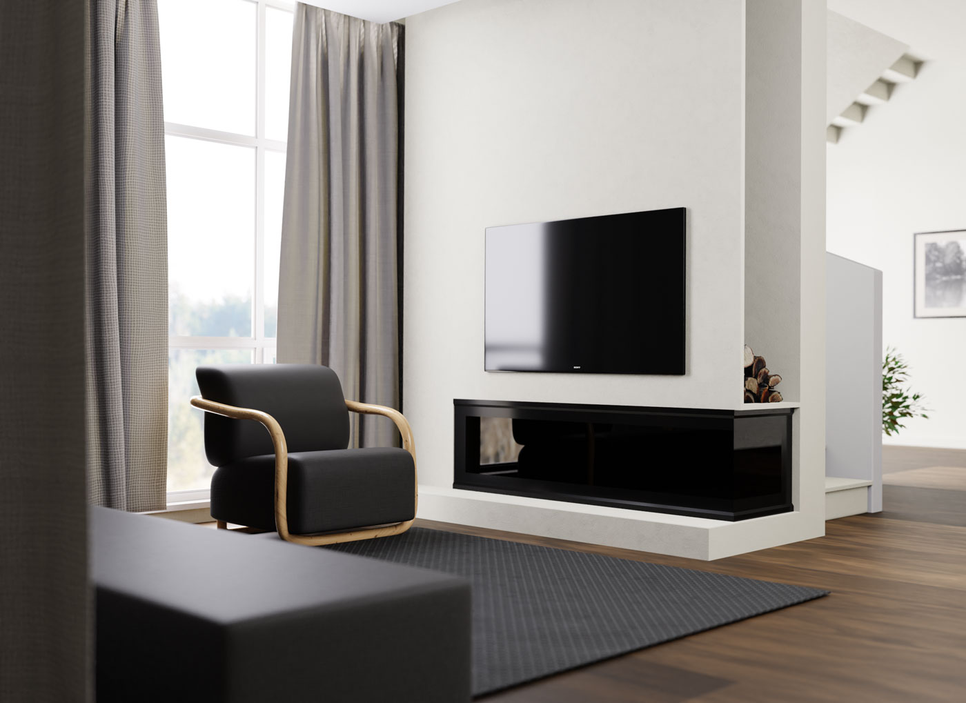
Clay render to final frame — the same camera, the same room.
A visualisation studio delivers the grey clay pass first, so the client argues about geometry before anyone spends a night on lighting. The lit frame follows. Both states sit in one box here, so nobody has to flick between two screenshots to see what changed.
One dish, two lighting states.
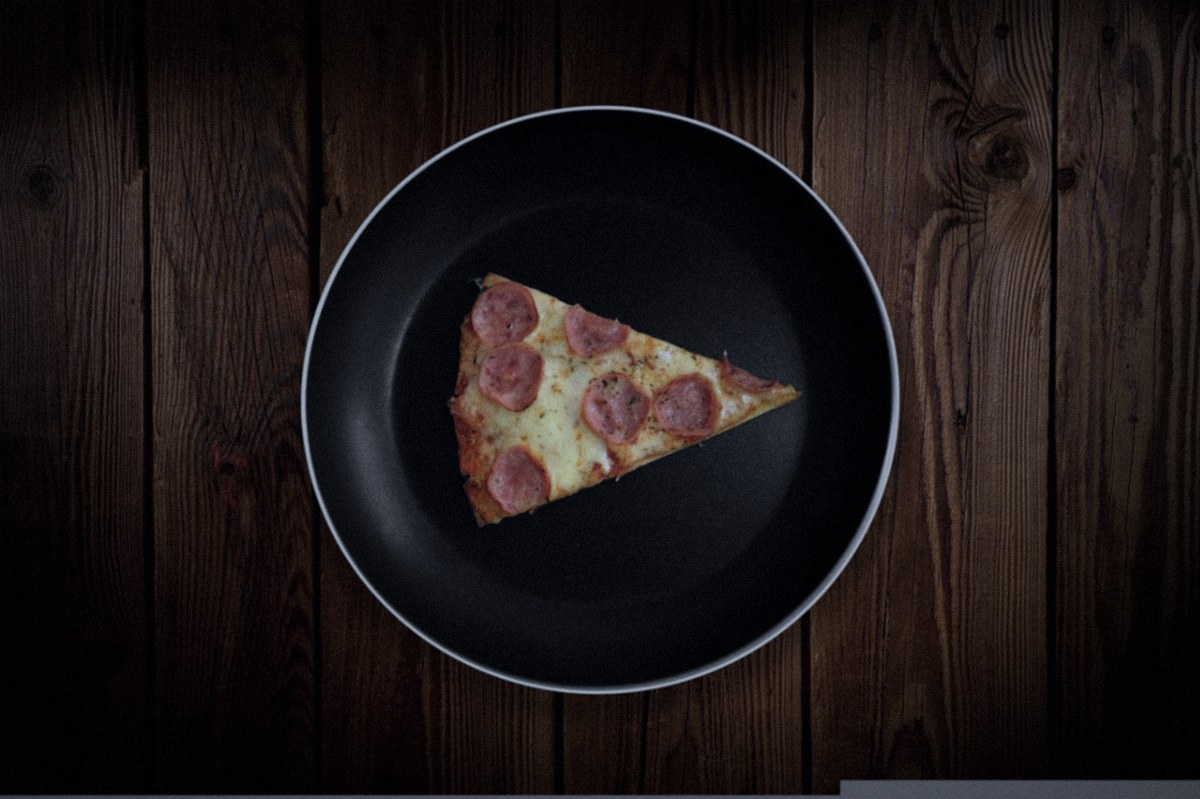
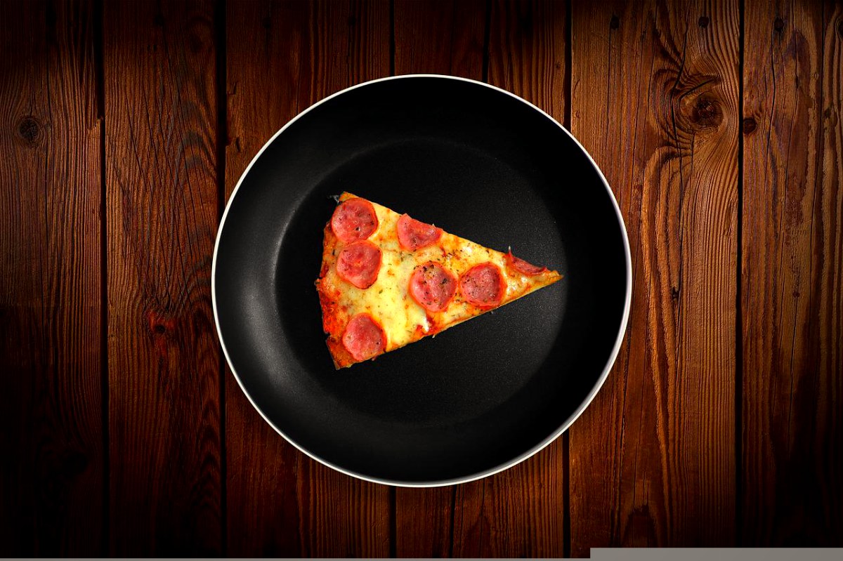
Restaurants send the picture somebody took at the table. This is the same plate after it has been relit and graded for the menu — and the gap between the two is exactly what the shoot is worth.
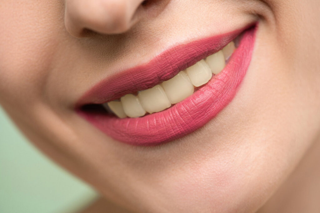
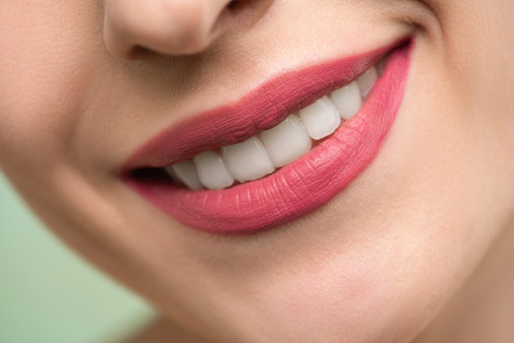
Skin, dentistry, file exports, low light — four different trades, one question at the end of each.



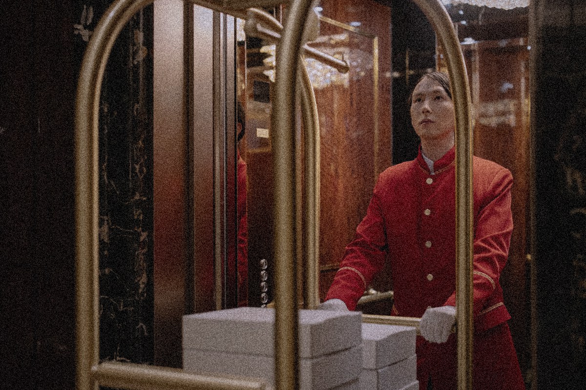
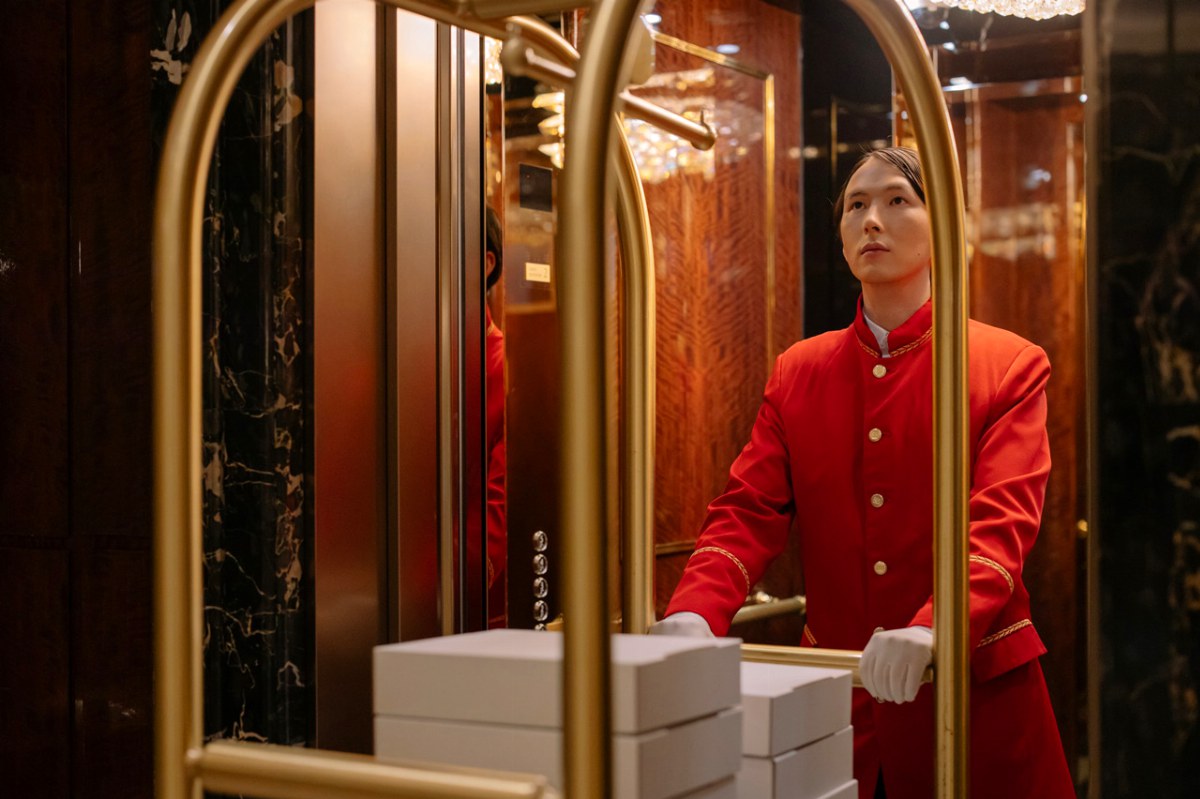
What the room looked like on handover, and what it looks like now.
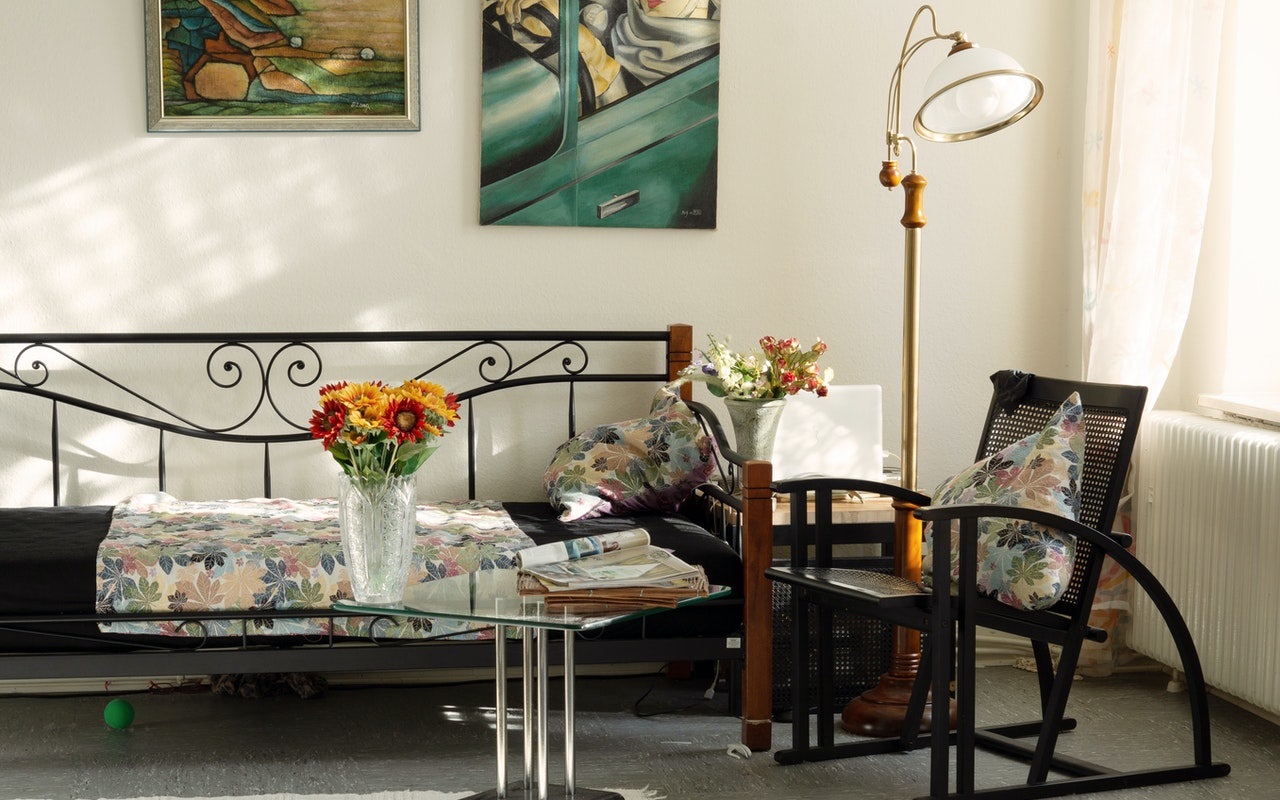
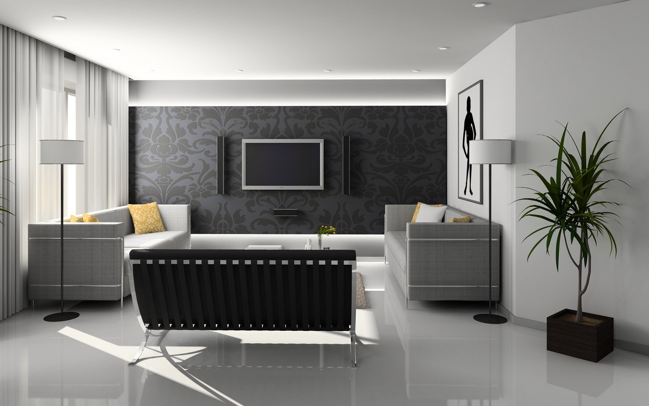
Blank stock on the left, the printed run on the right.
A print shop sells the second state of a garment. Putting the blank next to the finished run answers the only question a buyer really has — what will my artwork look like on this stock?


A grey test render beside the finished pass.
Clients approve a look, not a file. Put the camera original beside the delivered grade and the conversation about what they are paying for is over in about two seconds.


Drag the handle to move between them.
The same file delivered twice — as the light was at noon, and as a blue-hour regrade. A buyer picks the version that fits the campaign without booking a second shoot.
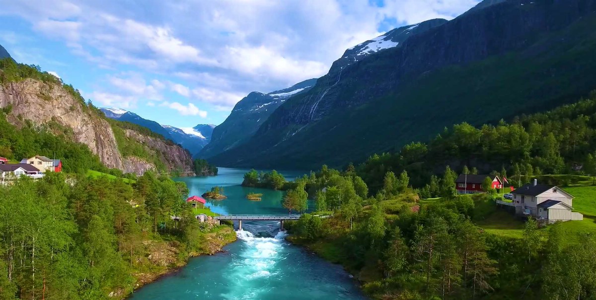
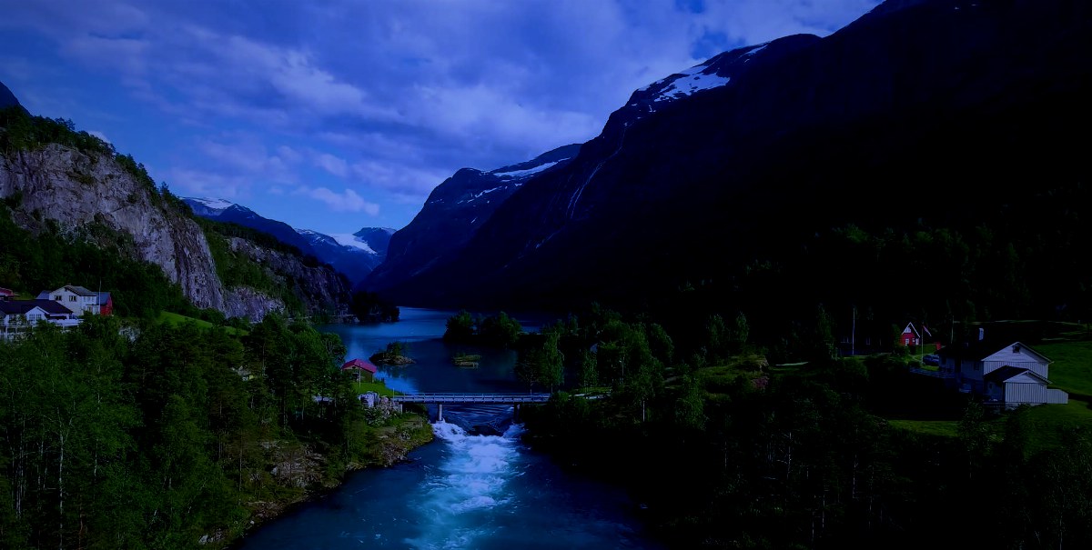
Drag to move between the two times of day.


Drag across the tear to see what was rebuilt.
Scanned from a torn print, then rebuilt: the fade corrected, the tears filled, the grain cleaned back without flattening the face. Dragging the handle is how a customer checks the work without a second appointment.
Turnaround — five working days for a single print, scan included.
Delivered — a 4000px archival file plus a print-ready crop.
Uncoated stock drinks ink and drops saturation; a screen adds contrast for nothing. Putting the proof beside the screen version stops the call that starts with “the colours look wrong”.
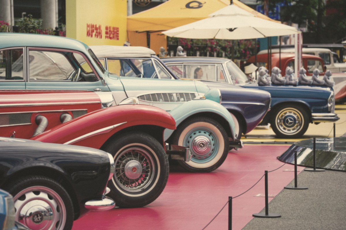
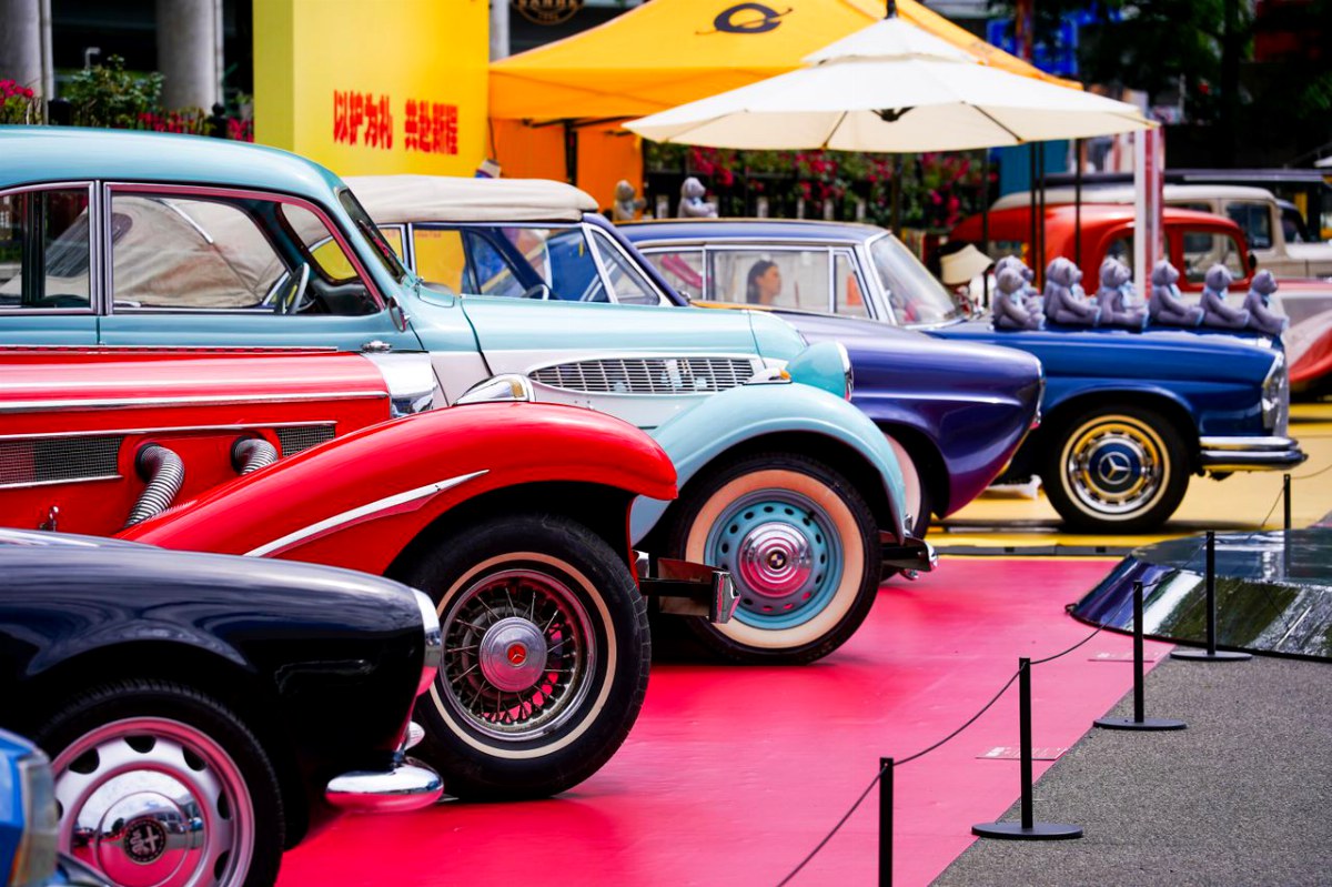
Drag to cross between the paper and the screen.
Ink on paper
Uncoated stock absorbs ink, so saturation drops and edges soften.
Backlit on screen
The same file gains contrast and reach the moment it is lit from behind.
One crop, one second
Nothing shifts under the handle, so the eye compares colour and nothing else.
Every listing starts with whatever the supplier sent — a phone frame under a warm bulb. This is how the buying team signs off the reshoot before the product goes live.
Rejected: colour cast, soft edges, grey backdrop.
Approved: neutral white, clean cut-out, true stitching.
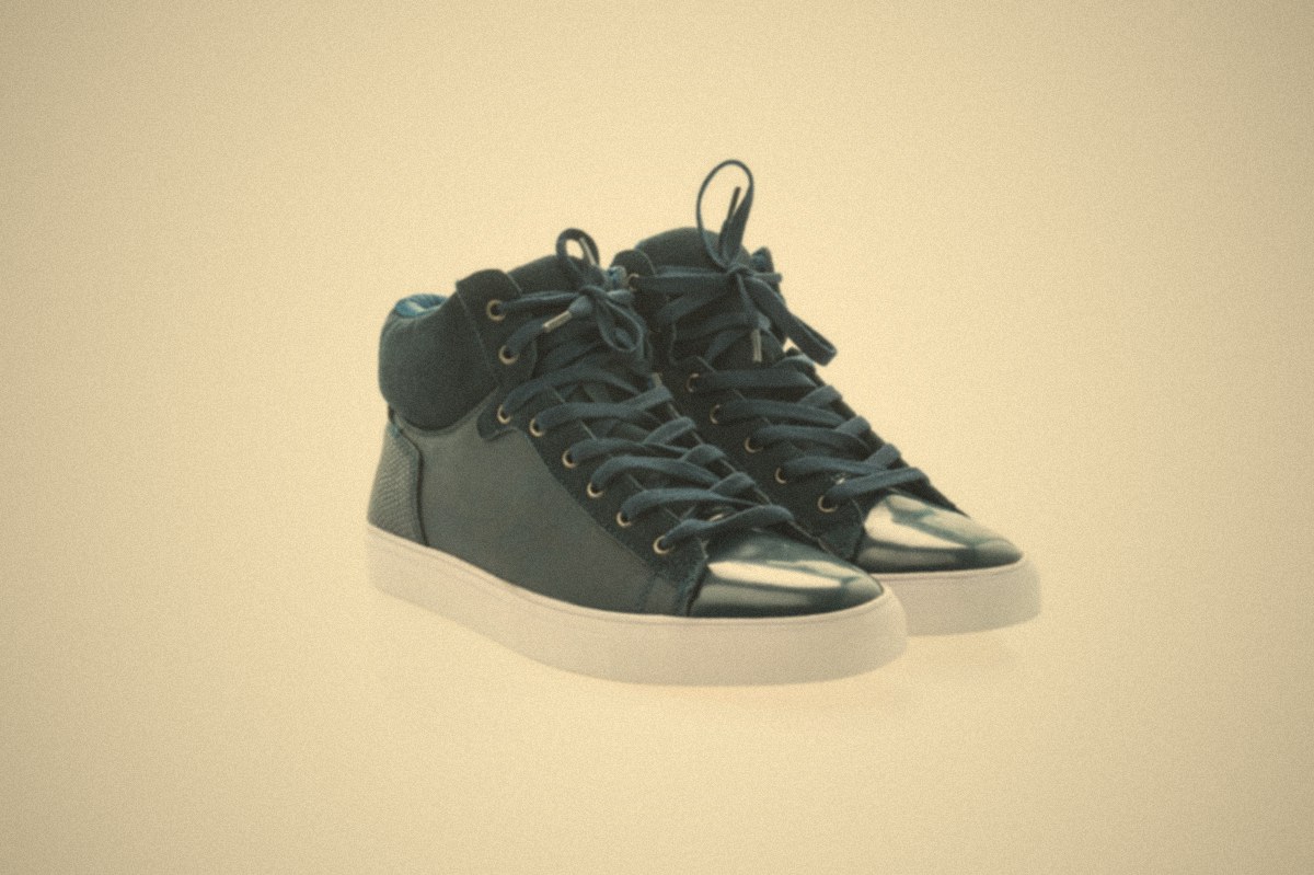
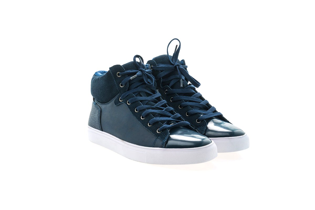
Drag to swap the supplier frame for the pack shot.
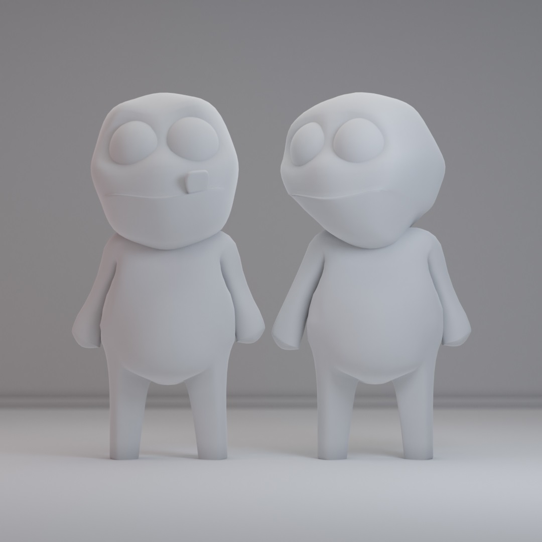
The last pass of a character build, next to the untextured test it started from. Drag it once and the amount of work between the two stops needing a paragraph.

Straight answers about what this one does, where it fits in a real build, and what it costs you to ship.
Read the documentation for this one, or write to us — a human answers inside a business day.
Yes — the Image Compare widget in Sky Addons for Elementor stacks two photographs in one frame with a draggable handle between them. It wipes left to right by default, and a Vertical Mode switch turns it into a top-to-bottom reveal instead, which suits tall subjects like full-length retouching shots.
No, and you do not need Sky Addons Pro either — Image Compare is part of the free Sky Addons plugin and runs on free Elementor with any theme. The comparison viewer script is bundled with the plugin and enqueued only on pages where the widget appears.
Yes, in practice. The before image sets the frame, and the after image is scaled to that exact height and pinned to the opposite edge, so two pictures with different aspect ratios will not line up along the handle. Export both at identical dimensions from the same crop.
Yes — switch on Fluid Mode and a per-device Height slider takes over, starting at 300 pixels and accepting pixels, ems or percentages. Note the trade-off: in Fluid Mode both pictures are drawn as cropped CSS backgrounds rather than image tags, so they lose their alt text and responsive srcset.
No — the bundled comparison viewer binds mouse and touch events only, with no key handling, so the handle cannot be moved with the keyboard. Touch dragging on phones and tablets does work. If accessibility is a requirement, repeat the point the comparison makes in text beside it.
At the centre by default. Initial Slider Position is a 0 to 100 percentage with a separate value for mobile, and Entry Animation slides the handle into place on load over anything from 300 to 3000 milliseconds, 800 by default. Activate Slider on Hover, on by default, means visitors need not click first.
Yes. The line and arrows take a colour and an optional drop shadow, an optional circle sits behind the arrows with its own size and a blur, and a vertical offset moves the whole handle off centre. Movement smoothing is on by default with an adjustable amount and four easing curves.
Yes — Before and After labels can be shown permanently or set to fade in only on hover, with their own fade duration, opacity, colours and offset. Separately, a content block adds a title in the heading tag you choose plus a line of text over the image, with its own placement, width and background.
Yes — both files are needed for the wipe to work, so budget for two images rather than one. The Image Size control ships at Large rather than Full, so you serve WordPress’s resized derivative by default, and outside Fluid Mode both are genuine image tags carrying alt text and a responsive srcset.
Because the wipe keeps both frames in the same position, so the eye compares the same pixels rather than shifting between two boxes — which is why it reads so well for retouching, renovations and restoration. If your two shots differ in framing or lighting, side by side is the more honest presentation.
Elementor widgets and extensions by wowDevs — built for people who would rather ship than fight a page builder.
One short email when something ships. No drip sequence.