
How to use Logo Carousel Widget of Sky Addons for Elementor
The Logo Carousel widget allows you to showcase logos of clients, sponsors, brands, or partners in a sleek and responsive carousel layout. This widget is perfect for adding trust and social proof to your website while keeping your design modern and interactive. Built with flexibility in mind, you can control carousel speed, autoplay, tooltip display, lightbox support, and individual logo styling, all without touching a line of code.
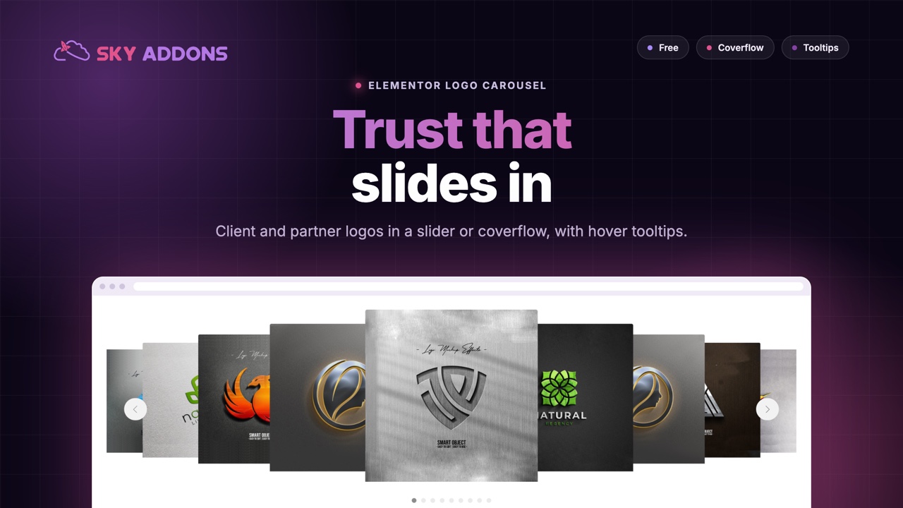
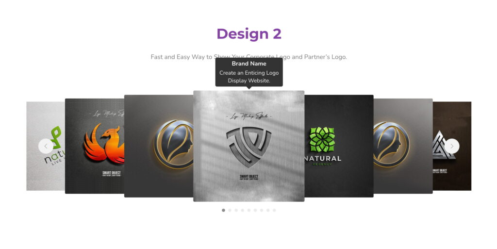
Features:
- Showcase logos in a responsive carousel format
- Supports tooltips, links, and lightbox options
- Multiple styles, navigation, and autoplay controls
- Fully customizable logo and carousel appearance
- Lightweight and smooth transitions
Insert Logo Carousel Widget
- Open Elementor Editor. In the Elementor panel, search for “Logo Carousel” under Sky Addons.
- Drag and Drop the Widget to the desired location on your page / editor.
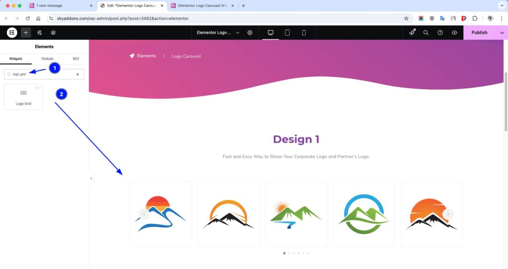
Layout Section
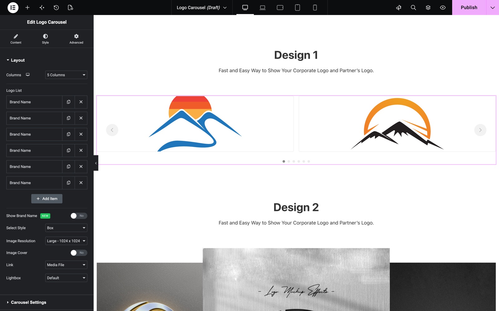
- Columns – Choose how many logos to show per row (1–6).
- Logo List – Add logos via repeater with full customization:
- Logo – Upload your logo image.
- Link – Add a custom or media file URL.
- Brand Name – Title for the logo.
- Brand Text – Description or tagline.
- Show Tooltip – Enable/disable tooltip on hover.
- Tooltip Placement – Choose Top, Right, Bottom, Left or Auto.
- Select Style – Choose between “None” or “Box” design.
- Image Resolution – Adjust resolution for quality control.
- Image Cover Size? – Stretch image to fit the frame.
- Link Open Type – Choose Media File, Custom URL, or None.
- Lightbox – Enable to view logos in a popup modal.
- Show Brand Name – Display the brand name below each logo, with a selectable HTML tag.
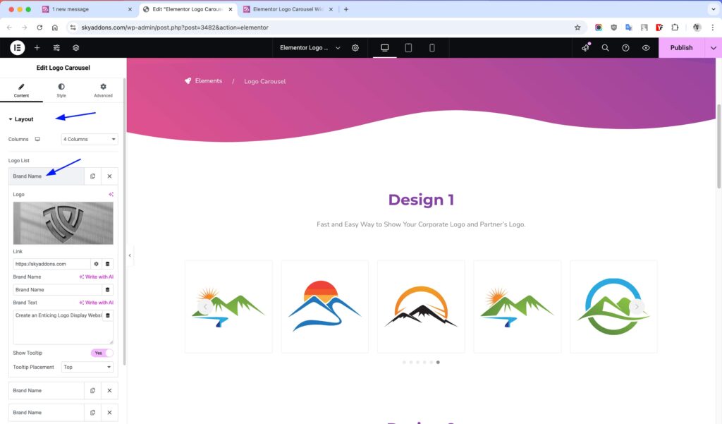
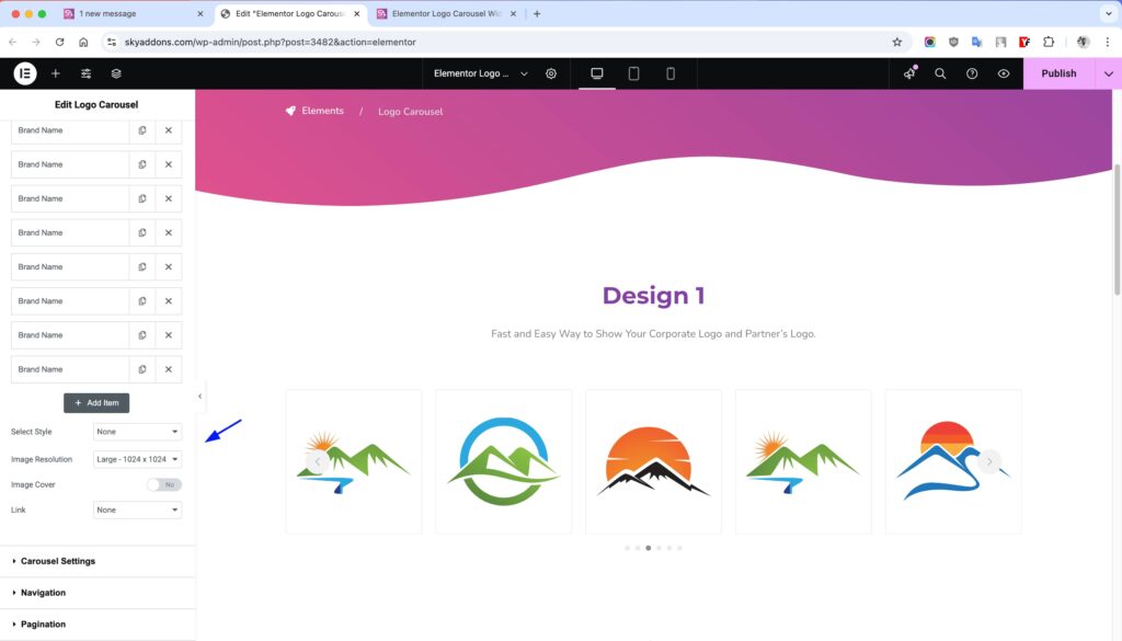
The first carousel in the Logo Carousel demo holds six logos with the Box style. Link is set to Media File, so each logo opens in the lightbox.
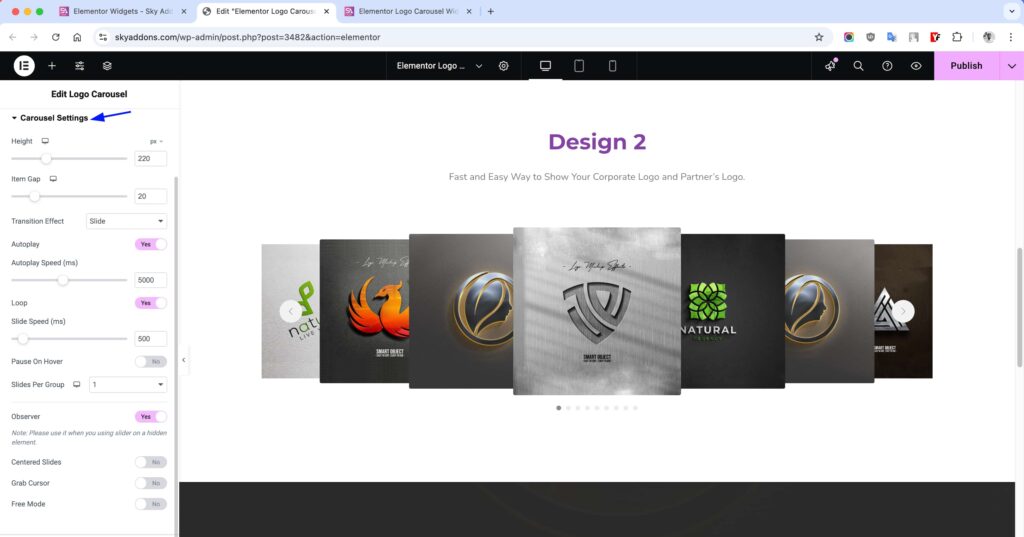
Carousel Settings
- Height – Set the height of the carousel in pixels.
- Lazy Load – Enable native lazy loading on logo images for better performance.
- Item Gap – Space between each logo/item.
- Transition – Choose Slide or Coverflow. Coverflow adds depth, rotate and shadow options.
- Autoplay – Automatically rotate through logos.
- Loop – Restart the carousel when the end is reached.
- Slide Speed – Time to complete one slide (ms).
- Pause on Hover – Stops autoplay when hovered.
- Slides Per Group – Move grouped slides together.
- Observer – Auto-detect changes in DOM or layout.
- Centered Slides – Centers the active slide.
- Grab Cursor – Show a grab hand cursor on hover.
- Free Mode – Freely scroll logos with momentum.
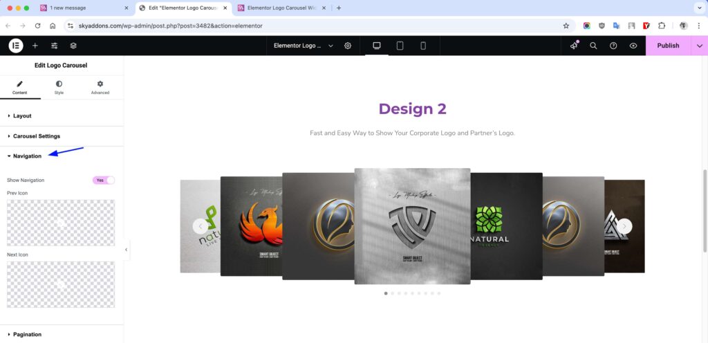
Navigation
- Show/Hide Navigation – Toggle previous/next arrows.
- Prev Icon – Choose the icon for the previous arrow.
- Next Icon – Choose the icon for the next arrow.
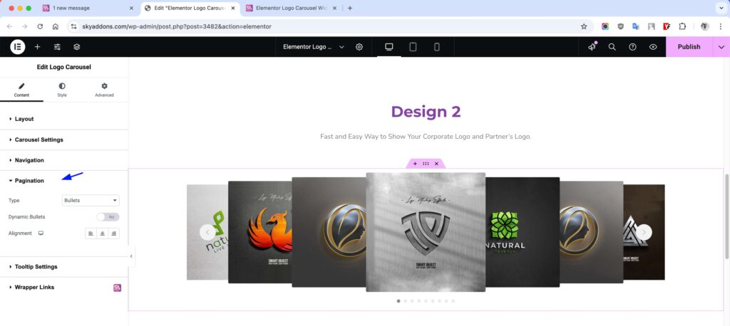
Pagination
- Type – Choose None, Bullets, Fraction, Progress Bar or Dynamic Bullets.
- Dynamic Bullets? – This is one of the Type options. The bullets change size as the slides move.
- Alignment – Align pagination center, left, or right.
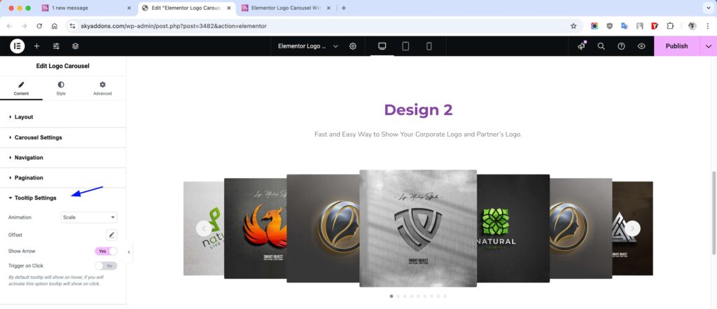
Tooltip Settings
- Animation – Choose from Scale, Shift-away, etc.
- Offset – Adjust spacing from the logo.
- Show Arrow – Enable/disable tooltip arrow.
- Trigger on Click – Show tooltip on click instead of hover.
Style Customization
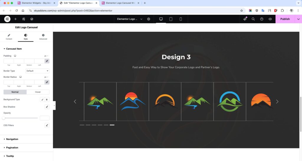
Open the Style tab and the Carousel Item section to set padding, border, radius and the Grayscale Effect. The Normal and Hover tabs hold background, box shadow, opacity and CSS filters.
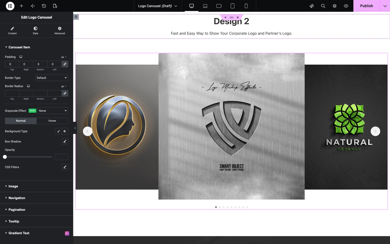
Carousel Item
- Padding – Adjust inner space around the logo inside each item container.
- Border – Add or style border lines for logo boxes.
- Radius – Control corner roundness for logo containers.
- Background – Set custom background color or gradient.
- Shadow – Apply box shadow to give depth or highlight logos.
- Opacity – Control transparency for each logo item.
- Grayscale Effect – Show logos in grayscale and reveal color on hover, or the reverse (color to gray on hover).
- CSS Filters – Apply effects like blur, brightness, contrast, etc.
- Hover Mode – Enable all above styles to change on hover interaction.
Brand Name
- Typography – Control font, size, weight, and spacing of the brand name.
- Color & Hover Color – Set the brand name color and its color on hover.
- Spacing – Adjust the gap between the logo and the brand name.
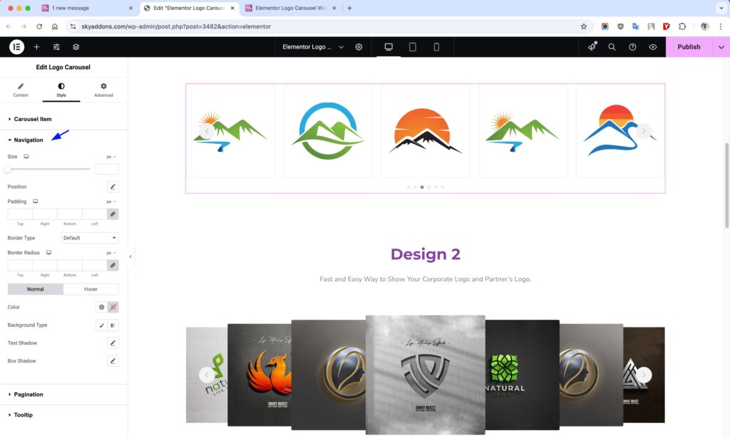
Navigation
- Size – Define width and height of the nav icons.
- Position Offset – Adjust icon position from edges.
- Border – Style the outer line of nav buttons.
- Radius – Curve the edges of the nav icons.
- Color – Set icon color for normal state.
- Background – Customize background color behind icons.
- Shadow – Add shadows around nav icons for depth.
- Hover Mode – Change all above styles on hover.
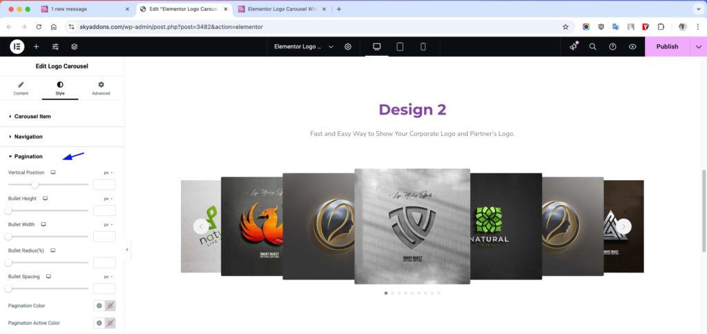
Pagination
- Vertical Position – Move pagination bullets up or down.
- Bullet Height – Set height for each pagination dot.
- Bullet Width – Set width to create round or rectangular bullets.
- Radius – Round the bullet corners or make them circular.
- Spacing – Control the distance between each bullet.
- Pagination Color – Set the default bullet color.
- Active Color – Change color of the active/selected bullet.
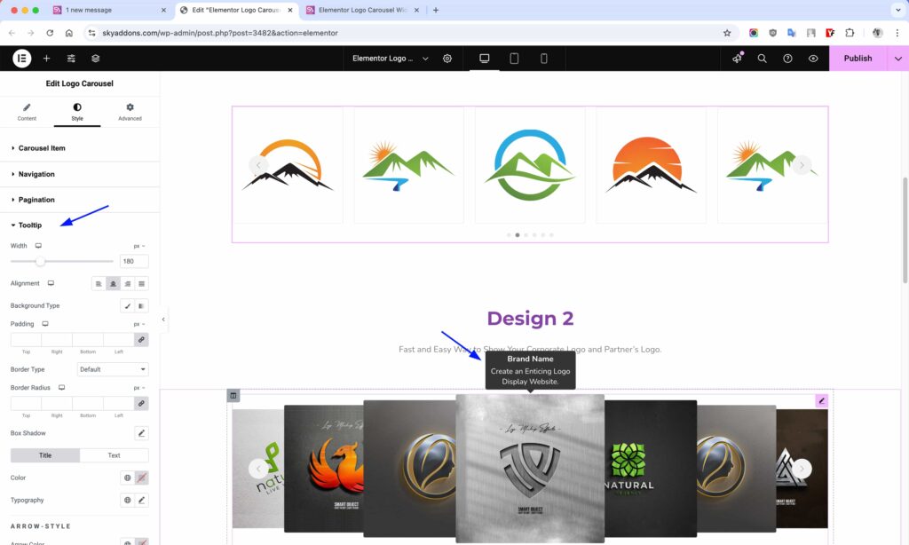
Tooltip
- Width – Set fixed width for tooltip boxes.
- Alignment – Align tooltip text: left, center, or right.
- Background – Set tooltip background color or gradient.
- Padding – Adjust inner space around tooltip content.
- Border – Add a border around the tooltip box.
- Radius – Round the corners of the tooltip.
- Box Shadow – Add shadows for a floating effect.
- Color – Set tooltip text color.
- Typography – Control font, size, weight, and spacing.
- Arrow Color – Set color of the tooltip arrow pointer.
- Title Style – Customize typography and color for title separately.
- Text Style – Set different styles for description text within tooltip.
Save and Preview
- Once you’ve customized and styled your carousel, click “Publish” or “Update” to save your changes.
- Preview the page to ensure the widget looks and functions as desired.
Troubleshooting
- Carousel not sliding? Check that Loop or Autoplay is enabled.
- Images not showing properly? Confirm resolution or cover settings.
- Tooltip not visible? Ensure tooltip is enabled and placed correctly.
- Navigation not appearing? Double-check visibility settings and icons.
Conclusion
The Logo Carousel widget adds professional credibility to your site by elegantly displaying brand or partner logos in motion. Whether you’re showcasing client lists, sponsors, or featured partners, this widget gives you all the tools for seamless customization and interactivity, fully integrated with Elementor.
Need help? Our team is happy to answer questions on the Sky Addons support page.