
How to use Advanced Accordion Widget of Sky Addons for Elementor
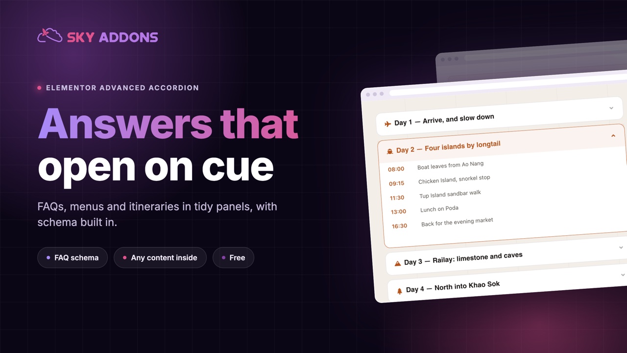
Advanced Accordion is the best and most powerful Widget for Elementor that creates an impressive accordion effect for your articles. It makes the accordion easy to customize. You can customize your Accordion with title, icon, menu, content, button etc. The Advanced Accordion Widget enhances your Elementor page-building experience by providing versatile and interactive accordion designs. You can build accordions from a simple repeater, pull them dynamically from posts, or map them to ACF repeater fields, arrange items in a multi-column grid, and even output FAQ Schema for SEO-friendly rich results. This documentation will guide you through the process of using the Advanced Accordion Widget to create engaging content sections on your website.

Features:
- Multiple Content Sources: Build items with the default Repeater, pull them from Dynamic Posts, or map them to ACF repeater fields.
- Grid Layout: Arrange accordion items across 1 to 4 columns with adjustable column gap.
- Multiple Accordion Styles: Choose from various pre-designed styles to match your website’s theme.
- Customizable Design: Adjust colors, fonts, borders, and more to fit your brand.
- Icon Support: Add a title icon plus separate open/close (active) icons with control over alignment.
- Collapsible or Expandable: Choose whether multiple sections can be open at once or only one at a time.
- Smooth Animation: Engage users with smooth opening and closing transitions.
- FAQ Schema: Output Schema.org FAQPage microdata for SEO-friendly FAQ rich results.
- Advanced Content: You can also use Elementor Templates or AE Templates as content too.
Insert Advanced Accordion Widget
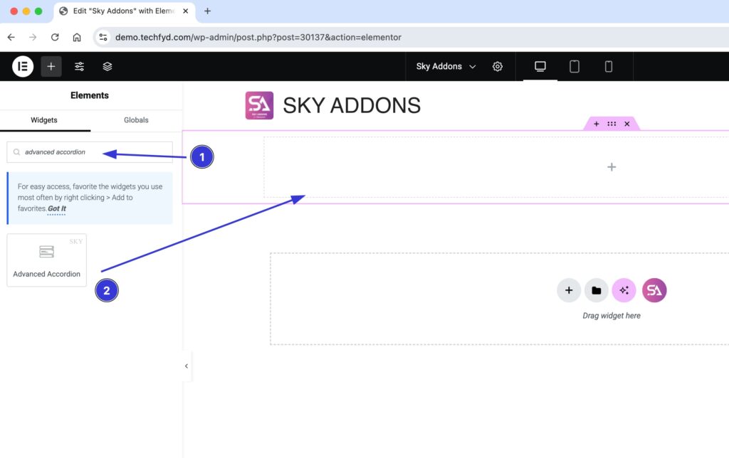
- Open Elementor Editor. In the Elementor panel, search for “Advanced Accordion” under Sky Addons.
- Drag and Drop the Widget to the desired location on your page / editor.
Choose a Content Type
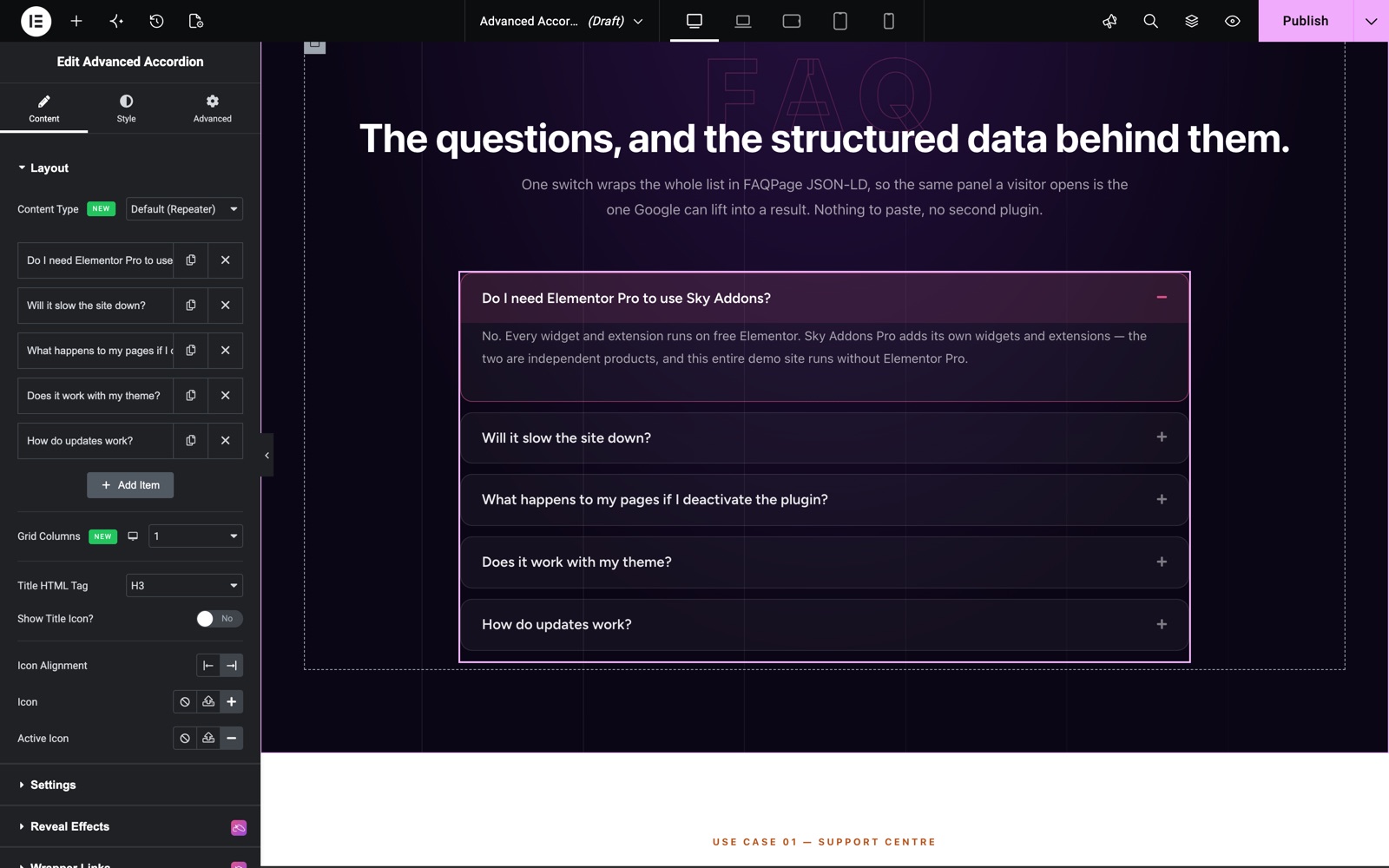
In the Layout section, the Content Type option lets you decide where the accordion items come from:
- Default (Repeater): Manually add each accordion item with its own title, icon, and content. Best for static FAQs and curated content.
- Dynamic Posts: Generate accordion items automatically from your posts using the built-in Query builder. Each post becomes an item (post title as the accordion title, post content as the panel).
- ACF Fields: Map an Advanced Custom Fields repeater to the accordion, so editors manage items through ACF instead of the widget.
You can also set Grid Columns (1–4) to arrange items in a multi-column layout, choose the Title HTML Tag for SEO/semantics, toggle Show Title Icon with Icon Alignment, and pick the closed and active (open) toggle Icons.
Configure Content (Repeater)
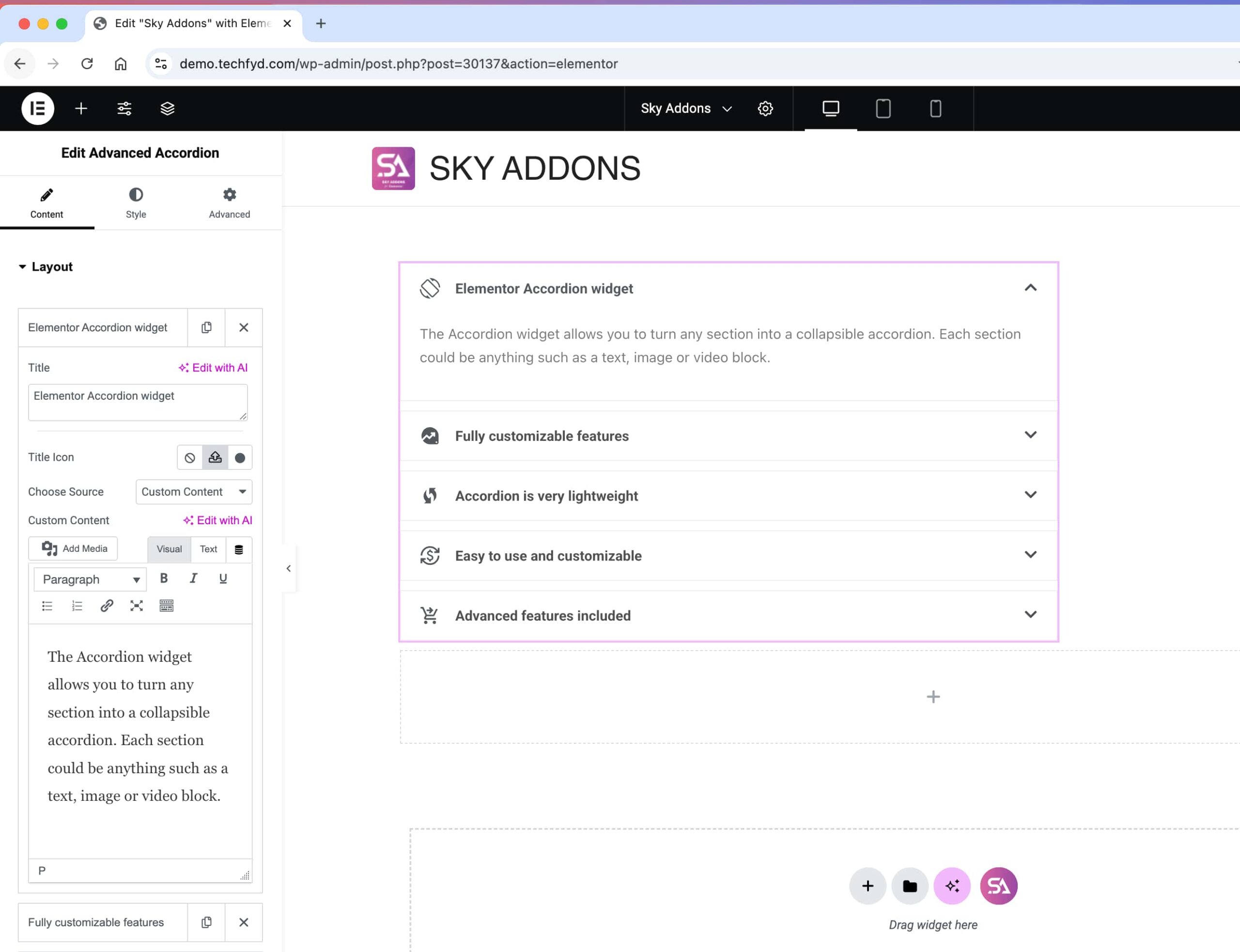
- Click “Add Item” to create a new accordion tab.
- Enter a title and content for each accordion section.
- You can Choose an icon for each accordion item from the icon library.
- You can also use Elementor Templates or AE Templates as content too.
- Drag accordion items to rearrange their order.
Dynamic Posts (Query)
Set Content Type to Dynamic Posts to build the accordion automatically from your content. A dedicated Query section appears where you can control the source. The Query Builder guide explains every query option:
- Select the post type and refine results by terms, authors, or other query parameters.
- Set Posts Per Page to limit how many items are generated.
- Each matching post becomes an accordion item. The post title is the trigger and the post content fills the panel.
ACF Fields
Set Content Type to ACF Fields to drive the accordion from an Advanced Custom Fields repeater. In the ACF Settings section, map your fields:
- ACF Repeater Field: Enter the name of the ACF repeater field that holds your items.
- Title Field Mapping: Enter the sub-field name used for each item’s title.
- Content Field Mapping: Enter the sub-field name used for each item’s content.
Note: ACF mode requires the Advanced Custom Fields plugin to be active, with the repeater field attached to the current post.
Configure Settings
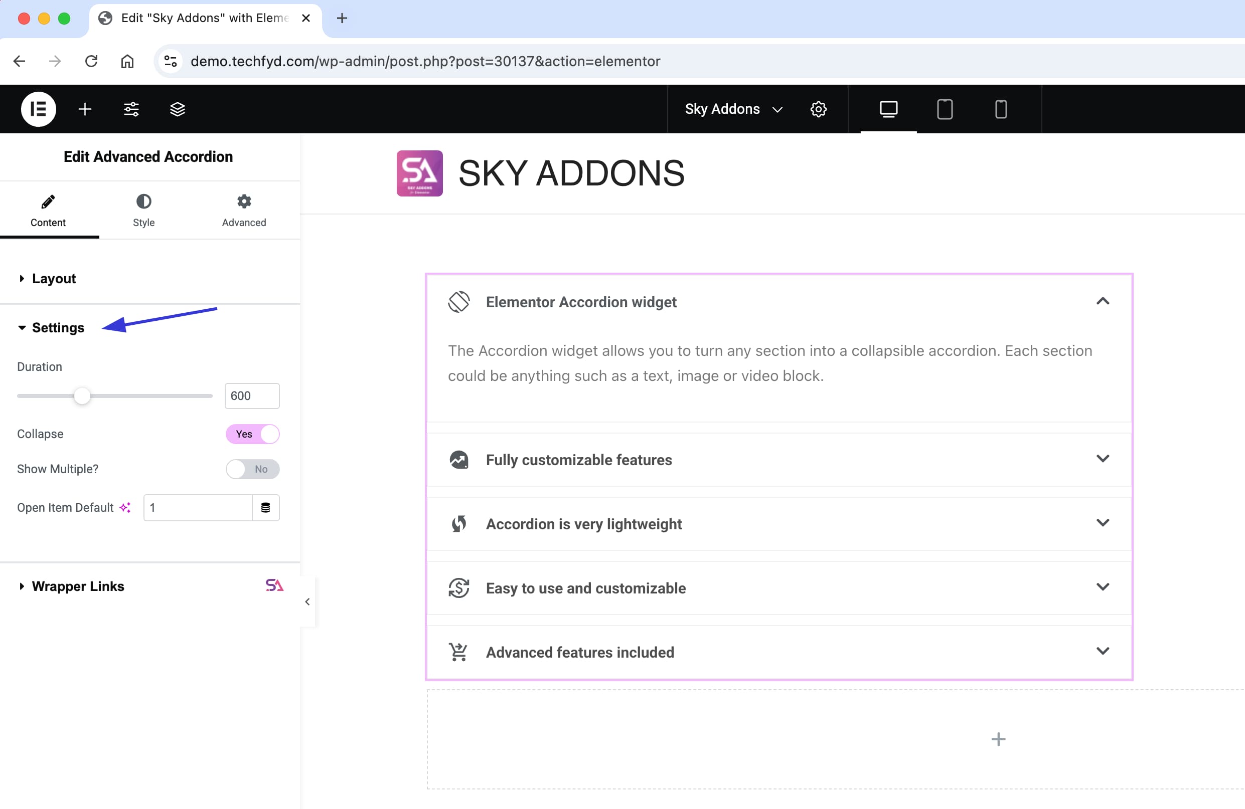
In the Settings section, you gain full control over the widget, unlocking powerful customizations options to enhance creativity and design flexibility.
- Duration: Set how quickly the accordion items open and close. The default is 400 milliseconds.
- Collapse: Lets visitors close an open item by clicking its title again. When it is off, an open item stays open until another item opens. It is on by default.
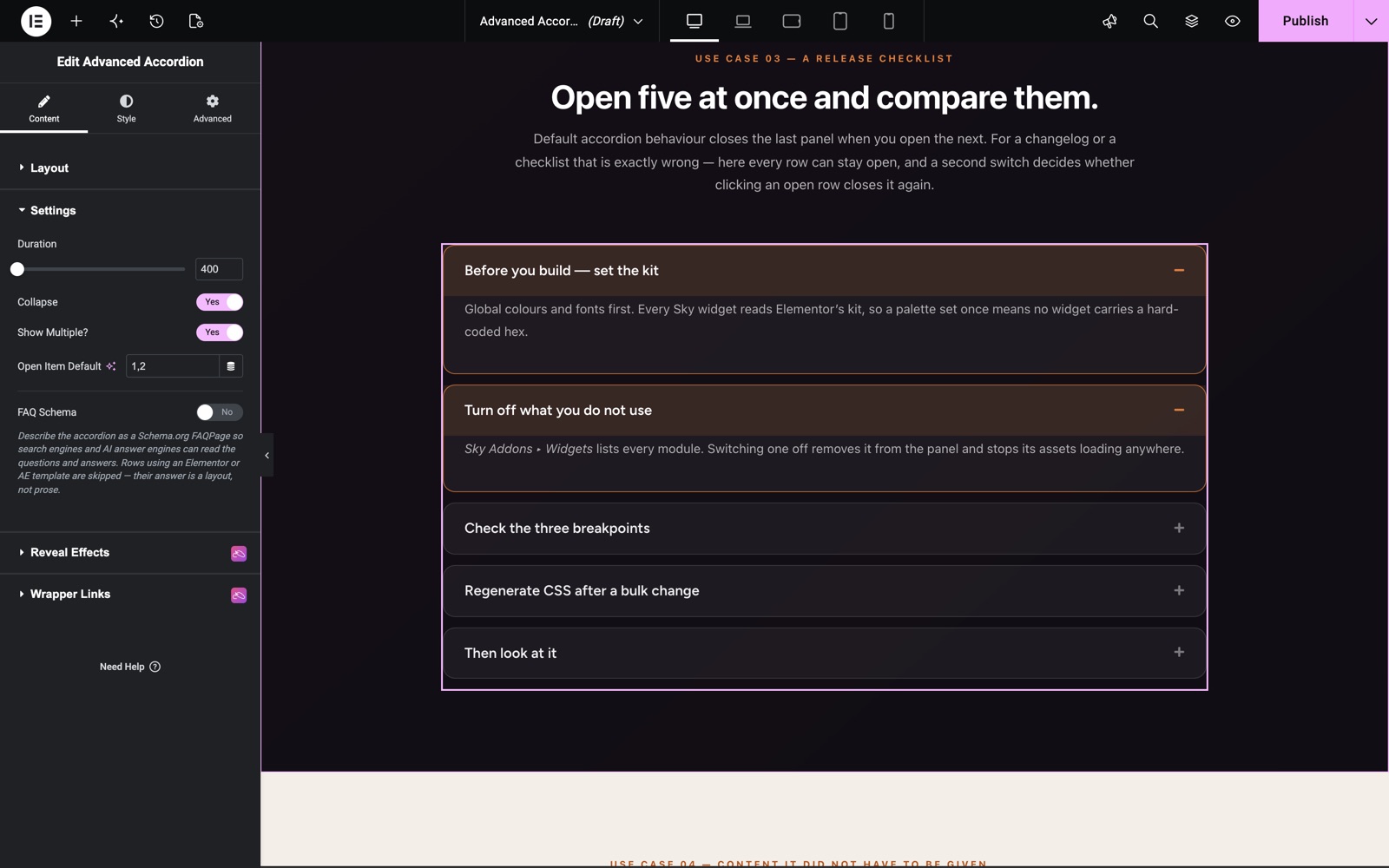
- Show Multiple: Decide if multiple accordion items can be open simultaneously or if only one can expand at a time. This feature enhances user experience by providing better content visibility and flexibility.
- Open Item Default: This Accordion settings allows you to set a specific item to be expanded by default when the page loads. Accepts a single number or a comma-separated list (e.g.
1or1, 2, 3). - FAQ Schema: Describes the accordion as a Schema.org FAQPage, so search engines and AI answer engines can read your questions and answers. Items that use an Elementor or AE template as content are left out of the schema, because their answer is a layout, not text.
- Schema Output: Appears when FAQ Schema is on. Choose Both (the default), JSON-LD or Microdata. JSON-LD is written once per page and merges every accordion on that page. Google prefers this format. Microdata sits inside the markup, and a page can hold only one FAQPage, so only the first accordion on the page carries it.
Here is a release checklist built with these settings. Show Multiple is on, so visitors can open every row and compare them. Open Item Default is 1, 2, so the first two rows are open when the page loads.
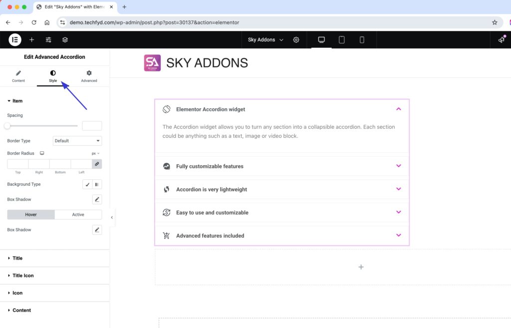
Style Your Accordion
Customize your accordion to match your design aesthetics effortlessly. Adjust colors, typography, spacing, icons, and more to create a visually appealing and engaging accordion that enhances user experience. Add smooth animations and interactive effects to make your content stand out!
- Item Section:
Fully customize the item container with options for spacing, column gap (for grid layouts), borders, background, and box-shadow to create a refined look. - Title:
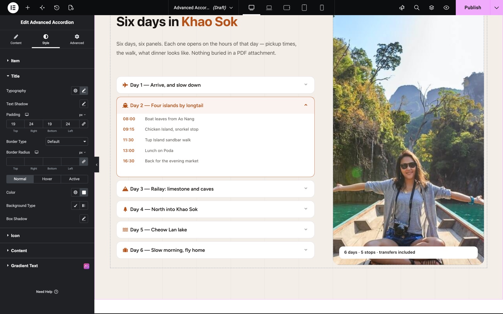
Style the title with advanced typography, text shadow, padding, colors, and box-shadow, offering customization for normal, hover, and active states. - Title Icon:
Adjust the title icon’s size, spacing, padding, border, background, and box-shadow with unique styles for normal, hover, and active modes. - Icon:
Personalize the open/close icon with complete control over size, spacing, padding, border, background, and color in different states. - Content:
Control content alignment, text color, typography, background, padding, border, and box-shadow to ensure a seamless and visually appealing design.
Each part of the accordion has its own section on the Style tab. The Title section sets typography, padding and border. Its Normal, Hover and Active tabs give the title a different color and background in each state, so visitors can see which item is open.
The Title Icon section styles the icon you choose for each item. Set its size and the spacing between the icon and the title. In this product page example, each row has its own icon, and Icon Alignment is set to left, so the open or close indicator sits before the title.
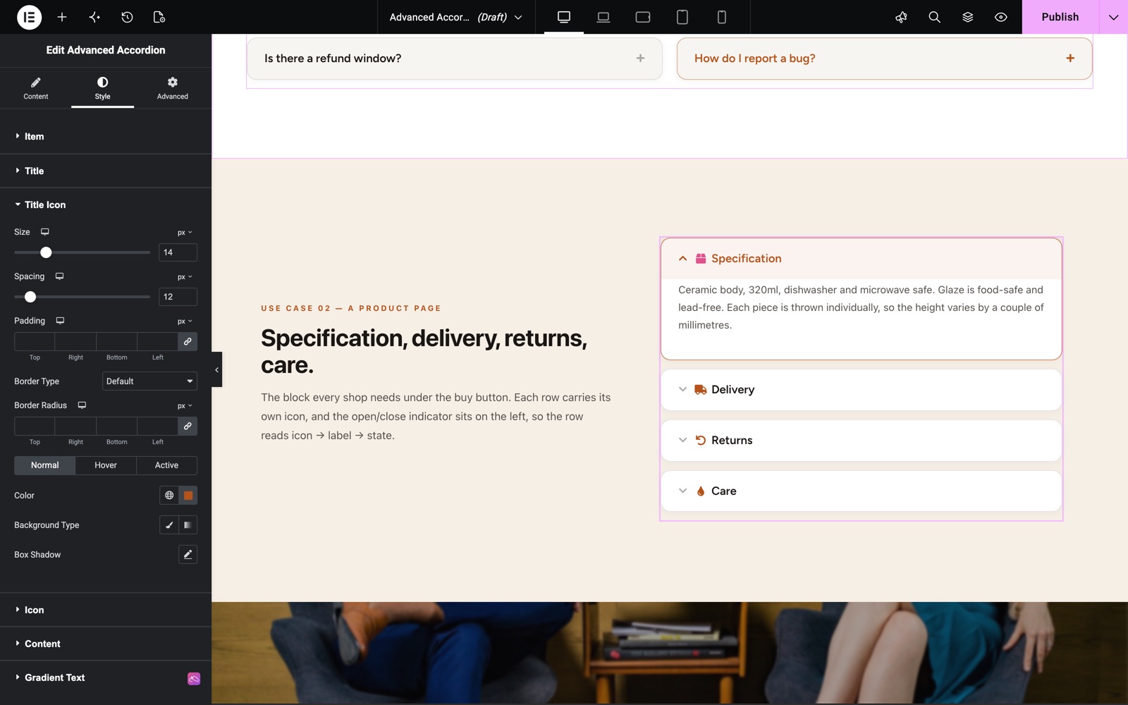
These advanced styling options empower you to fully personalize the accordion widget, making it adaptable to any project while keeping it both functional and visually appealing.
Keyboard Navigation
The accordion works from the keyboard. The Up and Down arrow keys move between item titles. Home jumps to the first title and End jumps to the last. Each title also tells screen readers whether its item is open or closed.
Save and Preview
- Once you’ve customized and styled your accordion, click “Publish” or “Update” to save your changes.
- Preview the page to ensure the widget looks and functions as desired.
Best Practices
- Consistency: Maintain a consistent style with the rest of your website for a cohesive look.
- Accessibility: Ensure text within accordion sections is legible and buttons are easily navigable.
- Use FAQ Schema for FAQs: Enable FAQ Schema on genuine question-and-answer content to improve search visibility.
- Testing: Check functionality across different devices and screen sizes for a responsive design.
Troubleshooting
- Accordion Not Expanding: Ensure JavaScript is enabled and there are no conflicting plugins.
- No Items in Dynamic/ACF Mode: Verify the Query returns posts, or that the ACF repeater field name and sub-field mappings are correct and the field is attached to the current post.
- Styling Issues: Double-check CSS settings and clear cache if recent changes aren’t displaying.
Frequently Asked Questions
Is the Advanced Accordion widget free?
Yes. Advanced Accordion is part of the free Sky Addons plugin.
Can I add FAQ schema to an Elementor accordion without another plugin?
Yes. Turn on FAQ Schema in the Settings section. The widget then outputs the questions and answers as a Schema.org FAQPage. Use Schema Output to choose JSON-LD, Microdata or both.
I have two FAQ accordions on one page. Is that a problem?
No. JSON-LD merges the questions from every accordion on the page into one FAQPage. Microdata allows only one FAQPage per page, so only the first accordion carries it.
Why is one item missing from my FAQ schema?
The item probably uses an Elementor or AE template as its content. Template items are left out of the schema. Switch that item to Custom Content if it must appear in search results.
How do I keep several items open on page load?
Turn on Show Multiple, then enter the item numbers in Open Item Default, for example 1, 2.
Related Widgets
- Content Switcher: show one of two or more panels with a toggle or tabs.
- Tidy List: a styled list for features, steps and short facts.
- Table of Contents: help readers move through long pages.
Conclusion
The Advanced Accordion Widget by Sky Addons for Elementor provides a dynamic way to showcase content. Utilize its customizable features to create a seamless user experience. For further assistance, consult the Sky Addons support team or community forums. Enjoy building engaging content sections!
Need help? Our team is happy to answer questions on the Sky Addons support page.