
How to use News Ticker Widget of Sky Addons for Elementor
The News Ticker widget displays scrolling headlines, breaking news, or announcements in a compact bar. Build items by hand with the repeater or pull them dynamically from your posts with a query and a loop template.
Key Features List –
- Two Content Sources: Default Repeater (manual items) or Dynamic Posts (query-driven).
- Ticker Label: A label badge (e.g. “News”) shown before the ticker items.
- 8 Animation Effects: Slide Left/Right/Up/Down, Fade, Flip, Marquee Left/Right.
- Autoplay Controls: Autoplay delay, pause on hover, and disable on interaction.
- Navigation Arrows: Optional prev/next arrows with custom icons.
Insert News Ticker Widget
- Open Elementor Editor. In the Elementor panel, search for “News Ticker” under Sky Addons.
- Drag and drop the widget to the desired location on your page.
The first ticker in the News Ticker demo uses the Default Repeater with three items, the label News and a source prefix on each item.
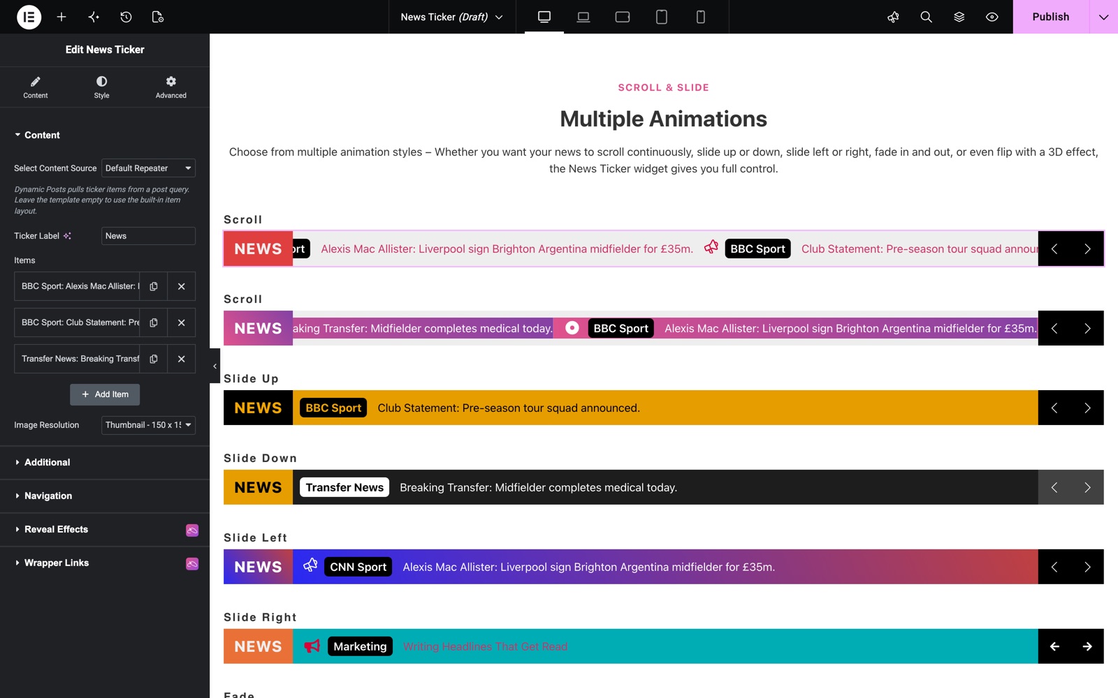
Content Section
- Select Content Source: Choose Default Repeater to add items manually, or Dynamic Posts to display posts from a query.
- Ticker Label: Set the label text displayed at the start of the ticker.
- Items (Repeater): Each item supports a Prefix (e.g. source name), a Date, the ticker Text, and under Media & Link a Thumbnail, an Icon and an optional Link.
- Item Content (Dynamic Posts): Pick what each post item shows: Thumbnail, Category, Date and Title. They render in the order you select them (default Category and Title).
- Select Template (Dynamic Posts): Optional. A saved template replaces the item layout above.
This ticker uses Dynamic Posts with the label Running order. Item Content shows the category and the title of each post.
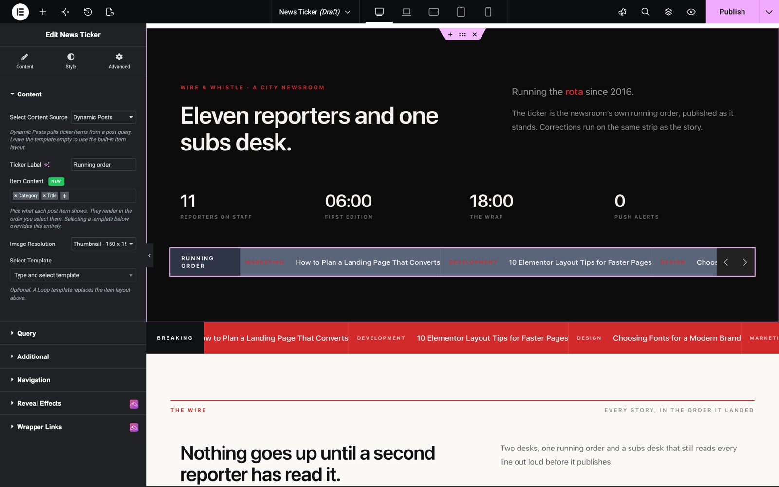
Query Section (Dynamic Posts)
When Dynamic Posts is selected, use the Query builder to choose the post source, include/exclude rules, ordering, and the number of posts to show.
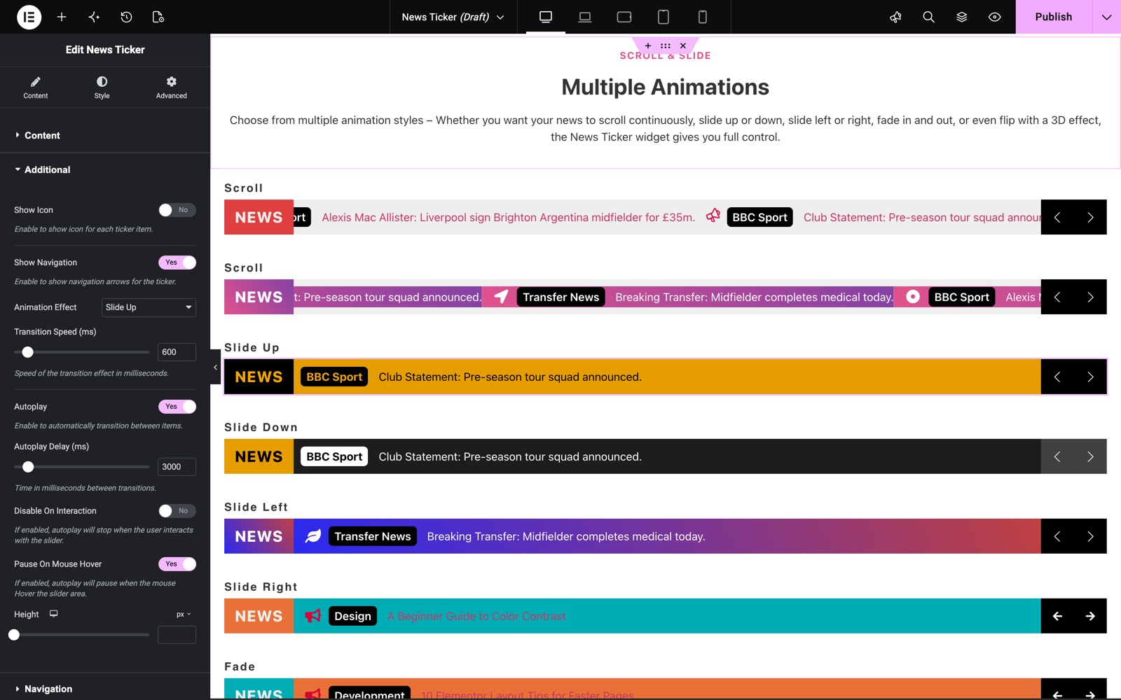
Additional Section
- Show Icon: Show or hide the icon for each ticker item.
- Show Navigation: Show or hide the prev/next navigation arrows.
- Animation Effect: Slide Left, Slide Right, Slide Up, Slide Down, Fade, Flip, Marquee Left, or Marquee Right.
- Marquee Speed (ms): Scrolling speed for the marquee effects.
- Transition Speed (ms): Animation speed for the slide/fade/flip effects.
- Autoplay & Autoplay Delay (ms): Automatically rotate items at the chosen interval.
- Disable On Interaction: Stop autoplay after the user interacts with the ticker.
- Pause On Mouse Hover: Pause the ticker while hovering.
- Height: Set the ticker bar height.
- Navigation Icons: Choose custom Prev and Next icons.
This ticker uses the Slide Up effect with a 600 ms Transition Speed. Autoplay moves to the next item every 3000 ms and pauses on mouse hover.
Style Customization
The Style tab includes dedicated sections for the Items (background), Label (color, typography, padding, background), Prefix (color, typography, padding, background), Title (color, hover color, typography, padding), and Navigation arrows (size, spacing, padding, border, plus Normal/Hover color, background, and shadows). Separate Icon, Thumbnail and Date sections style those parts of each item.
Save and Preview
Click Publish or Update to save. Preview the page to see the ticker move, since some effects only play on the front end.
Conclusion
The News Ticker widget puts headlines, offers or announcements in one compact moving bar. Fill it by hand or from your posts, pick one of eight effects, and style each part from the panel.
Need help? Our team is happy to answer questions on the Sky Addons support page.