
Elementor Grid Canvas: Give a Page the Structure Magazines Have
The free Elementor grid canvas draws a real column grid behind your sections, so a page looks composed instead of stacked. Lines, tints and exclusions.
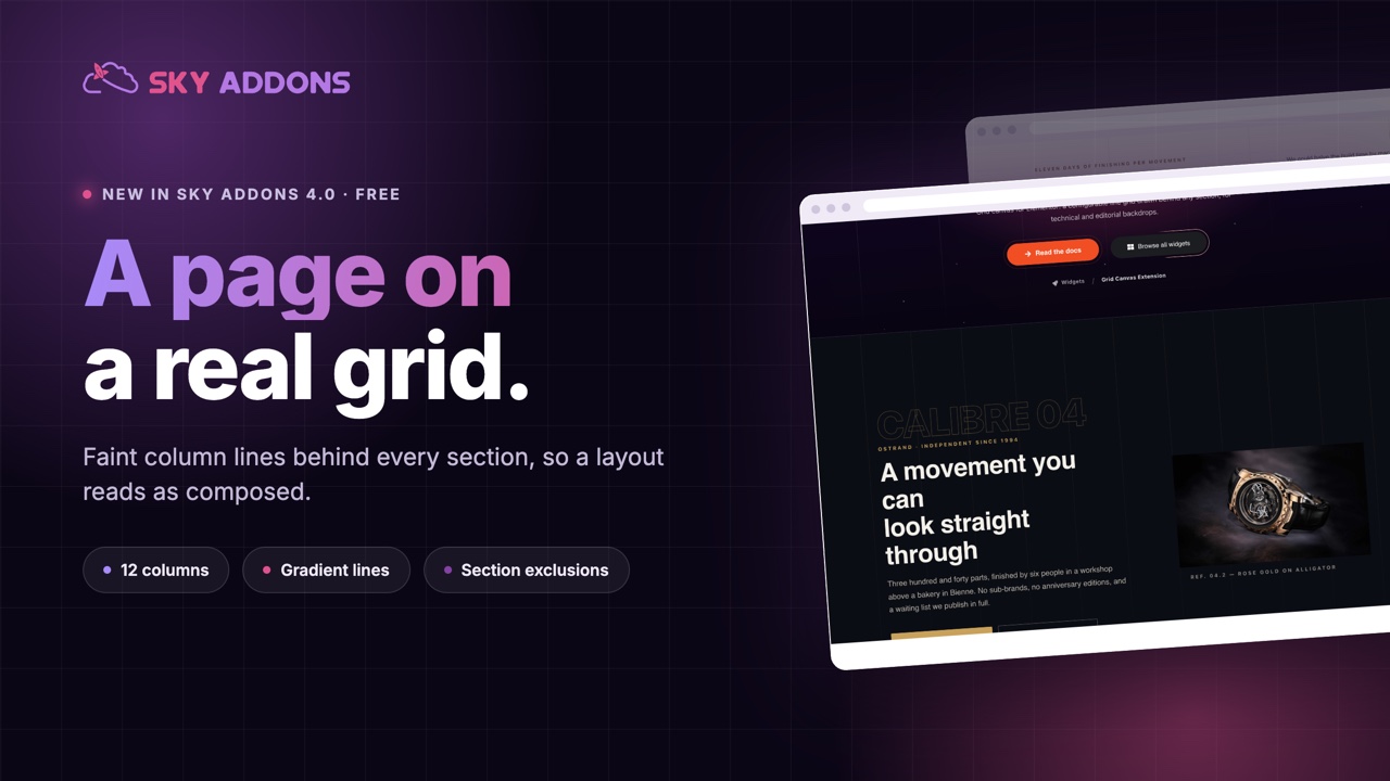
Open any magazine, any annual report, any piece of design that looks expensive, and there is a grid underneath it. Not visible exactly, but present: columns that everything aligns to, which is why the page feels deliberate rather than assembled.
Websites usually lose that. Sections get built one at a time, each with its own padding, and the page ends up looking like a stack of unrelated boxes with no shared structure.
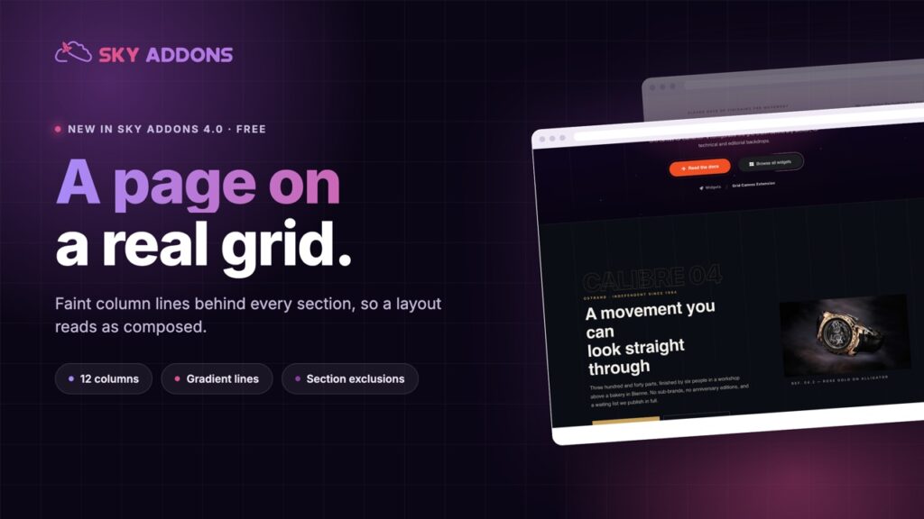
The Elementor grid canvas in Sky Addons 4.0 is free, and it does something unusual: it draws the grid on the page. Faint vertical lines, a tinted column, or a full grid, behind everything, so the structure becomes part of the design.
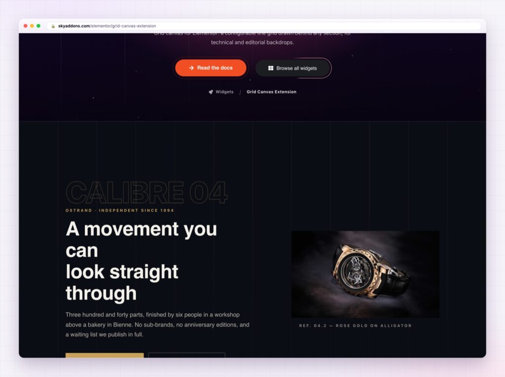
| A normal page | With an Elementor grid canvas |
|---|---|
| Sections float on flat colour | Everything sits on a visible structure |
| Alignment is invisible | Alignment becomes the design |
| Backgrounds need images to feel rich | Lines do it with no page weight |
| Each section its own island | One grid ties the whole page together |
Vertical, horizontal or both. Vertical columns are the editorial look. Horizontal lines suit data and specification pages. Both together gives you graph paper, which works far better on dark backgrounds than light ones.
Columns and rows you set. Twelve columns by default, because that is what most design systems use, and matching your grid to your content is what makes it look intentional.
Gradient lines. Set a start colour and an end colour and the lines blend across the page, which stops a full-width grid feeling mechanical.
Column fill. Tint the space between lines instead of drawing them, for a subtler striped effect behind a section.
Exclusions that matter in practice. Exclude sections or any selector, and set the escape colour to your page background so the grid disappears cleanly behind the elements that need a solid backdrop.
Max width. Keep the grid inside your content width instead of running edge to edge, so it lines up with the layout rather than the window.
A grid you notice is a mistake. A grid you feel is the point. Turn the opacity down until you are not sure it is there, then leave it.
Alignment is the most reliable signal of care in design, and most visitors cannot say why a page feels considered. Drawing the grid makes the alignment visible, so the same layout reads as more deliberate without moving a single element.
It is also nearly free in performance terms. This is a background, not an image, so a page can have the texture of a designed spread without downloading anything extra.
The reason it looks good on dark sections in particular is contrast. A black band with nothing in it reads as empty space; the same band with faint lines reads as a surface.
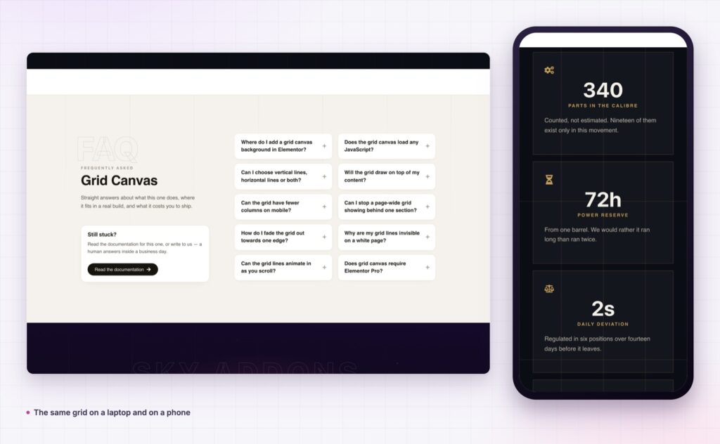
If you want to understand why a twelve column rhythm feels settled, the MDN CSS grid layout guide is the reference the whole idea comes from.
Yes, it ships in Sky Addons 4.0, the free plugin, and works with the free version of Elementor.
No. It is drawn as a background rather than loaded as an image.
Yes. Exclude sections or selectors, and set the escape colour to your page background.
Yes, with a start and an end colour.
That is where it works best, with white lines at low opacity.
The Elementor grid canvas gives a page the structure that print design takes for granted: a real column grid, drawn faintly behind everything, tying separate sections into one composition. It is free, it costs nothing in page weight, and it takes five minutes to set up once for a whole site.
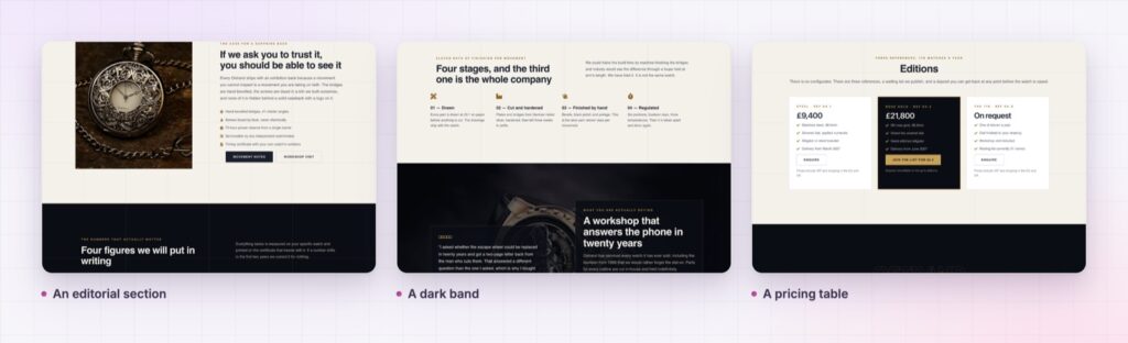
The Grid Canvas demo is a watchmaker’s site rather than a settings page, so you can see the grid doing its job behind a hero, an editorial section and a pricing table. Every setting is in the Grid Canvas documentation.
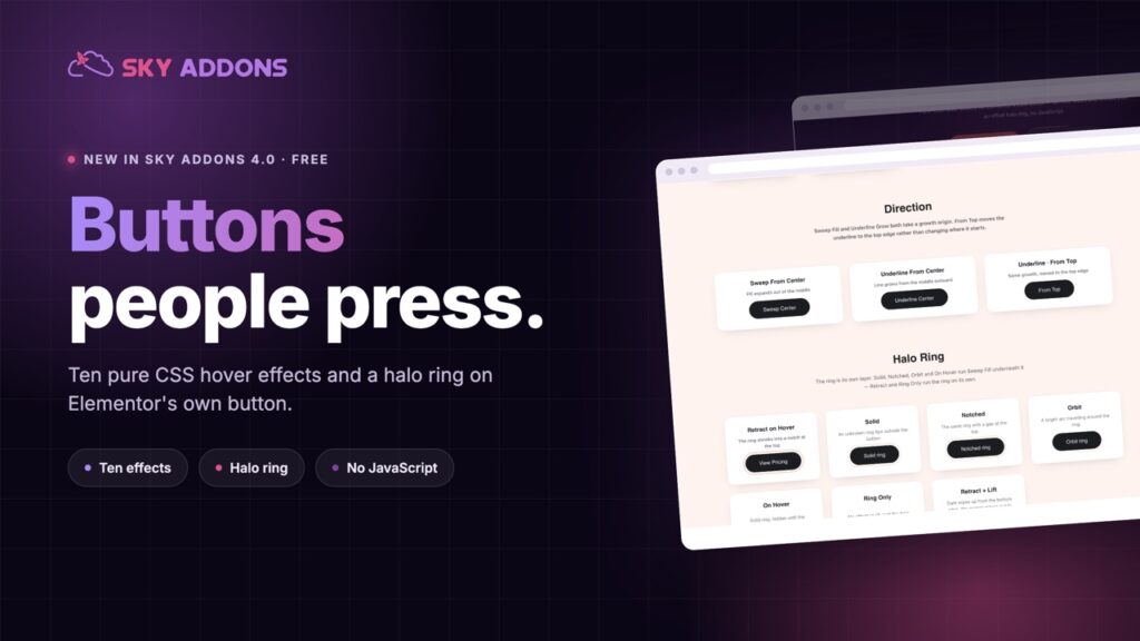
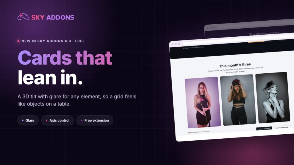
For the other free details that make a page feel designed, see the Elementor tilt effect and Elementor button effects. All three are in Sky Addons 4.0 and Pro 5.0.
Grid Canvas costs nothing. Sky Addons Pro adds the motion, social and store widgets, and the free versus Pro page shows what sits on each side.

Comments are closed.