
Elementor Tilt Effect: Make Cards Feel Like Objects, Not Rectangles
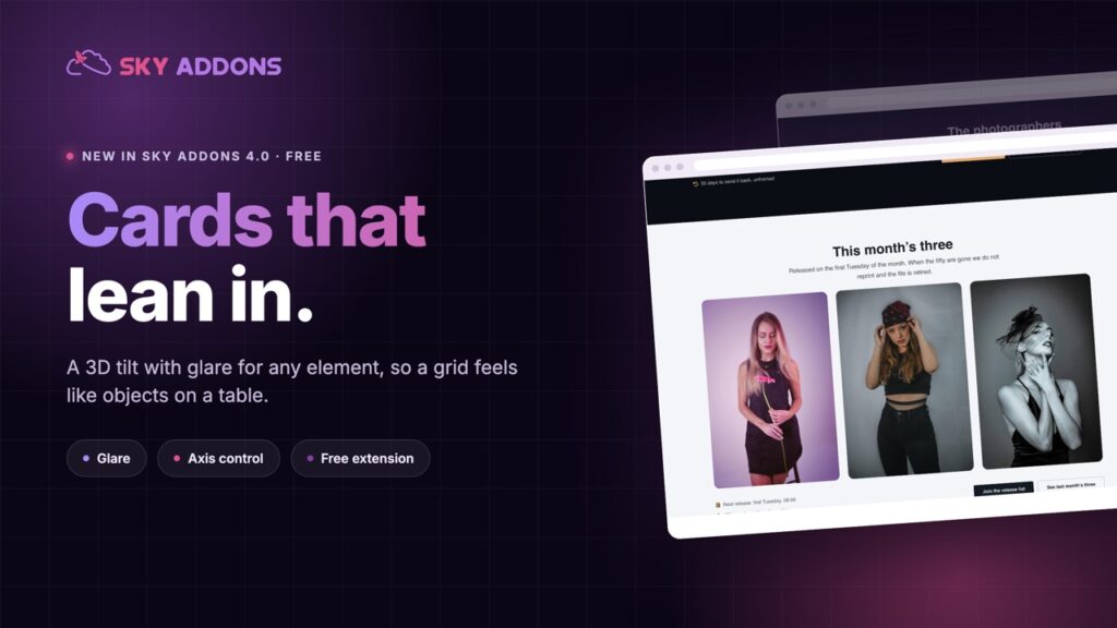
The free Elementor tilt effect adds a 3D hover to any element, with glare, scale and axis control, so product cards and portfolios feel physical.
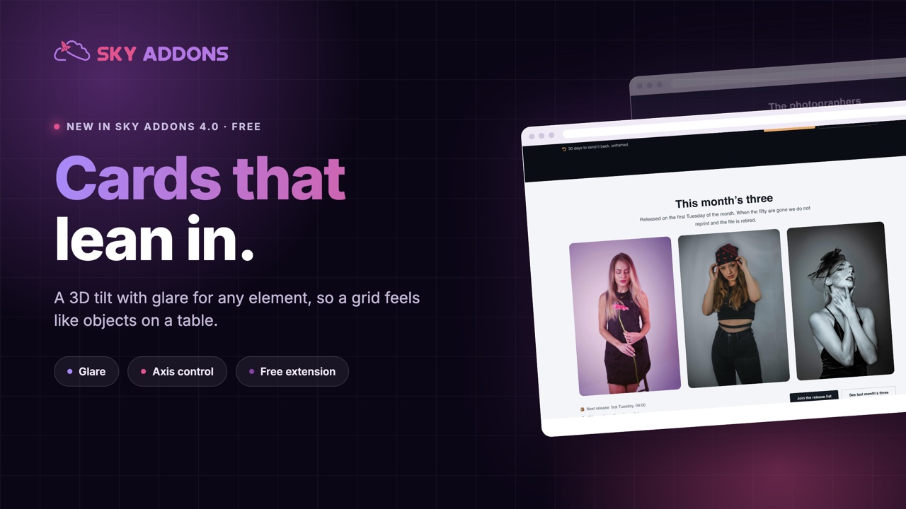
Every hover state on the web is the same three ideas: change the colour, lift the shadow, scale it up slightly. They work, and nobody has felt anything about them since about 2016.
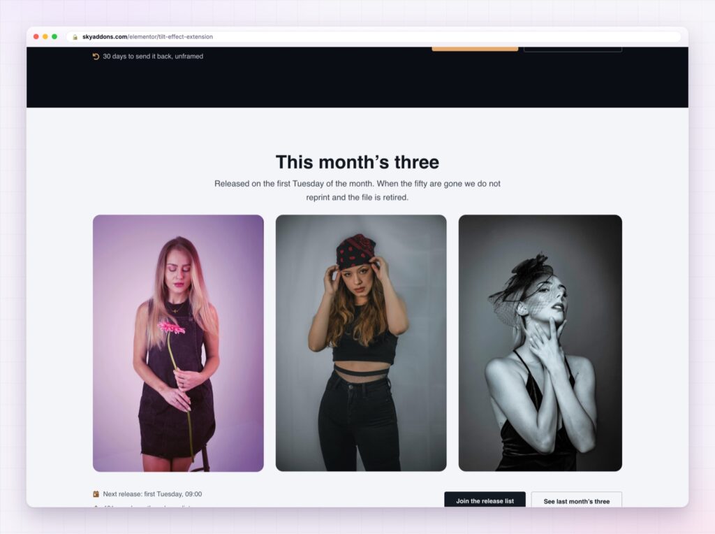
A tilt is different. The card leans toward your pointer, light moves across it, and for a moment the flat thing on the screen behaves like an object on a table. People move the mouse back and forth just to watch it, which is not something anyone has ever done with a shadow.
The Elementor tilt effect in Sky Addons 4.0 is free, and it applies to anything you can put on a page.
| A standard hover | An Elementor tilt effect |
|---|---|
| Colour, shadow, scale | The element responds to where the pointer is |
| Static feedback | Continuous, so it feels physical |
| Seen everywhere | Still uncommon enough to be noticed |
| One state | Angle, depth, glare and speed, all yours |
Max tilt and perspective together. Max tilt sets how far the element leans, perspective sets how dramatic the 3D reads. Lower perspective is stronger, and a small tilt with strong perspective usually looks better than the reverse.
Glare. A light sheen moving across the surface as the element turns. This is what makes a card look like a printed object rather than a div, and it is the setting most people forget to turn on.
Scale while hovered. A little zoom on top of the tilt, or none at all. One is no zoom, and small values are the difference between an effect and a party trick.
Axis control. Both axes, or only the vertical, or only the horizontal. Locking to one axis suits wide cards, because a full tilt on a wide element can read as wobble.
Reverse. Tilt away from the cursor instead of toward it. Rarely right, occasionally perfect, especially for background imagery.
Speed and easing. How quickly the element follows the pointer, from a smooth default to linear. Slow and smooth feels expensive; fast and linear feels like a toy.
The right tilt is the one people barely notice while using it and miss immediately when you remove it.
A tilt gives an element a position in space, and human eyes are extremely good at reading that. It is the same reason a product photograph at a slight angle sells better than a flat one: the object looks like it exists.
It is also one of the few effects that rewards exploration. Somebody moving a pointer across a grid of tilting cards is spending time on your page, and time is the thing every other technique on this site is trying to buy.
Use it on a few things, not everything. A page where every element tilts is a page that feels unstable.
The depth of the tilt is set by perspective, and the MDN perspective reference shows what changing that value actually does to the shape.
Yes. It ships in Sky Addons 4.0, the free plugin, and works with the free version of Elementor.
Any element or container you have already built. There is no special widget to use.
Yes, glare is a setting, and it is what makes the effect read as a physical surface.
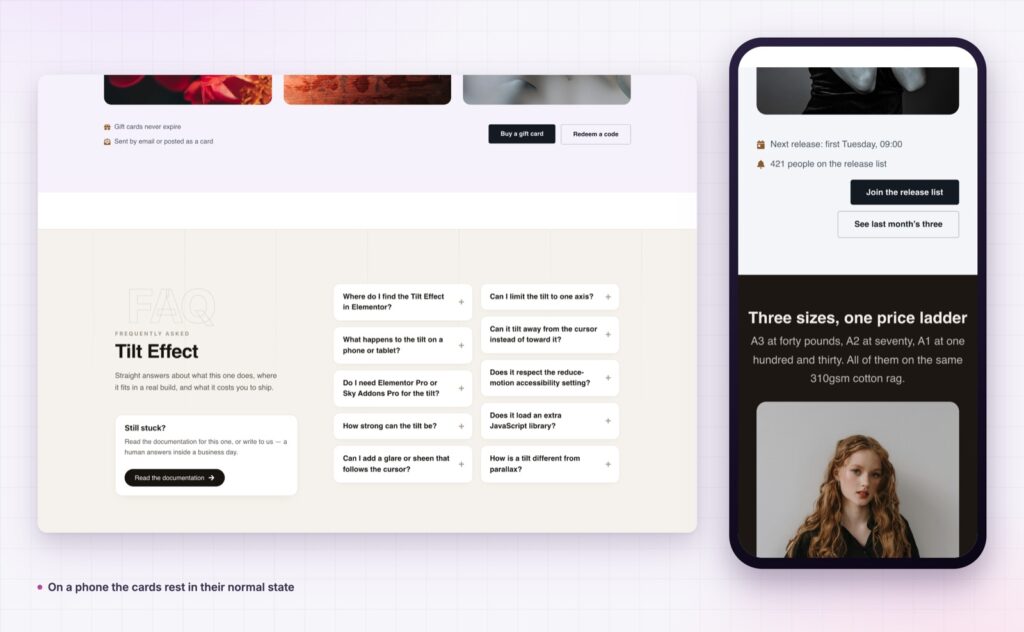
There is no pointer to follow on a phone, so the element rests in its normal state.
It is a transform on hover, which is the cheapest kind of animation a browser does.
The Elementor tilt effect turns flat cards into objects that respond to the pointer, with glare, depth and speed under your control. It is free, it applies to elements you already built, and used on the right two or three things it makes a page feel considerably more expensive than it was.
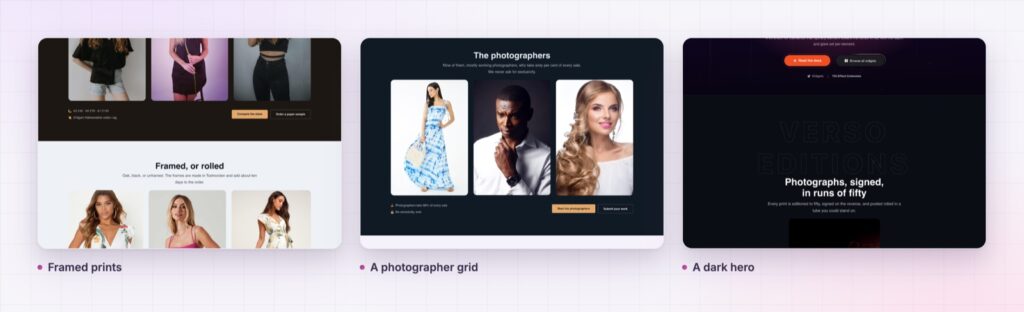
The Tilt Effect demo is a print shop rather than a settings page, with tilting product cards, a photographer grid and a pricing row. Move the pointer slowly across each one. Every setting is in the Tilt Effect documentation.
For the other cheap craft details on a portfolio site, see Elementor cursor effects. Both are part of the release described in Sky Addons 4.0 and Pro 5.0.
Tilt Effect costs nothing. Sky Addons Pro adds the motion, social and store widgets on top, and the free versus Pro page shows where the line sits.

Comments are closed.