
Elementor Pricing Table: Make the Right Plan the Obvious One
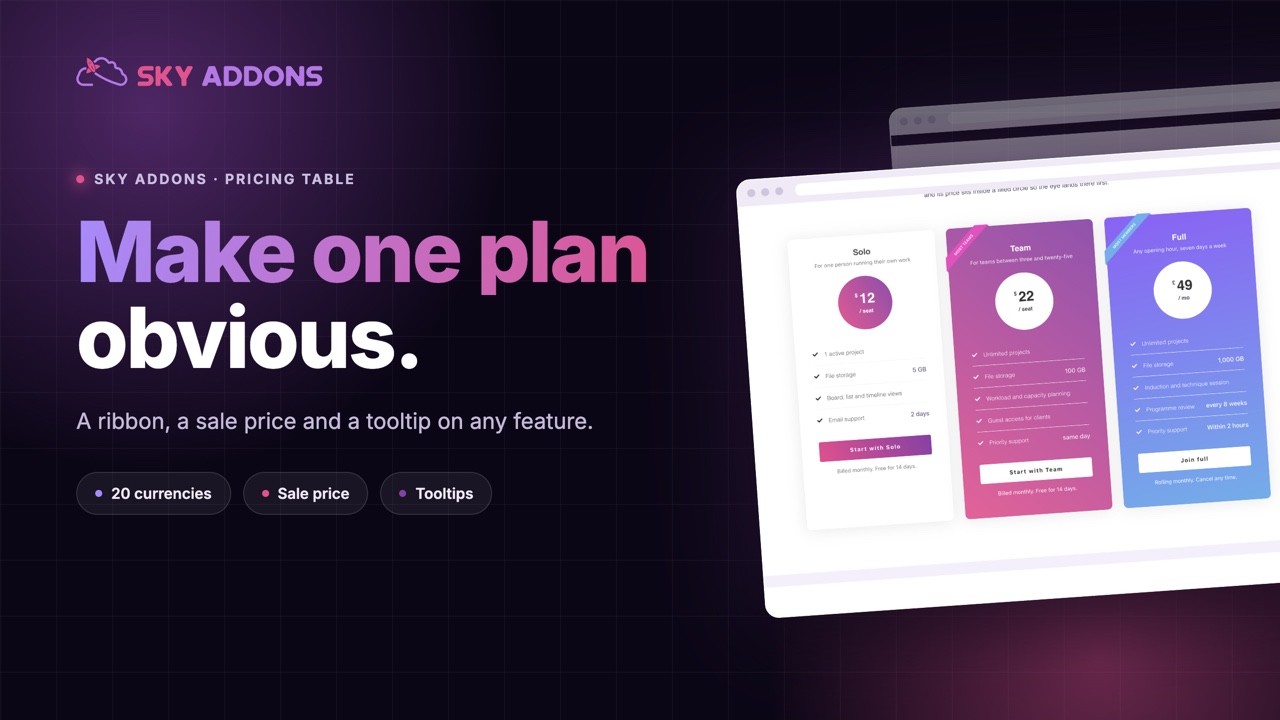
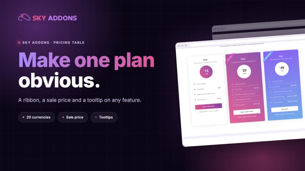
The Elementor pricing table handles sale prices, tooltips on any feature, a ribbon and twenty currencies, with the internal blocks in any order you like.
A pricing page has one job, and it is not listing prices. It is making one plan look like the sensible choice for the person reading. Sites that miss this end up with three identical columns, a wall of ticks, and a visitor who leaves to think about it.
The problem is rarely the pricing itself. It is that every plan is presented with exactly the same weight, so the page gives no help at all.
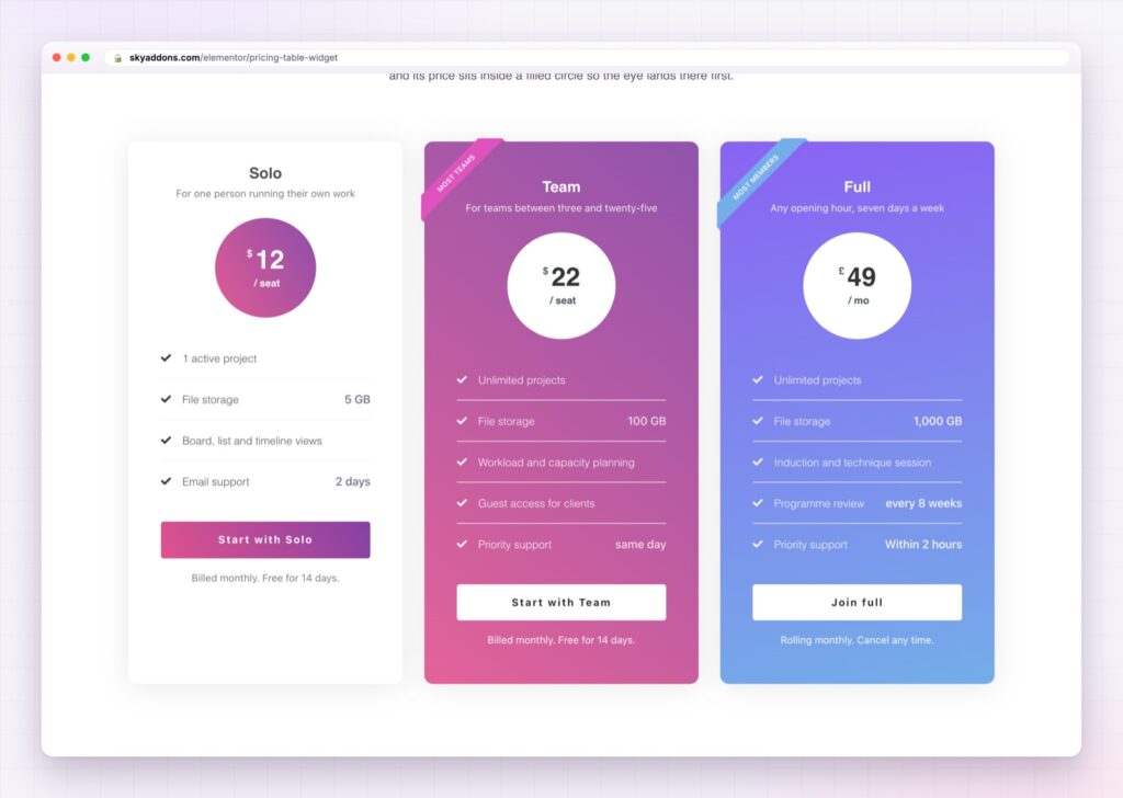
The Elementor pricing table gives you the tools that actually move a decision: a ribbon on the recommended plan, a struck through original price, and an explanation attached to any feature somebody might not understand.
| Three hand built columns | An Elementor pricing table |
|---|---|
| Every plan looks equally important | A ribbon marks the recommended one |
| Sale prices mean editing the layout | Original price and sale price are separate fields |
| Jargon goes unexplained or bloats the list | A tooltip on any feature line |
| Currency typed into the text | Twenty currency symbols, plus your own |
| Block order fixed by the markup | Reorder the internal blocks with a control |
A ribbon that does the recommending. “Popular Plan” on the middle column changes behaviour more than any headline on the page. Set the text, put it on either side, and leave it off the plans you are not steering people towards.
Sale pricing built in. The original price and the current price are separate fields, so a promotion is two edits rather than a rebuild. The struck through number is doing real work: it tells people what the plan is worth as well as what it costs.
Tooltips on any feature. Every feature line can carry its own tooltip with a title and an explanation, placed above, below or to either side, and opened on hover or on click. This is how you keep the feature list short without hiding what the terms mean. “Priority support” means nothing on its own and means a lot with one sentence behind it.
Twenty currency symbols. Dollar, euro, pound, rupee, taka, yen, won, real, shekel and more, plus a custom field for anything not listed, and a choice of decimal format. Small detail, but a price with the wrong separator looks careless in the market where that matters.
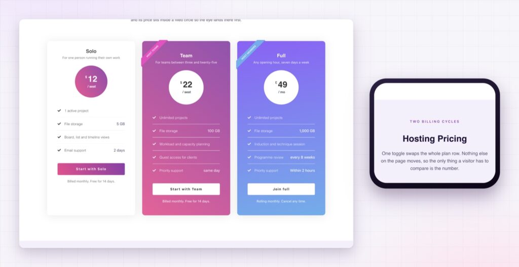
The internal blocks in any order. Icon, header, pricing, features and footer can be reordered, so a plan can lead with its price or lead with its name depending on which one sells it.
Per plan and per feature styling. Feature icons and titles can be coloured individually, the header and footer have their own states, and the whole card has a hover state. That is what lets the recommended plan sit visibly forward without a second widget.
Six features is the limit before people stop reading and start scanning. Put the sixth one behind a tooltip rather than adding a seventh line.
People do not compare plans feature by feature. They look for a signal about which one they are meant to pick, and they take it. A ribbon provides that signal honestly, and it gives the rest of the page permission to be brief.
Tooltips solve the other half of the problem. Feature lists get long because every term needs explaining, and long lists get skipped. Moving the explanation into a tooltip keeps the visible list short while the detail stays one hover away for whoever wants it. The WCAG guidance on content on hover or focus is worth knowing here, because a tooltip that vanishes when the pointer moves towards it is worse than no tooltip.
The sale price is the most direct of the three. A number on its own is a price. A number next to a crossed out larger one is an offer, and an offer has a deadline attached to it in the reader’s head even when you have not written one.
No. The pricing table is part of Sky Addons Pro.
Yes. The original price and the current price are separate fields, so the crossed out number needs no layout work.
Yes. Any feature line can carry a tooltip with its own title and text, on hover or on click.
Twenty symbols are built in, including dollar, euro, pound, rupee, taka, yen and won, plus a custom field for anything else.
Yes. Icon, header, pricing, features and footer can be reordered with a control.
The Elementor pricing table gives a pricing page the things that actually decide a purchase: a ribbon on the plan you recommend, a sale price beside the original, and a tooltip on any feature that needs explaining. Twenty currencies and a reorderable card mean it fits the market and the design, and the whole section is built where you can see the page it belongs to.
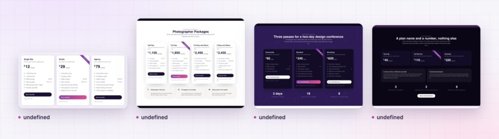
The Pricing Table demo shows the widget in several layouts, including dark cards, sale pricing and a single featured plan. Every control is listed in the Pricing Table documentation.
If the page compares features across plans rather than presenting them as cards, the Elementor comparison table is the better shape, and the Elementor calculator handles pricing that depends on what the visitor picks.
The pricing table is part of Sky Addons Pro. The free versus Pro page shows where the line falls.


Comments are closed.