
Elementor Video Player: Video Pages People Actually Watch
The free Elementor video player keeps video pages fast and watchable: the right source, a poster that loads first, and chapters that find the right minute.
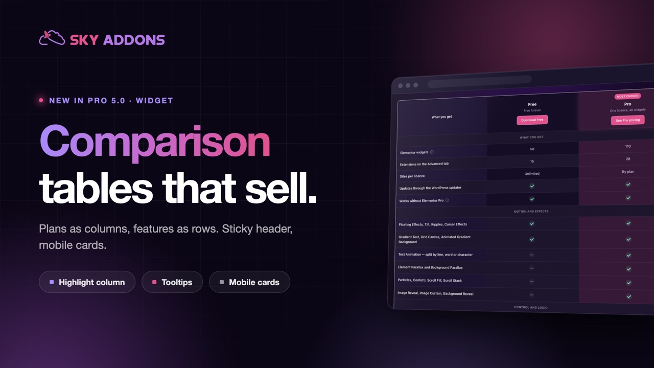
A pricing page has one job: help someone choose, quickly, and feel good about it. Most pricing pages do the opposite. Three columns of ticks, a wall of features nobody reads to the end, and a phone layout that turns the whole thing into a sideways scroll. The visitor cannot tell which plan is meant for them, so they pick the cheapest or they leave.
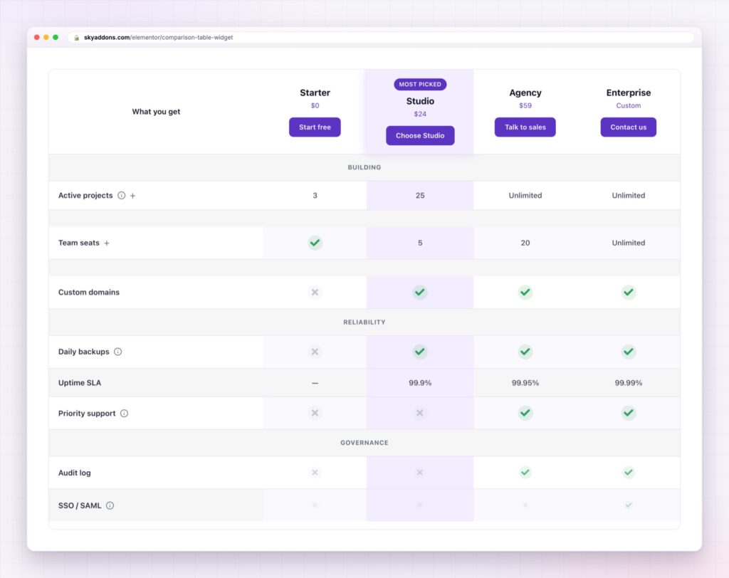
The Elementor comparison table exists to fix that moment. One column is visibly the recommended one, the rows are grouped so the list is scannable, the caveats live in tooltips instead of footnotes, and the whole thing stays readable on a phone.
Anyone can build a pricing grid from containers. It works until the client adds a fourth plan a week before launch.
| Hand-built grid | Elementor comparison table |
|---|---|
| Structure lives in the layout | Structure lives in two simple lists |
| A new plan means editing every row | A new plan is one entry, and the grid rebuilds |
| Highlighting a column is a manual restyle | One switch |
| Mobile is a separate build | Choose scrolling or stacked cards |
| Caveats become footnotes | Caveats become tooltips on the row |
A highlighted column with a badge. The single most effective element on a pricing page. Give the plan you actually want people on a tint, a lift and a “Most chosen” badge, and watch the split move.
Grouped rows. Break twenty features into “What you get”, “Motion and effects” and “Support”. Buyers scan for their own category, and a grouped table reads in seconds rather than minutes.
Tooltips instead of small print. If “Unlimited” comes with fair use, that belongs on the row, not in a footnote nobody scrolls to. Honesty in the right place builds trust rather than costing sales.
Values that can be anything. A tick, a cross, a dash, “3 sites”, “50 GB”, “99.9%”. Ticks work for capability; numbers work for limits; most good tables use both.
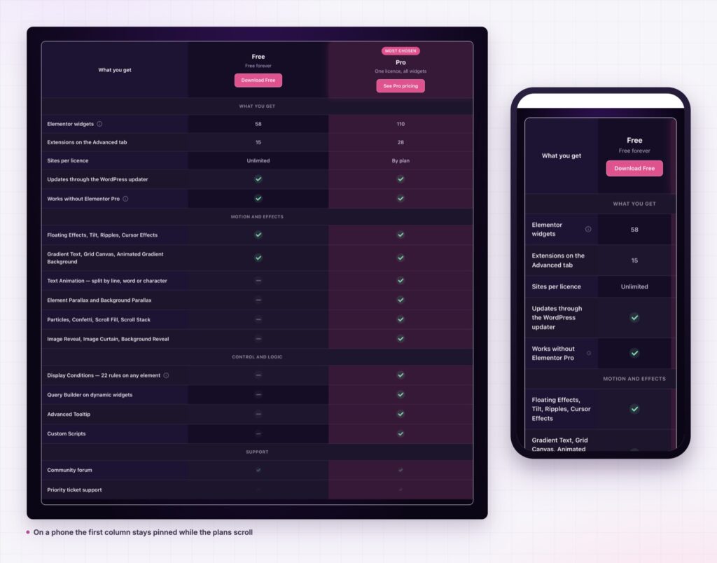
A mobile view you choose. Either the table scrolls sideways with the feature names pinned, or each plan stacks into its own card. Pick per project. Comparing limits favours scrolling; choosing one clear winner favours cards.
Buttons in every column. The decision and the action sit in the same place, so nobody has to scroll back up to buy.
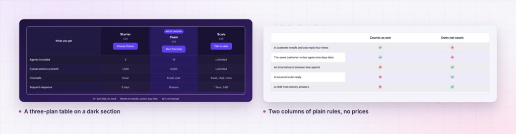
Highlight the plan most customers choose, not the most expensive one. A highlighted top tier nobody buys makes the entire table feel like a sales pitch.
The widget outputs a real HTML table with header cells, which matters more than it sounds. Screen readers use those headers to say which plan and which feature each value belongs to, and the W3C tables tutorial explains why a table built from divs leaves those people guessing. Ticks and crosses carry hidden yes and no text, so the table is not a row of decorative icons to anyone using assistive technology.
Accessible pricing tables also tend to be clearer for everyone. The discipline of naming rows properly is the same discipline that makes a table scannable.
No. Sky Addons runs on the free version of Elementor.
As many as you add. Past four columns, set a minimum column width and let the table scroll rather than squeezing the text.
Yes. Spec sheets, hosting tiers, course levels and “us versus them” pages all fit, because the widget only cares about columns and rows.
It renders a real table with header cells, hidden yes and no text on the marks, and animation that stands down for reduced-motion settings.
Accent colour, backgrounds, dividers, stripes, tints, radius, buttons and typography are all controls, with no custom CSS involved.
A pricing table is not a list of features. It is the moment someone decides, and the layout does most of the persuading. The Elementor comparison table keeps your plans and features as data, makes the recommended plan obvious, puts caveats where they belong, and stays readable on a phone. Add a plan later and the grid rebuilds itself.
The Comparison Table demo has ten tables built for different jobs: SaaS plans, hosting tiers, a product spec sheet, and a few deliberately awkward ones with long feature names. Resize the window on those, because that is where most tables fall over. The Comparison Table documentation covers every control.
For a live example on this site, our own free versus Pro page compares both plans feature by feature. If your pricing depends on quantity, put an Elementor calculator widget under the table so visitors can price their own case, and read Sky Addons 4.0 and Pro 5.0 for everything else in the release.
The comparison table is a Pro widget, covered by any Sky Addons Pro plan.



Comments are closed.