
Animated Heading for Elementor: Eleven Ways to Move One Line
An animated heading for Elementor with eleven styles, from typed and highlight to glitch and word rotate, all driven by one title field. Free widget.
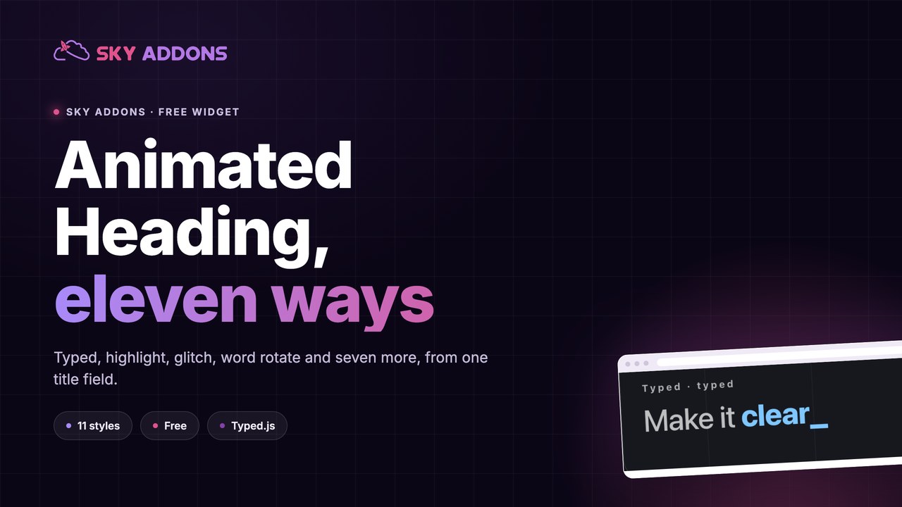
A hero headline has about a second to say what a business does. Most of them waste it by saying everything at once: a long sentence that a visitor reads in full or not at all.
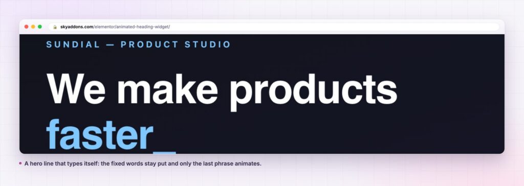
An animated heading splits the line into a part that stays and a part that moves. We make products, then the moving word: faster, clearer, cheaper. The fixed part carries the meaning, the moving part carries the emphasis, and the eye lands where the writer wanted it to.
Eleven styles do that in eleven different registers, from a quiet marker-pen highlight to a full glitch, and all of them come from the same three fields.
| Approach | Attention | Words carried | Build time | Risk |
|---|---|---|---|---|
| Static headline | Depends on the copy | One message | Minutes | Easy to skim past |
| Video hero | High, then ignored | One | Hours, plus hosting | Weight, autoplay rules |
| Slider of headlines | Moderate | Several, slowly | Moderate | Visitors leave before slide two |
| Animated heading | Focused on one phrase | Several, in place | Minutes | Overuse |
The important column is the last. A single animated heading in a hero is a design decision. Four on one page is a distraction, and the widget will happily let you build the second version.
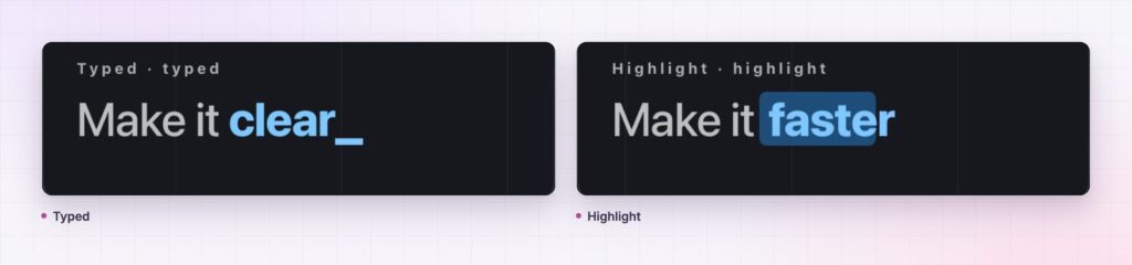
Typed writes the phrase out with a cursor, loops if you want, and takes speed, back speed, start delay, back delay, loop count and the cursor character. It is the most literal style and the most quoted; it suits product and software heroes.
Animated applies an Elementor entrance animation to the phrase, which is the quiet option when the page already moves enough.
Highlight draws a marker behind the phrase. It is the best style on a pale editorial page, because it emphasises without motion sickness.
Glitch breaks the phrase into offset colour channels. It is loud and it belongs to technical and gaming brands, not to a clinic.
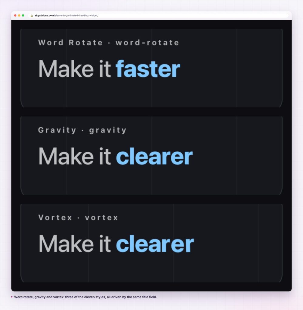
Reveal wipes the phrase in. Word rotate swaps whole words on an interval you set. Split chars and flip chars animate per character, which reads as craft at large sizes and as noise at small ones.
Gravity, vortex and wave in are the three most decorative. They work on a short phrase in a big type size and nowhere else.
Movement is an attention instruction. Used once on a page, it says start here. Used everywhere, it says nothing at all, because the visitor has stopped noticing.
The second reason is that a rotating phrase lets a headline carry more than one message without a slider. A studio that does research, design and delivery can say all three in one line and still have a hero that reads in a second. Everything a slider promised, minus the part where slides two and three are never seen.
One moving phrase in a hero is emphasis. Four moving phrases on a page is a screensaver.
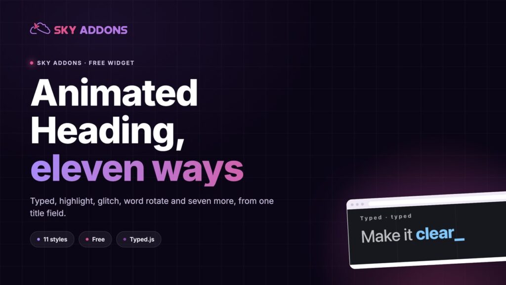
Cursor character sounds trivial and is not. The default vertical bar reads as a terminal. A block or an underscore changes the personality of the whole hero, and it costs one field.
Start delay is the control most people skip. On a hero with an entrance animation, a short delay lets the section settle before the typing starts, which makes the sequence feel directed rather than simultaneous.
Word interval in the rotate styles is the pacing dial. Under a second feels frantic. Three seconds reads as confident, and gives a visitor time to read the word before it changes.
The widget is a heading with three parts, so it is not limited to heroes. A statistics line where the number is the animated part. A pricing line where the plan name rotates. A footer line that names the cities a business serves. A testimonial section header that cycles through the industries the quotes come from.
It also makes a decent section divider. A large highlighted phrase, set as an h2, with plenty of space above and below, marks a shift in a long page more clearly than a rule and takes less design attention than a full band.

The widget’s eleven styles make it easy to build a page that moves everywhere. The discipline is deciding where motion earns its place.
A useful rule: one animated heading above the fold, and at most one more further down, on a long page where a second section genuinely opens a new idea. Beyond that, motion stops being emphasis and becomes texture, and texture is ignored.
The second decision is which words move. The animated phrase should be the one a visitor would underline if they were reading with a pen: the differentiator, the audience, the outcome. Everything else belongs in the prefix and suffix, where it stays still and stays readable. A headline where the verb moves and the noun stays still usually has it backwards.
Timing does more than style choice. In the typed style, a speed around 60 milliseconds with a back delay of roughly two seconds reads as confident; much faster feels nervous, much slower feels like the page has stalled. In the rotate styles, a word interval under a second changes the word before it has been read, which defeats the purpose.
Then there is the question of what the heading looks like before the script runs. The fixed parts render immediately, so write the prefix and suffix as a sentence that makes sense on its own. A hero that reads We make products, with the moving word missing for a fraction of a second, is fine. A hero that reads We make, is not.
Finally, keep one style per role across the whole site. Typed in heroes and highlight in section openers is a system. Eleven styles across eleven pages is a demo.
Yes. It ships in the free Sky Addons plugin with more than fifty other widgets. The free versus Pro page shows what Pro adds.
Eleven: animated, typed, highlight, glitch, reveal, word rotate, split chars, gravity, flip chars, vortex and wave in.
No. The heading is real text in the page with the tag you choose. Set it to h1 in a hero and h2 elsewhere, as you would any other heading.
Yes. Typed exposes speed, back speed, start delay, back delay, loop, loop count, cursor visibility and the cursor character.
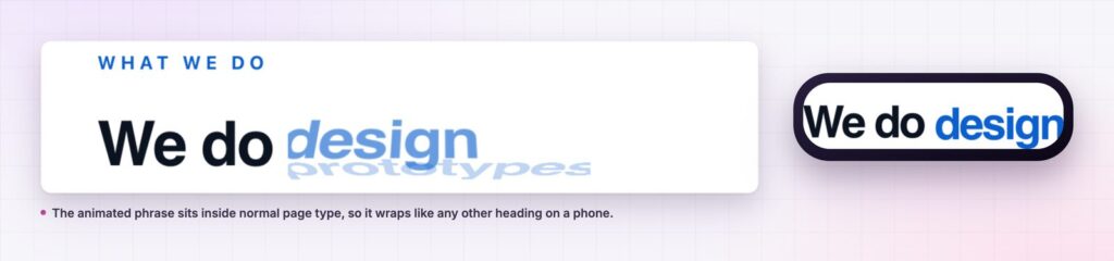
Yes. The heading wraps like any other, and typography is responsive, so set a smaller size at the phone breakpoint and keep the phrase short.
An animated heading splits a headline into fixed words and one moving phrase, so a hero can carry several messages and still read in a second. Eleven styles cover everything from a quiet highlight to a full glitch, with typing speed, delays, loop count and per-part typography exposed. Use one per page, keep the moving phrase to two words, and let the fixed words carry the meaning.
Try the animated heading demo, read the Animated Heading documentation, or see the pricing page. For longer moving copy there is the text animation widget, and for a hero built around slides, the advanced slider.

Comments are closed.