
Elementor Sticky Element: Keep the Buy Button on Screen All the Way Down
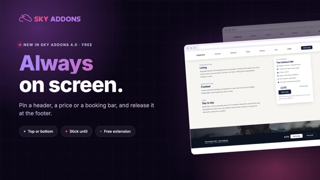
Pin any section with the free Elementor sticky element: stick to top or bottom, stop at a chosen element, hide on scroll down, and disable it on phones.
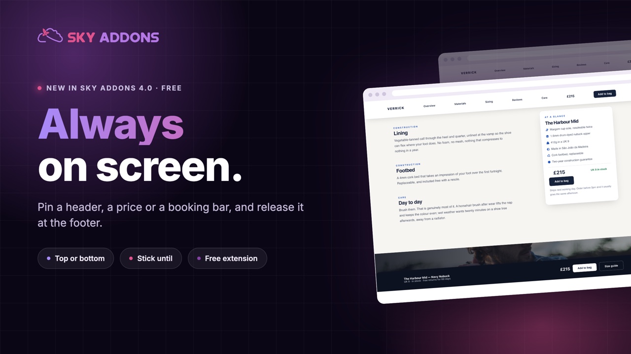
Long pages have a quiet leak. Somebody reads to the bottom, decides they are interested, and then has to scroll all the way back up to find the button. Most of them do not bother.
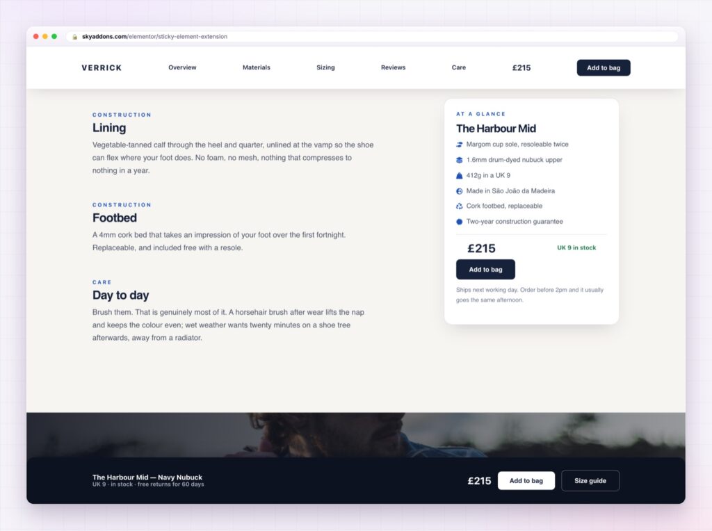
The fix is not a longer page or a second button halfway down. It is keeping the thing that matters on screen while everything else moves: a header, a price, a booking bar, a table of contents.
The Elementor sticky element in Sky Addons 4.0 is free, it works on any section or widget you have already built, and it does not require Elementor Pro.
| Repeating a button down the page | An Elementor sticky element |
|---|---|
| Clutters the layout | One element, always available |
| Easy to miss between sections | Never leaves the screen |
| Each copy needs maintaining | One place to edit |
| Nothing on phones, usually | Bottom bar, which is where thumbs are |
Top or bottom, with an offset. Headers stick to the top, calls to action work better at the bottom, especially on phones. The offset is the gap from the edge while stuck, which is how you clear an existing sticky header.
Stick until a specific element. Give it the ID of your footer or the next section and the element releases there instead of following the visitor forever. This is the setting that separates a helpful sticky bar from an irritating one.
Show on scroll up. Hide the element while people scroll down and slide it back when they scroll up. It is the pattern used by most mobile apps, because it returns the screen to the content while still keeping the control one gesture away.
An entrance animation. Slide or fade each time it becomes stuck, so the change is understood rather than noticed as a jump.
Z-index control. Raise the stacking order when the sticky element slips behind something else, without writing CSS.
Off on tablet or mobile. Sticky elements are useful on phones, but not all of them are. Disable per breakpoint rather than accepting a bar that eats a quarter of a small screen.
A sticky element that never releases becomes furniture people resent. Always set the point where it stops.
Decisions happen at unpredictable moments. Someone might be convinced by the second paragraph or the last testimonial, and a page that only offers the action in one place is betting on a single moment. Keeping the control visible means the page can be acted on whenever the reader is ready.
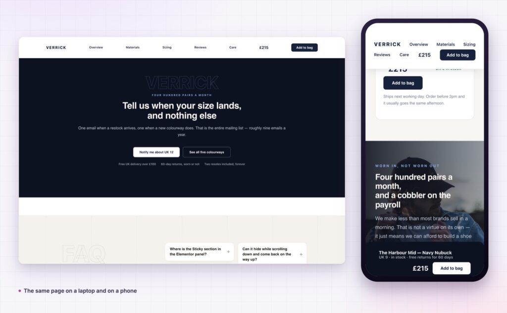
On phones the effect is larger, because scrolling back up a long page is genuinely tedious. A bottom bar with a price and a button is the single most reliable conversion change on a mobile product page.
Note that the effect runs on the front end only, so it stays out of the way while you are editing. If you use Elementor Pro’s own sticky, do not apply both to the same element.
When something refuses to stick, the cause is nearly always a parent with its own overflow rule, which the MDN reference on CSS position explains.
No. This is free in Sky Addons 4.0 and works with the free version of Elementor.
Yes. Enter the ID of the element where it should unstick.
Yes, with show on scroll up, which is the pattern most apps use.
Yes, and you can disable it per breakpoint if it takes too much room.
It runs on the front end only, so you can keep editing normally. Preview the page.
The Elementor sticky element keeps the one thing that matters visible while the rest of the page scrolls: a header, a price, a booking bar or a contents list. It is free, it applies to sections you already built, and setting the release point takes it from a nuisance to a conversion tool.
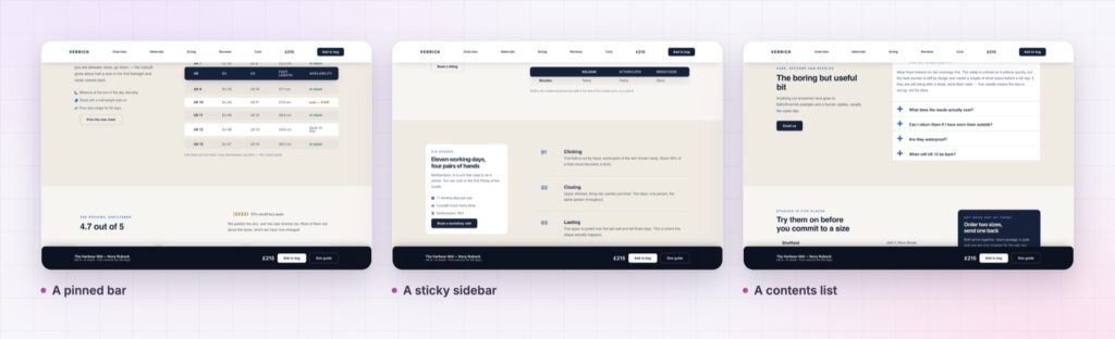
The Sticky demo shows a sticky header, a bottom action bar, a pinned sidebar and a contents list on one page, so you can compare behaviours rather than settings. Everything is documented on the Sticky page.
If the page needs the action to open something rather than link away, pair it with the Elementor modal popup. Both are part of the release described in Sky Addons 4.0 and Pro 5.0.
Sticky costs nothing. Sky Addons Pro adds the motion, social and store widgets, and the free versus Pro page shows where the line falls.

Comments are closed.