
Team Member for Elementor: A People Page That Does Not Need a Plugin
Build a team member card in Elementor with a photo, role, short bio, social links and a button, in six styles that all share the same controls.
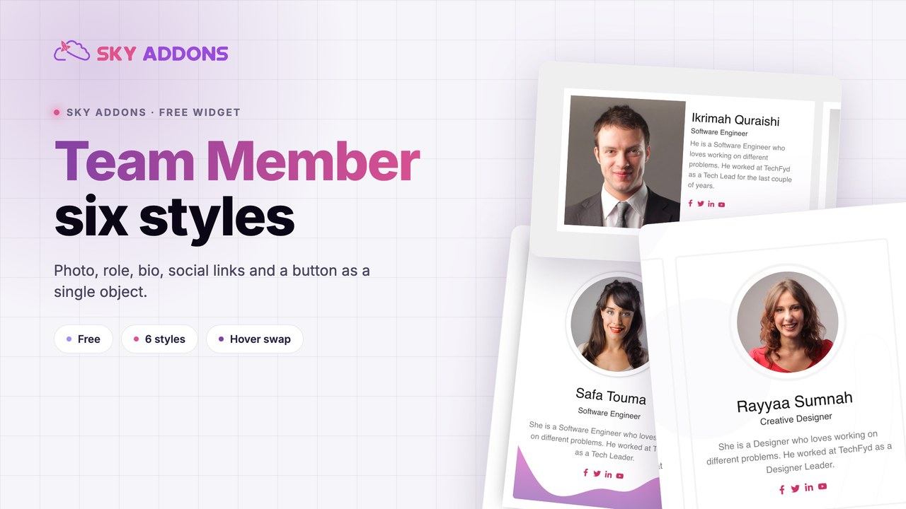
The people page is usually the last one built and the first one people visit before they get in touch. It is also the page most likely to be assembled out of image widgets, headings and icon lists, which means every card drifts slightly from the others.
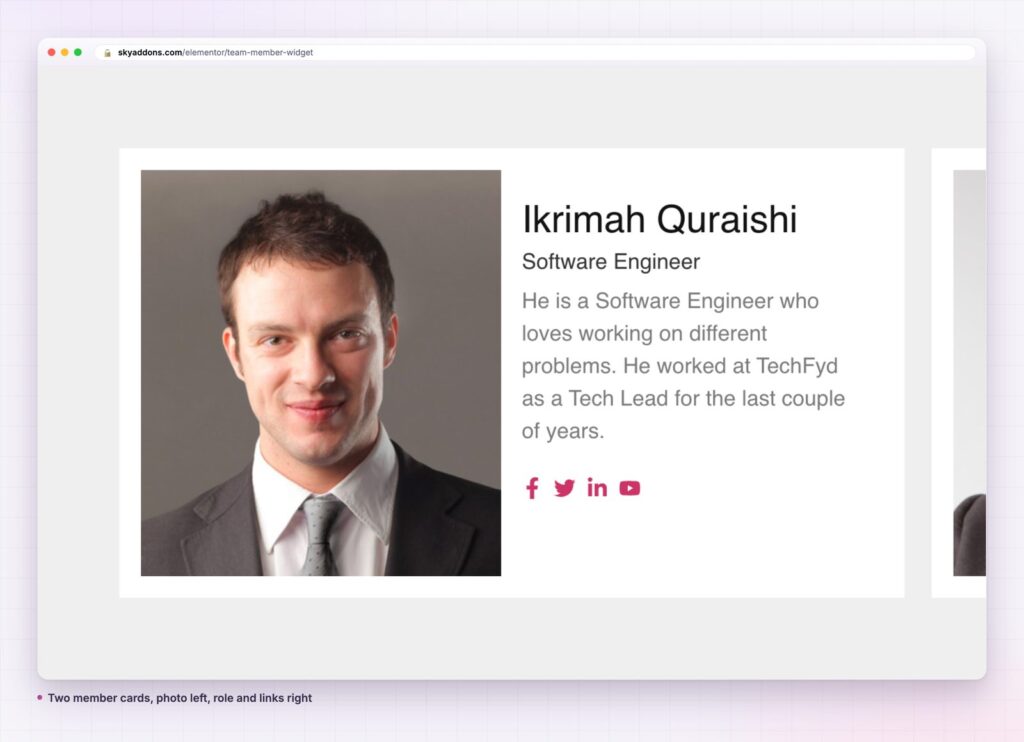
A team member widget makes the card one object. Photo, name, role, a short line of text, social links and a button, with the styling set once and repeated exactly.
| Approach | What it costs you |
|---|---|
| Image, heading and text widgets | Four widgets per person, and every card drifts as the page grows |
| A dedicated team plugin | Another plugin, another post type, another styling layer |
| Theme team shortcode | Styling lives in the theme and rarely matches the page |
| Sky Addons team member | One widget per person, eight styles, one set of controls |
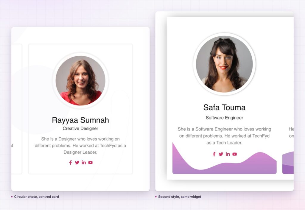
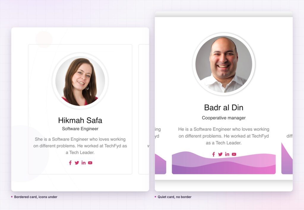
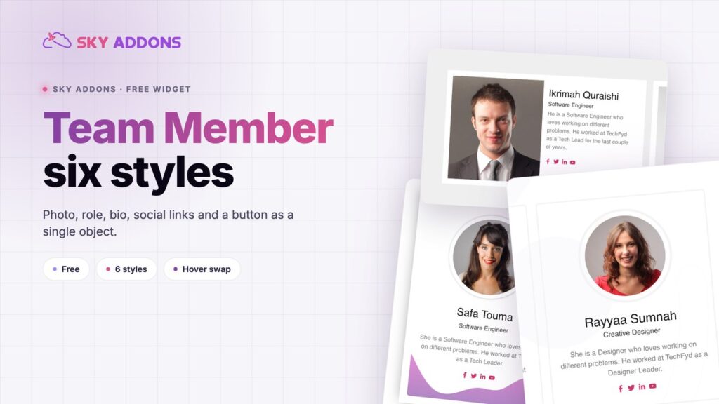
Six styles share one control set. Select Style offers Default, Ardent, Folk, Folker, Slide and Mold, which change the arrangement without changing the fields you fill in.
The second image is for the hover. Alternative Image swaps on hover, which is how a formal headshot can become a working photograph without any custom code.
Social links are a repeater. Each entry takes a title, a link and an icon, and the icon colours can be set globally or customised per entry through the Customize switch.
The button is positioned. Button Position, Button Text, Full Width, alignment, icon and icon spacing are separate controls, so the call to action can be a quiet link or a real button.
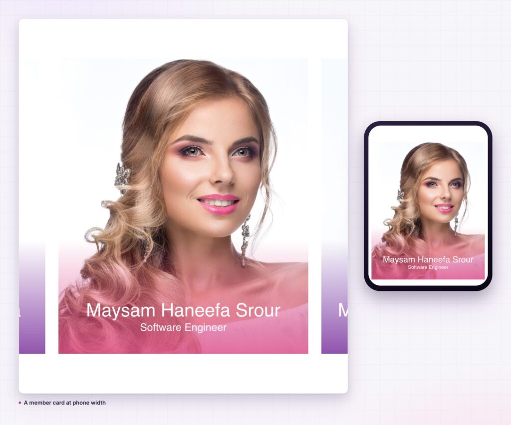
The overlay has its own padding. Overlay Content Padding and Overlay Color exist separately from the card padding, which matters for the styles where the text sits on the photograph.
People buy from people, and a people page is where a visitor checks whether the company is real. Consistent cards read as an organisation; inconsistent ones read as a collection of individuals who happen to share a website.
Consistent cards read as an organisation. Inconsistent ones read as individuals who happen to share a website.
The consistency is the point. Same crop, same role format, same length of bio line. The widget makes that easy to hold because every card is the same object with different content.
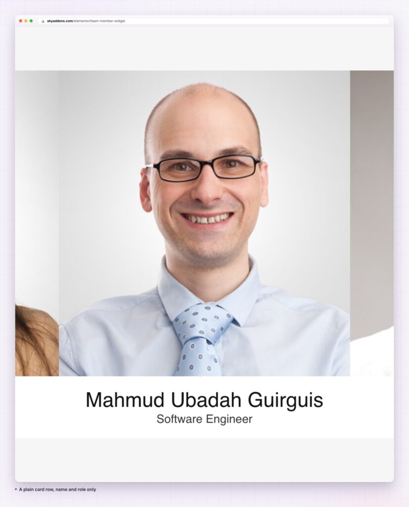
A team page lives or dies on the photographs, and most teams have a mixture: three professional headshots, two phone pictures and one crop from a wedding.
Two rules get a long way. Shoot or source everything against the same background, and crop everything to the same ratio with the eyes on roughly the same line. That alone makes a mixed set look intentional.
Where a proper shoot is not possible, go the other way deliberately. Use the same illustration style, or the same monochrome treatment, for every card. A consistent compromise reads better than a mixture of quality.
The hover swap is worth using when you have two usable images per person. Formal to candid is the common pairing, and it gives the page a small moment of life without any motion library.
The role should be the one people search for, not the internal job title. “Lead engineer” is useful; “Engineering IC4” is not. If the organisation uses internal grades, translate them.
The bio line is one sentence and should say something only that person could say. “Responsible for delivery” is filler. “Runs the migrations, and the only person here who enjoys them” is a sentence a visitor remembers.
Keep every bio to the same length, ideally within five words of each other. Uneven bio lines are the second most common reason a team grid looks ragged, after uneven photographs.
Order is a message whether or not anyone intends it. Alphabetical looks neutral and reads as a directory. Seniority first reads as a hierarchy, which suits firms where clients are buying the partner. Function grouped, with engineering together and design together, reads as an organisation and suits larger teams.
The one order to avoid is whatever happened to be convenient, because visitors assume the first face is the person in charge. If the founder is fourth because that is the order the photographs arrived in, the page is saying something nobody meant.
For teams above about twelve people, group them under headings rather than running one long grid. A visitor looking for their account manager does not want to scan forty faces, and a heading per function turns the page into something navigable.
A team page goes stale faster than any other page on a marketing site, and a stale one does real damage: a visitor who emails someone who left two years ago learns something about the company.
Because each card is a widget rather than a post, updating means editing the page. That is fine for a team of eight and tedious for a team of forty, which is the honest limit of this approach. Above that, a queried grid over a team post type is less work to maintain, even though each card is less precisely styled.
Whichever way the page is built, put a review date on it. Twice a year is enough for most companies, and it takes ten minutes if the photographs are already cropped to one ratio.
The card is really a person shaped container, so it suits anything with a face and a role: speakers, authors, instructors, practitioners, board members. It also works for testimonials where the person matters more than the quote, with the bio line carrying the comment.
For a row of small faces used as social proof rather than a directory, the image stack is the lighter tool. For a moving set of people rather than a static grid, the team member carousel covers the same content.
Yes. It ships in the free Sky Addons plugin. The free versus Pro page lists everything else.
No. It does not create a post type or store people separately, so there is nothing else to install or maintain.
The widget loads no JavaScript of its own. The photographs are the cost, so export them at the card size rather than uploading full resolution files.
Yes. Cards stack, and the social icons and button keep their touch targets. Check role titles at 390px.
Not with this widget, which is a card per person built in the editor. For a queried team, a post grid widget pointed at a team post type is the better fit.
A team member card earns its place by being one object rather than four widgets, in any of the six styles. Crop the photographs to one ratio, write the roles the way a visitor would search for them, keep every bio line the same length, and set the styling once so the tenth card matches the first.
See the styles on the team member demo, read the team member documentation, and compare plans on the pricing page. MDN on responsive images covers exporting photographs at the right size, and the W3C guidance on images of text is worth reading before putting names on photographs.

Comments are closed.