
Elementor Review Widget: Star Ratings That Build Trust
The Elementor review widget shows a name, role, star rating and review text on a card you can style. Rate out of 5 or 10. Free in Sky Addons.
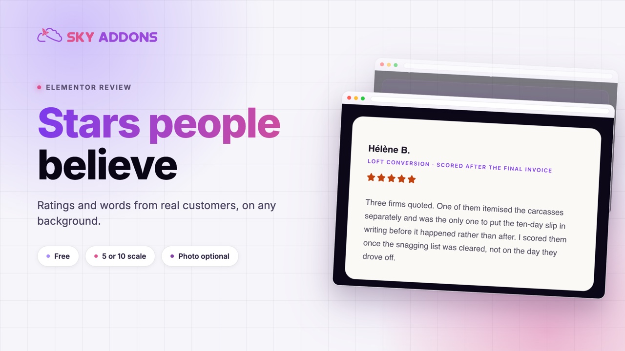
Before someone buys, books or signs up, they look for proof that another person did it and was happy. A star rating, a name and two honest sentences do more for a decision than a paragraph of your own praise. The problem is presentation. A quote in a plain text box looks like decoration. A screenshot of a review cannot be edited, is hard to read on a phone and will not match your brand.
A review widget solves this by giving each review a proper structure: the reviewer’s name, what they bought or did, a star rating and their words, on a card you can style. Sky Addons includes a free Review widget for Elementor that does exactly this. This article covers where reviews earn their place on a page, how the widget works, and how to present them so they build trust and do not look staged.
Put a review close to the decision it supports.
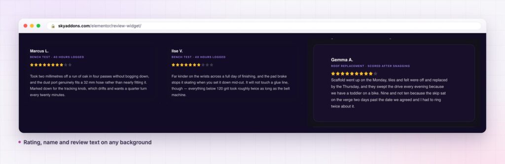
You can show a review with a quote block, a screenshot or a dedicated plugin. Each has a cost.
| Plain quote or text box | Screenshot of a review | Sky Addons Review widget | |
|---|---|---|---|
| Star rating | Typed characters | Baked into the image | Built in, 0 to 5 or 0 to 10 |
| Editable text | Yes | No | Yes |
| Matches your brand | Depends on the theme | No | Colours, type and spacing per part |
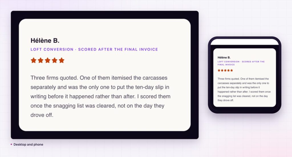
| Readable on mobile | Yes | Often too small | Yes, responsive |
| Rating markup | None | None | schema.org Rating microdata |
| Photo, name and role | Manual layout | In the image | Photo, name and designation fields |
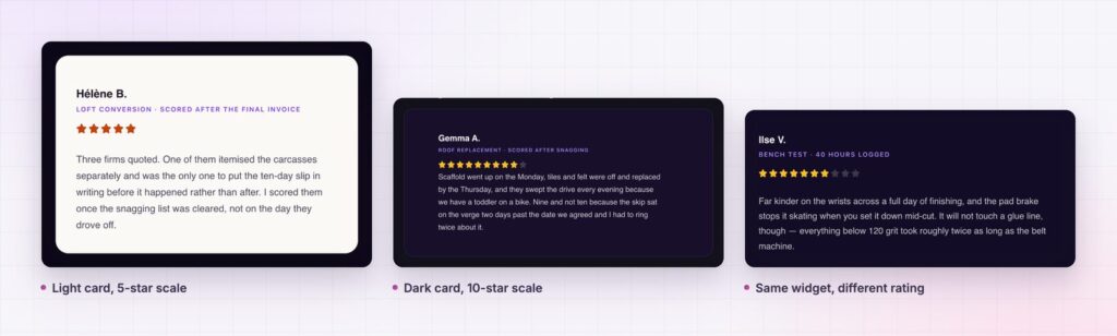
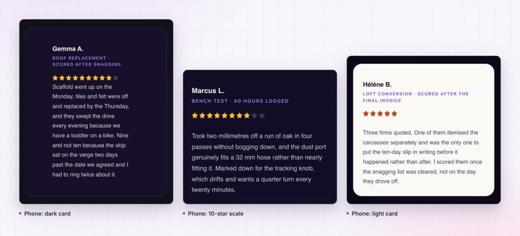
A rating that scales. Choose a 0 to 5 scale for the familiar five stars or 0 to 10 for a finer score. Set the rating value, then decide whether the stars are Font Awesome icons or Unicode characters, and whether unmarked stars are shown solid or as outlines.
Structure that reads like a review. Each card has a name, a designation line and the review text. Use the designation for context that makes the review believable: the job that was done, the plan used, the number of months. The name and the designation each have their own HTML tag, which helps keep your heading outline clean.
The rating above or below the text. The Review Position setting places the stars before or after the words. Above the text works for a quick score. Below reads like a sign-off.
An optional photo. Add a picture and choose its position, size, radius and offset. You can also leave it out, which is often the right choice for a short, text-led card. Only use a photo when you have the reviewer’s permission.
Full styling for every part. The name, designation and text each have colour and hover colour. The rating has its own size, spacing, marked and unmarked colours, padding and radius. The card has padding and you set a background in Elementor as you would for any container.
Screen reader friendly rating. The rating value is also written as text for screen readers, marked up as a schema.org Rating. Whether a search engine shows stars in results depends on that engine’s own rules, which Google documents in its review snippet guidelines.
A review is only persuasive when it looks like a real person’s words. That means specifics, a believable name and a rating that fits the text. The widget gives you the frame for that: a designation line for context, a rating that matches the score and an optional photo. It does not add the specifics. Those must come from the customer.
The structure helps readers judge in a second. They see the score, the name and the first sentence, and decide whether to read more. Compare that to a paragraph of unbroken text, where the score and the source are hard to find.
Consistency matters too. When three reviews share the same layout, the eye compares them without effort. A mismatched set, with different fonts and star styles, looks copied from three sites.
Most visitors read five stars at a glance, so the 0 to 5 scale is the safe default for shops, services and courses. Use the 0 to 10 scale when the score itself carries information: a product test, a course rating out of ten, a technical review where half a point matters. Whichever you choose, keep it the same across every review on the page. A row that mixes a 5 point card and a 10 point card makes the reader do arithmetic, and they will not.
The unmarked stars matter as much as the marked ones. Setting a visible but muted colour for the empty stars shows the reader how much of the scale is left, which makes a 4 out of 5 look earned instead of round. Keep the marked colour warm, keep the unmarked colour quiet and check both against the card background.
A review widget only persuades when the words look like a real person's: specific, named and honestly scored.

The widget is a review card, but it also works for a short case study score, a comparison between two products, or a rating of a place or a course. Set the rating scale to 10 and use it for a score out of ten on a product test. Move the rating before the text and it reads like a headline score. Hide the designation and it becomes a compact quote.
Because it is one widget, it slots into a grid as easily as a single row. Place three across for a homepage strip, or one full-width card for a testimonial section.
For a slider of many reviews, Sky Addons also has a Review Carousel, and the Fancy Testimonial widget presents customer words in a more editorial style.
Yes. Review is part of the free Sky Addons plugin. Free vs Pro shows what the Pro plugin adds.
No. The widget displays reviews that you enter. It does not collect them and it does not pull them from Google or another site. It is a presentation tool.
No. It works with Elementor and Sky Addons alone.
No. It is plain markup with a stylesheet and loads no scripts. A photo is the only heavy part, so use a small, compressed image.
Yes. It is responsive, and the photo size, spacing and alignment can be set per breakpoint.
A review widget turns a quote into proof: a name, a score and the words, in a layout that matches your brand. It is free, it supports 5 or 10 point ratings and it works on any device. Use real reviews, place them next to the decision and let the structure do the rest.
Next steps: see the live demo, read the Review documentation, compare plans and pricing, or read how a card widget builds the grid around it. For a review that pairs with a price, see the pricing table.



Comments are closed.