
Momentum Slider for Elementor: A Slider That Reads Like an Editorial Spread
A momentum slider splits each slide into a text column and an image that move at different speeds, with numbering, parallax and Swiper controls built in.

Most sliders put text on top of a photograph and hope the contrast holds. It rarely does. The headline fights the image, someone adds a dark overlay, and the photograph that justified the slider in the first place is now half hidden.
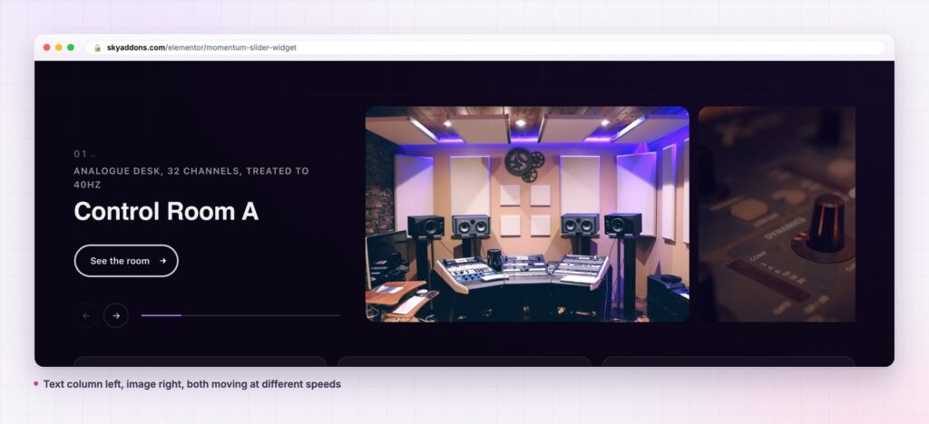
A momentum slider splits the slide instead. Text gets its own column, the image gets the rest, and the two move at different speeds as the slide changes. Nothing sits on top of anything, so both can be read.
| Approach | What it costs you |
|---|---|
| Hero slider with overlaid text | Contrast problems on every image, solved by darkening the photograph |
| Two column section, no slider | Only one item fits, so the rest of the story needs another section |
| Generic carousel | Cards of equal weight, no room for a headline that has to land |
| Sky Addons momentum slider | Separate text and image columns, independent motion, one widget |

Text and image are separate columns. Text Column Width and Column Gap set the split, and Direction decides which side the text sits on. Both columns get their own alignment controls.
The image moves against the text. Image Parallax offsets the photograph from the copy as the slide changes, which is where the sense of momentum comes from. Switch it off and the slide is a clean split layout.
Slides can be numbered. Show Number adds an index, with Number Format and Number Style controlling how it reads. A numbered sequence turns a slider into a list with a direction.
It runs on Swiper. Autoplay and Autoplay Speed, Loop, Slide Speed, Pause On Hover, Drag To Slide, Grab Cursor, Keyboard Control, Mousewheel Control and Observer are all exposed as controls, so the behaviour is set in the panel rather than in code.
Content comes from a repeater or a query. Content Type switches between slides you write by hand and slides built from posts, with Title Character Limit keeping long titles from breaking the column.

A slider that reads as a spread gives the eye somewhere to rest. The text column holds the argument and the image holds the mood, and because they move at different rates the section feels alive without demanding attention.
Copy that sits over a photograph is always written short and styled loud. Copy in its own column can be a real sentence.
It also solves a practical problem. Copy that has to sit over a photograph is always written short and styled loud. Copy in its own column can be a real sentence, and that is usually the sentence that sells the room, the property or the act.
Autoplay is the control people get wrong. On a page where the slider is the main event, autoplay with a slow speed is reasonable. On a page where it is one section of eight, autoplay competes with everything else and should usually be off.
If you do use it, set Pause On Hover. A reader who has stopped to read has told you they want it still, and a slide that moves under their eyes is the fastest way to lose them.
Slide Speed and Autoplay Speed are different numbers and both matter. Slide Speed is how long the transition takes, Autoplay Speed is how long a slide rests. A short rest with a long transition feels like the page is never settled.
Because the image occupies a column rather than the full width, it crops to a taller shape than a hero slider would. Photographs with the subject dead centre survive that. Wide landscapes with the interest at the far left or right do not.
Shoot or pick for the crop where you can. Where you cannot, use the column width to your advantage: a wider image column and a narrower text column keeps more of the original frame, at the cost of a shorter headline.
Keep the set consistent. Six interiors shot in similar light read as one story. Six images from six sources read as a stock library, however good each one is.

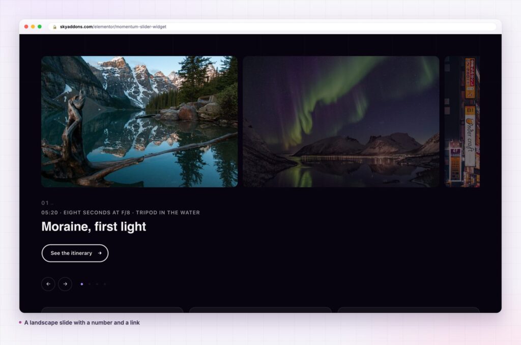
The widget does not care whether a slide is a room, a product or a person. Anything with a title, a line of text, an image and a link fits, which covers most of what a marketing page needs to show in sequence.
A few less obvious uses come up often. A process explained in five steps works well, because the number is doing real work and the image can show the stage rather than describe it. A price list where each tier has a photograph works for studios and venues, where the room is the product. And a set of locations, one per slide, gives a chain a way to show every branch without a map.
Where the content is a post type rather than hand written slides, pointing Content Type at a query keeps the section current. New case study, new slide, no editing. Title Character Limit matters more in that mode, because post titles are written for archives rather than for a narrow column, and one long title will otherwise set the height for everything.
Three cases come up where something else fits better. A gallery of twenty photographs with no copy does not need a text column, and a grid or a carousel will show more in less space. A single hero statement does not need a slider at all, because one section says it more clearly than five rotating ones. And a comparison, where the reader has to hold two options in mind at once, is the one job a slider can never do, since it only ever shows one.
The honest test is whether the slides are a sequence or a set. A sequence has an order that means something, and the momentum slider rewards that with numbering and direction. A set is just several things, and a set is usually better as a grid the reader can scan.
Yes. It ships in the free Sky Addons plugin. The free versus Pro page lists everything else that is included.
No. It loads Swiper, which the plugin bundles.
Swiper is one small library and it is only loaded on pages that use a slider. Images are the real weight, so size them for the column rather than the full page.
Yes. The columns stack, the number and button stay, and drag to slide is the natural control at that width.
Yes. Content Type switches to a query, and the title, image and link come from the post.
A momentum slider is for content where the words and the picture both have to work. Give the text a real column, let the image move against it, and number the slides when they are a sequence. Set autoplay carefully, or not at all, and pick images that survive a tall crop.
See it running on the momentum slider demo, read the momentum slider documentation for every control, and compare plans on the pricing page. For a slider with a thumbnail rail instead of a text column, see the pace slider post. The Swiper documentation covers the underlying options, and MDN on responsive images explains how to keep the picture sharp without shipping a huge file.



Comments are closed.