
Vertical Menu for Elementor: Sidebar Navigation That Holds Its Place
Build a vertical menu in Elementor from any WordPress menu, with sub levels that open in place, icons beside items and full control over every state.
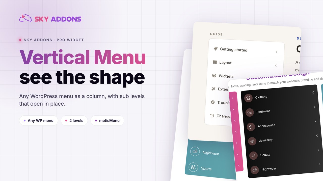
A documentation page with twenty articles has a navigation problem. A horizontal bar cannot hold twenty links. A dropdown hides them until someone guesses where to hover. The reader ends up using the search box because the structure is invisible.
A vertical menu solves it by showing the structure. Sections sit in a column down the side, sub items open underneath the parent that owns them, and the current page stays marked while the reader moves around. Nothing collapses behind a hover.
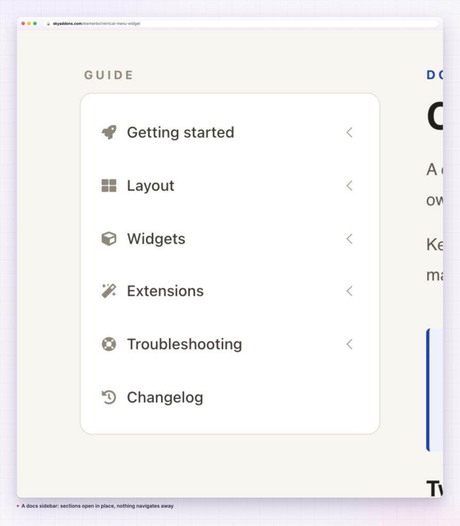
Most people reach for a theme widget or a plain list. Both work until the menu needs a second level or a styled active state.
| Approach | What it costs you |
|---|---|
| Theme sidebar widget | Inherits theme styling, so it rarely matches the page it sits on |
| Plain unordered list | No sub level behaviour, no active state, no icons |
| Accordion widget | Not a menu, so it does not read WordPress menu items or mark the current page |
| Sky Addons vertical menu | Reads any registered WordPress menu, opens sub levels in place, styles every state |
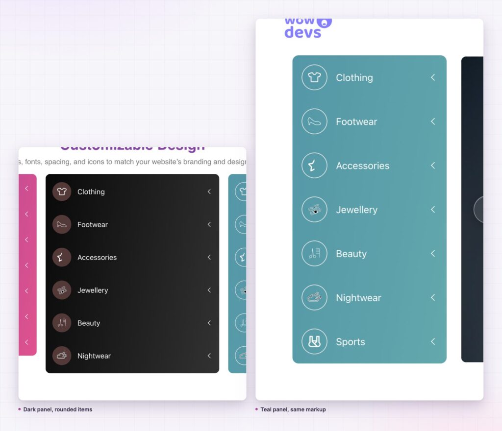
It reads the menu you already maintain. Select Menu picks any menu registered in Appearance then Menus. Add a page there and it appears in the vertical menu, with no editing in Elementor.
Sub levels open in place. The widget loads metisMenu, a small accordion library for nested lists, so a parent expands underneath itself instead of flying out sideways. Collapse Style decides whether opening one section closes the others.
Every state has its own colours. Normal, Hover and Active are separate tabs. Text colour, icon colour, parent indicator colour, background and border colour are set per state, so the current page can look genuinely current.
Spacing is yours. Item Padding, Item Gap and Icon Spacing are separate controls. A dense docs menu and an airy hotel menu come from the same widget with different numbers.
The container is a surface. Border radius and container padding turn the column into a card, or leave it flush against the page. Layout Width decides whether it fills its column or sits at a fixed size.
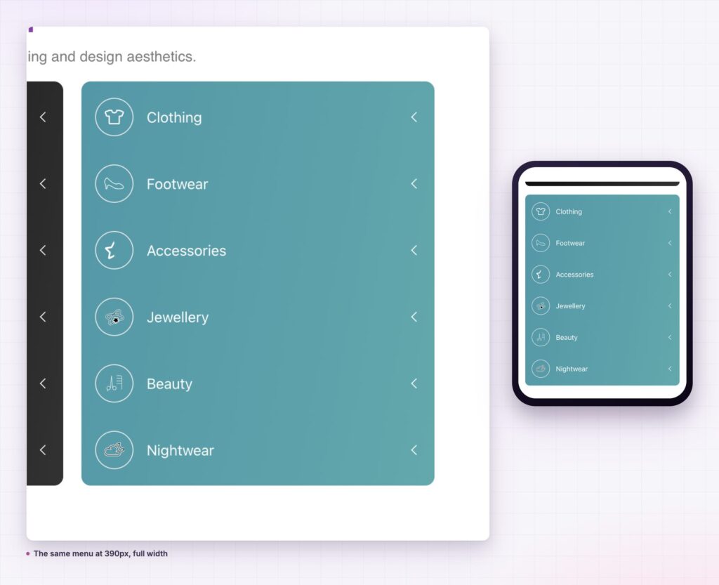
A reader who can see the whole structure stops guessing. They scan the column, find the heading that matches their problem, and open it. The parent stays visible while the child list is open, so they always know where they are.
A reader who can see the whole structure stops guessing. That is the entire argument for a column over a bar.
That matters most on pages people arrive at from search. They land deep, mid structure, with no idea what else exists. A vertical menu answers that in one glance.
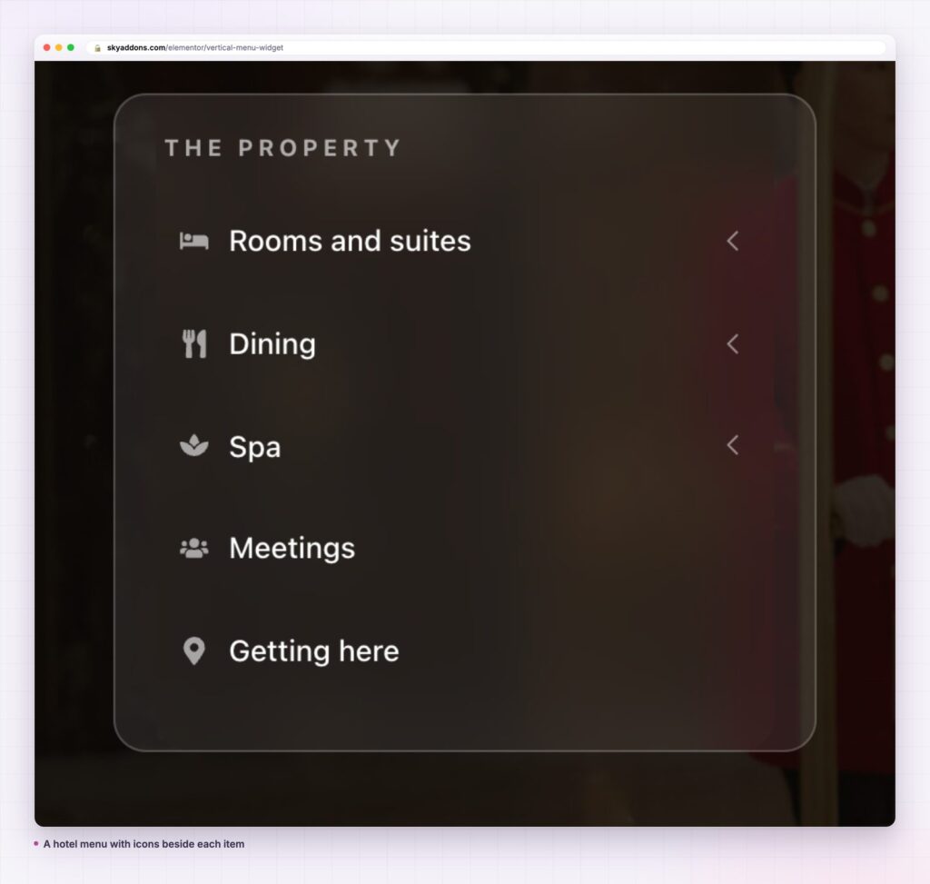
The widget renders a real nested list, so it is not limited to page links. Anchor links to sections on the same page work, which turns the vertical menu into an on page contents column. Category archives, custom post type archives and external links all behave the same way, because they are all just menu items in WordPress.
For a menu that slides between levels instead of expanding them, the Slinky Menu widget covers the same structure with different motion.
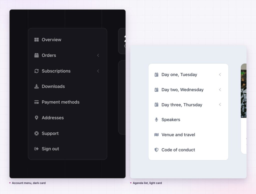
A horizontal bar is right when the whole structure fits in one line and every destination is a peer of the others. Home, shop, about, contact. Five items, no hierarchy, no depth.
A vertical menu is right when any of that stops being true. The moment you have more items than fit across the page, or a second level, or groups that mean something, a column reads better than a bar. Text runs left to right, so a column of labels is scannable in a way a crowded bar never is.
There is a middle case worth naming. A site with a wide primary bar and a deep secondary structure should use both: the bar for the five places everyone goes, and a vertical menu inside the section for everything under it. Documentation sites almost always end up here, because the top bar sells the product and the sidebar navigates it.
I would not put a vertical menu on a landing page with one goal. A column of links beside a sales argument gives the reader six ways to leave before they reach the button.
The active state is doing more work than it looks. WordPress marks the current menu item in the markup, and the widget styles it through the Active tab, so the column answers “where am I” without anyone writing a line of code.
Two habits keep that honest. Build the menu to match the real structure rather than a tidier version of it, because a parent that is not really a parent will never mark correctly. And keep one menu for one area: a docs sidebar and a shop sidebar should be separate menus in WordPress, not one menu with half its items hidden.
When the page has sections rather than pages, anchor links do the same job. Point menu items at fragment URLs and the column becomes a contents list for the page it sits on. It will not mark the active section by itself, which is the one thing to know before you plan a page around it.
No. The vertical menu is part of Sky Addons Pro. The free plugin includes other navigation widgets, and the free versus Pro page lists what sits where.
No. It reads menus from WordPress core, which every site already has.
It loads metisMenu, a small accordion script, and the plugin stylesheet. There is no jQuery UI, no framework and no extra request per menu item.
Yes. The column becomes a full width block, and sub levels still open in place. Item padding decides the touch target size, so set it with thumbs in mind.
Yes, and that is the point. Select any registered menu. Editing it in Appearance then Menus updates every vertical menu on the site at once.
A vertical menu earns its place when the structure is the message. It shows a reader what a section contains before they commit to a click, and it keeps the parent in view while they read the children. Build it from the menu you already maintain, give the active state a real background, and check it at phone width before you publish.
See it running on the vertical menu demo, read the vertical menu documentation for every control, and compare plans on the pricing page. For a menu that hides off canvas instead of sitting in a column, see the offcanvas menu post. The WordPress menu documentation explains how registered menus work, and the W3C navigation guidance covers what a menu owes a keyboard user.



Comments are closed.