
Info Box for Elementor: The Card You Build Most, Free and Without a Script
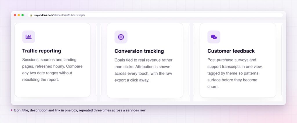
The info box is the card you build most: icon or image, title, text and a link, in one free Elementor widget that loads no JavaScript at all.
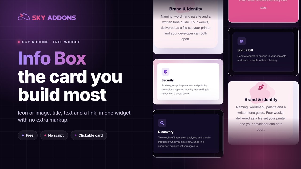
Count the cards on any business site. Services, features, benefits, steps, locations, plans: an icon or a small image, a heading, two lines of text, and sometimes a link. The same object, twenty times over.
Most sites build that object out of four widgets in a container, then rebuild it in every section, then discover that the third section has different padding from the first two. The card is simple and the maintenance is not.
An info box is that card as one widget. One element in the tree, one set of controls, one thing to copy when the next section needs six of them.
| Approach | Elements in the tree | Consistency across sections | Responsive work | Script cost |
|---|---|---|---|---|
| Icon, heading, text, button in a container | Five | Manual, and it drifts | Four elements to check | None |
| Theme card shortcode | One | Fixed by the theme | Theme decides | Varies |
| Card from a template kit | Several | Whatever the kit shipped | Per breakpoint | Sometimes |
| Info Box widget | One | One control set, copied | One element to check | None |
The last column is worth a sentence. The info box registers no script: it is markup and CSS, which means a page full of them costs nothing beyond the page itself.
Icon or image, your choice. Media Type switches between an icon from the library and an uploaded image, with width, height and size controls for each. The same widget serves an icon grid and a photo card grid.
Three media positions. Above the text, left of it, or right of it, with vertical alignment for the side positions. That one control covers most of the card layouts a site needs.
A clickable card. Clickable Card turns the whole box into a link rather than relying on the button. On a phone that is the difference between a card that works and a small tap target under two lines of text.
A button that behaves. Show or hide it, set the text, add an icon before or after with its own spacing, make it full width, and align it independently of the card text.
Media offsets and transforms. Horizontal and vertical offset, rotation, opacity, a transition duration and a hover animation, for both the icon and the image. That is how a card gets a decorative, slightly rotated icon without a custom stylesheet.
Title tag control. The title is h3 by default and can be set to whatever the page outline needs, which keeps a page of cards from producing a mess of heading levels. The WAI guidance on headings is the reason to care.
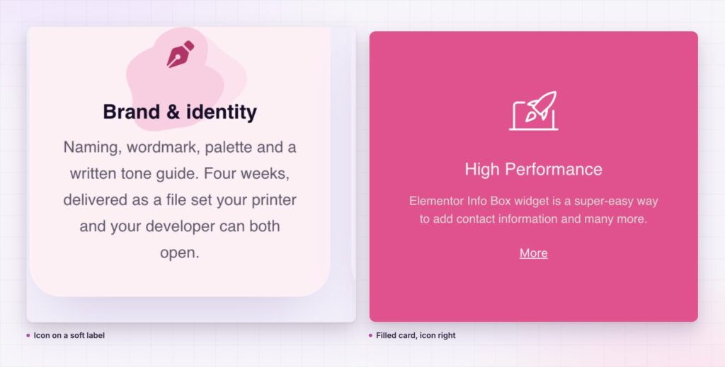
A card is a promise that one idea will be complete in one place. Title, one line, one link. Visitors scan a row of cards looking for the one that matches what they came for, and the card that wins is the one with the clearest first three words.
Building it as a single widget matters for a reason that only shows up later: sections get edited. When a client asks for more padding on the services cards, a single widget is one change repeated by copy and paste, and a stack of four elements is four changes per card, times six cards, in three sections.
The card is the most copied object on a business site. Make it one widget, or spend the rest of the project keeping twenty copies in line.
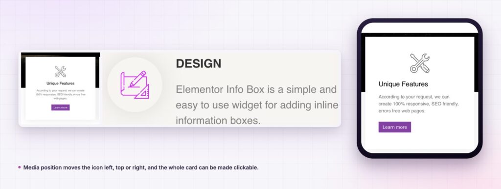
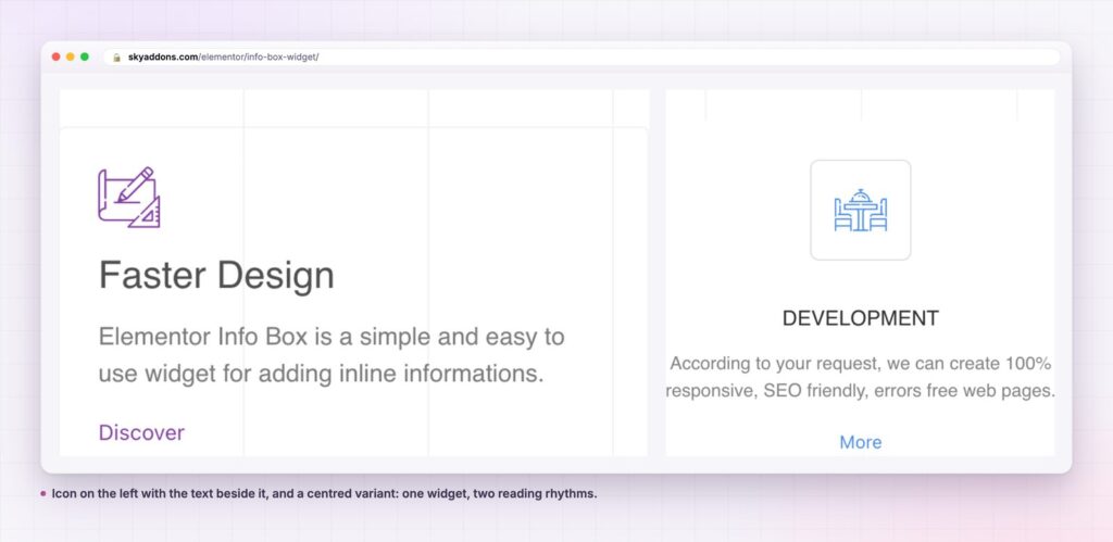
Three controls do more than their labels suggest. Media Position with vertical alignment set to middle produces the compact horizontal card that suits feature lists inside a narrow column, where a stacked card would run long.
Media Offset moves the icon out of the flow without changing the padding. A small negative vertical offset lifts an icon so it overlaps the card edge, the sort of detail that normally costs a stylesheet.
Button Icon Position matters more than it seems on a row of cards. An arrow after the label reads as forward motion, which is what you want on a services card; an icon before the label reads as a category marker, which is what you want on a downloads card.
The widget is a picture, a heading, a paragraph and a link, so it fits any section built from those parts. A team row with photographs. A document list with file type icons. A results row where the title is a number and the description is the metric. A comparison row where each card holds one option.
It also works as a single, wide card. One info box with the media on the left, a generous padding and a full-width button makes a clean call-to-action block that does not need a separate section template.
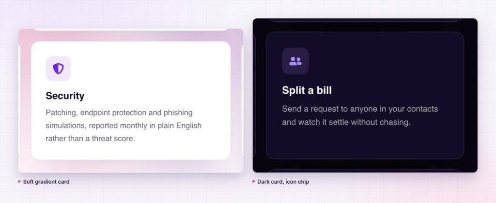
Most card rows look wrong for one of three reasons, and all three are fixable before a client notices.
Uneven copy. Two lines of description in one card and five in the next produces cards of different heights, which no amount of container styling hides. Write the descriptions in a single pass, to the same length, before any of them go into a widget. If one idea genuinely needs five lines, it does not belong in this row.
Mixed icon weights. An icon set drawn at one stroke weight looks intentional. One filled icon among five outlined ones reads as a mistake, and it is the most common reason a services row looks cheap. Pick a set, and if an icon is missing from it, choose a different concept rather than a different set.
Inconsistent media sizes. The icon and image size controls are per widget, so a copied card keeps its size and a rebuilt one does not. Building one card completely, then duplicating it, avoids the whole class of problem, which is the practical argument for the widget over four separate elements.
Two structural settings are worth setting once and keeping. The title tag should match the page outline rather than the visual size, so six cards under a section heading are usually h3. Clickable Card should be on wherever the audience is mostly on phones, because a small text link under two lines of copy is a poor tap target and a whole card is a generous one.
Last, check the row at the tablet breakpoint rather than only at desktop and phone. Three cards becoming two leaves an orphan, and the fix is usually to change the grid to two columns and let the third card sit centred, not to shrink the type.
Yes. Info Box ships in the free Sky Addons plugin, along with more than fifty other widgets. The free versus Pro page shows what Pro adds on top.
No. The widget registers no script, so a page full of info boxes costs nothing beyond its own markup and styles.
Yes. Clickable Card makes the box itself the link, which is the right choice for touch screens. You can hide the button and keep the card clickable.
Yes, with its own width and height controls, plus offsets, rotation, opacity and a hover animation.
Three or four on desktop, two on tablet, one on a phone. Six in a row reduces each card to a label nobody reads.
An info box is the card every business site builds over and over: icon or image, title, text and a link, in one free widget with no script behind it. Three media positions, a clickable card option, a button with its own icon controls and full styling make it flexible enough for services, features, steps and locations. Build one, style it once, copy it everywhere.
See the info box demo, read the Info Box documentation, or compare plans on the pricing page. For a card with a badge and a horizontal layout there is the card widget, and for numbered process sections, the step flow widget.

Comments are closed.