
Elementor Table of Contents: Let People Skip to the Part They Came For
The Elementor table of contents builds itself from your headings, sticks as people scroll, highlights the current section and collapses the deeper levels.
Long pages get skimmed, not read. Somebody arrives from a search result with one question, lands halfway down a two thousand word article, and has no idea whether the answer is above them or below. Most of them scroll for a few seconds and leave.
The fix is not shorter articles. Long pages rank and long pages sell. The fix is telling people what is on the page and letting them jump.
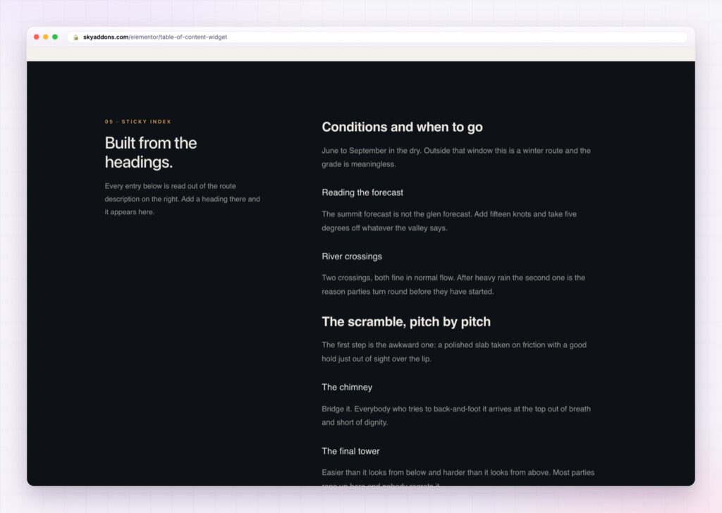
The Elementor table of contents builds that list from the headings you already wrote, keeps it visible as people scroll, and highlights the section they are currently in.
| Hand written jump links | An Elementor table of contents |
|---|---|
| Built by hand, out of date after one edit | Built from the headings, always current |
| Scrolls away with the page | Sticks, per breakpoint |
| No indication of where you are | Current section highlighted as you scroll |
| Every level shown at once | Deeper levels collapse until needed |
| Plain list styling | Minimal, accordion or timeline layouts |
It builds itself. Choose which heading levels to scan, h2, h3 and h4 by default, and the list appears. Edit the article, add a section, and the list updates. Nobody has to maintain anything, which is the only reason a table of contents survives on a real site.
Sticky per breakpoint. Stick it on desktop, on tablet, on mobile, or on any combination. On a wide screen a sticky sidebar list is genuinely useful. On a phone it usually is not, and being able to turn it off there is the difference between helpful and intrusive.
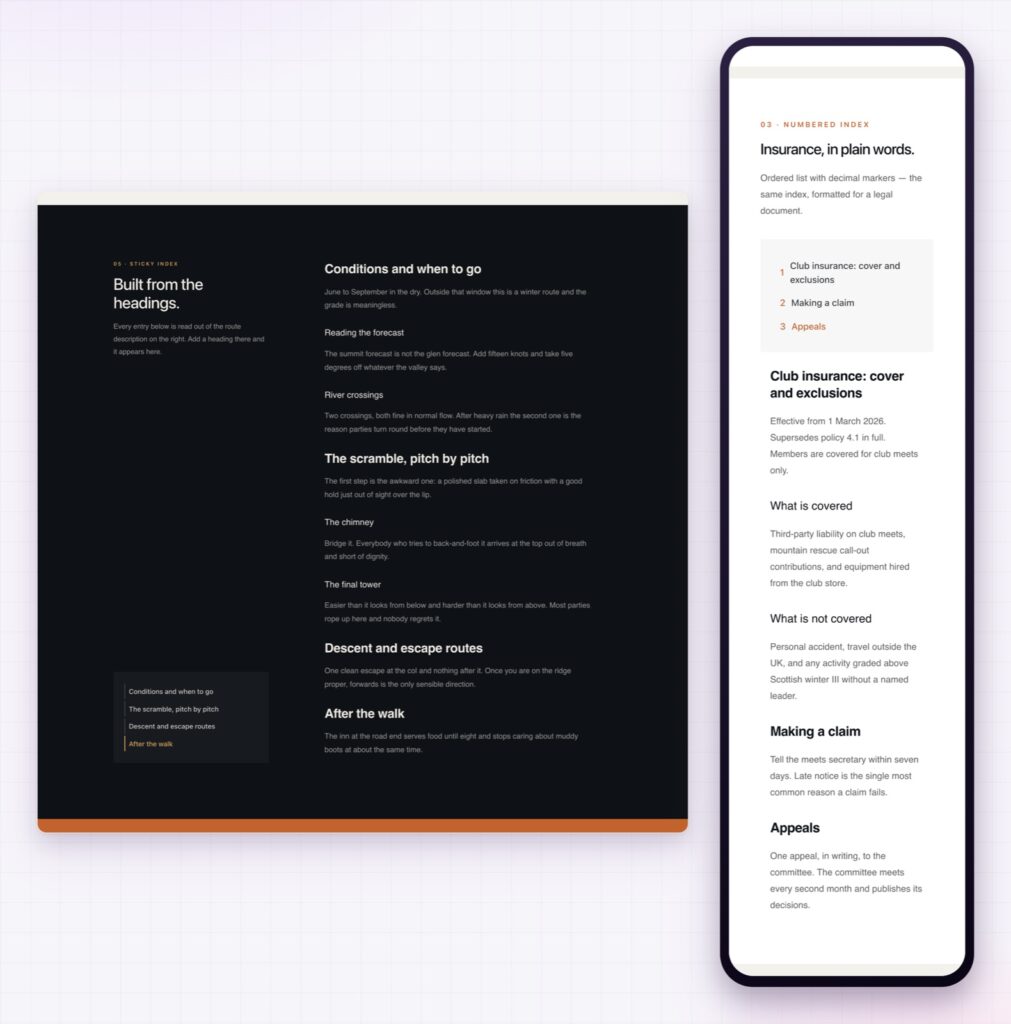
The current section is marked. As the reader scrolls, the matching entry becomes active, with its own colour and styling. That is orientation, and it costs the reader nothing.
Collapse the depth you do not need. Set how many levels stay expanded, from all collapsed to all visible, and let the rest open as the reader reaches them. A twenty heading article stays a six item list until somebody goes deeper.
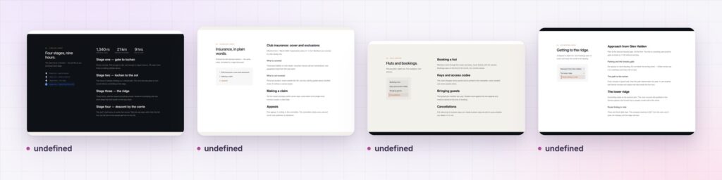
Three layouts. Minimal is a clean list, accordion groups the levels, and timeline draws the progression down the side. Each one has its own styling section, so the list matches the article rather than sitting on top of it.
Behaviour you can actually tune. Smooth scrolling with a duration you set, an offset so a fixed header does not cover the heading you jumped to, and an option to update the URL so a reader can copy a link to the section they are on.
A table of contents is a promise about the page. If the headings are vague, the list is useless. Fix the headings first.
Jump links change what a long page costs the reader. Without them, reading section four means scrolling past sections one to three, and the reader has to decide whether that is worth it before they know what is there. With them, section four is one click, and the page is worth staying on.
The headings do double duty. A clear heading structure is what a table of contents is built from, and it is also what search engines use to understand a page. The WordPress guidance on heading structure and the wider accessibility convention both point the same way: one h1, a sensible h2 spine, h3s underneath. Writing headings properly gives you the contents list for nothing.
There is an accessibility dividend as well. Screen reader users navigate by heading, so the same structure that feeds the list also gives them a way through the page. Getting it right helps two audiences with one piece of work.
Yes. The table of contents is in the free Sky Addons plugin.
No. It is built from the headings on the page, so it updates when the content does.
By default h2, h3 and h4, and you can pick any subset you want.
Yes. Sticky is set separately for desktop, tablet and mobile.
Yes. The matching entry becomes active as you scroll, with its own styling.
The Elementor table of contents turns a long page into something people can navigate: a list built from your own headings, sticky where you want it, with the current section highlighted and the deeper levels collapsed until they are needed. Three layouts and full styling mean it belongs to the article, and because it maintains itself it is still accurate a year later. It is free.
The Table of Contents demo shows the minimal, accordion and timeline layouts on one page, with sticky and collapsed variants. Every control is listed in the Table of Contents documentation.
For orientation above the article rather than inside it, Elementor breadcrumbs are the matching widget, and the Elementor sticky element handles anything else you want to keep on screen.
The table of contents costs nothing. Sky Addons Pro adds the motion, menu and store widgets, and the free versus Pro page shows where the line falls.



Comments are closed.