
Elementor Scroll Stack: Make Three Cards Do the Work of a Whole Page
The Elementor scroll stack pins your cards and piles them as the page moves, so features, steps or plans get read one at a time instead of skimmed.
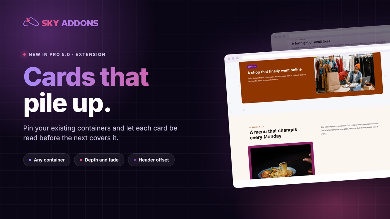
Three feature cards side by side is the most common section on the internet, and the least read. The eye takes in the headings, decides it has the gist, and moves on. Whatever was in the third card may as well not have been written.
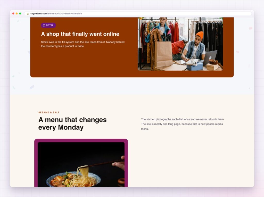
Stacking changes the pacing. Each card pins in place, is read, then slides under the next one, so the section takes the time it deserves without taking more space on the page.
The Elementor scroll stack in Sky Addons Pro 5.0 does this to any container you already built. No new content type, no rebuild: switch it on, and the direct children of that container become the deck.
| Three cards in a row | An Elementor scroll stack |
|---|---|
| Scanned in one glance | Read one at a time |
| Third card usually ignored | Every card gets the screen |
| Same height forced on all | Cards can differ, because they never sit side by side |
| Awkward on phones | Made for a single column |
| Static | Depth, scale and a little motion |
It works on containers you already have. Point it at a container and its direct children become the cards. Nothing to restructure, and you can undo it by switching it off.
Depth, not just pinning. Cards scale down as they are covered, so the pile reads as depth rather than as sheets of paper. The scale ratio is yours to set, and a lower number means deeper cards shrink more.
Fade and rotation when the design wants them. Fade a covered card back to an opacity you choose, or add an alternating tilt for a hand-dealt deck look. Both are off by default, which is the right default.
A top offset for sticky headers. Set it to your header height and cards pin below the header instead of sliding under it. This is the setting that makes or breaks the effect on a real site.
Stacking offset so the deck is visible. A small vertical gap lets the cards underneath peek out, which tells the visitor there is more without a label saying so.
A z-index base. Keep the deck above the section behind it and below your sticky header, without touching CSS.

Three or four cards. A stack of eight is a slideshow nobody asked to sit through, and the visitor has no idea how long it will last.
Attention is a queue. On a normal page the visitor decides what to read; with a stack the page decides, one card at a time, and each card has the screen to itself while it is being read. That is the same reason presentations work better than handouts.
It also solves a layout problem. Cards in a row have to share a height and a shape, which flattens the design. Cards in a stack never sit beside each other, so each one can be its own composition: an image card, a quote card, a numbers card.
Note that the effect runs on the front end, not inside the editor, so preview the page rather than judging it on the canvas.
The effect rests on sticky positioning, and the MDN reference on CSS position explains why a sticky element sometimes refuses to stick, which is usually an overflow rule on a parent.
No. Point it at an existing container and its direct children become the stack.
Yes, and it usually looks better there, because a single column is what stacking wants.
Yes. Scale is on by default with a ratio you set, and fade and rotation are optional.
The effect runs on the front end only. Preview the page to see it.
Not if you set the top offset to the header height and keep the z-index below the header’s.
A row of three cards gets skimmed. The Elementor scroll stack turns the same three cards into a sequence that gets read, using containers you have already built, with depth, an offset for your header, and nothing to maintain afterwards.
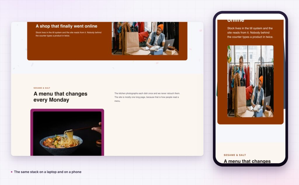
The Scroll Stack demo runs several stacks on one page, from plain feature cards to a dark product deck with imagery. Scroll it slowly on a laptop and then on a phone. Every setting is in the Scroll Stack documentation.
If the story is better told sideways, the Elementor horizontal scroll section is the other way to pace a page. Both are part of the release covered in Sky Addons 4.0 and Pro 5.0.
Scroll Stack is a Pro extension, included in every Sky Addons Pro plan, and the free versus Pro page shows what the free plugin covers.



Comments are closed.