
Elementor Scroll Stack: Make Three Cards Do the Work of a Whole Page
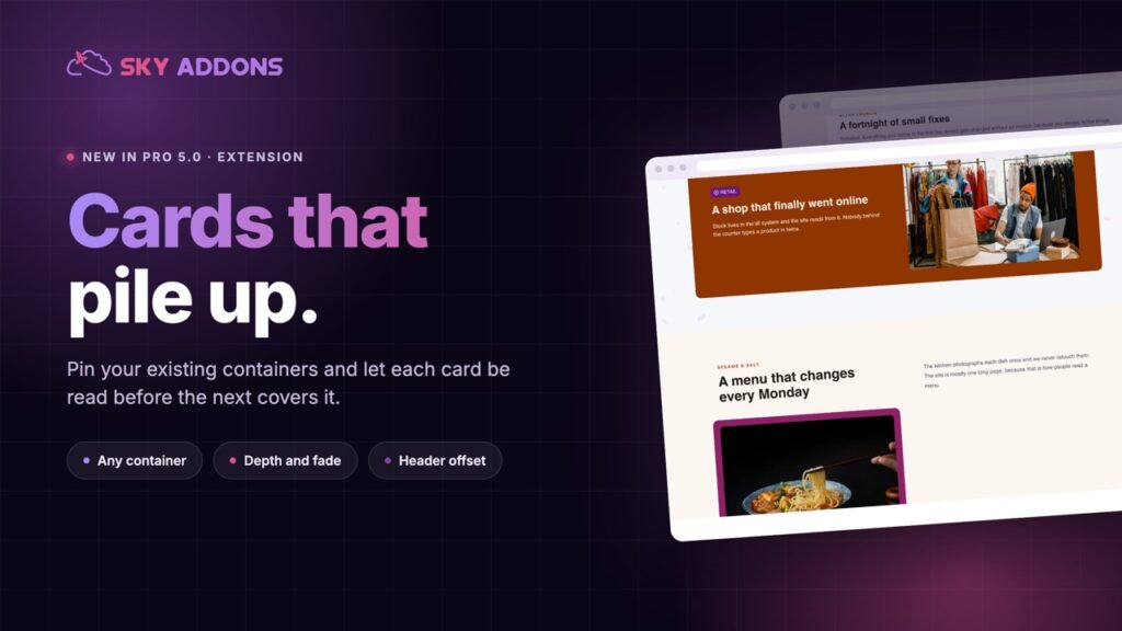
The Elementor scroll stack pins your cards and piles them as the page moves, so features, steps or plans get read one at a time instead of skimmed.
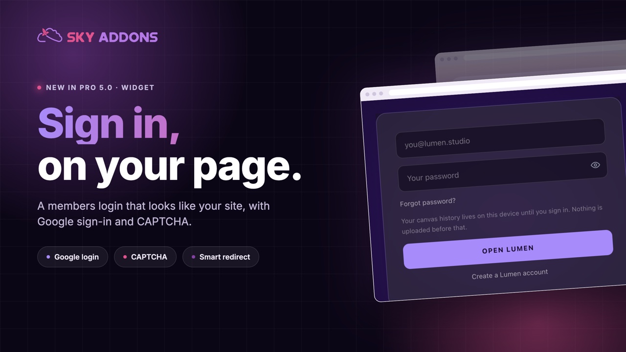
You spend weeks on a members area, a client portal or a course. Then the first thing every member sees is /wp-login.php: grey, blue, someone else’s logo, and the unmistakable message that the thing they just paid for was built out of parts.
Worse, it tells anyone who lands there exactly what software you run, and it sends people away from your site to sign in to your site.
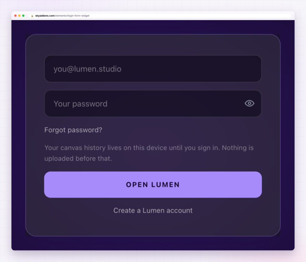
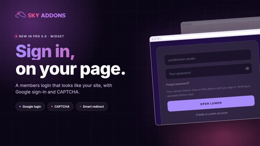
An Elementor login form fixes both. The sign-in lives on your own page, in your own design, with the extras members actually need: a password reveal, remember me, Google sign-in and a redirect to the right place afterwards.
| The WordPress login page | An Elementor login form |
|---|---|
| Someone else’s design | Your colours, type, spacing and card |
| Announces the platform you run | Looks like the rest of the site |
| Sends people off your page | Sign-in happens where they already are |
| One layout for everyone | Different forms for members, clients and staff |
| No social sign-in | Google sign-in built in |
Google sign-in that can create the account. Show a Google button with your choice of wording, and decide whether a first-time Google user gets an account created automatically or whether only existing members can use it. For a course or a community, that one setting removes the biggest drop-off in signup.
Bot protection that is not a nuisance. Turn on CAPTCHA with reCAPTCHA v3 or Cloudflare Turnstile, configured once in the Sky Addons settings. Members see nothing; scripts do.
The small things people expect. A show and hide toggle on the password, remember me, a lost-password link, placeholders and labels in your own words, and helper text above the button for a note like “use the email you bought with”.
A redirect that suits the role. Send people to the dashboard, the course, the last page they were on, or anywhere else, so signing in ends where the member expected to be.
A temporary stop. Refuse sign-ins for a maintenance window with your own message, while the form still behaves normally. This is also what makes a live demo of a login form safe to publish, because the WordPress login page itself stays reachable for you.
Styling to the last detail. Card or no card, labels on or off, full-width or auto button, and separate style sections for the form, labels, inputs, links and messages.
Write the error and helper text like a person. “We do not recognise that email” beats “ERROR: invalid username”, and it is the difference between a member trying again and a member emailing support.
Sign-in is a trust moment. People type a password, and everything about the screen tells them whether that is safe. A branded form that matches the page they came from reads as one product. A generic screen reads as a different site, which is exactly when people check the address bar.
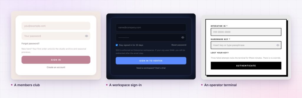
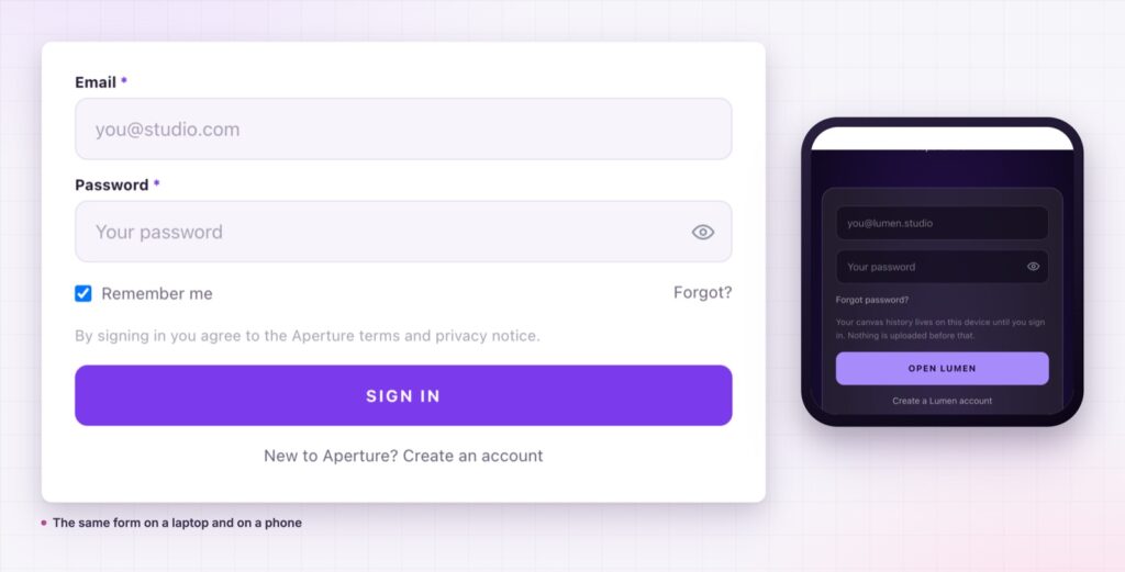
There is a practical argument too. Because the form is a widget on a page, you can have more than one: a simple member sign-in, a staff form with CAPTCHA, a client portal with its own redirect. Each one lives in the design of the section it belongs to.
What somebody sees after they sign in comes down to their role, so the WordPress roles and capabilities reference is worth a read before you decide where the form sends people.
It gives you a front-end sign-in on your own page. The default screen stays available for administrators.
Yes, with a button you can label, and an option to create accounts on first sign-in.
Yes, reCAPTCHA v3 or Cloudflare Turnstile, with the keys set once in the plugin settings.
Yes. Use separate forms with their own redirects for members, clients or staff.
Yes, with the temporary stop switched on. The form validates as normal and refuses every sign-in.
The login screen is part of the product, and the default one belongs to somebody else. An Elementor login form puts sign-in on your page, in your design, with Google sign-in, CAPTCHA and a sensible redirect. Members stay inside the experience they paid for, which is the whole point of having one.
The Login Form demo runs fifteen different designs on one page, from a soft membership card to a black operator terminal, all from the same widget. Every setting is in the Login documentation.
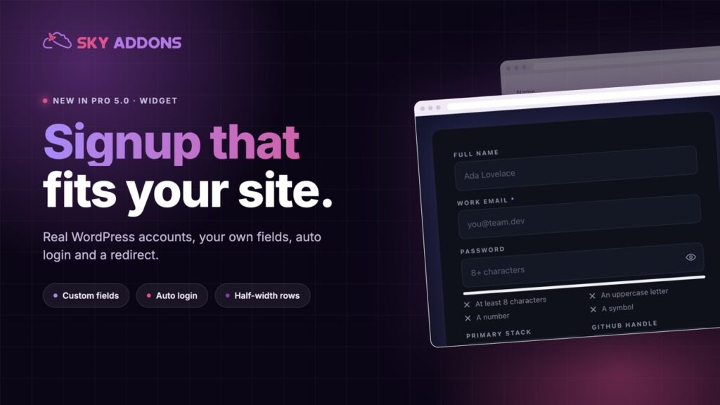
Pair it with the Elementor registration form so both halves of the account flow match. Both arrived in the release described in Sky Addons 4.0 and Pro 5.0.
The login form is a Pro widget, included in every Sky Addons Pro plan, and the free versus Pro page shows what the free plugin covers.

Comments are closed.