
Elementor Scroll Stack: Make Three Cards Do the Work of a Whole Page
The Elementor scroll stack pins your cards and piles them as the page moves, so features, steps or plans get read one at a time instead of skimmed.

Signing someone up is the most valuable thirty seconds on a membership site, and WordPress hands you a form designed in 2008 that asks for a username, an email, and nothing else you actually need.
So the workaround appears: a signup form plugin, then a second plugin to map its fields to user accounts, then a third to redirect people afterwards. Three subscriptions for one form.
An Elementor registration form replaces all of that. It creates real WordPress users, it asks the questions your business needs, it can sign people in immediately, and it looks like the page it sits on.
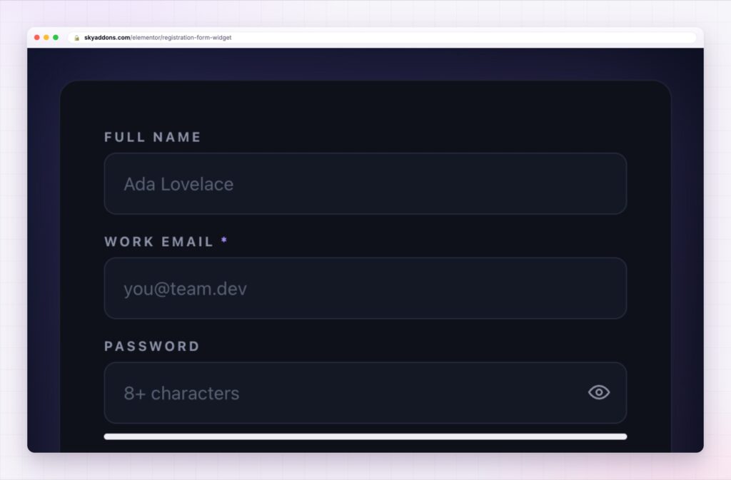
| Default WordPress registration | An Elementor registration form |
|---|---|
| Username and email only | Any fields you need, saved to the user |
| Generic screen, off your site | Your page, your design |
| Nothing after signup | Auto login, custom message or a redirect |
| No control over wording | Every label, placeholder and note is yours |
| Extra plugins for extra fields | One widget |
Custom fields that go somewhere useful. Text, email, phone, URL, number, textarea or select, each stored against the user with a meta key you choose. That means the data is available to your emails, your exports and anything else that reads user meta, rather than sitting in a form plugin’s own table.
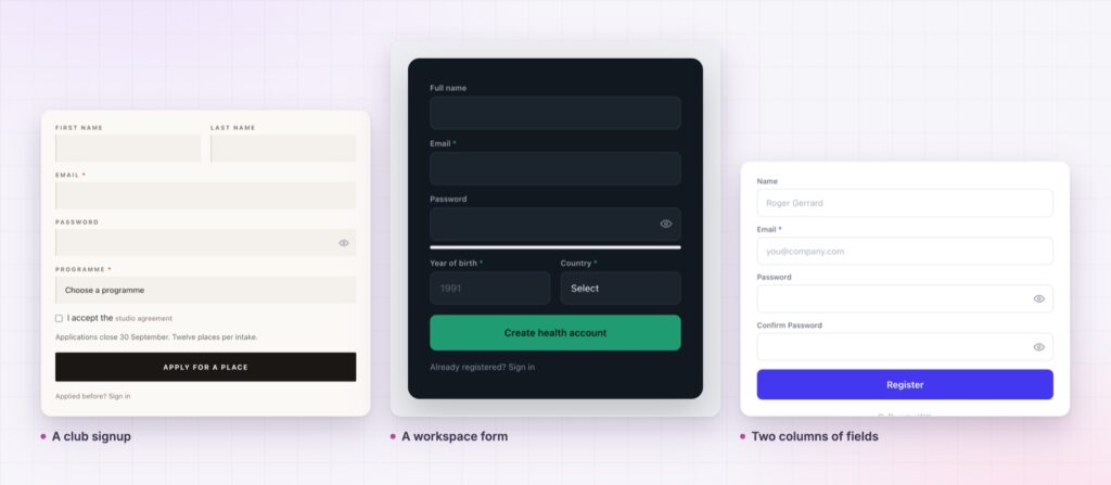
Layout that does not look like a form. Every field can be full, half or a third width, so a signup can be two tidy rows instead of eight stacked boxes. Shorter forms convert better, and this is the cheapest way to make one look shorter.
Passwords handled the way you want. Ask for a password on the form, or leave it off and let WordPress send a set-password email. For low-friction signups, off is usually better.
Auto login after registering. The new member lands inside the product rather than on a “check your email” page. For courses and communities this single setting is worth more than the rest of the form.
A redirect and a success message. Send people to onboarding, a welcome page, or the thing they were trying to reach, and write what they see if they stay.
A temporary stop. Refuse new accounts during a maintenance window, with your own message, while the form still validates normally. It is also how a public demo of a signup form stays safe.
Ask one question you will actually act on. “What are you hoping to learn?” answered at signup is worth more than a phone number nobody ever calls.
Signup is where intent is highest and patience is lowest. Everything that makes the form feel long, unfamiliar or unrelated to the thing being bought costs you members. A form on your own page, in your own words, asking only what matters, removes the three most common reasons people abandon it.
The data matters too. A membership site with a company name and a role on every account can segment its emails from day one. A site that collected a username cannot.
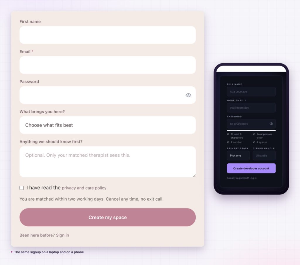
Signups get finished faster when the browser can fill them in, which is what the autocomplete attribute is for.
Yes, with the role your site assigns, so everything that reads users keeps working.
As user meta with the key you choose, so your emails, exports and other plugins can read them.
Yes, with auto login, followed by a redirect of your choosing.
Yes. WordPress then sends the new user an email to set their own password.
Yes, with the temporary stop and your own message, while the form keeps working normally.
Registration is a sales step, not an administrative one. An Elementor registration form lets you design it, ask the questions that make your emails and onboarding useful, sign people in immediately and send them somewhere that makes sense. One widget in place of a plugin stack.
The Registration Form demo shows fifteen designs on one page, including two-column forms and dark membership cards, all from the same widget. Every setting is in the Register documentation.
Pair it with the Elementor login form so both halves of the account flow match, and read Sky Addons 4.0 and Pro 5.0 for the rest of the release.
The registration form is a Pro widget, included in every Sky Addons Pro plan, and the free versus Pro page shows what the free plugin includes.




Comments are closed.