
Elementor Scroll Stack: Make Three Cards Do the Work of a Whole Page
The Elementor scroll stack pins your cards and piles them as the page moves, so features, steps or plans get read one at a time instead of skimmed.
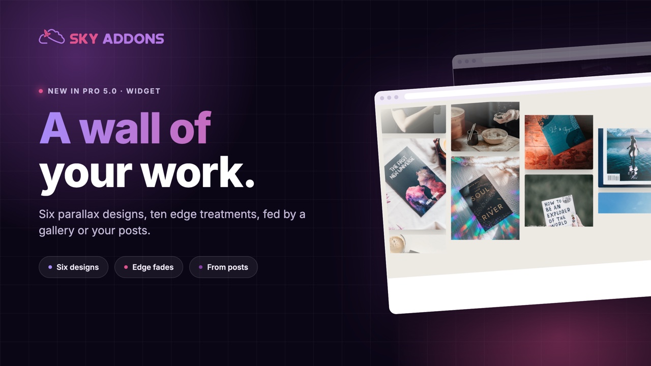
There is a moment on a good agency site where the page stops being a website and starts feeling like a place. Usually it is one section: a wall of work, moving slightly as you scroll, with no captions and nothing to click.
It is a difficult section to build by hand. Columns have to move at different speeds, the edges need to fade rather than stop, and the whole thing has to behave on a phone without becoming a very long list of photographs.
The Elementor showcase wall in Sky Addons Pro 5.0 ships it as six ready designs, fed by a gallery or by a post query.

| A gallery grid | A showcase wall |
|---|---|
| Static, and read as a task | Moves with the page, read as atmosphere |
| Equal weight to every image | Depth, because columns move at different speeds |
| Hard edges against the section | Edges fade, so it belongs to the page |
| One look | Six designs, from calm to theatrical |
| Manual images only | Gallery or a post query |
Six designs, not six hundred settings. Editorial drifts calmly with a soft fade. Skyline shapes both edges. Arc Reveal has the columns rise into line. Theater zooms as you scroll. Stream never stops moving. Slant tilts the whole wall. Each one is a curated combination of motion, offsets and edge treatment, and you can switch to Custom when you want to set every piece yourself.
Ten edge treatments. None, bottom, top, both, sides, a full frame, a bright spotlight centre, diagonal or a curved horizon. This is the setting that decides whether the wall sits inside your page or fights it.
Two to six columns. Two for large architectural work, five or six for a dense product wall. The images keep their own aspect ratios.
Fed by a gallery or by posts. Pick images by hand, or query posts and let the wall build itself from your latest work. On a busy studio site that means the home page updates when a project is published.
Motion tied to scrolling. The wall reacts to how the visitor moves through the page rather than running on a timer, which is what makes it feel like depth rather than animation.

A wall works because of what it leaves out. No captions, no buttons, no hover text. If the images are not strong enough on their own, fix the images rather than adding labels.
Depth is the oldest trick in design for making a flat surface feel real. Columns moving at slightly different speeds give a page the same cue your eyes use in the physical world, and the result reads as quality rather than as an effect, because nothing about it asks for attention.
The practical value is time. This section replaces a custom build that normally involves a developer, a scroll library and a stylesheet nobody else can safely edit. Here it is a design dropdown and a set of images.

Parallax is the first thing motion-sensitive visitors turn off, and prefers-reduced-motion is the setting their browser uses to say so.
Yes. Choose the post query source and the wall fills from your published work.
At least three per column, so twelve for the default four columns. More makes the motion smoother.
Yes, with fewer columns. Check it, because dense walls need dropping to two on small screens.
The motion is light. Image sizes are what matter, so export sensibly.
Yes, ten treatments including frame, spotlight, diagonal and a curved horizon.
One section can change how an entire site feels. The Elementor showcase wall gives you a parallax wall of work with six designs, ten edge treatments and a source that can be your own posts, so the page that sells your craft keeps itself current.
The Showcase Wall demo runs thirteen walls: editorial, skyline, theater, slant and more, across product, fashion, studio and app imagery. Scroll it slowly, because the designs differ most in how they behave rather than how they look when still. Every setting is in the Showcase Wall documentation.
If you want the same material moving sideways rather than with the scroll, the Elementor showcase flow is the other half of this pair. Both are in the release described in Sky Addons 4.0 and Pro 5.0.
Showcase Wall is a Pro widget, included in every Sky Addons Pro plan, and the free versus Pro page shows what the free plugin covers.




Comments are closed.