
Reveal Gallery for Elementor: A List That Shows Its Work on Hover
A reveal gallery turns a plain list into a gallery: hover any row and its image appears at the cursor, so the page stays short, fast and readable.
A studio with six projects has two bad options. Show six large images and the page becomes a scroll. Show six thumbnails and the work looks smaller than it is.
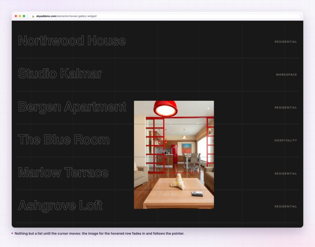
A reveal gallery takes neither. The section is a list: six titles, a category or a price at the right, a rule between each row. Move the cursor onto a row and that row’s image fades in and travels with the pointer. Move away and the list is a list again.
The page stays short, the type stays large, and the photographs still get seen.
| Approach | Page height | Type size | Images loaded | Feel |
|---|---|---|---|---|
| Image grid | Two or three screens | Small captions | All of them | Catalogue |
| Thumbnail list | One and a half screens | Medium | All of them | Directory |
| Text-only list | Short | Large | None | Plain |
| Reveal gallery | Short | Large | On hover | Editorial |
A thumbnail list is the honest middle option, and it is also the one that makes good photography look like stock. The reveal gallery keeps the list’s economy and gives the images their full size when they are wanted.
The list is real markup. Each row is a title, an optional category or postfix and a link. The image is attached to the row rather than sitting in the flow, so the list reads as a list to anything that is not a mouse pointer.
Two sources. A repeater for a hand-built list, or Dynamic Posts to pull rows from a post type. The query builder that comes with it handles limit, include and exclude by term or author, offset, order and date range.
The postfix earns its place. The right-hand column is free text, so it can be a price, a date, a week number, a category or a room type. In the demos it is doing all five jobs.
Style controls that reach the row. Row padding, the bottom border size and colour, title colour and hover colour, category padding, radius and colours, and image width, height and border radius. A reveal gallery can be a dark editorial band or a pale price list.
A title tag you choose. The rows are h3 by default and can be set to whatever the page structure needs, which matters when the list is the main content of a section.
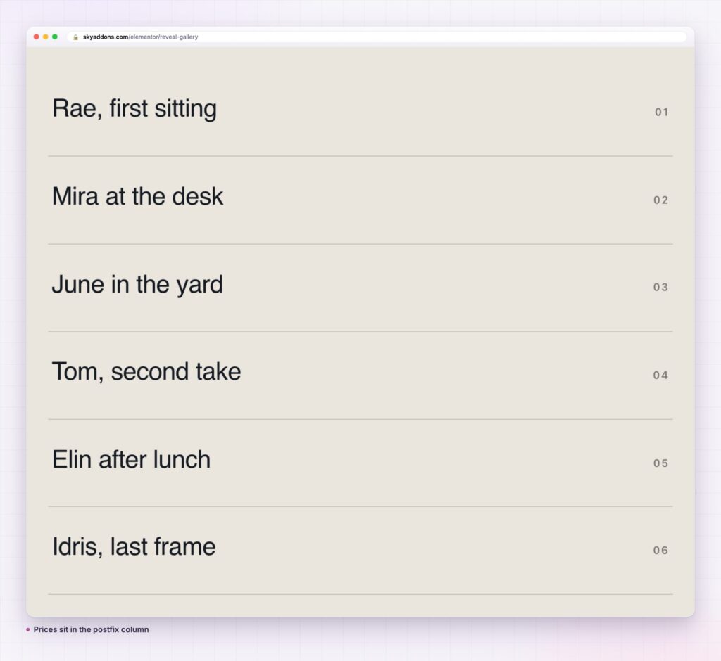
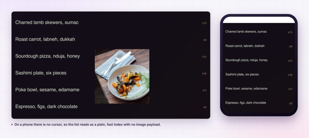
Two things happen. The first is economy: a twelve-row list is about a screen, where twelve images would be three. The second is pace. The visitor controls when an image appears, so the section never animates at them. That is the difference between motion that feels expensive and motion that feels like a plugin.
There is a practical benefit as well. A list does not reflow. Whatever sits under the reveal gallery stays where it was, and a visitor who has already scrolled past it never sees the layout jump.
The best galleries on studio sites are lists. The pictures arrive when the visitor asks for them, and not a moment earlier.
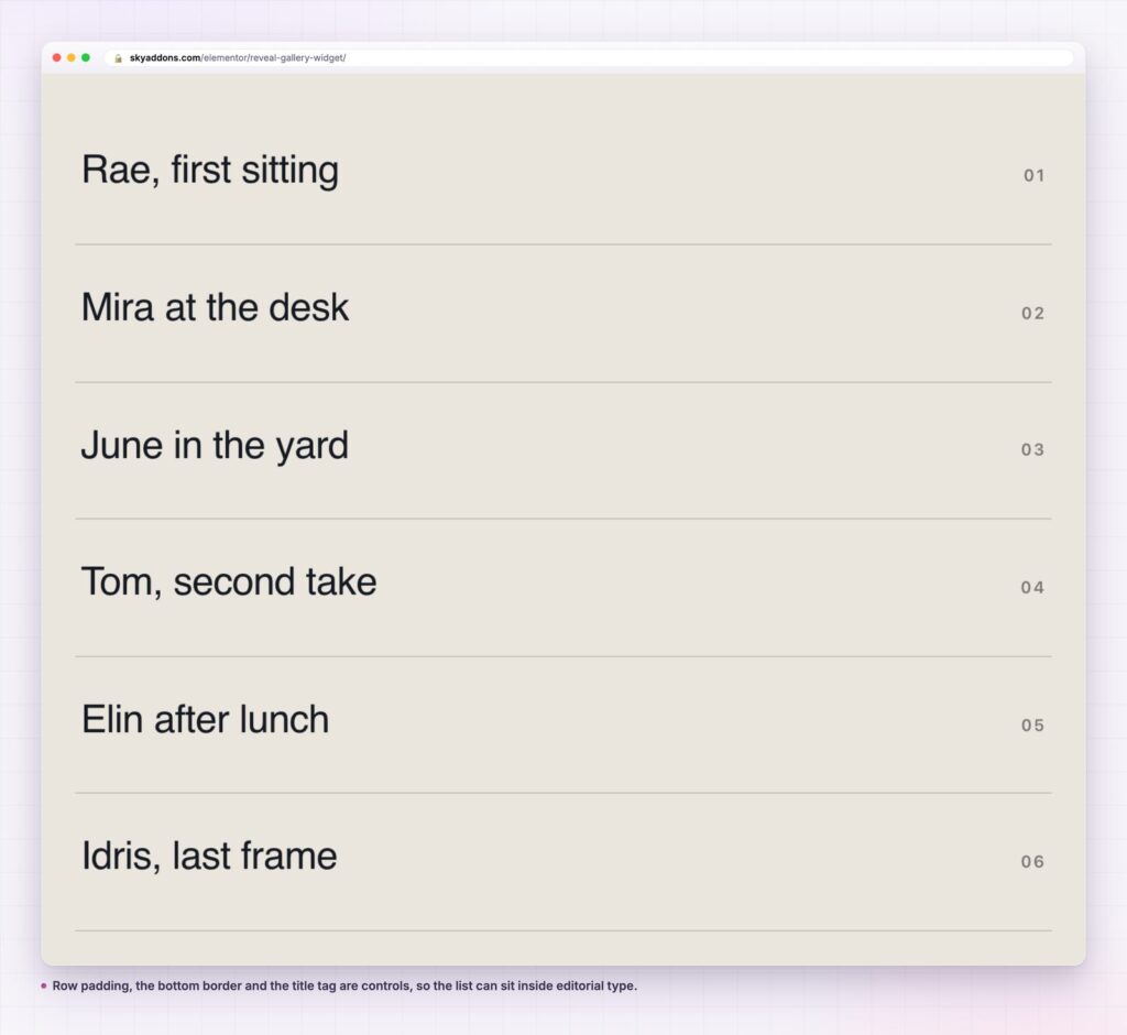
The row is a title, a short right-hand label and a picture, which covers more than project lists. A wine list with regions on the right. A team page with roles. A services list with lead times. A festival line-up with stage times. In each case, the image is the reward for interest rather than the thing competing for it.
It also works as a navigation block. Give each row a link to a landing page and the section becomes a menu that happens to show photographs, which is a better use of a hero area than six cards nobody clicks.
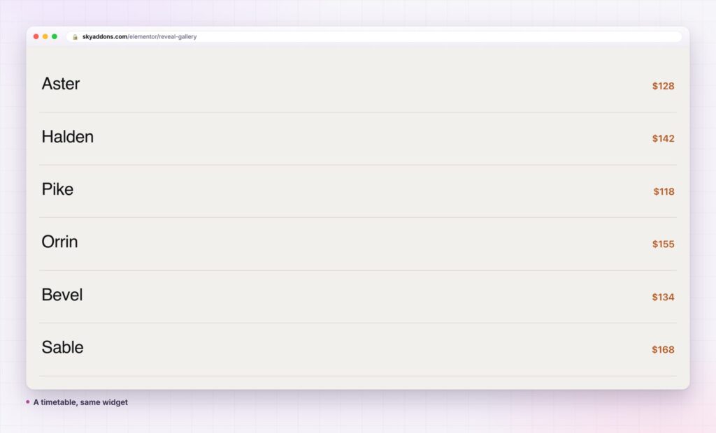
The reveal gallery is read twice: once as a list, by every phone visitor and every search engine, and once as a gallery, by whoever has a mouse. The second reading is the pleasure. The first is the one that decides whether the section is useful.
That puts the weight on the titles. A row called Project 12 tells a phone visitor nothing, and the image that would have explained it never appears. A row called Northwood House, kitchen extension tells them everything and still leaves the photograph a job to do.
The postfix column carries the second layer of meaning. It is free text, so it can hold a price, a date, a week number, a room type, a city or a duration. Choose one kind of information and keep it consistent down the list: mixing a price into one row and a date into the next makes the column unreadable at a glance.
Order matters more than in a grid. A grid is scanned in two dimensions and a list is read from the top, so the first three rows carry the section. Put the work you want commissioned there, not the work you finished most recently, unless recency is the point.
Length is the last decision. Six rows feel curated. Twelve feel complete. Twenty feel like an archive, at which point a paginated grid does the job better and the reveal gallery should be showing a selection that links to it.
Finally, read the list with the images turned off in your head. If it still tells a stranger what the business does and what they would get, the section works everywhere. If it does not, no amount of hover motion will rescue it.
No. It is a Sky Addons Pro widget. The free plugin carries Tidy List, List Group and Info Box for list work; the free versus Pro page shows what falls where.
No, only Elementor. The motion uses GSAP, a documented animation library, loaded on the pages that need it.
There is no cursor, so no image appears. The list stays a clean, fast index, which is why the titles and the postfix column deserve the attention.
Yes. Set the content source to Dynamic Posts and use the query builder: post type, limit, include or exclude by term or author, offset, order and date range.
The rows are text and links in the page, not an image map or a canvas, so they are read like any other HTML list. Keep the title tag sensible for the section it sits in.
A reveal gallery is a list that shows its pictures only when a visitor asks. The rows stay large and readable, the page stays short, and each image fades in at the cursor and leaves with it. Use it for project lists, menus, timetables and any index where the photograph is a reward rather than the point.
See it on the reveal gallery demo, read the Reveal Gallery documentation, or check the pricing page. For a set that should be visible at all times, use the diamond gallery; for panels that expand in place, the image accordion.



Comments are closed.