
Diamond Gallery for Elementor: Four Grid Shapes and a Built-In Lightbox
A diamond gallery for Elementor with four grid shapes, a built-in lightbox and real hover controls, so a photo set stops looking like a stock grid.
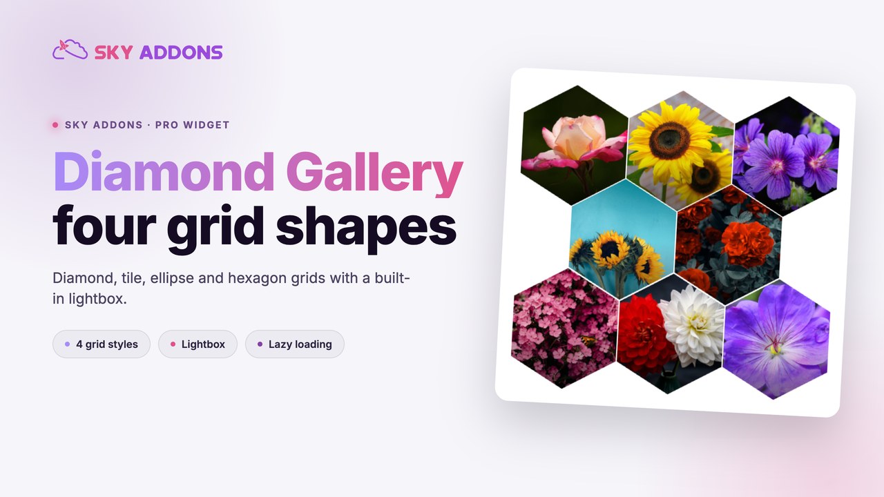
Every photo grid on the web looks the same, because every photo grid is the same: equal rectangles, equal gaps, three or four to a row. The pictures may be excellent. The shape says nothing.
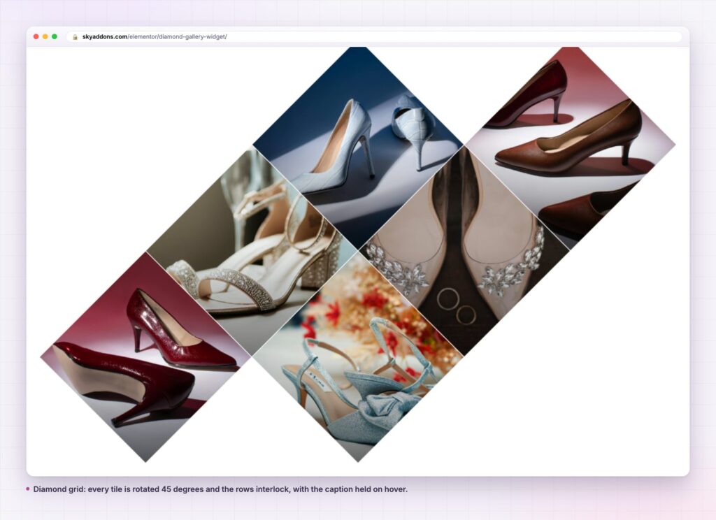
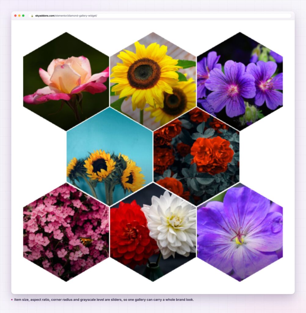
A diamond gallery changes the shape, not the workload. The images are the same images, the upload is the same upload, and the grid rotates forty-five degrees so the rows interlock. Swap one control and the same set becomes hexagons, ellipses or plain tiles.
That is the whole pitch: a gallery that looks designed rather than generated, without a designer touching it after the upload.
| Approach | Shapes available | Lightbox | Hover control | Setup time |
|---|---|---|---|---|
| Core gallery block | Rectangles | Theme dependent | None | Minutes |
| CSS grid by hand | Anything you can code | Build it yourself | Write it yourself | Hours |
| Third-party lightbox plugin | Rectangles | Yes | Limited | Minutes, plus a plugin |
| Diamond gallery | Diamond, tile, ellipse, hexagon | Built in | Overlay, text, scale, grayscale | Minutes |
The value is not that a diamond grid is impossible otherwise. It is that the alternative is a stylesheet somebody has to maintain, and a lightbox somebody has to bolt on.
Four grid styles from one control. Grid Style switches between diamond, tile, ellipse and hexagon. The images do not change. A set uploaded for a diamond grid works as hexagons without a re-crop.
A lightbox that is actually configurable. Keyboard control, touch threshold, z-index, a mobile viewport breakpoint, plain or circle buttons, custom close, previous and next button images, and a caption block with its own title, text and read more. Most galleries hand you a lightbox and no controls at all.
Hover that you can tune rather than accept. Overlay colour and opacity, hover text with its own size, colour, opacity and scale, image scale, and a grayscale level for both the resting and hovered state. A gallery that sits at 100 percent grayscale and drops to zero on hover is two sliders, not a filter plugin.
Three sources. Manual items, a bulk image gallery, or posts. The manual repeater gives every item its own title, text and link, which is what you want when tiles lead to product pages rather than a lightbox.
Click behaviour per gallery. Click Action is lightbox, redirect or nothing. Redirect takes a default URL plus a per-item link and a same tab or new tab setting, so the same widget serves a lookbook and a shop grid.
Grid geometry you can steer. Item size, aspect ratio, corner radius, fill edges, which rows shift, and inline or outline positioning. Lazy loading is on by default, so a forty-image wall does not load forty images at once.
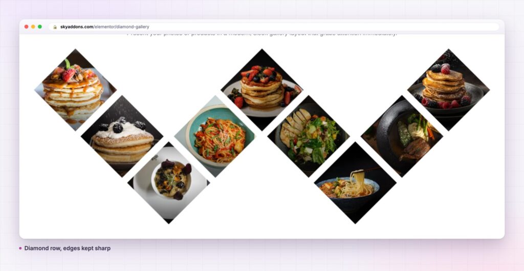
A rotated grid does something a rectangular grid cannot: it moves the eye diagonally. Visitors scan a normal gallery in rows and stop at the first row that bores them. A diamond or hexagon grid has no rows to abandon, so the set is read as one object.
The built-in lightbox matters for a duller reason. It keeps the visitor on the page. A gallery that opens images in place has no exit, no back button, no lost scroll position. On a phone the touch threshold and the mobile viewport control decide how the lightbox feels, and both are exposed.
Shape is the cheapest way to make a page look art directed. The photographs were always the expensive part.
A diamond gallery does not need forty pictures. Six tiles work as a services section, with each tile carrying a title, a sentence and a link, and no lightbox at all. Twelve tiles with a redirect action work as a category grid on a shop. The geometry does the signalling; the content can be anything with a picture.
A second use that comes up: a logo wall. Set the grayscale level high, drop it to zero on hover, use the tile style with a generous corner radius, and a client list stops looking like a spreadsheet of images.
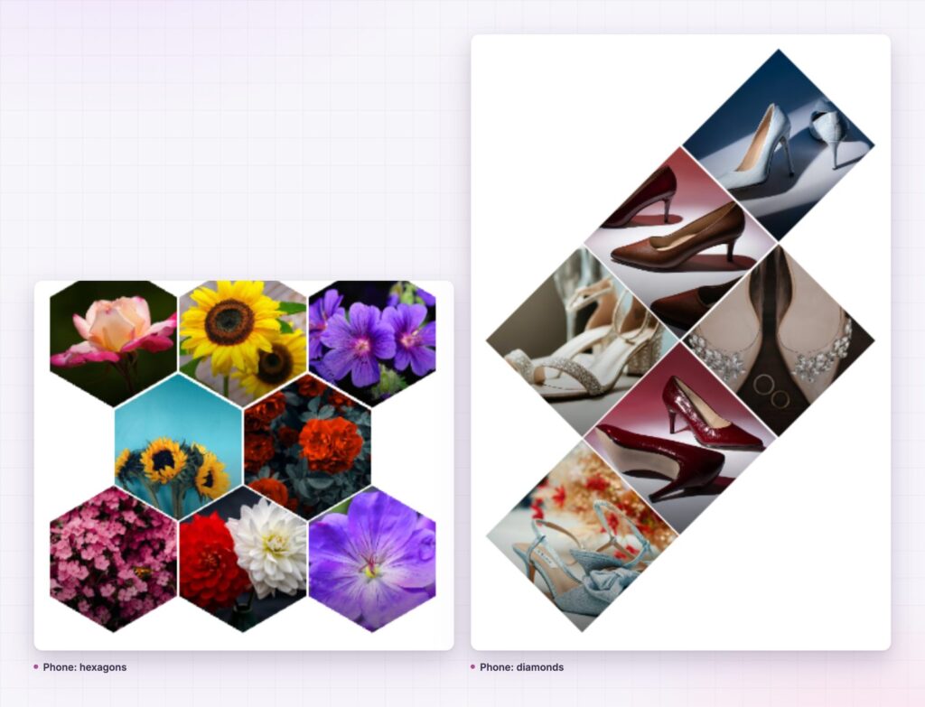
Four shapes sound like four styling options. In practice each one suits a different kind of photograph, and choosing by subject rather than by taste saves a re-shoot.
Diamond crops hardest. The corners of every image disappear, so it wants subjects that sit dead centre with space around them: a single shoe, a plated dish, a bottle. It is the most decorative of the four and the least forgiving of a busy frame.
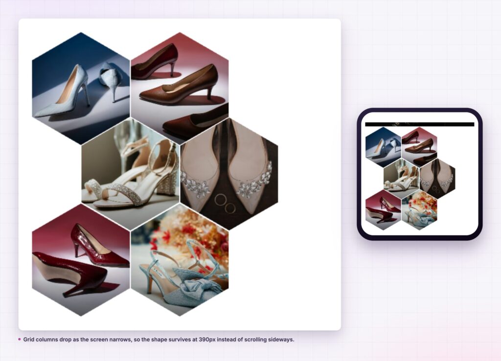
Hexagon keeps more of the image than a diamond and still breaks the grid. It is the safest choice for mixed sets, because a hexagon crops the corners gently rather than slicing them off. Flowers, food and product shots all survive it.
Ellipse reads as a portrait frame, which is why demo galleries use it for people. Applied to products it looks like a sticker sheet, so keep it for sets where a round crop means something.
Tile is a rectangle grid with the widget’s hover, lightbox and lazy loading attached. It is the option to use when the client wants the features and not the geometry, and it is worth remembering that it exists before reaching for a different widget.
Two more settings change the character as much as the shape does. Grid Rows To Shift decides whether the even or the odd rows step sideways, which flips the whole rhythm of an interlocked grid. Grid Position, set to inline or outline, decides whether the tiles sit inside the container edge or break past it.
Set the item aspect ratio before you start styling. Everything else, including the corner radius and the grayscale level, reads differently once the tiles stop being square, and it is the one control that is awkward to change after a set has been cropped to suit it.
No. It is a Sky Addons Pro widget. The free plugin includes Logo Grid, Info Box and Advanced Slider, among more than fifty others; the free versus Pro page sets out the split.
No. The lightbox is part of the widget, with its own buttons, captions and keyboard controls.
Lazy loading is on by default, so images load as they come into view. Size the source files sensibly and a large wall behaves like a small one.
Yes. Set Click Action to Redirect, give each item a link and choose the same tab or a new tab. The usual rules for link targets apply here as they do anywhere else.
Yes. Columns reduce as the viewport narrows, and the lightbox has a mobile viewport setting plus a touch threshold for swiping between images.
A diamond gallery is a photo grid with the shape turned up: diamond, tile, ellipse or hexagon, chosen from one control, with a real lightbox and hover controls that reach overlay, text, scale and grayscale. It suits sets where the photography is good enough to deserve a frame that is not a rectangle, and it takes about as long to build as a plain gallery.
Try the diamond gallery demo, read the Diamond Gallery documentation, or see what else Pro adds on the pricing page. For an expanding band of images there is the image accordion, and for a wall that scrolls sideways, the showcase wall.


Comments are closed.