
Elementor Logo Carousel: Show Every Client Without the Clutter
The Elementor logo carousel slides client logos with autoplay, coverflow, tooltips and grayscale hover. One to six columns. Free in Sky Addons.
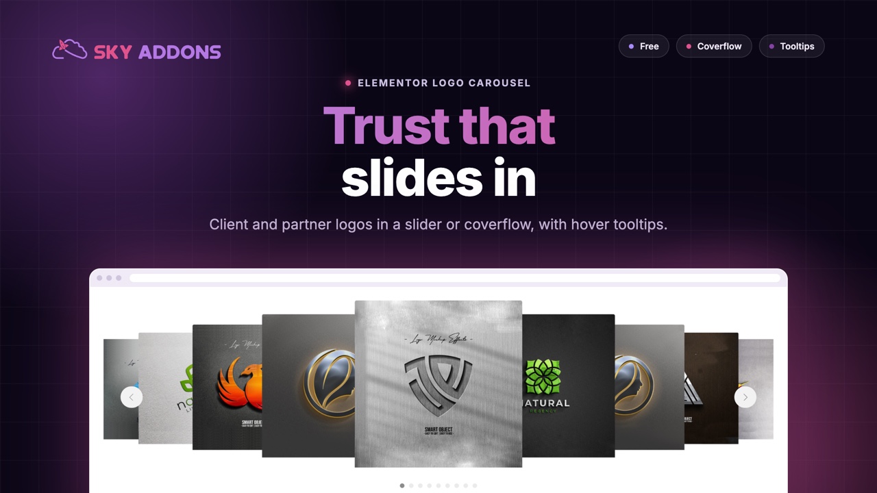
A strip of client logos says something no headline can: other companies trusted us. It is one of the oldest tricks in marketing, and it still works, provided the logos are readable, in order and not squashed into a corner of the page. The usual failure is either a static row that fits six logos and hides the other twenty, or a cheap slider that jerks, crops the images and breaks on mobile.
A logo carousel fixes both. It shows a handful of logos at a time, slides through the rest, and stays sharp on every screen. Sky Addons includes a free Logo Carousel widget for Elementor built on Swiper, with autoplay, arrows, dots, a coverflow effect and hover tooltips. This article explains where a logo carousel helps, what to look for in one, and how to build a strip that people actually notice.
Use it wherever a list of names needs to earn trust or show scale.
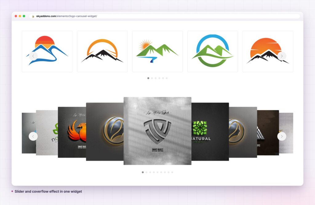
You can show logos with a plain image row, a gallery or a slider plugin. The table shows where each one stops.
| Static image row | Generic slider plugin | Sky Addons Logo Carousel | |
|---|---|---|---|
| Fits many logos | No, it wraps or shrinks | Yes | Yes, with autoplay and loop |
| Logos per view | Fixed by width | Set per slide | 1 to 6 columns, responsive |
| Hover tooltip | No | Rarely | Yes, with brand name and text |
| Grayscale hover | Custom CSS | Custom CSS | A built-in setting |
| Coverflow effect | No | Sometimes | Yes, with depth and rotate |
| Link or lightbox | Manual | Varies | Custom URL or media file lightbox |
A carousel you can tune. Set the number of columns from one to six, turn on autoplay with your own speed, loop it, set the slide speed and pause it when the pointer is over it. Slides per group, centred slides and a grab cursor give you a finer feel. It runs on Swiper, a well-established touch slider library.
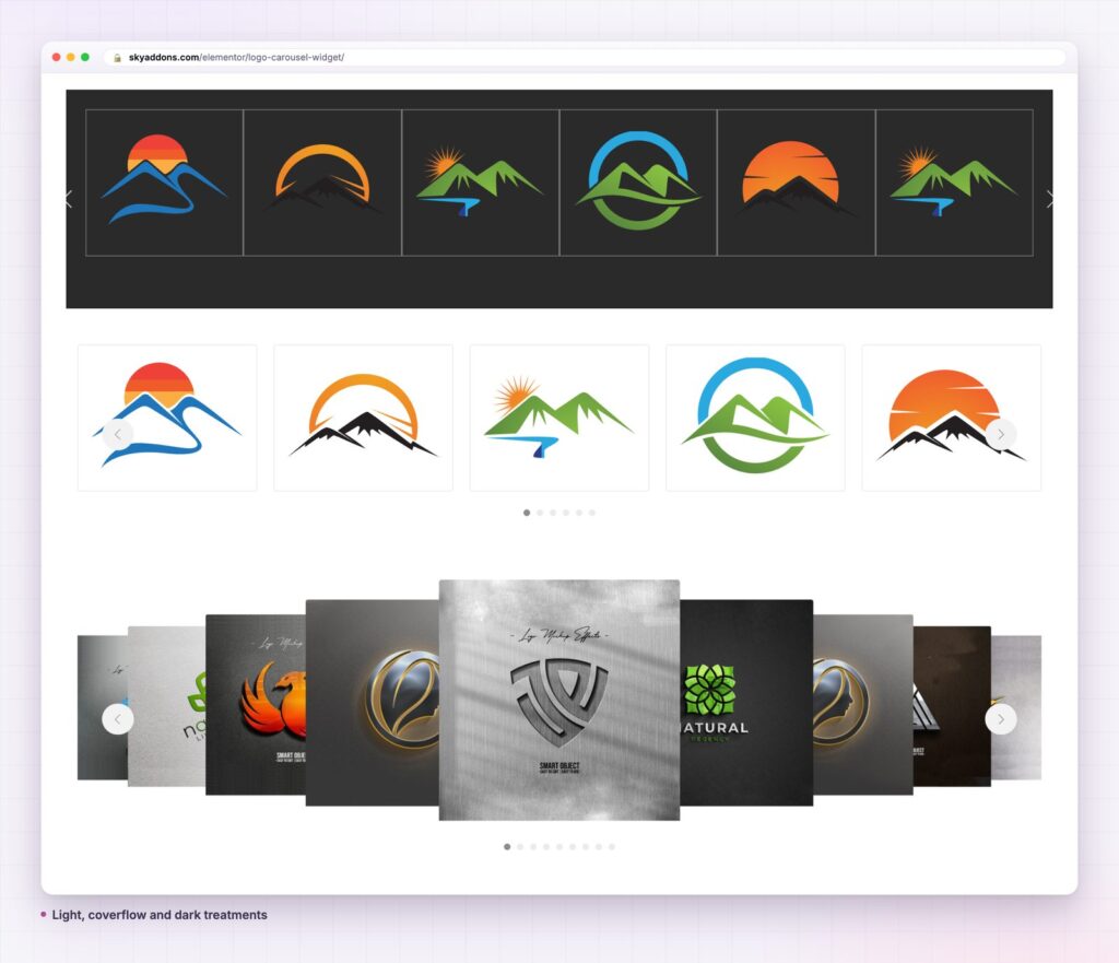
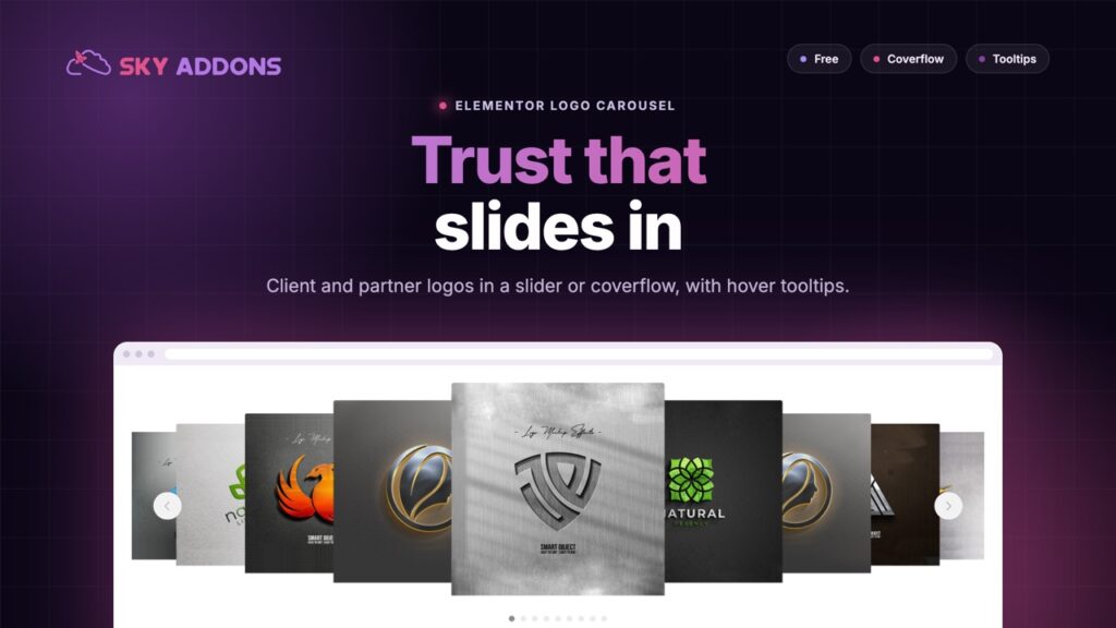
Two ways to move. The default effect slides logos in a row. The coverflow effect turns the carousel into a gallery with a large centre logo and tilted neighbours. You can control depth, rotation, stretch and shadows, so it can be subtle or dramatic.
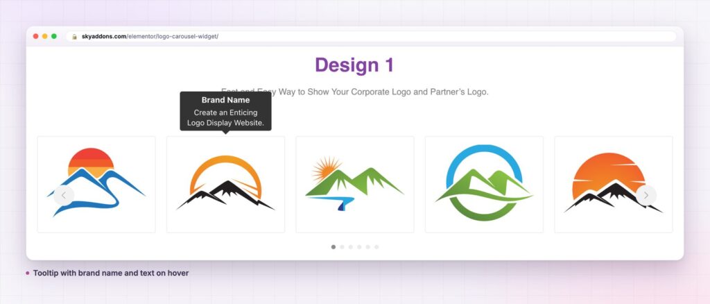
Tooltips that add information. Give each logo a brand name and a short line of text and switch on the tooltip. Choose where it appears, how it animates and whether it opens on hover or on click. It is a neat way to say who a client is without cluttering the strip.
Grayscale that responds. Show every logo in grayscale and let colour appear on hover, or do the reverse. A row of mixed brand colours often looks messy, and grayscale calms it. Opacity and hover opacity, a transition time and a hover animation finish the effect.
Boxes, spacing and height. Choose a box style or none, set the item gap, and control the carousel height and image height so logos with different proportions sit consistently. Use Image Cover if you want each logo to fill its box.
Links that suit the use. Each logo can link to a custom URL or open its own media file in a lightbox. Choose none if the strip is decorative.
Navigation and pagination. Arrows and pagination can be switched on or off and styled. Pagination comes as bullets, a fraction or a progress bar.

A logo strip is a shortcut for trust. A visitor who recognises one name in the row starts to believe the others. The carousel lets you show more names than a row would fit, so the chance of a familiar logo goes up, without making the page longer.
Movement helps when it is gentle. A slow drift or a controlled slide tells the eye there is more to see, and the pause on hover lets a reader stop and read a tooltip. Overdo it and the strip becomes noise, so keep the speed low and the transition smooth.
It also protects your layout. A row of forty logos in a grid would take a whole screen. A carousel shows five or six and keeps the section short, which matters on a phone.
The carousel can only look as tidy as the files you give it. Before you upload, trim the empty margin from each logo so every mark is close to the edges of its file, then set them to a similar height. Wide wordmarks and tall emblems both look right when the image height control gives each one the same box. Use SVG or transparent PNG so a logo sits on any background, including the dark strip in the demo.
Speed is the second thing to settle. A logo needs a couple of seconds on screen to be recognised, so choose an autoplay delay that gives each slide time, use a slower slide speed for a soft transition, and turn on pause on hover so a reader who stops to look does not lose the logo they were reading. Slides per group lets you advance one logo at a time or a full row at a time, whichever feels calmer.
A logo strip is a shortcut for trust: recognise one name and you start to believe the rest.
It is not only for client logos. Use it for badges and awards, payment methods, press mentions, tools your team uses or product brands. A carousel of large images with the brand name shown beneath acts as a portfolio strip. With the lightbox link it opens each picture full size.
The tooltip setting is worth exploring. It can show a short description of a partner, the service they provide or the year you started working together, and it appears only when someone asks for it. For a static alternative with the same tooltips, the Logo Grid documentation describes the grid version.
Yes. Logo Carousel is part of the free Sky Addons plugin. Free vs Pro shows what the Pro plugin adds.
No. The widget bundles Swiper for the slider and Tippy.js for the tooltips, and works with Elementor and Sky Addons alone.
It loads Swiper and the tooltip library, which are small. The bigger factor is image size, so use compressed logos, and switch on lazy load so images below the fold load as the reader scrolls.
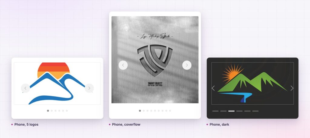
Yes. It is responsive with separate column counts per screen, and it supports swipe. Tooltips can open on click for touch screens.
Yes. The columns setting is responsive, so you can set five on desktop, three on tablet and two on phone.
A logo carousel shows more logos in less space, with hover tooltips, a grayscale effect and a coverflow option. It is free, built on Swiper and fully responsive. Add your logos, keep the speed calm and let recognisable names do the persuading.
Next steps: see the live demo, read the Logo Carousel documentation, compare plans and pricing, or read how the review widget adds a customer voice next to the logos. The tooltip library is Tippy.js.


Comments are closed.