
Elementor Image Compare: Prove the Difference Instead of Describing It
The Elementor image compare slider reveals a second image as the visitor drags: horizontal or vertical, starting anywhere, and free in the base plugin.

Some work is impossible to describe and obvious to see. A restoration, a retouch, a renovation, a treatment, a redesign. Put the two photographs side by side and the reader’s eye has to jump between them, holding one in memory while looking at the other. Most people do not bother.
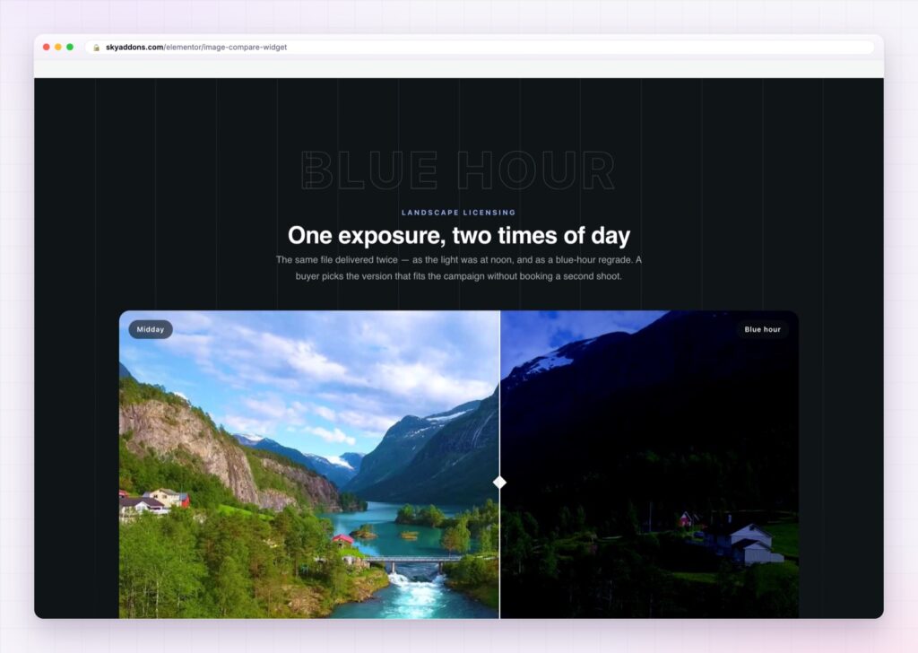
Stack them with a slider and there is nothing to hold in memory. The same pixels change under the same cursor, and the difference becomes undeniable.
The Elementor image compare widget is that slider, and it is in the free plugin.
| Two images in a row | An Elementor image compare |
|---|---|
| The eye travels between them | The change happens in one place |
| Both are half size on a phone | One full width frame at every size |
| Passive | The visitor does the reveal themselves |
| Labels get lost | Before and after labels are part of the widget |
| No sense of how much changed | The slider position is the measurement |
Horizontal or vertical. The handle usually runs down the middle and moves sideways, which suits rooms and landscapes. Switch it to vertical for anything where the difference is top to bottom, like a facade or a full body shot.
A starting position you choose. The slider does not have to begin in the middle. Start it at twenty percent so the after image is mostly visible, or at eighty so the change is a surprise. You can set a different starting point for phones, which matters more than it sounds: on a narrow screen the first impression is most of the impression.
Labels that behave. Before and after labels can sit at the top, middle or bottom, appear only on hover, and fade at a speed you set. They are part of the widget, so they move with the images rather than being two text boxes you positioned by hand.
It invites the drag. An entry animation runs on load, so the handle moves once and the visitor learns what the thing does without instructions. Hovering can take control of the slider, which means people discover it by accident, which is the best way.
Smoothing that makes it feel good. The handle follows the pointer with an easing curve, choosing from four options, with the amount adjustable. It sounds like a detail and it is the difference between a slider that feels physical and one that feels like a form control.
A title and text over the top. An optional heading and paragraph can sit on the image, positioned top, middle or bottom, so the widget can carry a whole section on its own.

The two images have to line up exactly. A slider between two photographs taken from slightly different positions looks like a trick, and people notice before they can say why.
A comparison slider works because it removes the memory step. Side by side images ask the viewer to hold one picture in their head while examining another, and human visual memory is poor at exactly that. Overlaying them means the comparison happens on the retina rather than in recollection, which is why the effect is so much stronger than the extra effort suggests.
There is a persuasion argument as well. The visitor moves the handle themselves, so the reveal is something they did rather than something you claimed. That small act of participation makes the result more credible than the same two images presented passively.
Accessibility is worth a thought. The comparison is visual and interactive, so anybody who cannot use it needs the same information in text. The W3C tutorial on images covers what to write in the alt text: describe what changed, not just what the picture shows.

Yes. The image compare widget is in the free Sky Addons plugin.
Yes. Vertical mode moves the divider up and down instead of side to side, with its own label positions.
Wherever you set it, as a percentage, with a separate value for phones.
Yes. An optional title and paragraph can sit on the image, positioned top, middle or bottom.
Yes. Drag with a finger, and the entry animation shows people what to do without instructions.
The Elementor image compare widget turns two photographs into proof. The change happens in one frame under the visitor’s own hand, horizontally or vertically, starting wherever you choose, with labels and an optional heading built in. It is the shortest route from “we improved this” to “you can see we improved this”, and it is free.
The Image Compare demo runs fifteen comparisons on one page, including vertical sliders, hover labels and full width sections. Every control is listed in the Image Compare documentation.
For a set of images rather than a pair, the Elementor showcase wall and the Elementor image stack are the matching widgets.
Image compare costs nothing. Sky Addons Pro adds the motion, menu and store widgets, and the free versus Pro page shows where the line falls.




Comments are closed.