
Floating Effects: 4 Smart Motions for Any Elementor Widget
The floating effects extension loops translate, rotate, scale and skew on any Elementor widget, each with its own duration, delay and easing. Free.
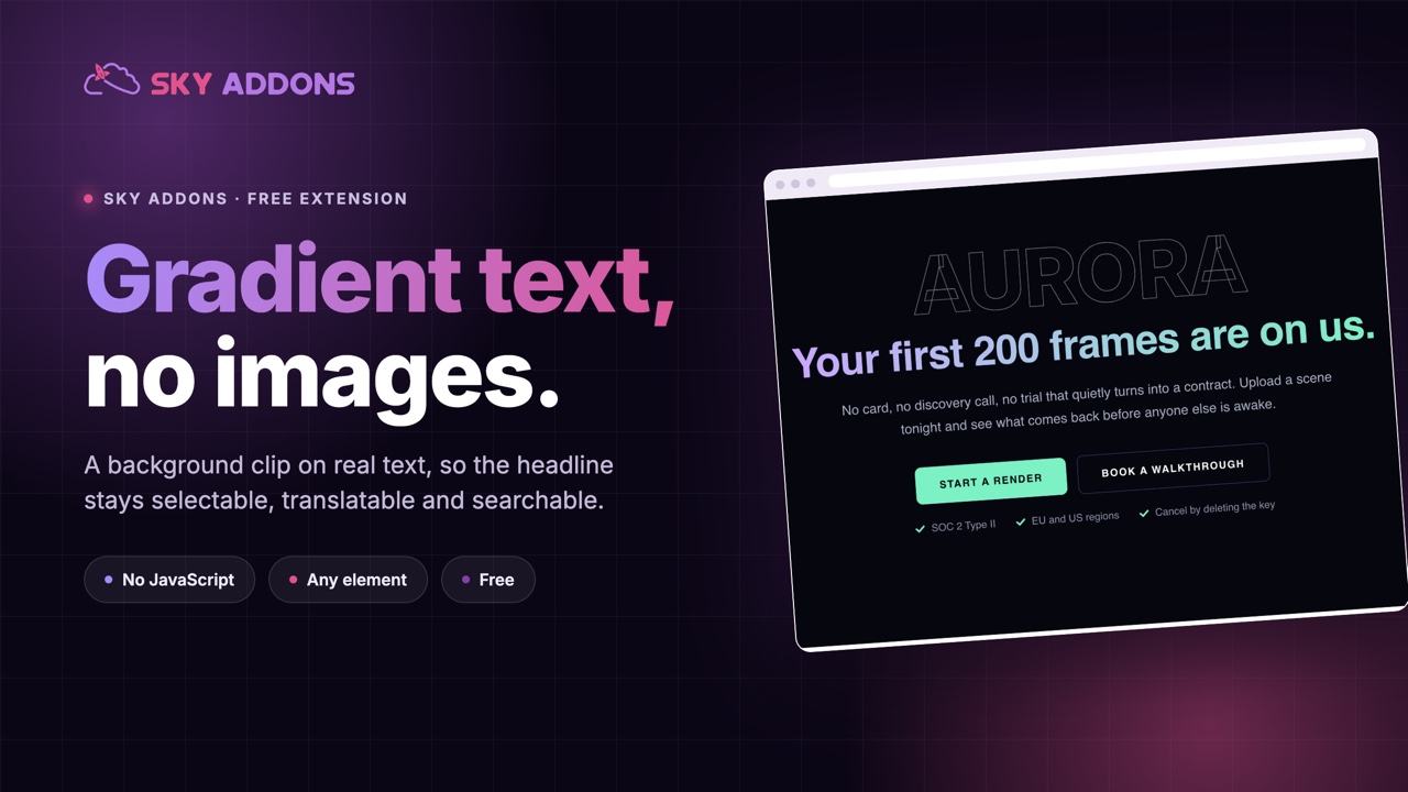
The usual way to get a coloured headline on a WordPress page is to give up and export an image. It looks right, it is done in five minutes, and it is wrong in every way that matters later: it does not resize, it does not translate, search engines cannot read it, screen readers cannot read it, and the day you change the wording somebody has to open a design tool.
Gradient text solves this at the CSS level. The heading stays real text. The gradient is a background painted behind it, clipped to the shape of the letters. Nothing is rasterised, nothing is exported, and the headline stays selectable, translatable and searchable.
| Headline as an image | Gradient text | |
|---|---|---|
| Resizing | one fixed size, or blurry | real type at any size |
| Editing | reopen the design tool | edit the text field |
| Search engines | invisible | indexed like any heading |
| Screen readers | alt text, if you remembered | read normally |
| Translation | one image per language | translated with the page |
| Page weight | a file per headline | none |
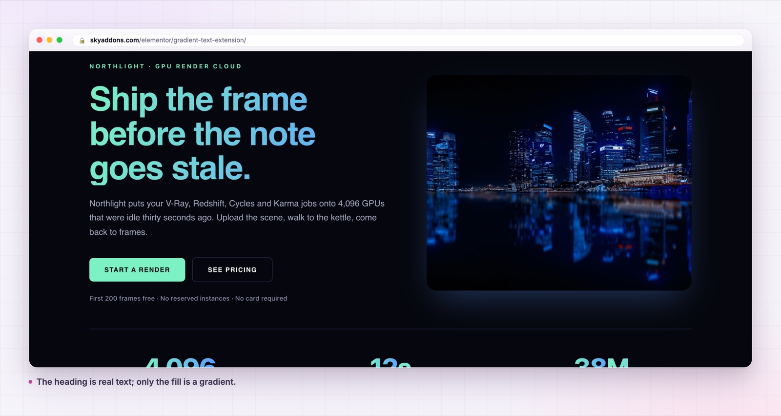
The weight column is worth a second look. A hero headline exported at two times for retina is commonly one hundred kilobytes or more, and it is in the critical path because it is the thing above the fold. The CSS version costs nothing.
It is an extension, not a widget. The controls appear on the element itself, so gradient text works on a heading, a text editor, a button, a counter or any other widget without swapping what you are using.
A real gradient control. The fill is Elementor’s own background group, set to gradient, so you get two colours, positions, an angle and the choice of linear or radial. The default is a violet at #7C3AED, and from there it is your palette.
A custom selector for precision. Leave it empty and the extension colours the usual elements inside the widget: headings, spans, paragraphs, links and divs. Enter h2 or .my-highlight and only that part takes the gradient, which is how you colour two words out of a sentence rather than the whole line.
No JavaScript at all. The effect is background-clip: text with a transparent fill, written by the control as CSS. There is no script, no handler and nothing to initialise, so it costs nothing at runtime and cannot break in the editor.
It survives the things images do not. Change the copy, translate the page, resize the viewport, or let a visitor increase their font size, and the headline still works.
h2 or .accent in Custom Selector. Leave it empty to colour everything inside.That is the whole build. Wrap the words you want in a span with a class in the heading field, point the selector at that class, and you have the two colour headline that every landing page seems to want this year.
Write the selector against something stable. A class you add yourself survives; a selector like
span:nth-child(2)breaks the first time somebody edits the sentence.
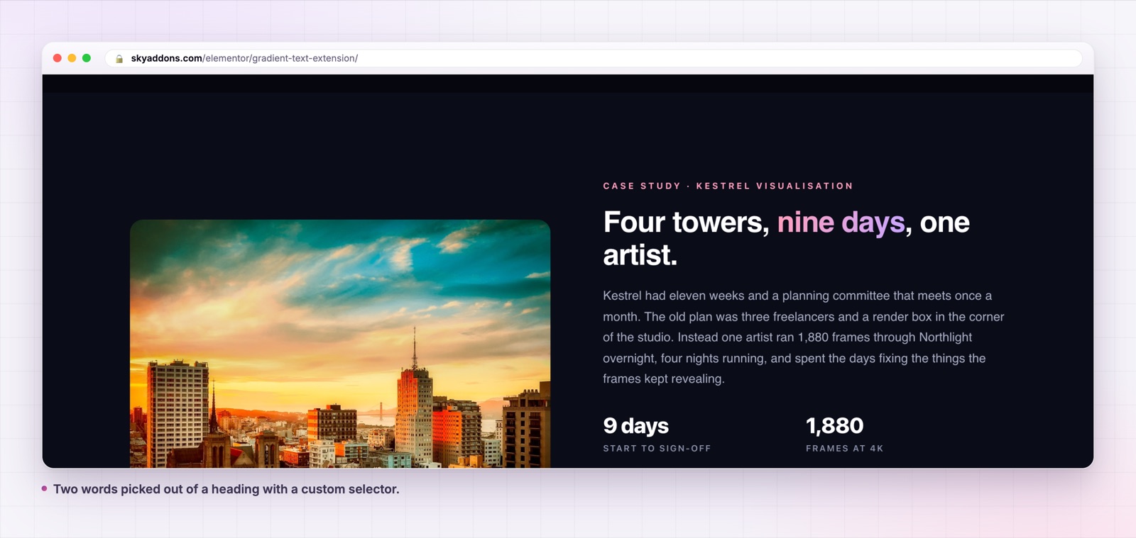
Visually, not much, and that is the point: a gradient headline looks the same whether it came from an image or from CSS. What changes is everything downstream. The marketing team can edit the hero without a designer. The translation plugin can translate it. The page passes an accessibility audit on that heading. The largest contentful paint stops being a picture of some words.
On a site with a dozen landing pages, this is the difference between headlines being content and headlines being assets. Content is cheap to change. Assets are not.
Because this is an extension rather than a heading widget, it applies wherever the controls appear, and a few of those uses are less obvious than a hero line.
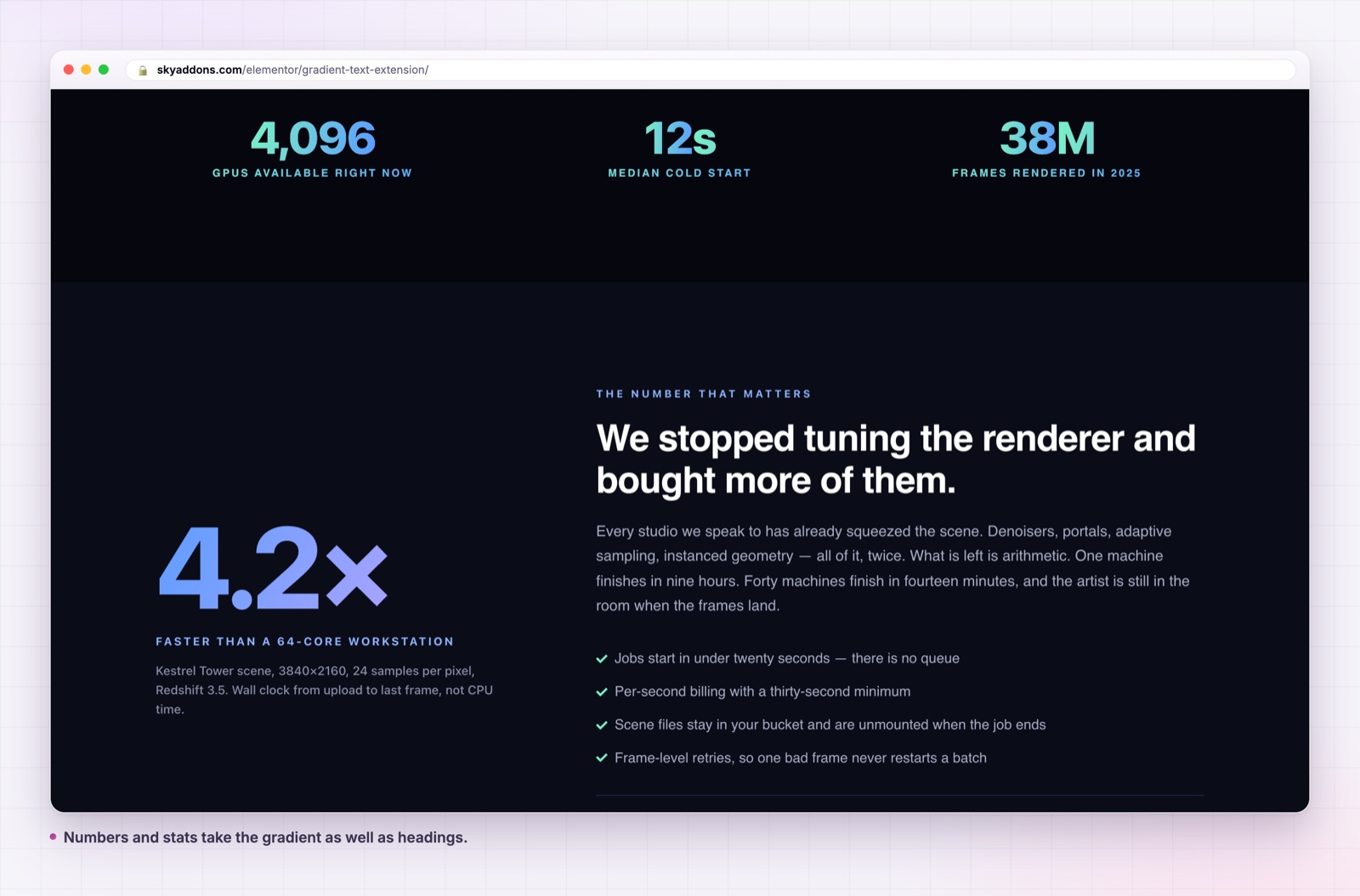
A counter is the best of them. A large animated number in a gradient reads as a designed statistic rather than a plugin output, and the effect survives the count animation because the fill is painted behind the digits rather than applied per frame.
Buttons work too, though carefully. Colouring the label of a ghost button is effective; colouring the label of a solid button usually is not, because the gradient then sits on a coloured background and the contrast goes.
Icon lists and pricing tables take it well on the figure or the plan name, which is often the only part of those widgets that needs to compete for attention.
Text editors are the case to watch. Enabling the extension on a text editor with no selector colours every paragraph inside it, which is almost never what you want. Point a selector at a class and colour the one line that should stand out.
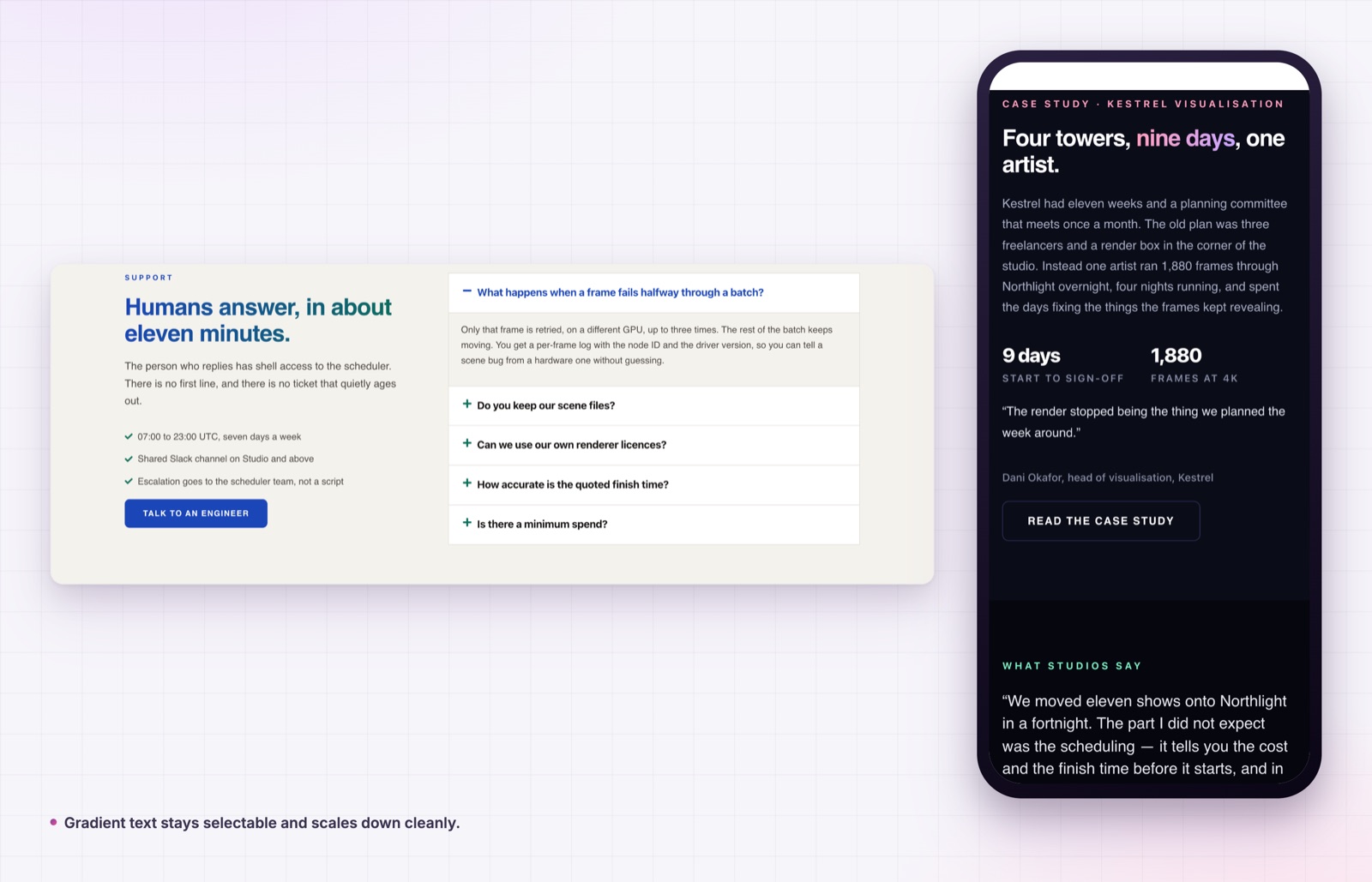
A gradient is a contrast risk, because the text is now two colours and one of them is usually the lighter one. A few rules that keep it accessible.
Check the lighter end of the gradient against the background, not the darker end. If the pale end of your gradient fails the contrast requirement, the headline fails, even though most of it looks fine.
Keep gradients to large text. The contrast rules are more forgiving above roughly twenty four pixels, which is where headlines live anyway. Do not run a gradient through body copy.
Use it once per screen. The effect works because it marks the single most important line. Three gradient headings in a row cancel each other out and the page reads as decorated rather than designed.
Mind the angle on long headlines. At one hundred degrees across a short line the colour shift is obvious; across a line of twelve words it flattens into a single muddy colour, and you lose the effect you paid for. Shorten the line or narrow the colour distance.
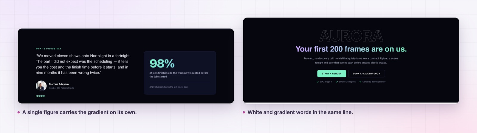
Finally, keep one part of the headline plain. The strongest version of this pattern is almost always a white or dark line with one gradient line beside it, not a whole block in gradient. The contrast between plain and coloured is what makes the coloured part read as emphasis.
Yes. It is an extension in the free Sky Addons plugin and it works on every widget.
No. Elementor and the free Sky Addons plugin are enough.
Yes. Wrap those words in a span with a class in the text field, then put that class in Custom Selector.
No. There is no JavaScript involved. The control writes CSS and the browser does the rest.
Background clipping on text is supported across current browsers. In anything that does not support it, the text falls back to its normal colour, so the headline is still readable.
The image version of a coloured headline costs you a file, a workflow and an accessibility problem. The CSS version costs one switch and a colour picker, and the words stay words.
Try it on the gradient text demo, read the documentation, and pair it with the animated heading widget when the headline needs motion as well as colour. For section level colour instead of type level, see the floating effects extension. The free versus Pro page and the pricing page cover what else is included. The underlying property is documented by MDN as background-clip, and the contrast requirement is set out by the W3C in Understanding Contrast (Minimum).


Comments are closed.