
Reading Progress: 5 Smart Skins That Keep Readers Scrolling
The reading progress widget adds a top bar, a floating bar with a percentage, a side rail, a scroll to top ring or a cursor overlay. Free, no library.
Long articles lose people in the middle. Not at the top, where the headline did its job, and not at the end, where the reader is already committed, but somewhere around the third subheading, when the page stops giving any sense of how much is left. A scroll bar answers that question, badly, and on a phone it is usually not visible at all.
A reading progress indicator answers it properly. One thin bar that fills as the page moves tells a reader they are two thirds through, which is exactly the information that keeps them going. It costs almost nothing to add and it is one of the few interface flourishes that earns its place on a content site.
| Skin | What it is | Best for |
|---|---|---|
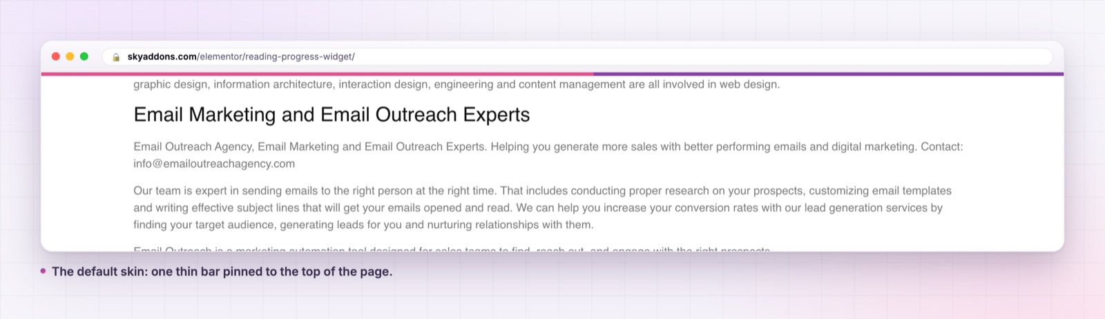
| Default | a thin bar pinned to the top or bottom | any article template |
| Fancy Horizontal | a floating bar with the percentage beside it | pages where the number matters |
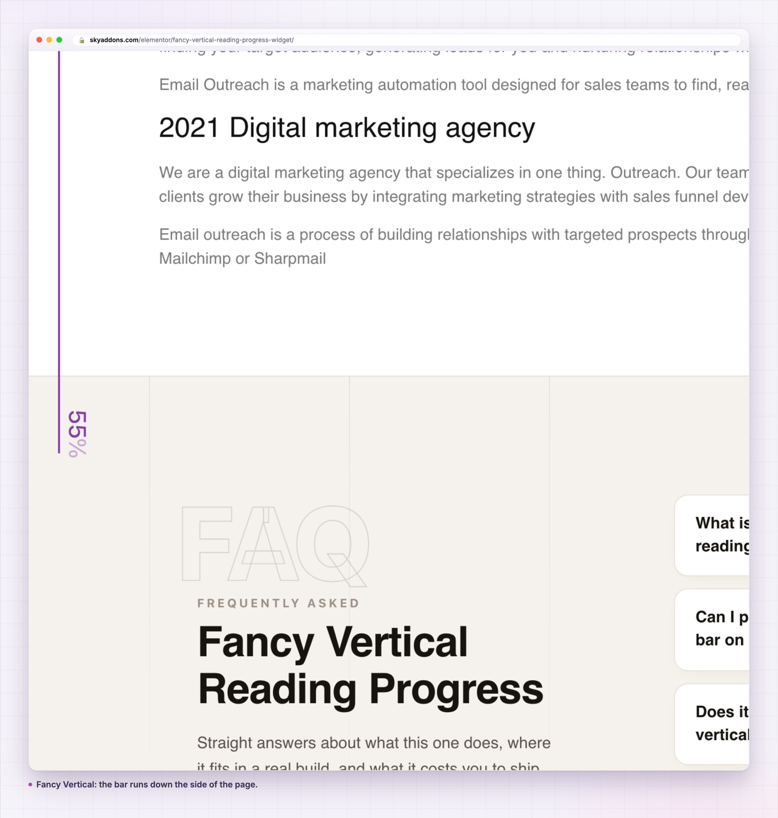
| Fancy Vertical | a bar down the left or right edge | wide layouts with room in the margin |
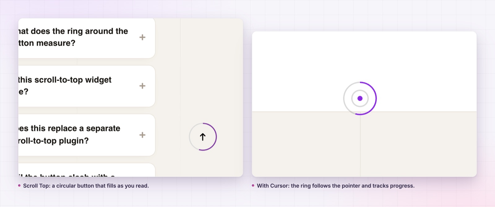
| Scroll Top | a circular button that fills as you read | long pages that need a way back |
| With Cursor | a ring that follows the pointer and tracks progress | design led desktop pages |
Every skin reads the same scroll position, so the choice is purely a design one. You can change it after the page is built without touching anything else.
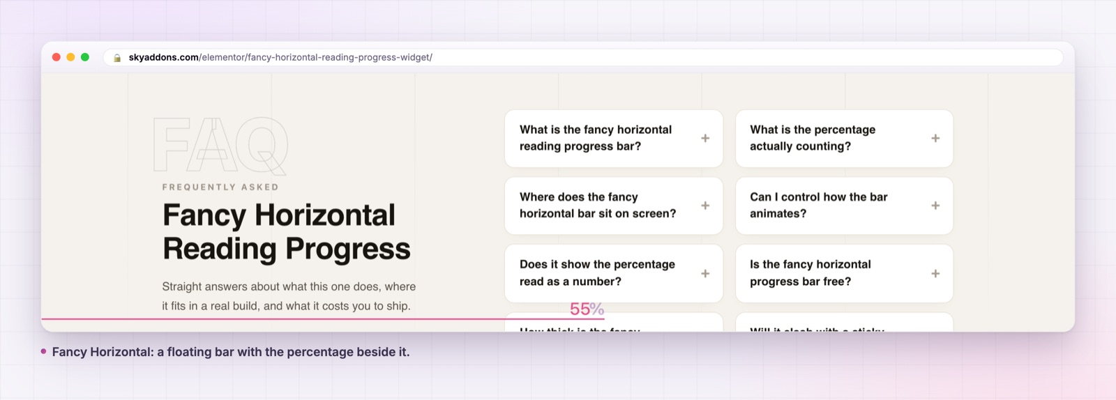
A percentage, when you want one. Show Percentage adds the live number beside the bar on both fancy skins, and it is rendered only when the switch is on, so nothing empty sits in the markup when it is off.
A scroll to top button that hides until it is useful. The Scroll Top skin takes a Show After value in pixels, so the button appears once a reader has moved far enough to want it, and a Scroll Animation duration in milliseconds for how fast it travels back.
A cursor made of three layers. The With Cursor skin draws a dot that follows instantly, an inner ring that lags behind it and an outer ring with the progress arc that lags further still. Ring Follow Lag sets the distance in milliseconds, and zero means instant.
A blend mode for the cursor. Normal, Difference, Exclusion, Multiply, Screen or Overlay, applied to every cursor layer, which is how you keep a light ring visible over both a white section and a photograph.
Offsets on the button. The scroll to top button takes horizontal and vertical offsets behind a popover, so it can sit clear of a chat bubble or a cookie bar.
No vendor library. The widget carries no third party scroll plugin. The logic is about eighty lines, inlined, with every scroll and mouse handler wrapped in a frame request so the updates stay smooth.
Put the widget in the single post template once rather than on each page. The scroll handlers are page global by design, so two instances of the same skin on one page will fight, and the second one wins.
The measurable change is scroll depth on long pages. The reason is not magic: a reader who can see that they are seventy percent through a piece is much less likely to abandon it than a reader with no idea whether two screens remain or twelve.
The second change is on mobile, where it matters more. Phone browsers hide the scroll bar, so there is no native signal at all about page length. A thin bar at the top of the viewport is the only thing telling a reader that the article ends soon.
The temptation with this widget is to take the most elaborate option. A few honest notes on each.
Default is right for most content sites. It is one bar, it sits above or below the viewport edge, and it never competes with the writing. If you are adding a progress indicator to a blog for the first time, start here and stop here.
Fancy Horizontal earns the extra weight on pages where the number is meaningful, like a long form guide or a multi step form page. The percentage is a real number, not a rounded guess, so it moves smoothly rather than jumping.
Fancy Vertical needs a layout with actual margin. On a centred article at 800 pixels wide on a large screen it looks considered. On a full width page it sits on top of the content, and you will end up with the spacing control fighting your section padding.
Scroll Top is the most practical of the five, and the only one that does a job beyond information. On a two thousand word page it saves a reader a lot of thumb work, and the filling ring means it is not just another floating button.
With Cursor is a desktop only effect, since touch devices never fire a mouse move, and the elements simply stay hidden. It suits a portfolio or a studio site. On a documentation site it will read as a distraction, which it is.
One last note that applies to every skin: all of them account for the WordPress admin bar, so what you see while logged in matches what a visitor sees.
A reading progress bar goes wrong in one of two ways: it is invisible, or it is a stripe of brand colour shouting at the top of every page. Both are avoidable.
Use your accent colour for the fill and a very light neutral for the track. The contrast between fill and track is what makes the bar readable; the contrast between the bar and the page is what makes it loud. A four pixel bar in the accent colour on a near white track is visible without being a design element.
Set the transition duration rather than leaving it. The default two hundred milliseconds smooths the fill so it glides instead of stepping, which matters on a page with lazy loaded images where the total height changes as you scroll.
If the page has a sticky header, check the bar against it. The default and fancy horizontal skins sit at the viewport edge, so a sticky header with a shadow can swallow a thin bar completely. Either move the bar to the bottom with the Position control or raise its size by a pixel or two.
Yes. All five skins are in the free Sky Addons plugin.
No. Elementor and the free Sky Addons plugin are enough.
No. The vendor dependency was removed and the logic inlined into the widget script.
Not of the same skin. The scroll handlers are page global, so the second instance cancels the first. One per page is the intended use.
No, and that is deliberate. Cursor tracking needs a pointer, so on touch devices the layers stay hidden. Use the Scroll Top skin instead.
A progress indicator is a small thing that makes long pages feel finishable. Five skins cover everything from a plain bar to a cursor overlay, with no library loaded and no Pro licence needed.
Try each one on the reading progress demo, read the documentation, and if you are building the article template itself, the table of contents widget is the natural companion. For a different kind of scroll behaviour, see the scroll stack widget. The free versus Pro page and the pricing page cover the rest of the plugin. The underlying browser behaviour is documented by MDN in the scroll event reference, and the cursor skin uses mix-blend-mode.

Comments are closed.