
Elementor Content Switcher: Let Visitors Choose the Version That Fits Them
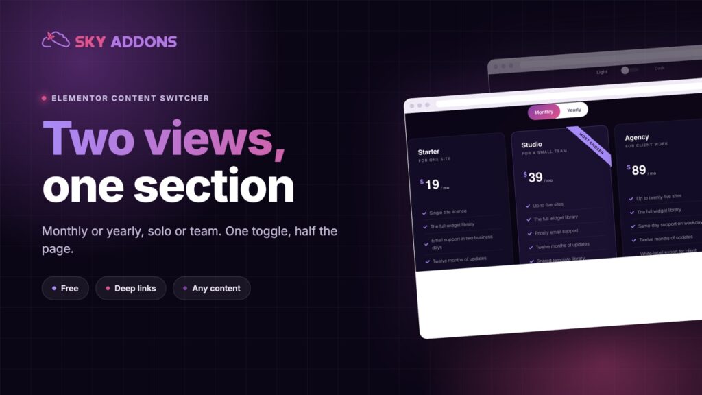
The Elementor content switcher toggles two or more views in one section: monthly or yearly, solo or team, with fade or slide and deep links. Free to use.
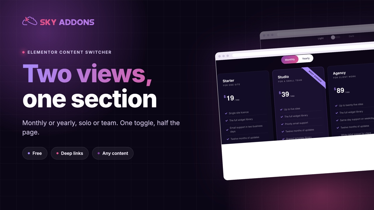
Some pages have two right answers and one visitor. Monthly or yearly. Solo or team. Home delivery or collect in store. Show both at once and the page doubles in length. Show one and half the audience sees the wrong thing.
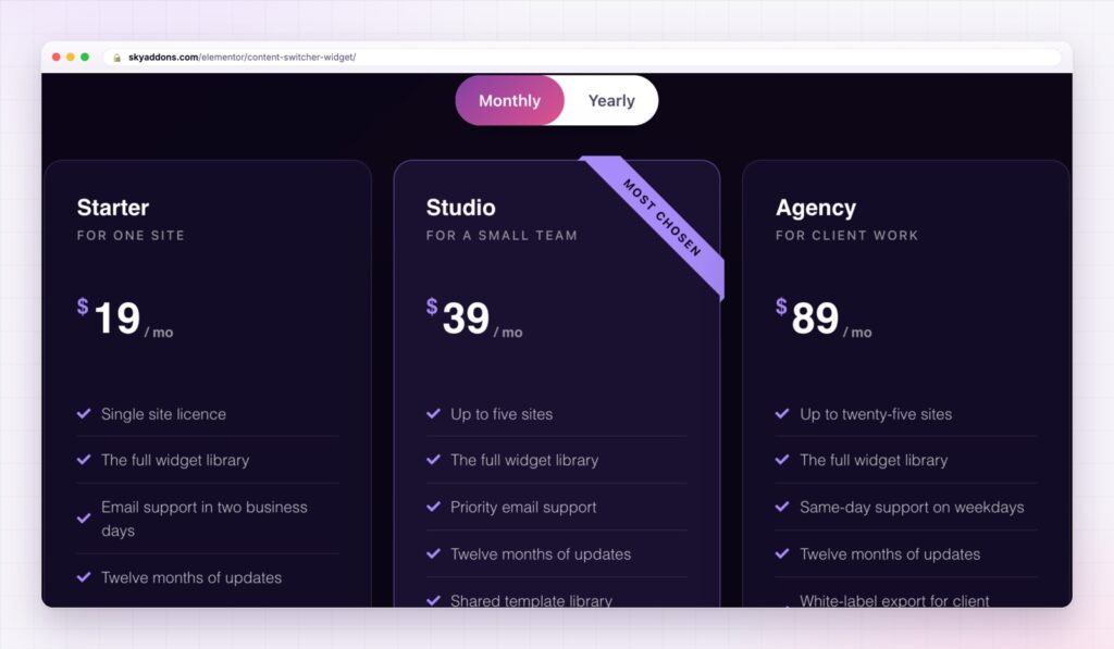
A content switcher gives the choice to the visitor. Two labels sit above a section, one is active, and clicking the other swaps the content below it. The page stays short, and each reader sees the version that is theirs.
The Elementor content switcher does that with any content: text, a saved Elementor template or a whole pricing table. It is in the free Sky Addons plugin.
| Both versions on the page | An Elementor content switcher |
|---|---|
| A page twice as long | One section, two views |
| The reader scans past half of it | The reader sees only their version |
| Comparison is buried in the layout | The choice is a control at the top |
| Duplicated design to keep in sync | One place to style |
| No way to link to one version | A link that opens the version you name |
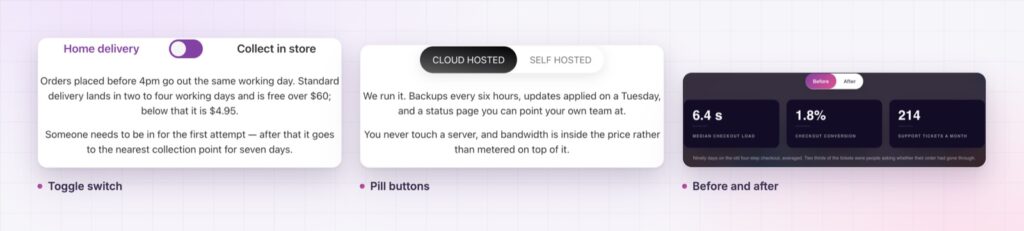
Five switcher styles. Round, round fancy, square, square fancy and button. The toggle styles suit two options. The button style takes more than two, so a section can switch between three or four views.
Any content behind each side. Every option holds custom text or a saved Elementor template. That is how a switcher can swap a paragraph, a pricing grid or a full layout without you rebuilding the page.
Deep links. Give each option a URL slug and the page can open on that option from a link, written as the page address followed by a hash and the slug. A link in an email can land on the yearly plan, not on the default one.
Transitions that suit the content. Switch with no animation, a fade, a slide up or a zoom in, and set the speed in milliseconds. A quiet fade suits pricing. A slide suits a story.
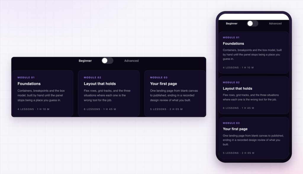
Icons and layout. Each label can carry an icon before or after the text. The switcher can sit on the left or centre, and the tabs can run horizontally or vertically.
Styling for both states. Typography, colour, background, border, radius and shadow are set for the normal and active states, and the bar behind the labels has its own padding and background. For a choice that reveals detail rather than swaps a view, the advanced accordion is the matching widget.
Make the default the option most visitors want. A switcher helps the minority, and the majority should never need to touch it.
A switcher removes a decision from the page and hands it to the visitor at the moment it matters. They see two options, choose one and get an answer built for them. There is no scrolling past the version that does not apply, and no design that has to hold both at once.
A toggle should also be usable without a mouse. The W3C switch pattern describes how a two state control should behave for keyboard and screen reader users, and it is worth checking your labels against it.
Yes. The content switcher widget is in the free Sky Addons plugin.
Yes. Each option can use custom text or a saved Elementor template.
Yes. Give the option a URL slug and link to the page address followed by a hash and that slug.
Yes. The button style takes more than two options, and the tabs can run horizontally or vertically.
Yes. It resizes to its container, and the vertical layout helps when there are several labels.
The Elementor content switcher lets the visitor choose the version of a section that applies to them. It swaps any content, comes in five styles, animates with a fade, slide or zoom and opens on a chosen option from a link. It is free, and it keeps the page as short as the decision it serves.
The Content Switcher demo runs seventeen switchers on one page, from pricing to specifications. Every control is listed in the Content Switcher documentation.
For plans set side by side rather than switched, the Elementor pricing table and the Elementor comparison table pair well with a switcher.
The content switcher costs nothing. Sky Addons Pro adds the chart, motion and store widgets, and the free versus Pro page shows where the line falls.


Comments are closed.