
Equal Height for Elementor: Line Up Cards That Refuse to Match
Equal height in Elementor without custom CSS. Pick from 9 targeting modes, match any widget or selector, and switch it off on mobile in one click.
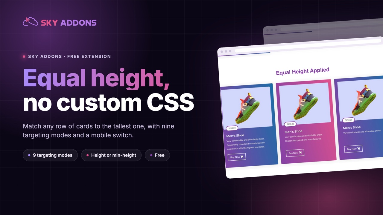
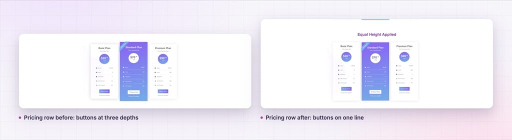
You write three service cards. The first has a two line description, the second has four lines, the third has one. On screen they become three different heights, the buttons sit at three different depths, and the row looks like it was assembled by accident. Every content change breaks the alignment again.
This is the most common layout complaint in Elementor, and the usual fixes are all bad. Padding the short card is guesswork that dies the next time someone edits the copy. Trimming the text to fit means the design is dictating the content. Writing a flexbox rule works until the widget is not a direct flex child, which it often is not.
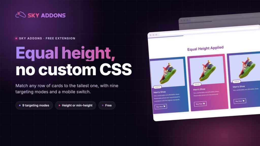
Equal height is a Sky Addons extension that solves it properly. It measures the tallest element in a group and applies that height to the rest, then re-measures on every resize. No custom CSS, no fixed pixel values, and nothing to redo when the copy changes.
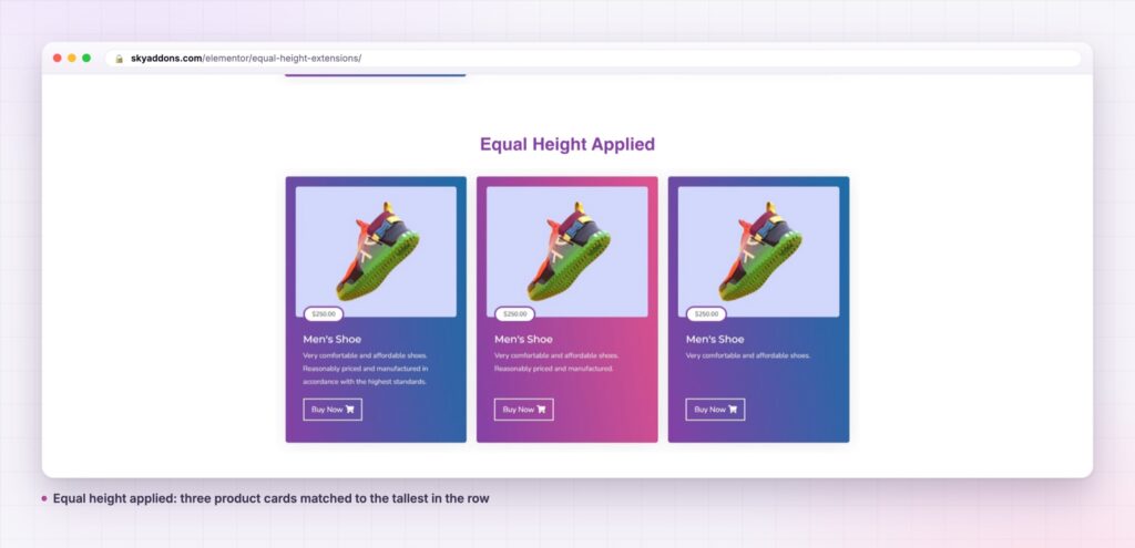
The pattern is always the same. The content is genuinely different, the layout still has to look deliberate.
| Approach | What breaks |
|---|---|
| Padding the short card by hand | Any copy edit undoes it. Wrong at every screen width but one |
| Trimming the text to fit | The design is deciding the content. Real work gets cut |
| A custom flexbox or grid rule | Only works when the target is a direct child. Fails inside widget wrappers |
| Setting a fixed pixel height | Tall content overflows or is clipped. Breaks on mobile |
| Equal height extension | Measures the real tallest element, applies it to the group, re-measures on resize |
Nine targeting modes, so you pick what gets measured. The default mode, Select Widgets, gives you a dropdown of every widget type in that section and equalizes each type as its own group. The other eight modes reach further in: all widget wrappers as one group, or the first, second or third child inside each widget, or one and two levels deeper again, or any CSS selector you type. The deep modes exist because the thing that needs to match is often not the card, it is the description block inside the card.
A widget picker that reads your actual layout. The Select Widgets dropdown is not a fixed list. It scans the section in the editor and offers the widget types that are really in it. Pick Info Box and every info box lines up, while the heading above them is left alone.
Height or min-height, your choice. One control decides which CSS property is written. Use height for a strict grid. Use min-height when a card may legitimately grow past the group, for example when a plugin injects a badge.
Off on mobile by default. Stacked cards on a phone do not need matching heights, and forcing them produces tall boxes with dead space. The extension ships with mobile disabled and a separate switch for tablet, so the desktop grid is tidy and the phone layout stays compact.
It only loads when you use it. The matchHeight library and the handler are enqueued in the before render hook, and only when the toggle on that element is on. A page with no equal height section ships no equal height JavaScript.
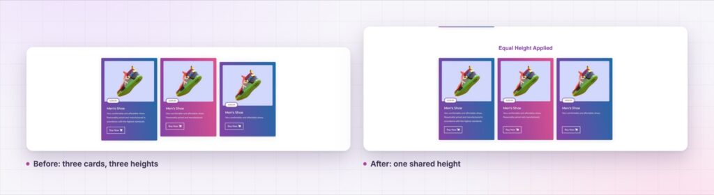
The extension groups elements, measures the tallest one in each group, and writes that height to the others. It repeats the measurement on resize and on orientation change, so a phone turned sideways gets a correct layout rather than a stale one.
The grouping rule is what makes it usable. In Select Widgets mode each widget type is its own group and row grouping is switched off, because you have already said exactly what to match. In the other modes elements are grouped by visual row, so a twelve card grid on three rows lines up row by row rather than forcing all twelve to the height of the tallest one anywhere on the page.
A grid does not look designed because the boxes are the same size. It looks designed because nothing in it draws attention to an accident. Equal height removes the accident, then gets out of the way.
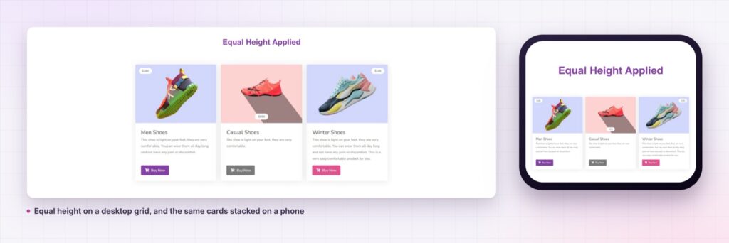
The extension is attached to sections, columns and containers, not to any one widget, so it works on anything you can place. Testimonials with quotes of different length, comparison cards, download boxes, statistic tiles, category tiles above a shop grid. If the content is variable and the layout should not be, it applies.
It also survives a redesign. Because the target is a widget type or a selector rather than a specific element, swapping one card widget for another of the same type keeps the alignment working.
If you want the underlying browser behaviour rather than a measured height, read the MDN guide to box alignment in grid layout, which covers how stretch and align-items decide heights natively. The extension exists for the many cases where that native behaviour cannot reach the element you care about.
Yes. It ships in the free Sky Addons plugin, with all nine targeting modes and both CSS property options. Nothing in this extension is behind the Pro licence. See free versus Pro for the full split.
No. It needs Elementor and Sky Addons. The matching library is bundled with the plugin.
Only pages that use it load anything. The library and the handler are enqueued in the before render hook and only when the toggle is on, so an unrelated page ships no extra JavaScript.
It can, but it is off on mobile by default, because stacked cards rarely benefit. There is a separate switch for tablet. Turn either back on when your layout stays in columns at that width.
Yes. The panel is registered for sections, columns and containers. On containers it appears under the Layout tab rather than Advanced.
Equal height measures the tallest element in a group and applies that height to the rest, then re-measures whenever the window changes. Nine targeting modes mean you can match whole widgets, a block inside them, or any selector you name. It is free, it loads only where it is used, and it is off on mobile until you say otherwise.
See it running on the equal height demo, then follow the equal height documentation for every control. If your grid also needs the cards themselves to react, the tilt effect and reveal effects posts cover the motion side. Compare plans on pricing.

Comments are closed.