
Advanced Tooltip: 15 Placements With Powerful Tippy Control
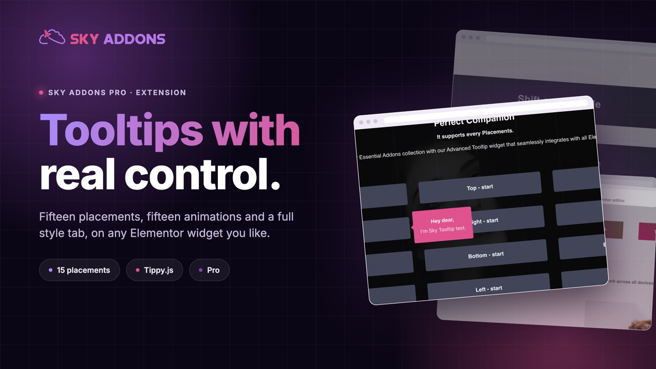
The advanced tooltip extension adds a Tippy powered tooltip to any Elementor widget, with 15 placements, 15 animations and a full style tab.
Pages get long because everything has to be explained on the page. A plan name needs a note about what it includes. A form field needs a sentence about the format. A feature list needs a line about the limit. Written inline, each of those is fine; written inline six times, the page has turned into a manual and the actual offer is somewhere below the fold.
A tooltip moves that detail one interaction away. The explanation is there for anybody who wants it, and invisible to everyone who does not. The advanced tooltip extension attaches one to any Elementor widget, with real control over where it appears, how it animates and what it looks like.
| Browser title attribute | Advanced tooltip | |
|---|---|---|
| Delay | about a second, not adjustable | show and hide delays you set |
| Placement | wherever the browser decides | 15 positions, or auto |
| Styling | none | colour, background, border, shadow, typography |
| Animation | none | 15 options |
| Trigger | hover only | hover or click |
| Touch devices | usually nothing | works with the click trigger |
The delay is the part people underestimate. A native tooltip waits about a second, which is long enough that most visitors never see one. A two hundred millisecond delay changes the feature from decoration to something people actually use.
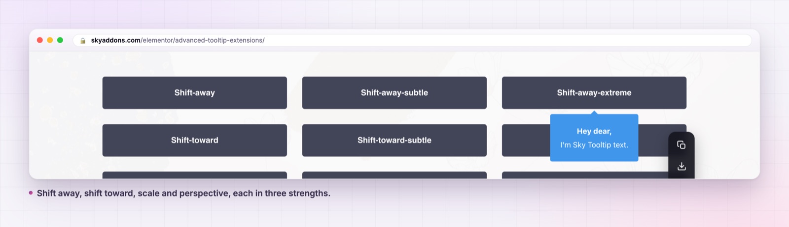
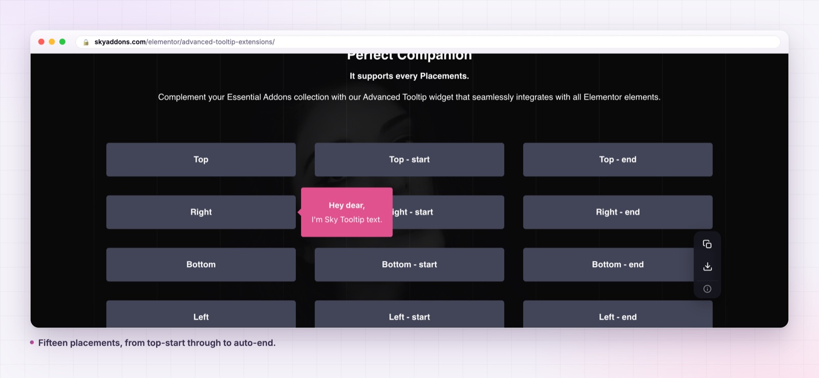
Fifteen placements. Top, right, bottom and left, each with a start and end variant, plus auto, auto-start and auto-end. Auto lets the library pick, which is what you want near the edge of a viewport.
Fifteen animations. Fade, shift away, shift toward, scale and perspective, each of those four in subtle and extreme variants, plus animate fill. Show and hide durations are separate controls.
Separate show and hide delays. Both in milliseconds, up to five thousand. A short show delay stops tooltips flashing as the pointer crosses a row of icons; a longer hide delay lets a visitor move onto the tooltip itself.
An interactive mode. Switch it on and the tooltip stays open while the pointer is inside it, which is what makes a link inside a tooltip usable.
A custom trigger selector. By default the tooltip attaches to the widget’s own container. Point Custom Trigger Selector at another element and you can separate where the tooltip appears from what opens it.
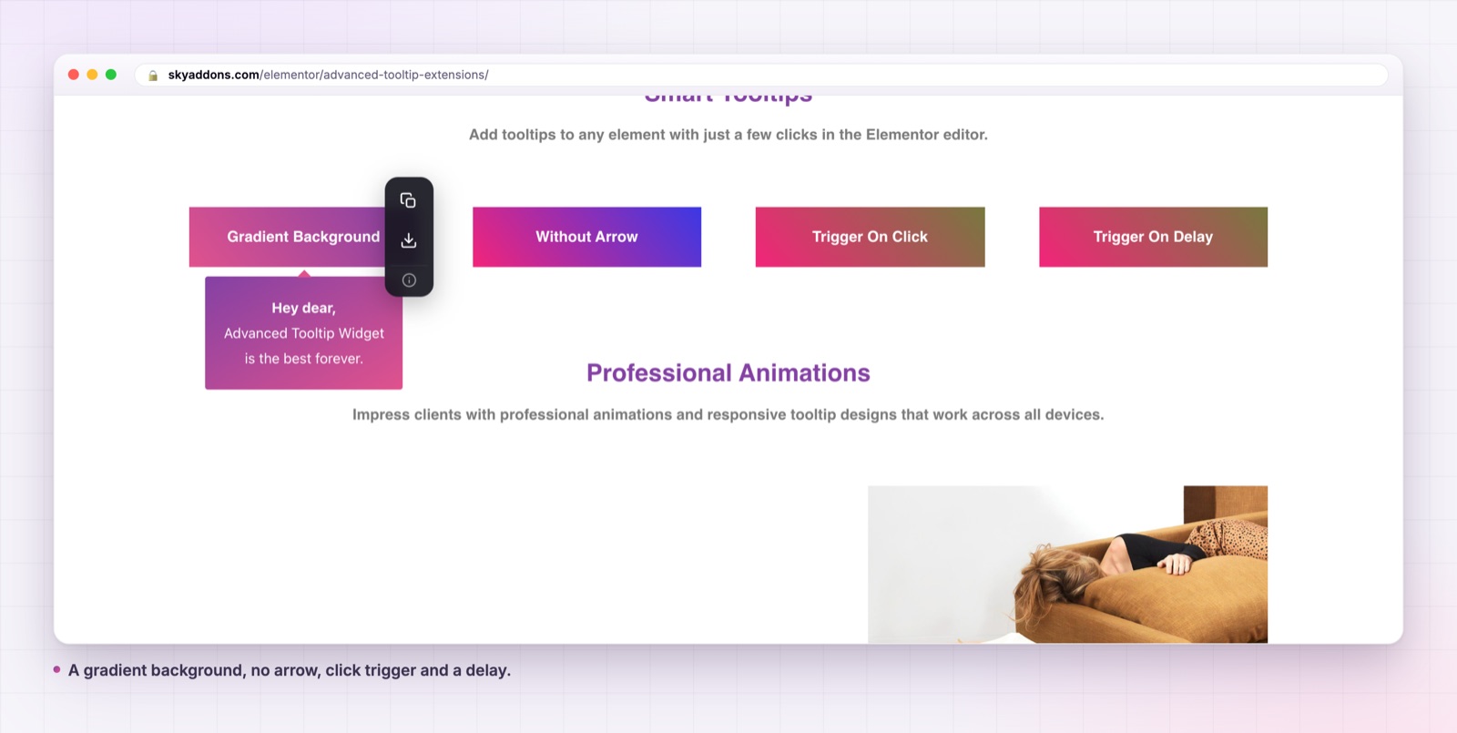
A full style tab. Max width, alignment, text colour, background including gradients, padding, border, radius, typography, text shadow, box shadow and arrow colour. Each tooltip gets its own theme name, so two tooltips on one page can look completely different.
Click as a trigger. With hide on click set to true, false or toggle, which is how a tooltip becomes a small popover for touch devices.
Check every tooltip near the edge of the screen at a phone width. A tooltip set to left on an element that sits at the left margin will have nowhere to go, which is exactly what the auto placements are for.
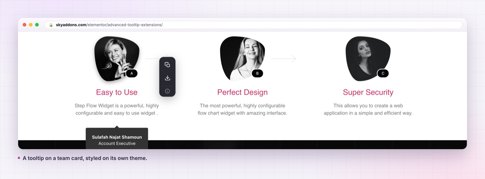
The page gets shorter without losing information. That is the whole trade, and on a pricing or comparison page it can be the difference between the plans fitting on one screen and the visitor scrolling past the decision point.
There is a second effect worth naming. Tooltips let you write for two audiences at once: the fast reader who wants the headline, and the careful reader who wants the qualification. Without them, you either bore the first or mislead the second.
Most of the difference between a tooltip that feels good and one that feels broken comes down to two settings nobody reads about.
The trigger decides who can use it. Hover is the default and the right choice for supplementary notes on a desktop heavy page, such as a dashboard or an internal tool. Click is the right choice for anything a phone visitor needs, and it has the useful side effect of making the tooltip deliberate rather than accidental.
The delays decide whether it feels responsive or twitchy. A show delay of roughly one hundred and fifty to two hundred and fifty milliseconds is long enough that tooltips do not fire while a pointer crosses the element on its way somewhere else, and short enough that a visitor who paused gets an answer immediately. A hide delay a little longer than the show delay gives someone time to move onto the tooltip itself, which matters when interactive mode is on and the tooltip contains a link.
Animation duration is separate from both, and shorter is better. Two hundred milliseconds in and one hundred and fifty out reads as instant but not abrupt. The extreme animation variants look good in a demo and get tiring on a page with a dozen tooltips, so keep those for the one tooltip that is meant to be noticed.
Tooltips are easy to add and easy to misuse, and the misuse is always the same: putting something important where only a pointer can find it.
Never hide essential information in a tooltip. If a visitor needs it to make a decision, it belongs on the page. A tooltip is for the detail that supports a decision already being made.
Assume touch users will not hover. On a phone there is no hover state, so a hover tooltip either does nothing or fires on tap and behaves unpredictably. If the content matters on mobile, set the trigger to click.
Keep it to one sentence. The max width control exists because long tooltips need it, but a tooltip that needs three lines is usually a sign the content belongs in the page.
Write the trigger so it looks like a trigger. A dotted underline, a small question mark icon or a distinct colour tells people something is there. A tooltip on a plain word is a tooltip nobody finds.
Mind the stacking context. The tooltip is attached to the widget’s outer container, so a parent with hidden overflow can clip it. If that happens, the custom trigger selector lets you move the anchor to an element that is not inside the clipped box.
Worth being straight about this: a hover tooltip is a mouse interaction, and mouse interactions leave some people out. Two practical steps help.
Use the click trigger wherever the tooltip carries anything beyond a nicety. A click target is reachable in ways a hover target is not, and it behaves the same on a phone as on a desktop.
Repeat anything load bearing in the page text or in the element’s own accessible name. If the plan really does have a fair use limit, that sentence should exist somewhere a screen reader will reach without a pointer.
Treat the tooltip as an enhancement on top of a page that already makes sense. Done that way it is a genuine improvement to a dense page; done as a hiding place it is a problem you will hear about later.
It is a Pro extension, in Sky Addons Pro. It applies to every Elementor widget rather than being a widget of its own.
No. It needs Elementor and Sky Addons Pro.
Yes. Turn interactive mode on so the tooltip stays open while the pointer is inside it, and set a hide delay long enough to reach it.
Set the trigger to click. Touch devices have no hover state, so a hover tooltip is unreliable on a phone.
Yes. Each one gets its own theme name, so the style controls apply per element rather than site wide.
A tooltip is the cheapest way to make a dense page readable: the detail stays available, the layout stays short. Fifteen placements, fifteen animations and a full style tab mean it can look like part of your design rather than a browser default.
See the range on the advanced tooltip demo, read the documentation, and pair it with the comparison table, which is where tooltips pay for themselves fastest. For content that needs a panel rather than a note, see the offcanvas panel widget. The free versus Pro page and the pricing page cover what else is included. The library underneath is Tippy.js, and the W3C publishes the tooltip pattern in the ARIA Authoring Practices Guide.

Comments are closed.