
Floating Effects: 4 Smart Motions for Any Elementor Widget
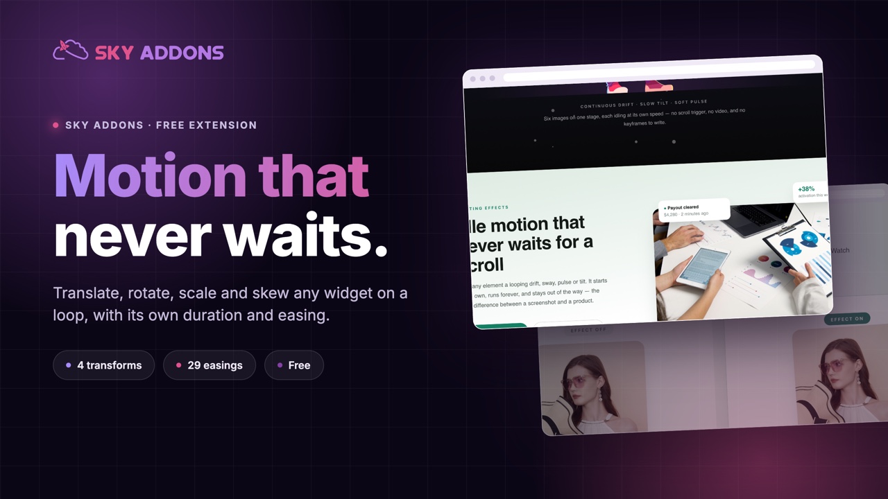
The floating effects extension loops translate, rotate, scale and skew on any Elementor widget, each with its own duration, delay and easing. Free.
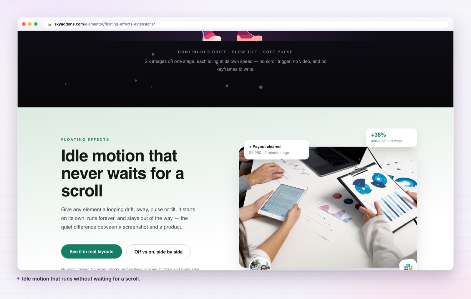
Entrance animations have a problem: they run once. A visitor scrolls past, a card slides in, and from that moment the section is completely still. If they scroll back up, nothing happens. The page was alive for four hundred milliseconds and then it was a screenshot.
Floating effects solve the other half. Instead of playing once on arrival, they run continuously and quietly: a card that drifts a few pixels, a badge that turns half a degree, a shape that breathes. The movement is small enough that nobody consciously notices it, and large enough that the page reads as alive rather than printed.
| Entrance animation | Floating effects | |
|---|---|---|
| When it runs | once, on scroll into view | continuously |
| After it runs | the section is static | the section keeps breathing |
| Scroll back up | nothing | still moving |
| Controls | one preset, one duration | 4 transforms, each with its own timing |
| Feels like | an arrival | a living page |
The two are not rivals. An entrance animation says “this has arrived”. Floating effects say “this is on”. Most good landing pages use both, on different elements.
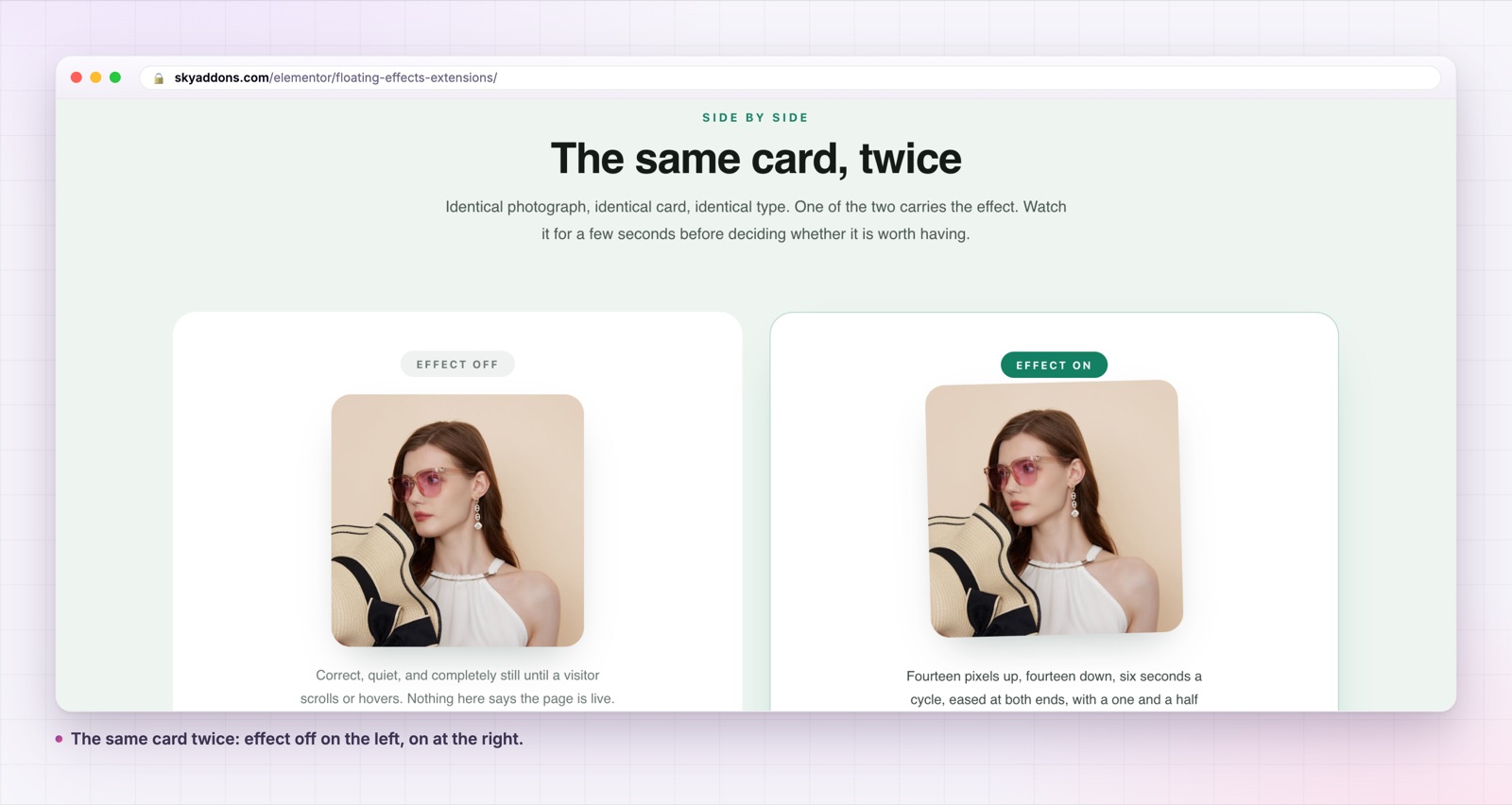
Four transforms, each with its own timing. Translate, Rotate, Scale and Skew are separate popovers. Each carries its axis sliders plus its own duration and delay, so a card can drift slowly on one cycle while its badge turns on a different one.
Real axis ranges. Translate runs from minus one hundred to one hundred pixels on X and Y. Rotate covers minus one hundred and eighty to one hundred and eighty degrees on X, Y and Z. Scale runs zero to five. Skew matches rotate’s range. The values are sliders, so the fine adjustment happens by eye.
Twenty eight easing curves. The Easing control offers the full anime.js table: quart, quint, sine, expo, circ, back and bounce, in their In, Out, InOut and OutIn variants, plus the default. Easing is what separates drift from bouncing, and it is the control most people never touch.
Direction and loop. Alternate, normal or reverse, with a loop switch. Alternate is the one that makes a drift feel natural, because the element eases back the way it came instead of snapping to the start.
A perspective value for 3D. Rotate on X or Y needs perspective to read as depth rather than as a squash. The control defaults to one thousand pixels and sits with the other animation options.
It applies to every widget. The controls are injected into the Advanced tab of every Elementor element, so a heading, an image, a button and a form all take the same four transforms.
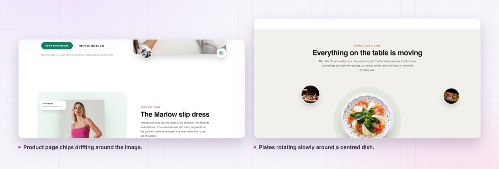
If you can consciously watch the movement from a normal viewing distance, it is too big. Halve the distance and double the duration, and it will look more expensive immediately.
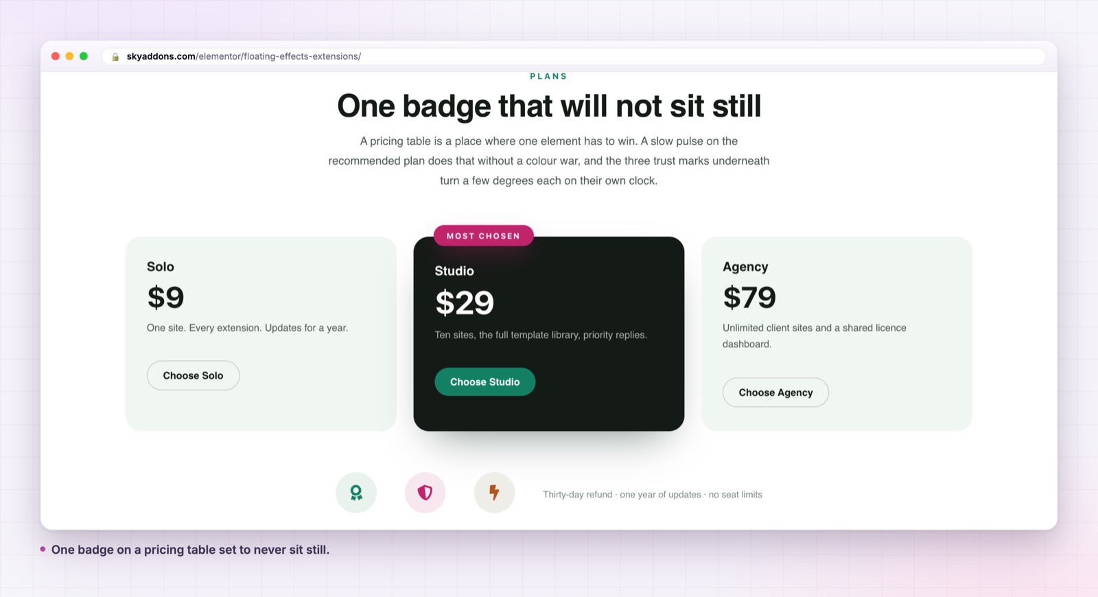
A static page and a page with quiet idle motion feel different in a way that is hard to put in a metric. The closest honest description is that the page stops feeling like a document. Sections that are technically identical read as more considered, because something on them is alive.
The practical version is attention control. A single moving element in an otherwise still section is the strongest way to point at something without making it bigger, brighter or louder. That is why the effect belongs on the one badge that matters rather than on every card in the grid.
Four transforms sounds like a menu, but in practice each one has a job it does better than the others.
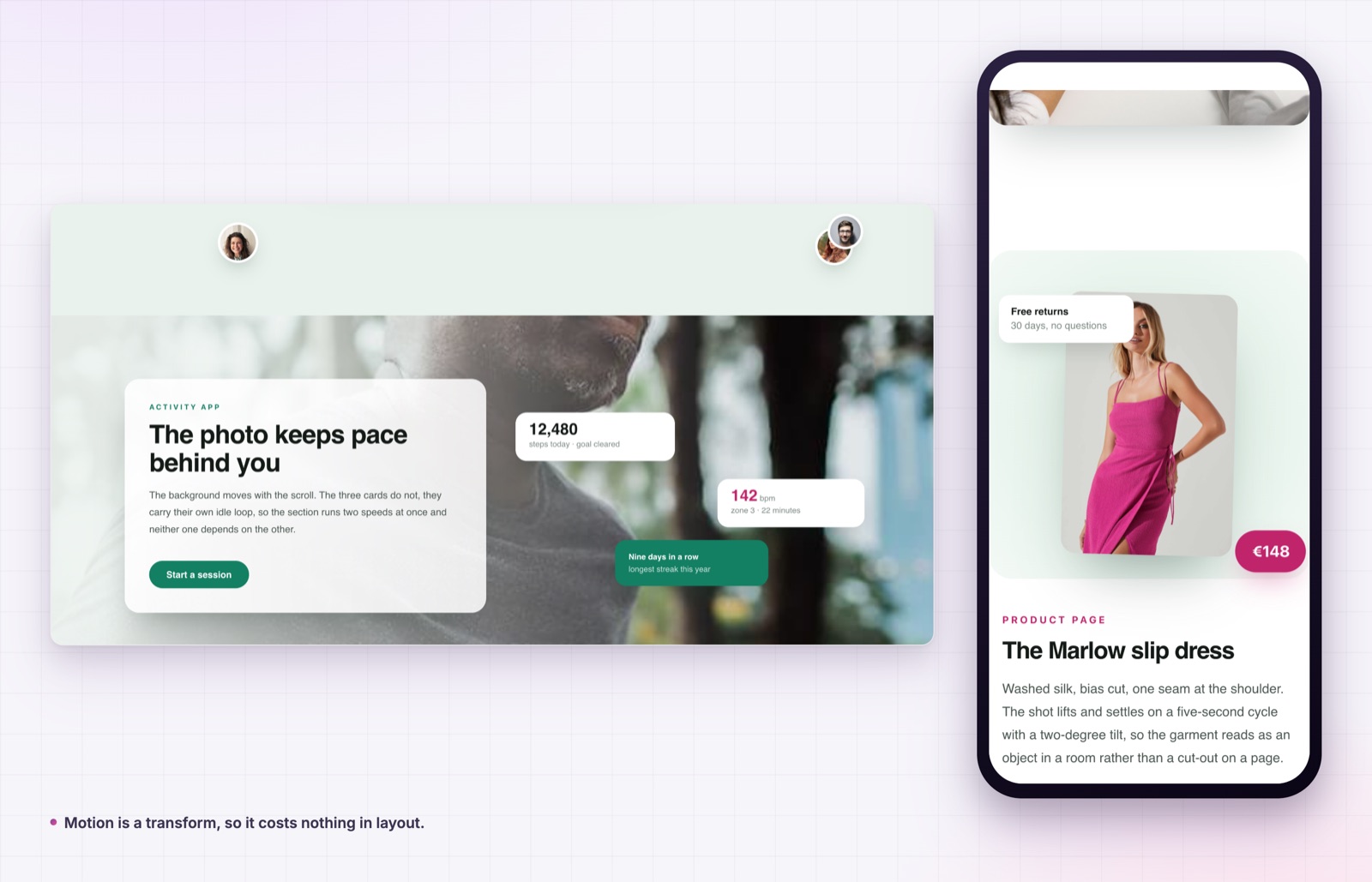
Translate is the workhorse. A few pixels on Y is the classic drift, and it is the safest choice on anything rectangular: a card, a screenshot, a device frame. Translate on X reads as sliding rather than floating, so keep the range smaller than you would on Y.
Rotate belongs on things that look like they could turn. Badges, circular stamps, leaves, coins, plates. Half a degree to two degrees on Z is usually the whole effect. Rotate on X or Y needs the perspective value set, otherwise a flat element just narrows.
Scale suits attention markers. A dot, a ring or a small icon growing by three percent and easing back reads as a pulse, which is the right signal for a live status or a new label. On a large card, scale is the most noticeable transform of the four and the easiest to overdo.
Skew is the specialist. It distorts, so it is wrong on photographs and on anything with a face, but it works on abstract shapes, background blobs and decorative panels where a little shear reads as fluid rather than broken.
Motion is easy to overdo, and floating effects make it particularly easy because the controls are on every widget. Some boundaries worth keeping.
One or two moving elements per screen. Beyond that the eye has nowhere to rest and the page reads as busy rather than alive. If three things move, none of them is emphasis.
Vary the timings deliberately. Two elements on the same duration look mechanically linked, like a carousel. Give one a three second cycle, the other four and a half, and the section stops repeating visibly.
Use delays to break the pattern. Each transform has its own delay, which is the cheapest way to stop a row of three cards moving as a block.
Keep transforms off text people are reading. Moving a heading a few pixels is fine. Moving a paragraph is not, because the reader’s eye has to re-find the line.
Remember that a transform reserves no space, so an element can drift over its neighbour without pushing anything. Give a moving element a little margin, or a twelve pixel drift becomes a twelve pixel overlap.
Finally, one technical note worth knowing. If a page was imported from elsewhere and its saved data carries a CSS easing name such as ease-in-out, the handler maps it onto the nearest sine curve rather than failing, so imported sections keep working.
Yes. It is part of the free Sky Addons plugin and it works on every widget.
No. Elementor and the free Sky Addons plugin are enough.
Yes. Translate, rotate, scale and skew are independent, and each keeps its own duration and delay.
The animation runs on transforms, which browsers handle on the compositor, and the script only loads on pages where an element has the effect enabled.
Yes. It is worth turning the effect off for mobile on heavy sections, using Elementor’s own responsive visibility, since small screens gain the least from idle motion.
The difference between a page that feels finished and one that feels flat is often four pixels of movement on one element. Floating effects give you that on any widget, with four transforms, their own timing and twenty eight curves to shape it.
See the range on the floating effects demo, read the documentation, and pair it with the particle effects extension when the background needs movement too. For colour instead of motion, the gradient text extension is the other half of the same job. The free versus Pro page and the pricing page list what else is included. The library behind it is anime.js, and MDN documents the accessibility setting worth respecting in prefers-reduced-motion.

Comments are closed.