
Fancy Testimonial: 2 Proven Layouts That Make Reviews Read
The fancy testimonial widget gives Elementor two avatar layouts, a rating, a word limited review and a Read More link. Free, and no extra plugin.

Most testimonial sections get skipped. Three cards in a row, three grey portraits, three paragraphs of praise that all sound the same, and the visitor’s eye slides straight past to the next section. The content is fine. The shape is the problem: a row of equal cards reads as decoration, so nobody stops.
The fancy testimonial widget changes the shape. Instead of parking every review in its own box, it puts the people first, as a run of avatars, and gives one review at a time the whole width of the section. You see a crowd, then you read a single voice. That is closer to how word of mouth actually works.

The layout control offers exactly two, and they solve different problems.
| Wave Path | Cluster Wall | |
|---|---|---|
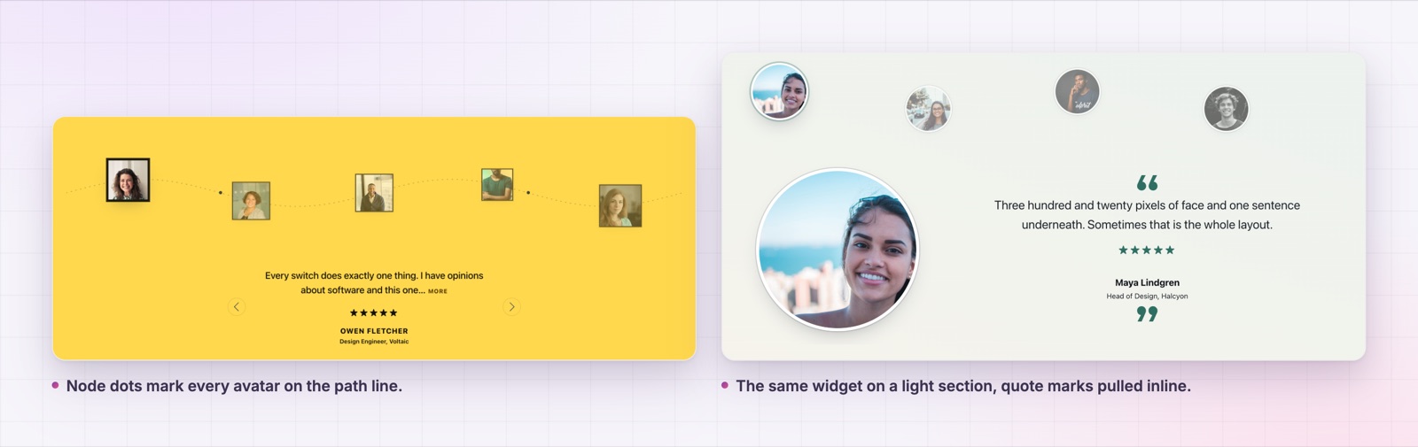
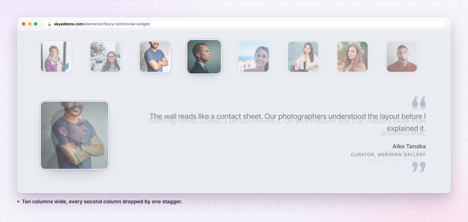
| Avatars | ride a drawn sine curve, with node dots | strict grid, every second column dropped |
| Best for | six to twelve reviews | twenty or more reviews |
| Review sits | below the curve, arrows either side | beside or under one large featured avatar |
| Reads as | a journey through customers | a crowd that already bought |
| Extra controls | avatars per view, wave depth, path line | wall columns, column stagger, featured size |
Wave Path suits a considered service where each client matters. Cluster Wall suits volume, where the point is how many there are. Both run on the same content, so switching is one control, not a rebuild.
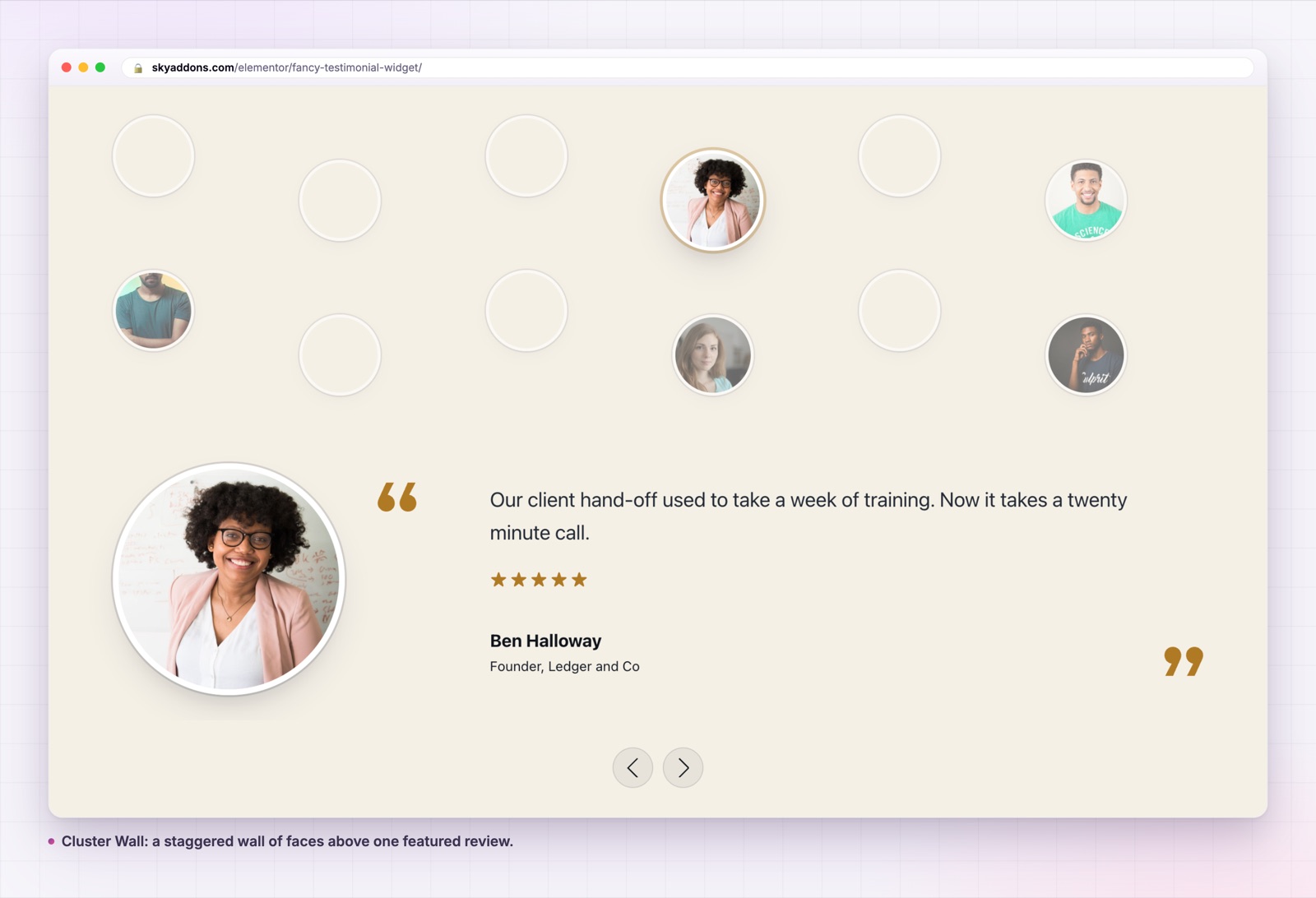
Two content sources, one widget. Write the reviews by hand in the repeater, or set Source to Dynamic Posts and pull them from a query. On the dynamic path the post title becomes the name, the first category becomes the designation, the excerpt becomes the review and the featured image becomes the avatar. A testimonial custom post type works with no mapping code.
A rating that comes from your data. Each repeater row carries a 0 to 5 rating. On the dynamic path, point Rating Custom Field at the meta key that already holds the score and every post brings its own stars.
A Read More link that keeps the layout still. Reviews are trimmed to a word limit on the front end, not on the server, so the link has something to reveal. Long reviews and short ones sit in the same height, and a visitor who wants the detail can have it.
Click any avatar to jump to that review. Every avatar is a button. The active one gets a halo drawn on its own box, so the ring stays concentric no matter what size the avatar is.
Dynamic tags on every field that can take one. Image, name, designation, review, rating, the rating meta key, the word limit and both Read More labels all accept dynamic tags, which is what makes the widget usable inside a loop template.
Build the layout against three fake reviews, then swap in the real query. Designing against live content is how sections end up shaped around whoever happened to write the longest paragraph.

A testimonial row that reads as decoration gets skimmed. A fancy testimonial section gets a stop, because a face at readable size is a person and a grid of small boxes is furniture. The practical gain is attention: one review at a time means the copy actually gets read, and the avatars carry the volume that a single review cannot.
There is a second gain that is easy to miss. Because the widget holds one review at a time, you can afford longer reviews. The three card layout punishes anyone who wrote more than forty words. This one rewards them.
The widget will render whatever you give it, so the selection is still your job. Three rules have served me well.
Pick reviews that name a result, not a feeling. “They were great to work with” is a sentence about the writer. “Our client hand off used to take a week of training, now it takes a twenty minute call” is a sentence about you. The second one is also longer, which the fancy testimonial layout can carry and a three card row cannot.
Mix the designations. Six founders in a row reads as one customer type. A founder, a CTO, a marketing lead and an ecommerce manager reads as a product that survives contact with different departments. On the dynamic path, the first category becomes the designation, so the category names you already use decide how varied the section looks.
Order them deliberately. The widget shows the first item first, and most visitors read one review and move on. Put your strongest review in position one and treat the rest as proof of volume. If your query sorts by date, the newest review is not automatically the best one, so consider a manual order or a pinned first row.
One more practical note on the avatars. Because the layout sizes faces well above the usual card thumbnail, a 96 pixel image will look soft. Upload avatars at roughly twice the avatar size you set, and crop them square before upload rather than relying on the browser to do it.
Yes. It lives in the free Sky Addons plugin. It was built in Pro and moved into the core plugin before release, the same way the Table widget was.
No. It needs Elementor and the free Sky Addons plugin, nothing else.
Yes. Set Source to Dynamic Posts and use the Query tab. Title becomes the name, the first category becomes the designation, the excerpt becomes the review and the featured image becomes the avatar.
No. There is no GSAP and no animation library at all. The only motion is the slide transition and a CSS transition on the active avatar.
Yes. The review stacks under the avatar when the widget runs out of width, and the featured alignment is responsive, so it centres on tablet and mobile by default.
A testimonial section is not a content problem, it is a shape problem. Put the faces in front and give one review the room to be read, and the same words start working. The fancy testimonial widget does that with two layouts, no animation library and no Pro licence.
See it running on the fancy testimonial demo, read the documentation, and compare it with the testimonial widget if you want plain cards instead. For the difference between a blog feed and a review feed, the post list widget covers the other half. Check what else is included on the free versus Pro page and the pricing page. If you want the reasoning behind rating markup, Schema.org publishes the Review type and Google documents its review snippet rules.




Comments are closed.