
Scrolling Gallery for Elementor: Three Rows That Move as You Scroll
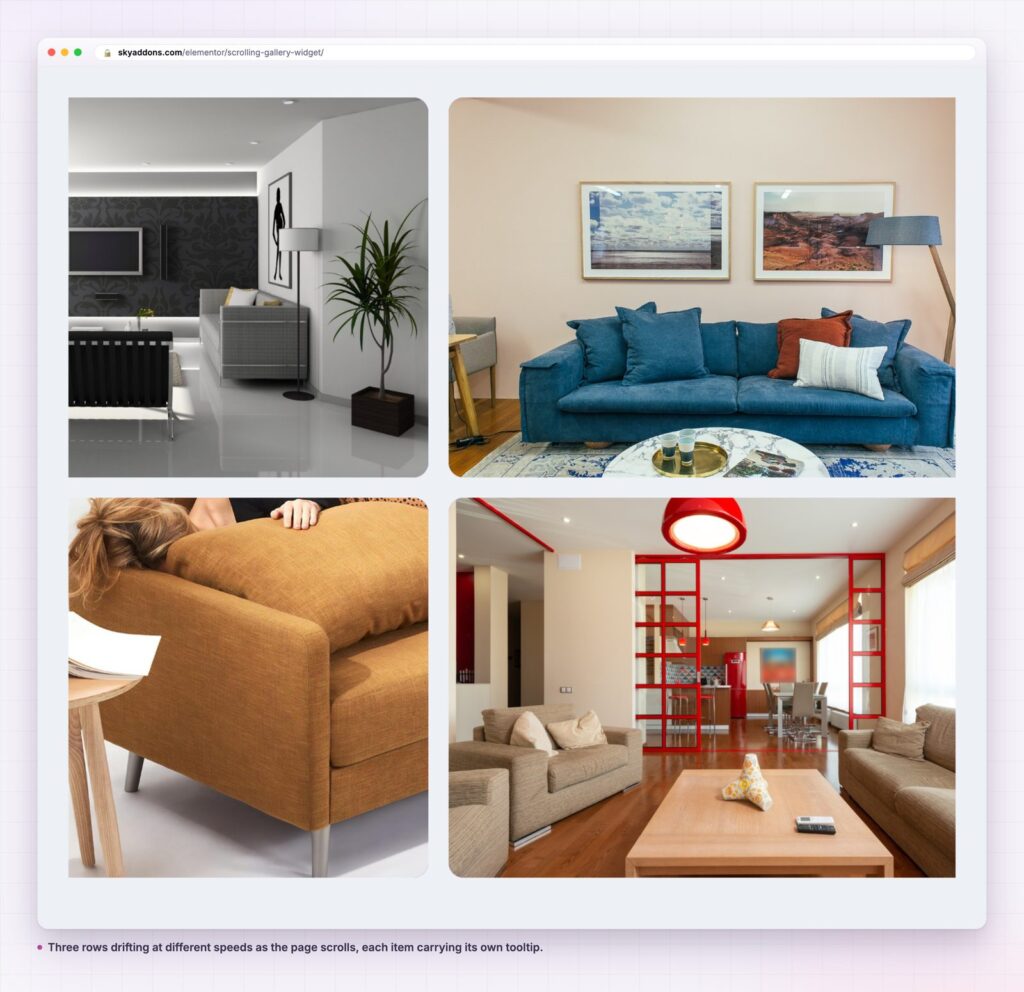
A scrolling gallery for Elementor: three rows of images drifting at different speeds as the page scrolls, each item with its own tooltip and link.

Most image sections are still. The visitor scrolls, the pictures sit there, and the section reads as filler between two blocks of text. That is fine for a product grid and wasted on a brand page, where the gallery is supposed to set a mood.
A scrolling gallery makes the movement part of the scroll. Rows of images drift sideways at different speeds while the page moves, so the wall has depth instead of being a flat grid. Stop scrolling and it stops. Nothing plays on a timer, nothing demands attention, and nothing moves unless the visitor is already moving.
It is a mood section, not a catalogue. If the visitor needs to compare items or read captions, a grid is the honest choice.
| Approach | Motion | Setup | Controls exposed | Risk |
|---|---|---|---|---|
| Static image grid | None | Easy | Layout only | Reads as filler |
| CSS marquee | Constant, timed | Hand written | Whatever you code | Moves when nobody is scrolling |
| Video background | Constant | Export and host a file | Playback only | Weight, and no links |
| Scrolling gallery | Tied to the scroll | Minutes | Levels, size, gap, tooltip | Needs enough images |
The difference from a marquee is control. A marquee runs whether or not the section is on screen, which is both a performance cost and a distraction. Here the motion is driven by the scroll position, so an idle page is an idle section.
Three slider levels. Each item is assigned to level 1, 2 or 3, and the levels move at different speeds. That is what produces the sense of depth. Put the strongest images on the level that moves least, because they stay legible longest.
Per-item tooltips. Every item carries a title and a text field, shown as a tooltip with its own typography, spacing and backdrop blur. A wall of images can explain itself without captions under each frame.
Single images or a bulk gallery. An item is either one chosen image with its own link and tooltip, or a gallery of images added at once. The second is how you fill a wall quickly; the first is how you make it useful.
Links on the items. Each item takes a URL, so a mood wall can carry traffic to products, projects or posts instead of dead-ending.
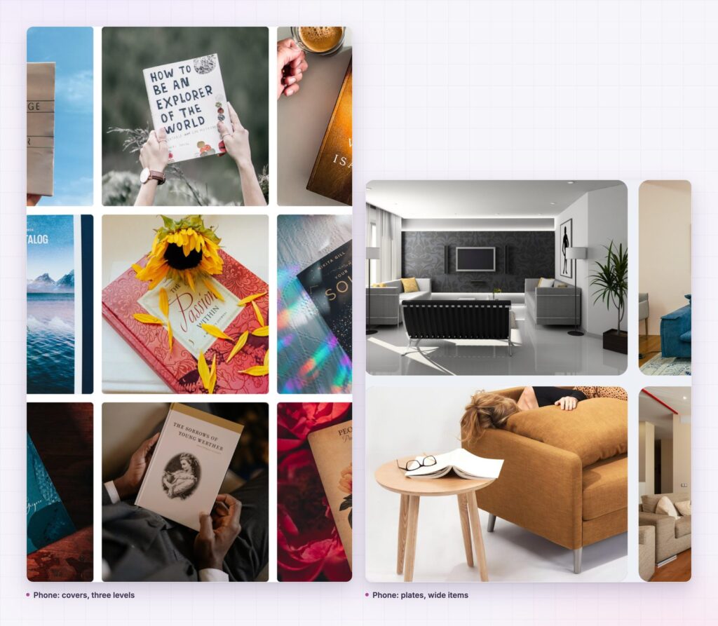
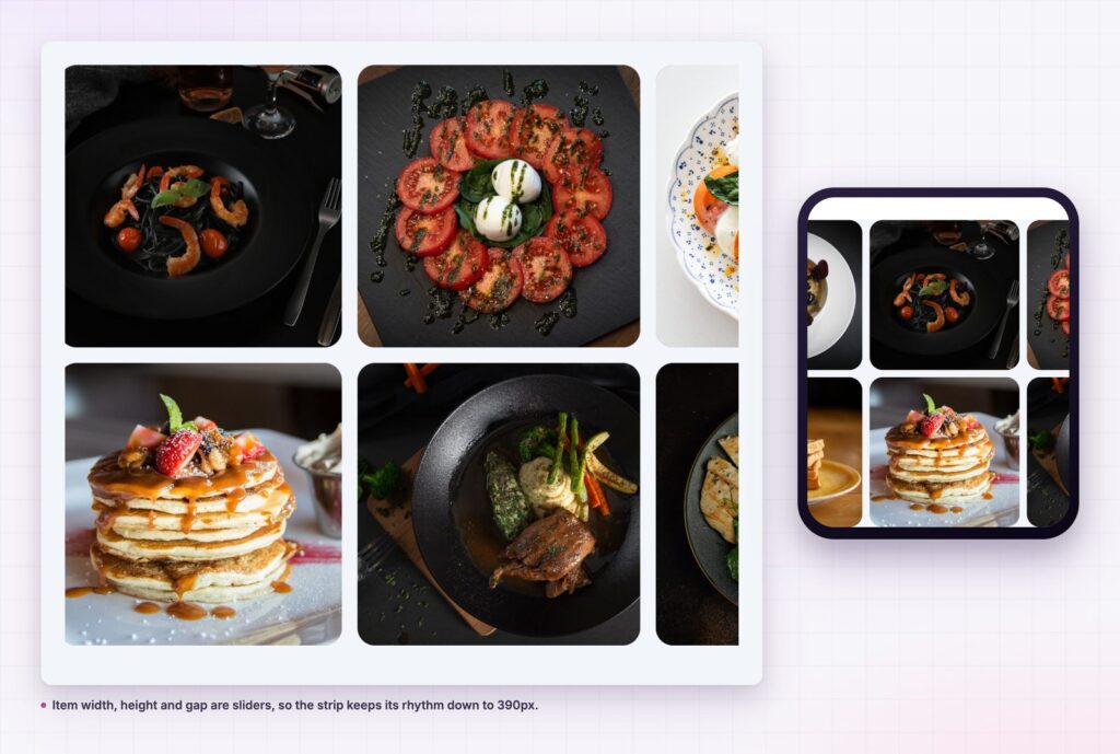
Item geometry. Width, height and gap are sliders, so the same set can read as a tight mosaic or an airy band. They are responsive, which is what keeps the effect intact on a phone.
It runs on known libraries. The widget is built on Swiper and GSAP’s ScrollTrigger, both loaded only on the pages that use it.
Motion that follows the scroll reads as craft, because the visitor is in charge of it. Motion on a timer reads as an advert, because it is not. That is the whole psychological difference, and it is why a scrolling gallery sits comfortably on a brand page where an autoplaying carousel would not.
It also solves a layout problem. A wall of thirty images in a grid is three screens tall. Three drifting rows show the same thirty images in one screen, and the visitor sees more of them than they would in a grid they scrolled past.
A gallery that moves with the page feels like part of the page. A gallery that moves on its own feels like an interruption.
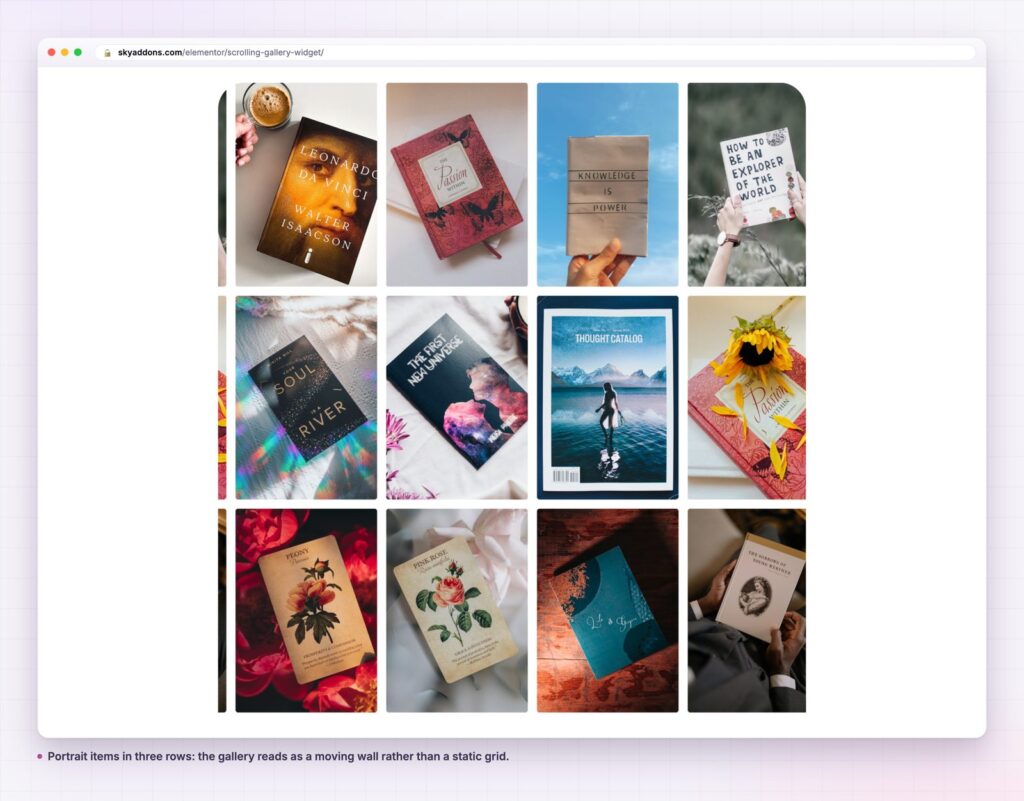
Images are the obvious content, and not the only one. A wall of book covers, record sleeves, packaging shots or posters works the same way. So does a logo wall for a client list, where the drift keeps the section alive without a carousel’s arrows.
There is also a quieter use: a texture band. A single-level scrolling gallery with a slow drift and no tooltips makes a good separator between two heavy sections, in the way a full-bleed image used to, but with more to look at.
A scrolling gallery is only as good as the set behind it, and the set has different requirements from a normal gallery.
Consistency beats quality. Twenty-four competent photographs with the same crop, the same light and the same treatment read as a designed wall. Twelve excellent photographs in mixed styles read as a folder. If the source images come from several shoots, apply one grade across all of them before uploading.
Portrait crops move better. A tall item stays legible while it drifts, because the eye can take it in as a single object. Wide items get read as fragments as they pass, especially on the faster levels.
Spread the levels by importance. Level assignment controls speed, so the images that carry the message belong on the slowest level, where they stay in view longest. Filler images can take the faster rows, where nobody is expected to study them.
Count on repetition. Each level cycles its items, so a row with four images shows the same four in a loop. Eight or more per level keeps the repeat from being obvious, which is why twenty-four is a sensible floor for the whole wall.
Watch the total weight. Forty images at 400 kilobytes each is sixteen megabytes, and no amount of lazy loading makes that acceptable. Export at roughly the rendered size, keep the format modern, and check the page in a network panel before it goes live.
Leave the tooltips mostly empty. A tooltip on every item turns a mood wall into a list that moves. Five named items in a wall of thirty reads as editorial selection, which is the effect worth having.
No. It is a Sky Addons Pro widget. The free plugin includes Logo Carousel and Generic Carousel for moving image rows; the free versus Pro page lists the split.
No. The rows move in response to the page scroll. A stationary page is a stationary gallery.
They will if the files are heavy. The widget loads Swiper and ScrollTrigger once, and the images are ordinary attachments, so sizing and compression are where the weight is decided.
Yes. Item width, height and gap carry their own tablet and phone values, so the rows can be sized for a narrow screen rather than shrunk.
Yes. Every item takes a URL, and the tooltip can carry a short line of text explaining what the visitor gets if they follow it.
A scrolling gallery shows a wall of images as three rows that drift at different speeds while the page scrolls, with tooltips and links on the items that need them. It fits brand, studio and shop pages where a grid would read as filler, and it stays still whenever the visitor does.
See it on the scrolling gallery demo, read the Scrolling Gallery documentation, or compare plans on the pricing page. For a still set with a lightbox, use the diamond gallery; for a sideways band the visitor drives, see the horizontal scroll widget.



Comments are closed.