
Elementor Dual Button: Two Clear Choices in One Control
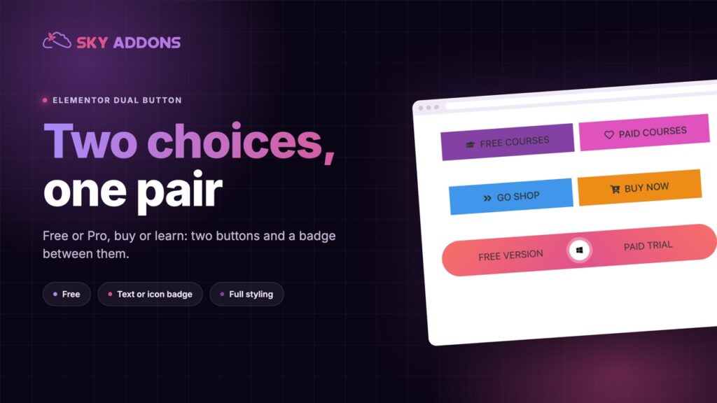
The Elementor dual button pairs two calls to action with a badge between them, each with its own text, link, icon and style. Free in Sky Addons.
A page with one button asks one question: will you click? A page with two asks a better one: which of these is right for you? Free or paid. Buy now or learn more. Book online or call us. Download the app or open it in the browser. When there are exactly two good answers, showing both, side by side and in a clear order, helps people choose faster than a row of five near-identical buttons.
A dual button is the widget built for that moment. Sky Addons includes a free Dual Button widget for Elementor: two buttons joined as a pair, each with its own text, link, icon and style, and an optional badge in the middle, such as “or”, an icon or a short word. This article covers where a pair of buttons works, what it does that two separate buttons cannot, and how to build one that reads clearly and is easy to tap.
A dual button suits any moment when a reader has two sensible next steps.
Two buttons in a row work until you need them to align, share a width and look joined. Then the layout takes effort.
| Two Elementor buttons | Sky Addons Dual Button | |
|---|---|---|
| Elements to manage | Two widgets in a container | One widget |
| Align as a pair | Manual, per breakpoint | Alignment and width controls |
| Space between | Container gap | One setting |
| Badge between the buttons | Absolute positioning by hand | Text or icon, with a ring |
| Consistent height | Padding per button | Shared padding, adjustable per button |
| Icons | Per button | Per button, with position and spacing |
| Styling | Per widget | A separate style group for each button |
A pair that behaves as one. The widget sets the alignment and width of the pair and the space between the two buttons, and it stays a pair on small screens. That saves the work of aligning two separate widgets on desktop, tablet and phone.
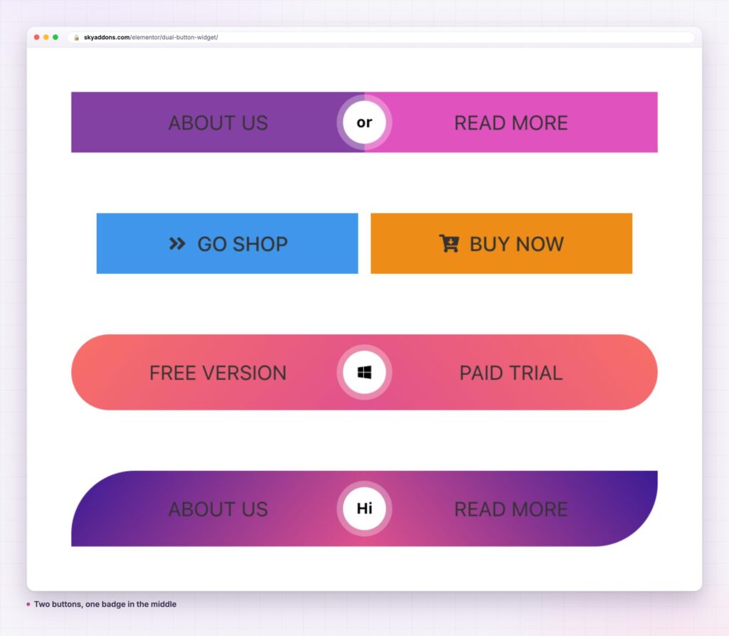
A badge in the middle. The separator is optional and defaults to on. Choose text such as “or” or a two-letter word, or an icon such as a play button or a logo, and style its size, colour, radius and the ring around it. The ring width and colour are controls, so it can look like a soft halo or a bold border. The badge is what makes the two buttons read as a choice.
Each button is its own design. Button A and Button B each have their own text, link, icon and alignment, and their own colours, hover colours, padding and radius. Backgrounds can be a flat colour or a gradient, and both buttons take borders, shadows and typography.
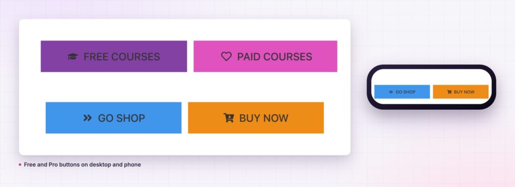
Icons on either side. Place an icon before or after the text, set its spacing and style its size, padding, radius and colour separately for each button. The icons are hidden from screen readers, so the button text stays the accessible name.
Shape freedom. Set the radius per button and per state. Round both for a pill, round only the outer corners for a segmented control, or make one square and one round. The curved gradient pair in the demo is just a radius setting.
Hover states that respond. Each button has its own hover colour, border colour and radius, so the buttons can react in different ways when a pointer arrives.

People decide faster when the options are few and clearly different. A pair of buttons frames the decision: there are two routes, here they are, choose one. The badge between them signals that these are alternatives, so the reader does not feel they must click both.
The visual join matters too. Two buttons that share a shape, a height and a badge look like one control, and the eye reads them together. Loose buttons at different heights look like leftovers. The pair also saves vertical space in a hero, where every line counts.
There is a hierarchy benefit as well. When one button is stronger, the reader sees your recommended path first, and the other is still there for those who want it. That is a friendlier approach than forcing everyone through one option.
The words on a dual button do most of the work. Each label should say what the reader gets, not what they do with their mouse. “Download the app” and “Use it in the browser” describe two outcomes. “Click here” and “Learn more” describe nothing. Keep the two labels close in length so the buttons balance, and keep them parallel in form: two verbs, or two short noun phrases, but not one of each.
Where the two choices are unequal, tell the reader which is which by design, not by extra words. The stronger colour goes on the action you would recommend to most people. The other button can be an outline or a softer tone. When both are equal, such as “Book online” and “Call us”, give them matching styles and let the badge carry the “or”.
Two clear choices beat five vague ones, and one of them should look like the one you recommend.
A dual button is not limited to sales. Use it to pair “Previous” and “Next” at the end of a lesson, or “Yes” and “No” in a short questionnaire. Use it for a language switch, a monthly and yearly toggle that links to two pages, or two versions of a document. With the badge showing a short word like “Hi”, it can act as a friendly greeting to two audiences.
Because the two buttons and the badge are styled separately, you can make a matching pair, a contrasting pair or a segmented control that looks like a single tab. The same widget also fits in a header, where a compact pair of “Log in” and “Sign up” needs to line up with a menu.

Yes. Dual Button is part of the free Sky Addons plugin. Free vs Pro shows what the Pro plugin adds.
No. It works with Elementor and Sky Addons alone.
No. It is two links with a stylesheet and loads no scripts.
Yes. It is responsive. You can change the alignment, width, spacing and padding per breakpoint so the buttons fit a narrow screen.
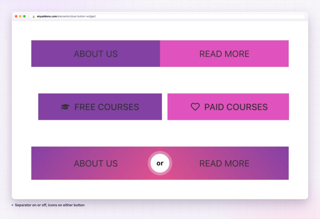
Yes. The separator is a switch. Turn it off and the two buttons sit next to each other with the spacing you set, which suits two steps rather than two alternatives.
A dual button puts two choices in one clear control, with a badge that says they are alternatives. It gives each button its own text, link, icon and style, keeps the pair aligned on every screen and is free. Make one action the leader, keep both labels short and let the pair do the deciding.
Next steps: see the live demo, read the Dual Button documentation, compare plans and pricing, or read how the WhatsApp button adds a chat option beside it. For a full offer, see the pricing table.

Comments are closed.