
Elementor Logo Grid: A Partner Wall That Shows Every Name
The Elementor logo grid shows every partner at once in two to six columns, with three tile styles, tooltips and grayscale hover. Free in Sky Addons.
A carousel is right when you have more logos than space. A grid is right when you want every logo visible at once, in order, with none hidden behind an arrow. Partner directories, sponsor walls, integration pages and “our stockists” sections all fall into that second group. The reader should be able to see the whole set in one glance and hover over any name for more.
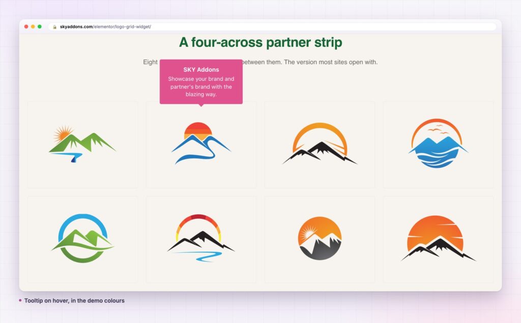
A logo grid does that job. Sky Addons includes a free Logo Grid widget for Elementor: choose two to six columns, pick a box, border or magic border style, add tooltips with a brand name and a line of text, and switch on a grayscale effect that reveals colour on hover. This article covers where a logo grid works, how it compares with a gallery or a carousel, and how to build a wall of logos that looks composed, not crowded.
Any page that lists organisations, brands or badges as a group is a good fit.
The three look similar and behave differently. Choose by what you want the reader to do.
| Image gallery | Logo carousel | Sky Addons Logo Grid | |
|---|---|---|---|
| All logos visible at once | Yes | No | Yes |
| Layout | Masonry or grid | One row that slides | Columns and rows, 2 to 6 columns |
| Tooltips | No | Yes | Yes, with name and text |
| Grayscale on hover | Custom CSS | Built in | Built in |
| Box styles | Limited | Box or none | Box, border or magic border |
| Best for | Photographs | Many logos, little space | A defined set you want fully shown |
If you have too many logos for the space, the logo carousel slides through them instead.
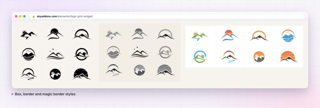
Three card styles. Choose Box for a filled tile, Border for a clean outline, or Magic Border, a third border style with its own effect. Set the border type, size, colour and radius, and the padding inside each tile.
Columns that adapt. Choose two to six columns for desktop, and set tablet and mobile separately. The default is four columns on desktop and two on tablet, which suits most sets. Use the row and column spacing controls to tighten or loosen the grid without touching the images.
Tooltips with content. Each logo has an optional brand name and a short line of text. Turn on the tooltip and choose its position, its animation, an offset, an arrow and whether it opens on hover or on click. It lets a wall of logos also tell readers who the partner is and what they do.
Grayscale that comes alive. Show every logo in grayscale so a mixed set looks uniform, then let colour appear on hover. Or show colour by default and fade it on hover. Add opacity, a hover opacity, a transition time and a hover animation to finish the effect.
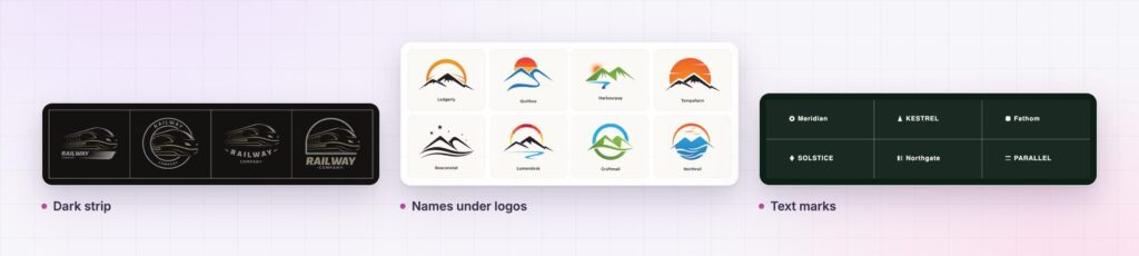
Brand names under the logo. Turn on Show Brand Name and pick a heading tag. It gives the grid a caption for each logo, which helps accessibility and search engines that read the text.
A link on every logo. Each item has its own link with Elementor’s standard options, so a logo can lead to a partner’s site or to a page of your own.
Lazy load. Switch on lazy load so the images below the fold load as the reader scrolls, which keeps a long partner wall light.

A grid uses the human eye’s talent for patterns. When logos are the same size and spaced evenly, a reader takes the set in as one block and forms an impression: many partners, established, organised. When the sizes and spacing are uneven, the same set looks scattered.
Showing all the logos at once has a second benefit. A visitor scanning for a name they know can find it in a second, with no waiting for a slide. That is why partner directories and sponsor pages tend to work better as grids.
The tooltip does the rest. Most visitors will not read a paragraph about every partner. A hover reveal gives the information to those who want it and keeps the page clean for the rest.
The three tile styles suit different pages. Box gives each logo its own filled tile, which works on a plain white page because the tiles create structure where there is none. Border draws a clean outline and lets the background show through, which suits a section that already has a colour. Magic Border is the showpiece: choose it for a landing page where the partner wall is a feature, not a footnote.
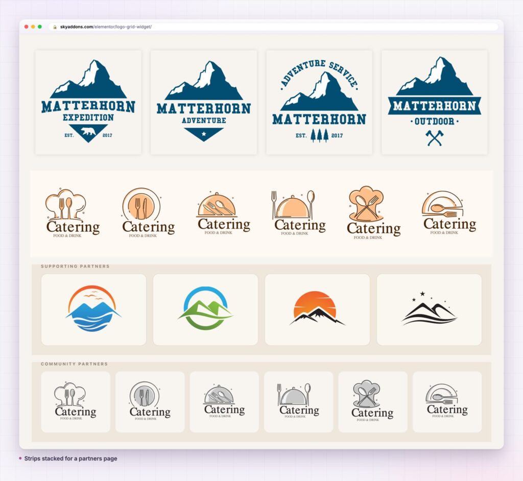
Whichever you choose, pair it with a sensible gap. A tight gap makes the wall look like one solid block, and a wide gap lets each logo breathe. Test both, then pick the one that reads best at the size your visitors will see. Group logos into separate grids with a heading each when partners come in tiers, so a top sponsor never sits at the same visual weight as a community supporter unless you mean it to.
When logos share a size and a rhythm, a wall of names reads as one confident statement.
For the CSS layout model behind the grid, the MDN guide to CSS grid layout explains how rows and columns work.
A logo grid is a good general-purpose tile wall. Use it for badges, payment methods, awards, app store icons, tool logos or product brands. Replace the logos with icons and short labels and it becomes a set of feature tiles. With the brand name on and the border style set, it doubles as a directory index.
The tooltip and link fields also make it a small navigation tool. A grid of platform logos, each linking to its own guide, is a friendly way to send visitors to the right documentation. And because the tile style, spacing and hover effects are separate controls, the same set of logos can sit in a dark footer or on a white page and feel native in both.
Yes. Logo Grid is part of the free Sky Addons plugin. See Free vs Pro for what the Pro plugin adds.
No. The tooltips use Tippy.js, which the widget loads itself, and everything else is native to Elementor and Sky Addons.
The widget itself is light. The images decide the weight, so use compressed logos, keep each file small and switch on lazy load for long walls.
Yes. The columns are set per screen size, and tooltips can open on click for touch devices.
You can, but a hundred logos in a grid is a long scroll. Group them into tiers, or consider the carousel version if space is tight.
A logo grid shows every logo at once, in a tidy set of two to six columns, with three tile styles, tooltips and a grayscale hover. It is free and fully responsive. Choose the columns, match the logo sizes and let the grid make the set look like one composed wall.
Next steps: see the live demo, read the Logo Grid documentation, compare plans and pricing, or read how the card widget builds richer tiles when a logo needs a description.

Comments are closed.