
Elementor List Group: Rows That Send Readers Somewhere
The Elementor list group builds rows with a marker, a title, detail text and a direction arrow, from custom rows, posts or ACF. Free in Sky Addons.

Some lists inform. Others send people somewhere. A job board, a help-centre index, a set of shipping options, the steps in an order, the sections of an account: each row is a small decision, and the reader needs to see at a glance which rows lead on and which are just information.
A list group is the layout built for that job. Every row carries a marker, a title, a line of detail and an arrow that says “this goes somewhere”. Sky Addons includes a free List Group widget for Elementor, so you can build the whole thing without a plugin for job listings, a table-of-contents plugin or a stack of buttons.
This article shows where a list group works best, how it differs from a tidy list or a row of buttons, and how to set one up so it is easy to use on a phone.
Use it whenever a page offers a short set of choices, and each choice deserves a line of explanation.
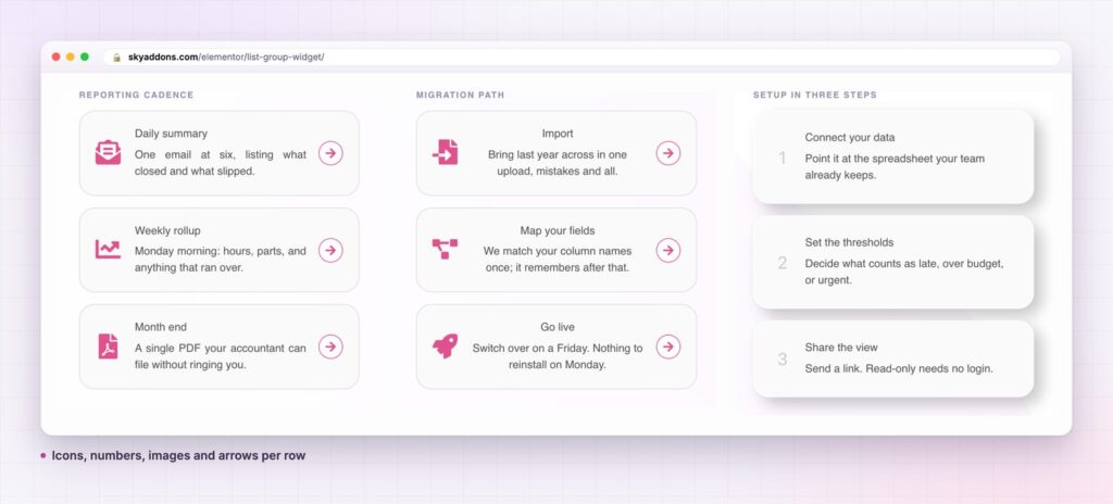
The alternatives all work for a while. The table shows where each one stops.
| Stack of buttons | Elementor Icon List | Sky Addons List Group | |
|---|---|---|---|
| Row content | One label | Icon and one line | Marker, title and text |
| Direction arrow | Add by hand | No | Built in, styled separately |
| Marker | Icon | Icon | Icon, image or number |
| Per-row colours | Per button | Per item | Optional override on each row |
| Content from posts | No | No | Custom rows, dynamic posts or ACF fields |
| Spacing and card style | Manual | Limited | Space, padding, radius and hover border |
If your rows only inform, a tidy list is the closer fit. If each row is a route to another page, the list group is the better tool.
A direction arrow on every row. The arrow is what sets a list group apart. It tells the reader that a row is interactive, and you can swap it for another icon, change its size and spacing, and give it its own colours and a hover state. Turn it off for rows that do not lead anywhere.
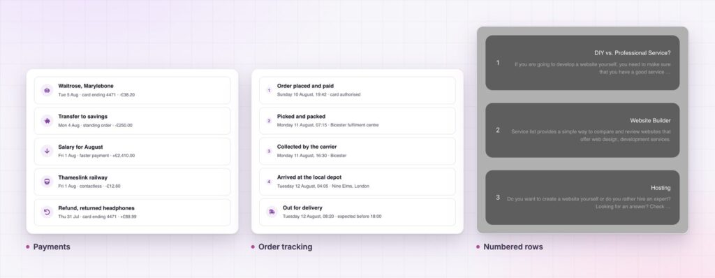
A marker that fits the row. Choose an icon, a number or an image. Job lists work well with a small icon for the discipline. A setup guide is clearer with numbers. A directory with an image marker reads like a contact card.
A title and a sentence. The title carries the point and the text explains it. Turn the text off for a compact list, and set its length when the rows come from posts.
Three ways to fill it. Write custom rows in a repeater, pull the rows from your posts, or map an ACF repeater field for the title and the content. Posts and ACF are right when the list is content you already publish, such as vacancies, guides or resources.
Per-row colour overrides. Switch on Customize for a single row and set its title and text colours. That is how an urgent notice or a highlighted plan stands out without a second widget.
Real list markup. The widget outputs a proper unordered list, so assistive technology treats it as a list and reads out how many items it has.
Full styling from the panel. Space between rows, row padding and radius, a border colour on hover, marker size and spacing, and colours for the title, text and arrow are all controls in the editor, so the list can match a light brand or a dark product.
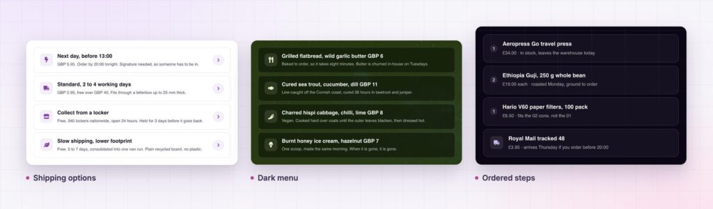
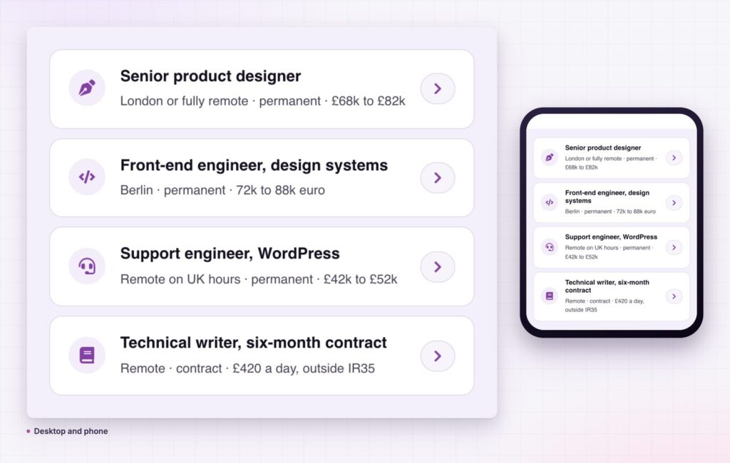
A list group makes choices cheap. Each row shows just enough to decide whether to click: what it is, one detail and a clear signal that it leads on. Visitors do not need to read everything, and they do not have to guess whether a line is a link.
It also keeps a page honest about structure. Because all rows share one style, the list is easy to extend and never drifts as different editors add lines. When the source is your posts, the list is never out of date, because publishing a new vacancy or guide adds a row automatically.
On mobile, the rows do the work of a button stack without the weight. Each row is a full-width block with an arrow at the end, which is easier to hit than a small text link inside a paragraph.
A list group makes choices cheap: each row shows just enough to decide, and an arrow that says it leads on.
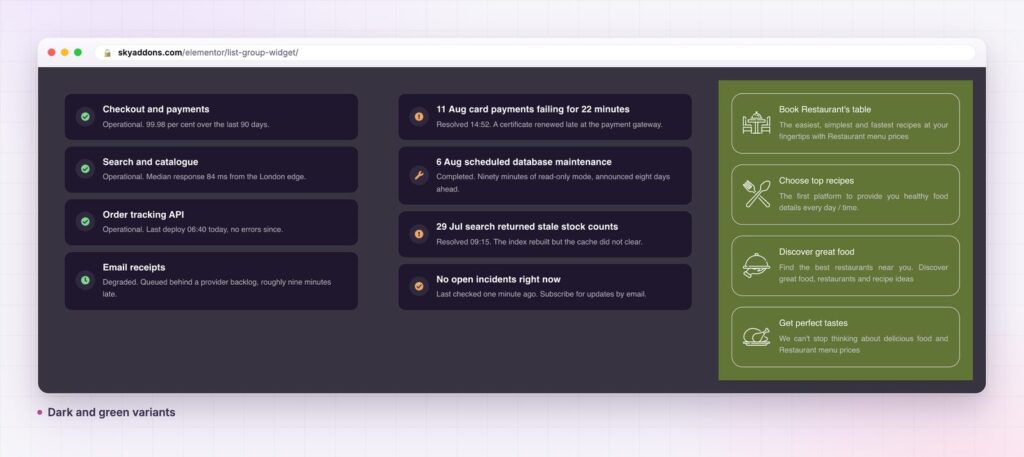
The widget is not limited to links. A pricing page can use it for plan inclusions with a highlighted row. An order page can use it as a timeline of statuses, one row per event. A dashboard can present recent activity. Set the marker to an image and the same layout is a contact directory, or to a number and it is a checklist you can tick through.
Because the styling is separate for the marker, the text and the arrow, you can push it a long way from the default look. A dark list with green icons feels like a status page. A soft grey card with a purple arrow feels like a settings screen. It is one widget with many faces.
Yes. List Group is part of the free Sky Addons plugin. See Free vs Pro for what the Pro plugin adds.
Only if you use the ACF source, which needs Advanced Custom Fields. Custom rows and dynamic posts work with WordPress alone.
It outputs a plain list with its own stylesheet. There is no slider or animation library, so a list of a dozen rows adds very little to the page.
Yes. It is responsive and you can set spacing, alignment and sizes separately for tablet and mobile. Rows stack as full-width blocks, which suits touch.
Yes. Turn on Customize for that row and set its own title and text colours. That is how you highlight an urgent item without breaking the rest of the list.
A list group is a list built for decisions. It gives every row a marker, a title, a line of detail and an arrow, and it fills itself from custom rows, posts or ACF. It is free, it is fully styleable and it works on a phone as well as a desktop.
Next steps: see the live demo, read the List Group documentation, compare plans and pricing, or read how the comparison table sets plans side by side. The list structure follows the HTML unordered list element documented on MDN.


Comments are closed.