
Elementor Tidy List: Turn Bullet Points Into Rows People Read
The Elementor tidy list turns bullet points into clean rows with icons, numbers or images. Custom rows, posts or ACF fields. Free in Sky Addons.

Every website has lists. What the price covers. How booking works. Three steps to get started. Service levels, opening hours, the things to pack. They are some of the most useful content on a page, and they are also the ones most often left as a plain bulleted paragraph that nobody reads to the end.
A tidy list gives that content a shape. Each row gets a marker, a title and a line of explanation, laid out on a clean card with room to breathe. Sky Addons includes a free Tidy List widget for Elementor that does exactly this. You write the rows once, choose how they look, and the widget handles spacing, alignment and the responsive layout for you.
This article covers where a tidy list beats a normal bullet list, what the widget can do beyond a checklist, and how to build one that reads well on a phone as well as a desktop.
Any content that is a set of short, parallel points is a candidate. These are the uses that come up most.
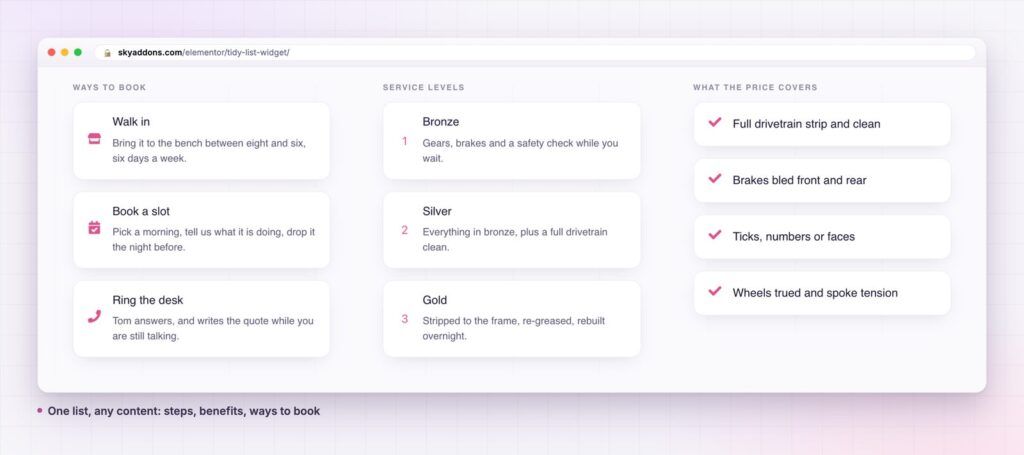
A basic list is fine for five words per line. Once each item needs a title, an explanation or a link, the usual options start to strain.
| Plain bullets in a text editor | Elementor Icon List | Sky Addons Tidy List | |
|---|---|---|---|
| Marker | Dot or number | Icon | Icon, image or number |
| Title plus description | Awkward | One line of text | Title and text on each row |
| Card styling and spacing | None | Limited | Space, padding, radius and hover border |
| Layout | Vertical | Vertical or inline | Block or inline |
| Content from posts | Manual | Manual | Custom rows, dynamic posts or ACF fields |
| Editing many rows | Rewrite text | Repeater | Repeater with per-row link |
A marker that fits the content. Choose an icon for benefits, a number for steps, or a small image for a menu or a directory. The marker can differ from row to row, so one list can mix a tick, a clock and a phone icon when the meaning changes.
A title and a sentence, not just a phrase. Each row has a title and an optional text, so you can lead with the point and explain it underneath. Turn the text off when you want a compact checklist, and back on when a row needs context.
Block or inline. The block layout stacks rows. Inline places them side by side, which is how a three-step strip such as “Strip, Measure, Road test” is built. Both use the same content, so you can try each and keep the better one.
Three content sources. Write your own rows in a repeater, pull them from your posts, or map them to a repeater field from Advanced Custom Fields. The post and ACF sources are useful for team pages, job lists and any list that should update itself. Custom rows suit everything else.
Real list markup. The widget outputs a proper unordered list, so assistive technology reads it as a list of items, and search engines can see the structure.
Styling that stays in the editor. Space between rows, padding, border radius, the border colour on hover, the size and spacing of the marker, and separate colours and hover colours for the title, the text and the number are controls in the panel. You do not need custom CSS to match your brand.


People do not read web pages, they scan them. A list with a clear marker and a bold first line lets a visitor take in three or four points in the time it takes to read one sentence. The eye finds the title, decides whether the row matters, and only then reads the description. That is the behaviour a tidy list is designed around.
The cards help in a second way. Each row is a separate target with its own padding, so on a phone it is easy to tap and easy to tell apart from its neighbours. A plain bullet list has none of that structure.
It also makes maintenance simple. Because the rows live in a repeater, adding a fourth step or reordering the list takes seconds and never disturbs the layout. A team that edits the page every month will feel the difference.
A good list is one where every row earns its place and the reader never has to wonder where to look.
For lists that are essentially a set of steps, see our article on the Step Flow widget, which draws connected stages with a path between them.
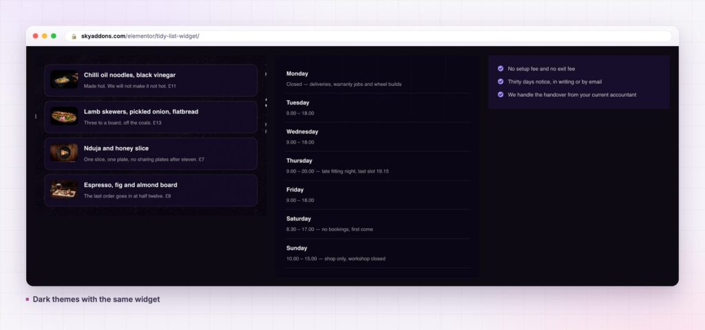
The widget goes further than a set of ticks. A list of links becomes a navigation panel for a help centre. A row of icons with a short label becomes a set of service badges. With the image marker, a menu with photographs is a list of dishes. In inline mode it is a slim process strip that sits under a hero.
The dynamic sources matter when the list is content you already manage elsewhere. Choose posts and each row is an article, with a length setting for the excerpt and a read more label. Choose ACF and map the repeater, title and content fields, and a team page or a job board can be driven from the fields your editors already use.

Yes. Tidy List is part of the free Sky Addons plugin. Free vs Pro shows what the Pro plugin adds.
Only for the ACF source. The custom rows and the dynamic posts sources work without anything else. If you want to feed rows from Advanced Custom Fields, you need that plugin installed, as you would for any ACF-driven content.
No more than any small widget. It outputs a simple list with a stylesheet, and a repeater of a dozen rows is a few lines of markup. It has no slider or heavy script to load.
Yes. It is responsive, and you can set spacing, alignment and the media position separately for tablet and mobile so the layout stays tidy on a small screen.
Yes. Every row has a link field with Elementor’s standard link options, so you can open a page, a booking form or an anchor further down the page.
A tidy list turns content people would skip into rows they can scan. It gives you icons, numbers or images, block or inline layouts, and three ways to fill it, all free. Set it up once and it stays neat as the list grows.
Next steps: see the live demo, read the Tidy List documentation, compare plans and pricing, or read how a timeline widget shows a longer sequence. The structure of the widget follows the HTML ordered and unordered list elements, which are documented on MDN.



Comments are closed.