
Elementor Bar Chart: Make Your Numbers Land at a Glance
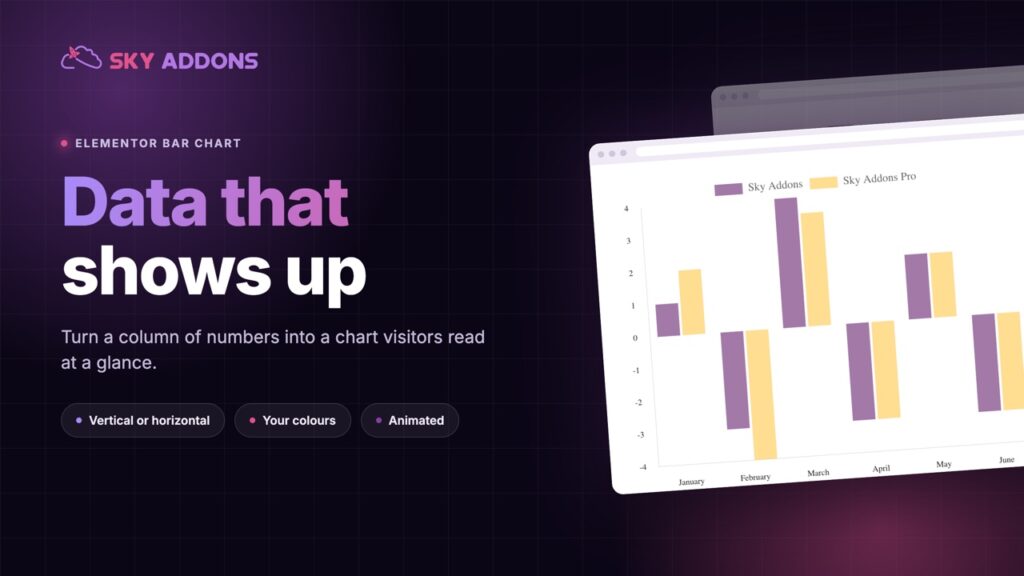
The Elementor bar chart widget draws vertical or horizontal charts from a list of numbers, in your colours, and animates on scroll. No extra plugin.
A page full of numbers is a page nobody reads. A year of sales, a survey result, a set of prices, a before and after in percentages: the figures are the argument, and a paragraph is the slowest way to deliver them.
A bar chart does it at a glance. One bar is tall, one is short, and the point lands before the reader has finished the first sentence.
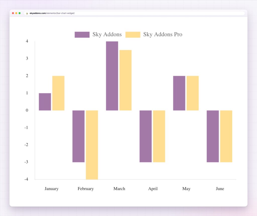
The Elementor bar chart widget draws that chart on your page from a few lines of text. No screenshot from a spreadsheet, no separate charting plugin, no code.
| A screenshot of a chart | An Elementor bar chart |
|---|---|
| Fixed pixels, soft on a retina screen | Drawn sharp at any size |
| Editing means going back to the spreadsheet | Edit the numbers in the panel |
| Colours you cannot match to the brand | Every bar and border in your own colours |
| No hover, no detail | Hover a bar to see its value |
| One size for every device | A chart height for each device |
| Sits on the page doing nothing | Animates as it scrolls into view |
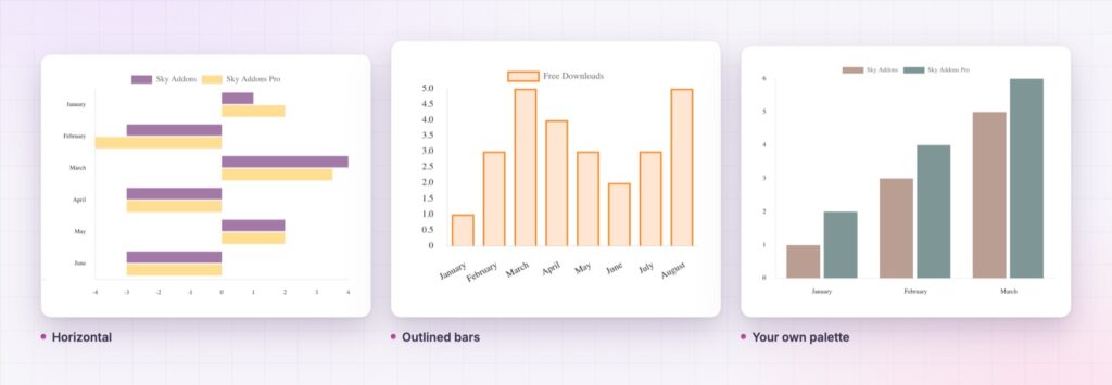
Vertical or horizontal. Vertical bars suit time: months, quarters, years. Horizontal bars suit ranked lists and long labels, like countries or products. One setting flips between them.
As many series as you need. Each series has its own name, its own values and its own colours, so two years, three plans or five regions can share one chart. Add a series and the legend follows. Values go in as a plain comma separated list.
Colour with intent. Every series has a fill, a hover fill, a border and a hover border. That is enough to match a brand exactly, or to make the bars outlined and light. Grid line colours, border width and padding are in the style tab.
Cleaner or richer, your call. Axis labels, grid lines, tooltips, a title and a legend each switch on or off. The legend can sit at the top, left, bottom or right, in reverse order if you like, and a step size sets the gap between axis numbers. The same widget can be a stripped back graphic or a full report figure.
Motion that fits. Pick from four animation curves, linear, ease in cubic, ease in circ and ease in bounce, and a duration of up to ten seconds. The chart draws when it scrolls into view, so the visitor sees it happen.
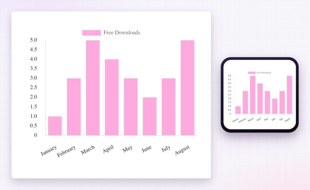
A height for each screen. Chart height is set separately for desktop, tablet and phone, so a wide chart on a laptop does not become a tiny one in a hand.
A chart should make one point. If the sentence above it needs a second point, you probably need a second chart.
People compare lengths quickly and compare digits slowly. A bar chart hands the reader the comparison ready made, so the point lands first and the exact figures are there for anyone who wants them. That is why a chart beside a paragraph outperforms the same numbers inside it.
The widget draws on the open source Chart.js library, which ships inside Sky Addons Pro and loads on pages that carry a chart. The Chart.js bar chart documentation shows what that library is built to do.
A chart is a picture of data, so anybody who cannot see it needs the same message in words. State the takeaway in the text next to the chart. For data that needs more detail, the W3C guidance on complex images explains how to describe it.
No. The bar chart widget is part of Sky Addons Pro.
Yes. Set the type to horizontal and the same data runs left to right, which suits long labels and ranked lists.
Each series is one item in the widget’s list, so add as many as the chart can show clearly. Each gets its own name, values and colours.
No. You type the labels and values into the widget. The chart library is included, and it draws when the chart scrolls into view.
Yes. The chart resizes to its container, and its height can be set separately for desktop, tablet and mobile.
The Elementor bar chart widget turns a list of numbers into a chart your visitors understand at a glance. It runs vertical or horizontal, holds as many series as you add, matches your brand colours and draws itself as it scrolls into view. It is the quickest way to make a figure the argument instead of a footnote.
The Bar Chart demo runs nine bar charts on one page, including horizontal, outlined and multi colour versions. Every control is listed in the Bar Chart documentation.
For figures that need to stay as text, the Elementor comparison table and the Elementor advanced table are the matching widgets.
The bar chart is included in Sky Addons Pro, and the free versus Pro page shows where the line falls.



Comments are closed.