
Elementor Offcanvas Menu: Give Navigation Its Own Room
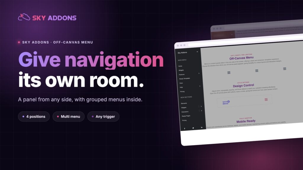
The Elementor offcanvas menu slides navigation in from any of four sides, with grouped sections, social links, and any element on the page as the trigger.
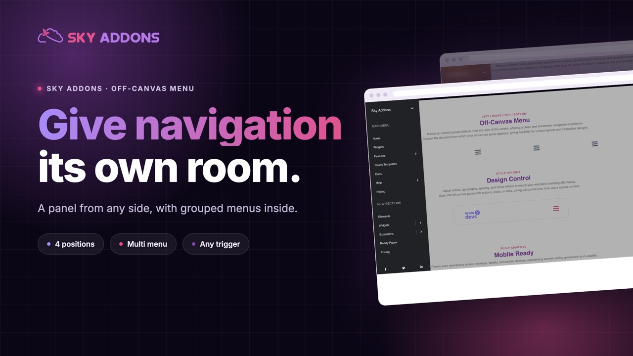
Some sites have more navigation than a header can hold. A shop with fifteen categories, a university with six departments, an agency with services, work, writing and a shop. Cramming that into a bar produces a header nobody can read and a mobile menu that scrolls forever.
The answer is not to cut the navigation. It is to give it somewhere to live.
The Elementor offcanvas menu slides a full panel in from the side, top or bottom, with room for grouped sections, social links and whatever else belongs in the site’s index rather than its header.
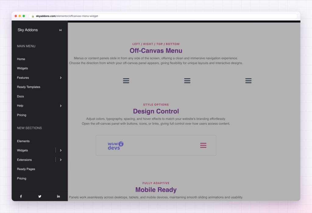
| A packed header bar | An Elementor offcanvas menu |
|---|---|
| Items shrink until nothing is readable | A full panel with room for everything |
| One flat list | Several menus, each with its own heading |
| Opens from the theme’s hamburger only | Any element on the page can open it |
| Always from the same side | Left, right, top or bottom |
| Closing is a guess | Closes on a link click, on Escape, or on the overlay |
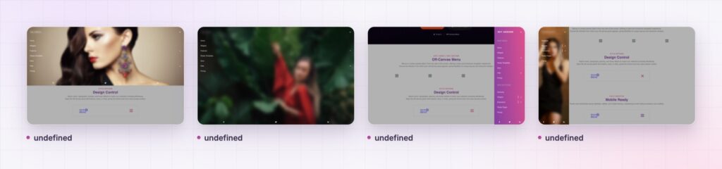
Four positions. Slide in from the left, the right, the top or the bottom. Left and right take a width, top and bottom take a height, so a top panel can be a shallow strip of categories and a left panel can be a full height index.
Several menus in one panel. Turn on multi menu and add sections, each with its own title and its own WordPress menu. This is what makes a panel readable: “Shop”, “Learn” and “Company” as three blocks rather than twenty undifferentiated links.
Any element as the trigger. Name a CSS selector and that element opens the panel. Your own icon in a header template, a text link in the footer, a button in a hero. The panel is not tied to one hamburger.
Submenus that behave. Choose whether a deeper level overlaps the panel or expands inside it, set the indent, and set the label on the back control. Overlap suits deep catalogues, expanding suits short menus.
Social links built in. The row of icons that always ends up in a menu panel is part of the widget rather than a second widget you position by hand.
Closing that works three ways. Click a link, press Escape, or click outside. All three are on by default, because a panel that traps somebody is worse than no panel at all.
A panel is only better than a dropdown if the extra room gets used. If your offcanvas menu is one list of six links, a dropdown was the right answer.
Navigation competes with content for space in a header, and content usually loses. Moving the full index into a panel means the header can be a logo, one action and one trigger, which is the shape almost every well designed site has converged on.
The grouping is what makes it work rather than the sliding. A visitor scanning twenty links finds nothing. The same twenty links under three headings become three decisions, each with a handful of options, and that is a shape people can actually use.
The closing behaviour deserves attention too. Escape, the overlay and a link click all closing the panel is what the WAI-ARIA authoring practices for dialogs describe, and it is the difference between a panel that feels light and one that feels like a trap. Somebody who opened it by accident should be able to get out without thinking.
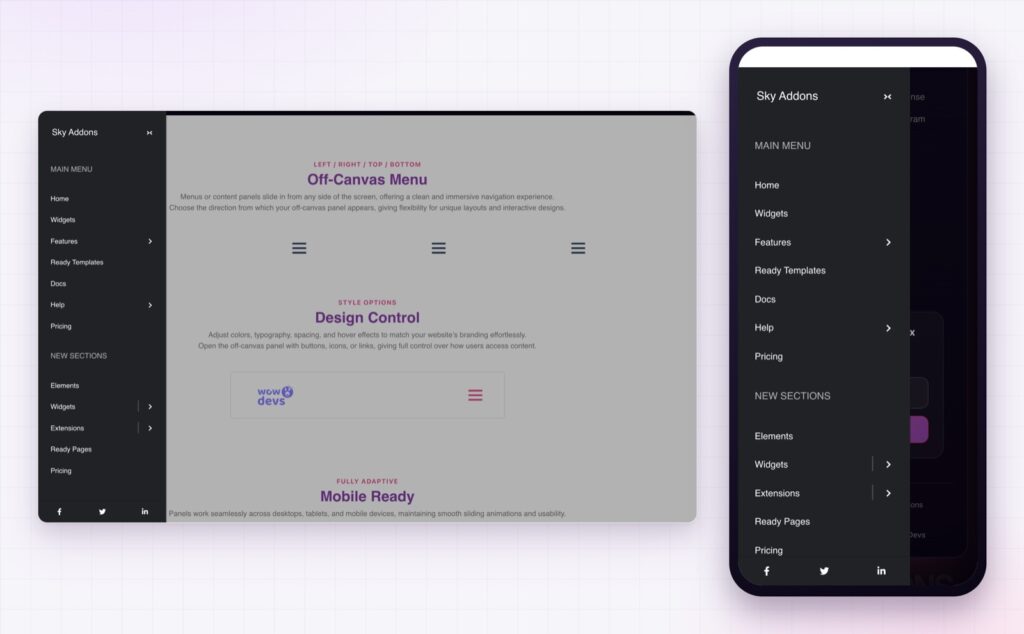
No. The offcanvas menu is part of Sky Addons Pro.
Left, right, top or bottom, whichever suits the design.
Yes. Give the widget a CSS selector and any element on the page becomes the trigger.
Yes. Multi menu mode lets you add several sections, each with its own title and its own WordPress menu.
By clicking a link, pressing Escape, or clicking outside the panel. All three are on by default.
The Elementor offcanvas menu gives navigation the room a header cannot spare: a panel from any of four sides, several grouped menus inside it, social links at the bottom, and any element on the page as the trigger. It closes three different ways, it styles like the rest of your site, and it turns a crowded header into a logo, an action and one clear control.
The Offcanvas Menu demo runs six panels on one page, including a grouped multi section layout and panels from three different sides. Every control is listed in the Off-Canvas Menu documentation.
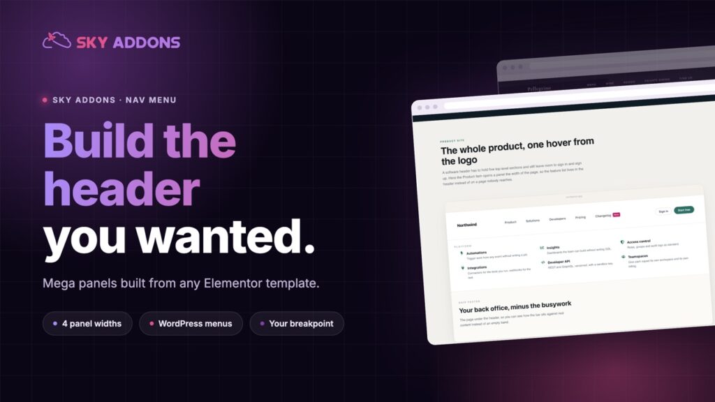
For a header bar with mega panels rather than a slide in, the Elementor nav menu is the matching widget, and Elementor breadcrumbs tell people where they landed.
The offcanvas menu is part of Sky Addons Pro. The free versus Pro page shows where the line falls.

Comments are closed.