
Elementor Nav Menu: Build the Header Your Theme Would Not Let You
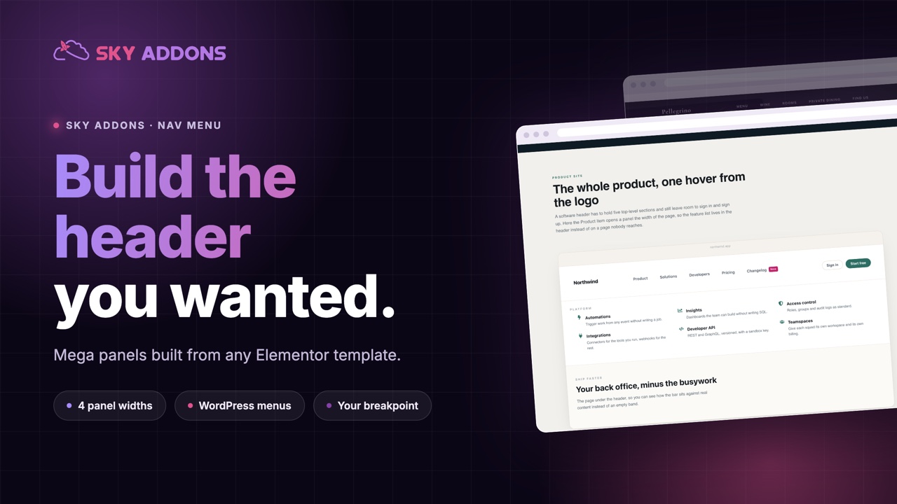
The Elementor nav menu builds real headers: WordPress menus or custom items, mega menu panels from any template, and a hamburger you can trigger yourself.
The header is the part of a site people use most and designers control least. The theme decides how the menu looks, how it behaves on a tablet, and what happens when a submenu has more than five items. Usually the answer to that last one is a narrow grey column that runs off the bottom of the screen.
Anything more ambitious, a panel with product images or a column of categories next to a promotion, normally means either a mega menu plugin or a developer.
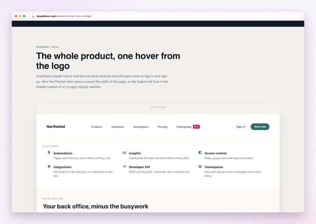
The Elementor nav menu closes that gap. It reads your existing WordPress menu, or lets you build items by hand, and any item can open an Elementor template as its panel.
| A theme menu | An Elementor nav menu |
|---|---|
| Submenus are a narrow grey column | Any item can open an Elementor template |
| Panel width fixed by the theme | Dropdown, centred, full width or container width |
| Breakpoint decided for you | You choose where it collapses |
| Hamburger is whatever the theme ships | Your own icon, your own trigger element |
| Styling means editing theme files | Every state is a control |
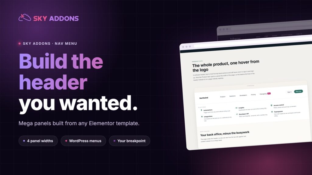
Four mega menu panel layouts. A panel can sit under its item like a dropdown, centre itself under the item, span the full width of the nav bar, or match your header container. That last one is what keeps a mega menu aligned with the rest of the header instead of hanging off it.
Panels are ordinary Elementor templates. Build the panel the way you build any section, with images, grids, buttons and a loop of posts if you want one. There is no separate mega menu editor to learn, and anything you can build on a page you can put in a menu.
Your WordPress menu or custom items. Point it at a menu you already maintain, so editors keep using the screen they know. Or build the items in the widget with three levels, icons and a badge on any item, which is how you get a “New” or “Sale” label without a plugin.
A trigger you choose. Use the built in hamburger, or name a CSS selector and let any element on the page open the menu. That is how a custom icon in a header template ends up controlling the mobile panel.
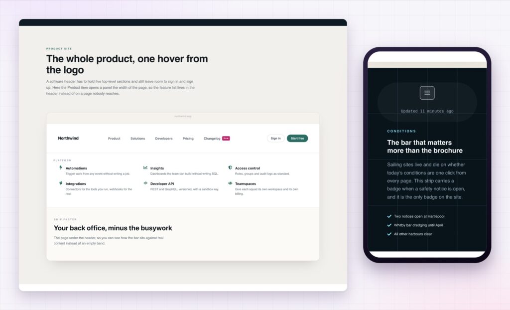
Your breakpoint, not the theme’s. Decide whether the menu collapses at desktop, tablet or mobile, using the Elementor breakpoints you already set. A menu with seven items and a long logo usually needs to collapse earlier than the theme thinks.
Everything has a state. Normal, hover and active for the top level, the dropdown, the mega panel, the badge, the hamburger button and the off canvas panel. Submenu open speed is slow, medium or fast.
If a menu needs more than three levels, the problem is the site structure, not the menu. Three levels is the point where visitors stop keeping track of where they are.
Navigation is how people decide whether a site is worth their time. A menu that shows a category with an image and a price makes the next click obvious; a grey list makes it a guess. The panel does not need to be clever, it just needs to show something.
The technical side matters as much. A menu built from a real WordPress menu keeps working when somebody adds a page, because it reads the same structure the rest of the site uses. That is the WordPress navigation menu system doing its job, and it is why a client can reorder the header without touching Elementor.
Then there is the mobile panel, which is where most headers quietly fail. A menu that collapses too late leaves a cramped row of links on a tablet. One that collapses too early hides navigation from people who had room for it. Choosing the breakpoint yourself is a small control that fixes a very common problem.
No. The nav menu is part of Sky Addons Pro.
Yes. Pick a registered menu and editors carry on using the normal Appearance screen. Custom items are there if you prefer building them in place.
Yes. Any item can open an Elementor template as its panel, in four widths including full width.
Wherever you choose: desktop, tablet or mobile, using your own Elementor breakpoints.
Yes, and you can point the menu at any element on the page as the trigger instead.
The Elementor nav menu turns the header from the part of the site you inherit into the part you design. It reads your WordPress menu, opens any Elementor template as a mega panel in four widths, collapses at the breakpoint you choose, and gives every state its own controls. A client keeps editing the menu the way they always have, and the header finally looks like the rest of the site.
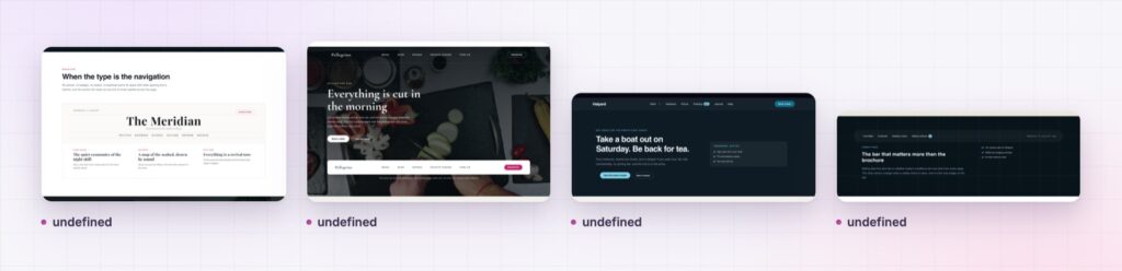
The Nav Menu demo runs twelve headers on one page, including full width mega panels, centred dropdowns and the mobile panel. Every control is listed in the Nav Menu documentation.
For a slide in panel rather than a bar, the Elementor offcanvas menu is the matching widget, and Elementor breadcrumbs handle the trail underneath.
The nav menu is part of Sky Addons Pro. The free versus Pro page shows where the line falls.

Comments are closed.