
Elementor Image Curtain: Reveal the Picture Instead of Just Showing It
The Elementor image curtain uncovers an image as the reader arrives or hovers, so the picture that sells the page gets a moment instead of a glance.
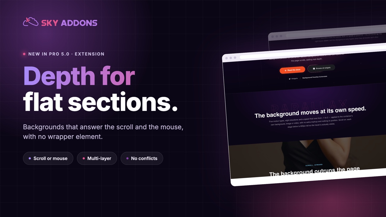
A hero with a full-width photograph behind it is the most common section on the web, and the flattest. The image sits there, the text sits on it, and the whole thing reads like a poster taped to a wall.
Depth changes that, and depth on the web comes from one trick: different things moving at different speeds. A background that drifts more slowly than the text in front of it reads as distance, and distance is what makes a section feel like a place rather than a rectangle.
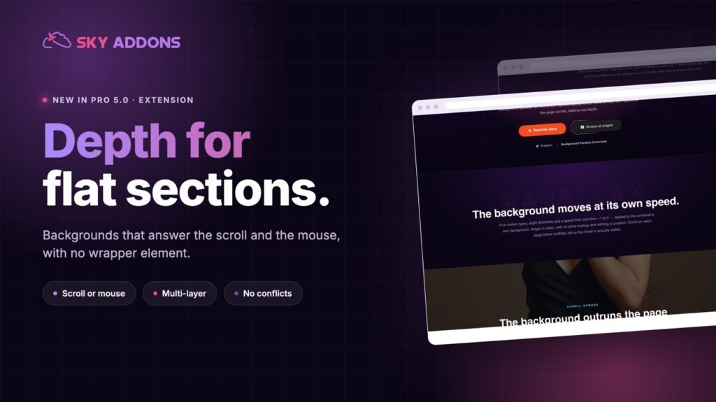
Elementor background parallax in Sky Addons Pro 5.0 does that for any section, responding to the scroll, the mouse, or both, without a wrapper element or a second plugin.
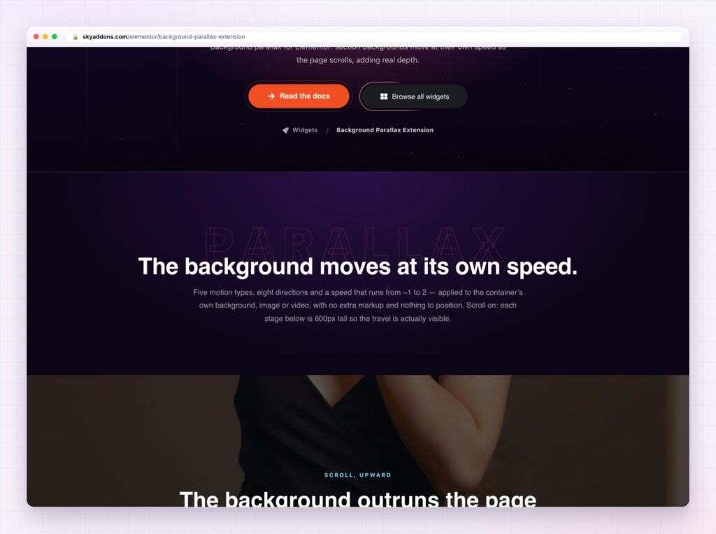
| A static background | Elementor background parallax |
|---|---|
| Flat, and read in a second | Depth, so the eye stays longer |
| Nothing responds to the visitor | Answers the scroll and the mouse |
| Needs a video file to feel alive | Uses images you already have |
| Usually a plugin or custom code | A setting on the section |
Scroll and mouse, or either. Scroll parallax suits long pages. Mouse parallax suits heroes, where the visitor is not scrolling yet but is moving the pointer. Together they make a section feel interactive without asking for a click.
Multi-layer depth. More than one background layer, each with its own speed, so a foreground element can travel faster than the sky behind it. That is how you get depth rather than a single sliding photograph.
No wrapper element. The effect applies to the section you already built, so nothing in the structure changes and nothing else on the page is affected.
Speed and direction control. How far the background travels and which way, including diagonals, which look considerably better than a straight vertical shift.
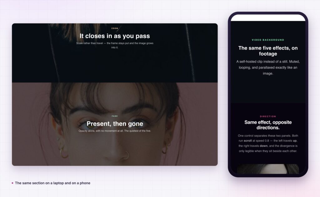
It behaves on phones. Movement is reduced or disabled on small screens, where a heavy parallax is both distracting and expensive.
No plugin conflict. It uses its own transform layer, so it does not fight Elementor’s own effects or a second animation plugin.
Parallax is a rumour, not an announcement. If a visitor says “nice parallax”, it was too strong.
Human vision reads relative motion as depth automatically, which is why the trick has survived since the first side-scrolling games. On a page it buys you two things: attention, because moving things hold the eye, and quality, because depth is expensive to fake any other way.
There is also a practical benefit. A parallax section makes an ordinary stock photograph look intentional, which matters on projects where the photography budget was whatever was left.
There is a budget argument as well. Commissioning original photography or a background video for a hero is one of the more expensive line items on a project, and it dates quickly. A still image with depth applied to it holds attention almost as well, costs nothing extra, and can be swapped in a minute when the campaign changes.
Keep it to the sections that carry the story. The value comes from contrast with the rest of the page, so a site where everything drifts has no depth at all.
Parallax is one of the effects motion-sensitive visitors switch off, and prefers-reduced-motion is how their browser says so.
No. It applies to the section you already built.
Yes, either or both, which is what makes a hero feel alive before any scrolling happens.
It uses its own transform layer, which avoids the usual conflicts.
The movement is a transform, so the cost is the image weight, not the effect.
The movement is reduced or disabled, because heavy parallax on a small screen is a distraction.
Elementor background parallax turns a flat section into one with depth, using the images you already have and the section you already built. Apply it to the hero, keep it subtle, reduce it on phones, and a page that looked like a stack of rectangles starts looking like a place.
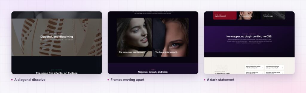
The Background Parallax demo runs several sections, including a diagonal dissolve and a pair of image frames moving in opposite directions, so you can see how different a small change of direction feels. Every setting is in the Background Parallax documentation.
For depth on individual widgets rather than backgrounds, look at Elementor element parallax. Both are part of the release described in Sky Addons 4.0 and Pro 5.0.
Background Parallax is a Pro extension, included in every Sky Addons Pro plan, and the free versus Pro page shows what the free plugin covers.



Comments are closed.