
Elementor Horizontal Scroll: The Story Layout Clients Keep Sending You
Build an Elementor horizontal scroll section that turns a page into a story: panels pinned, side scrolling on the wheel, and a sane fallback on phones.
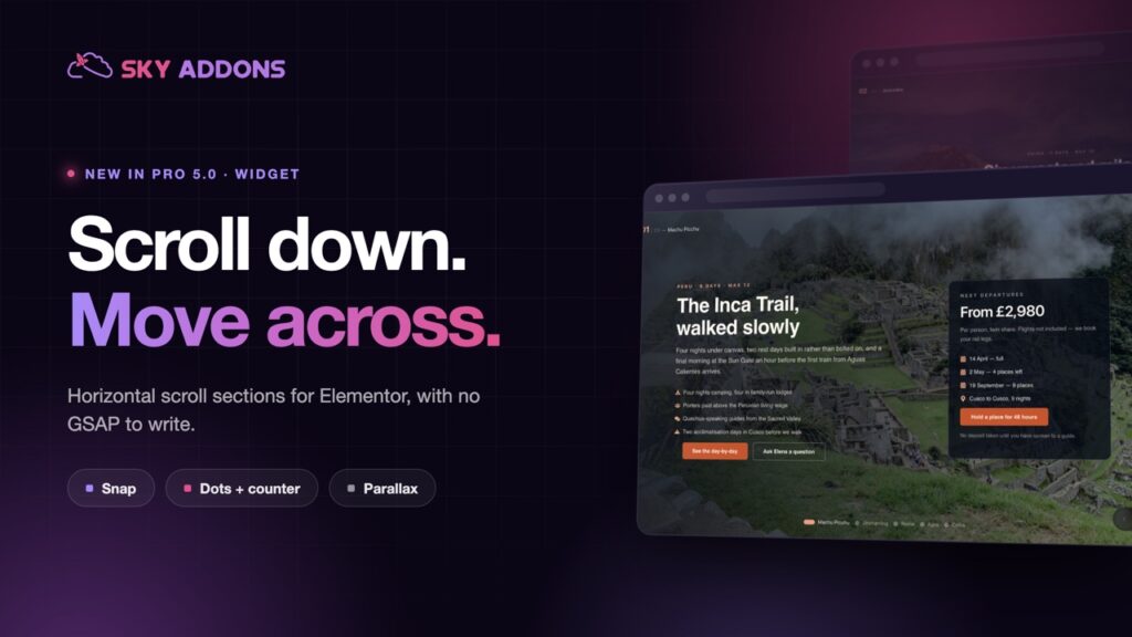
Sooner or later a client sends you a link to an agency site where the page stops, and the content slides sideways as you scroll. They want that. Not for any measurable reason, but because it made them stop and read, and that is exactly the thing their own site fails to do.
Until now the honest answer was a quote for custom GSAP work. The Elementor horizontal scroll widget in Sky Addons Pro 5.0 gives you the same effect as a widget, with panels you build the way you build any other section.
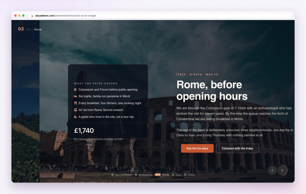
The common thread: content that has an order, where you want people to see every item rather than the first and the last.
A normal page rewards scrolling with more of the same. A horizontal section changes the direction of travel, so the visitor notices they are moving through something. Because the section is pinned while it plays, every panel gets its moment on screen instead of sliding past at whatever speed the mouse wheel decides.
Used once on a page, that is memorable. Used three times, it is exhausting. This is a feature for the part of the page that carries the argument, and only that part.
One horizontal section per page, near the top of the story. If you cannot say which section deserves it, the answer is none of them.
Panels are ordinary containers. Anything you can build in Elementor goes in a panel: images, headings, buttons, forms, another widget. There is no special content type to learn and no repeater to fill in.
Motion that feels intentional. Panel width, scroll distance, easing and snap are all settings, so the section can drift gently or click firmly from panel to panel. Snapping suits short statements; free scrolling suits imagery.
Navigation for the people who miss it. Arrows, dots and panel labels are optional, and worth turning on. Some visitors will not realise the section moves sideways until they see a control that says so.
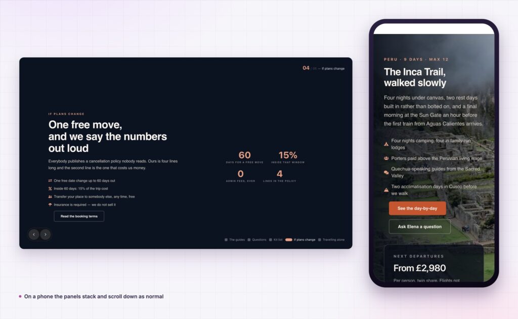
It behaves on a phone. Below your chosen breakpoint the panels stack and the section scrolls down like any other, which is the right answer on a touch screen where hijacked scrolling feels broken.
It respects reduced motion. Visitors who ask their operating system for less movement get the content without the ride. That is both the accessible choice and a requirement under WCAG animation guidance.
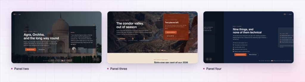
A custom build of this effect means a developer, a GSAP licence conversation, a stylesheet nobody else on the team can edit, and a maintenance job every time the client wants a new panel. The widget version means the client can add a panel themselves, and the site does not depend on one person understanding one script.
That is the real argument for it. Not that the effect is new, but that it stops being expensive.
No. The motion is handled for you and every setting is in the Elementor panel.
Below your breakpoint the panels stack and scroll normally, which is the behaviour visitors expect on touch screens.
Yes. Panels are ordinary containers, so a panel can hold an image, a form, a video or anything else you build.
The content is real content in the page, not loaded on demand, so it is there to be indexed.
The section stands down for anyone whose system asks for reduced motion.
Horizontal scroll is the layout clients ask for by sending a link and the one agencies used to quote days for. As a widget it becomes a section you build from normal containers, tune with a few settings, and hand over to a client who can add panels without calling you. Use it once per page, on the part of the story that deserves the attention.
The Horizontal Scroll demo runs three full sections, including a travel itinerary with imagery and a panel set built from plain cards. Scroll it on a laptop and then on a phone to see both behaviours. Every setting is documented on the Horizontal Scroll page.
If your story is a sequence of dates rather than places, the Elementor timeline widget does the same job vertically. Both arrived in the release covered by Sky Addons 4.0 and Pro 5.0.
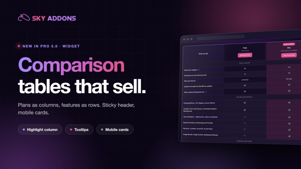
Horizontal scroll is a Pro widget, included in every Sky Addons Pro plan. The free versus Pro page shows what the free plugin covers on its own.



Comments are closed.