
Elementor Pie Chart: Show How the Whole Divides Up in One Look
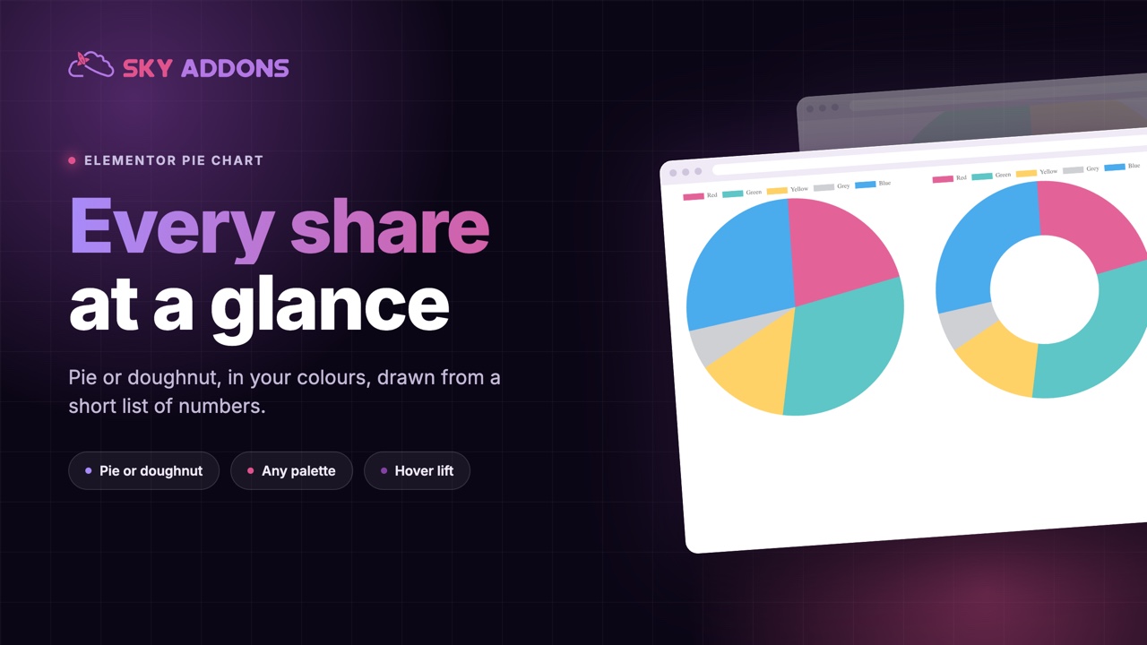
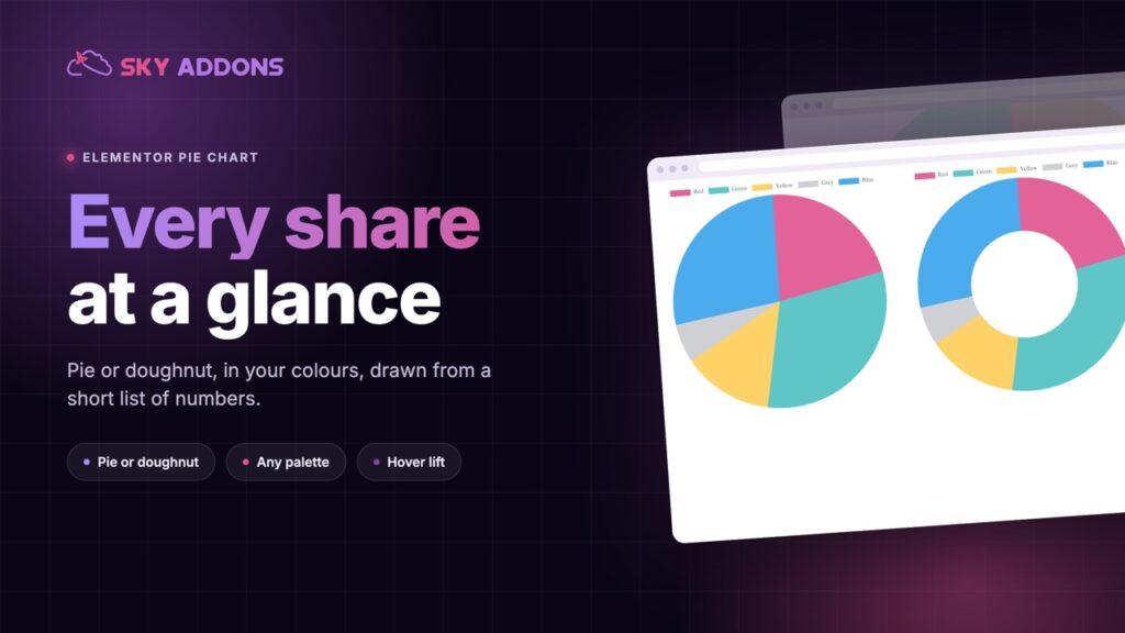
The Elementor pie chart widget draws pie and doughnut charts from a short list of values, in your colours, with a hover lift. No extra plugin needed.
“Where does the money go?” is one of the most common questions a website has to answer, and the answer is usually a list of percentages. Forty, thirty, twenty, ten. The reader has to add them up in their head and picture the split.
A pie chart pictures it for them. The whole is a circle, each share is a slice, and the biggest one is obvious before anyone reads a label.
The Elementor pie chart widget draws that circle on your page from a short list of values. One setting turns it into a doughnut, and both are part of Sky Addons Pro.
| A list of percentages | An Elementor pie chart |
|---|---|
| The reader adds the numbers up | The whole is drawn for them |
| Every share looks equally important | The biggest slice is visible at once |
| Colours cannot carry meaning | Each slice in a colour of your choice |
| Nothing to touch | Hover a slice to lift it and see its value |
| Plain text on every screen | A chart height set for each device |
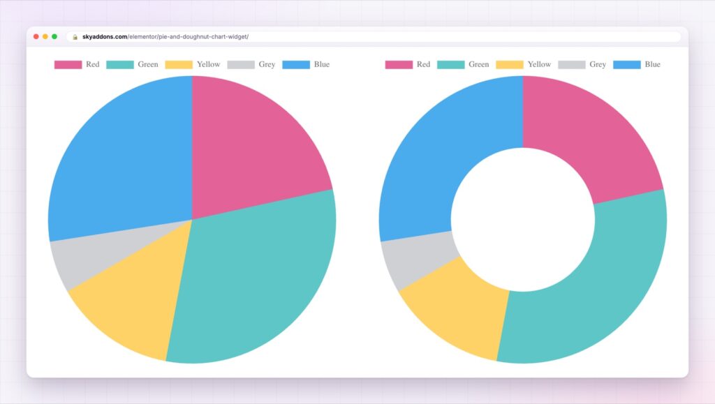
Pie or doughnut, one setting. A pie is a solid circle. A doughnut leaves a hole in the middle, which reads lighter when several charts share a page. The data does not change, only the shape.
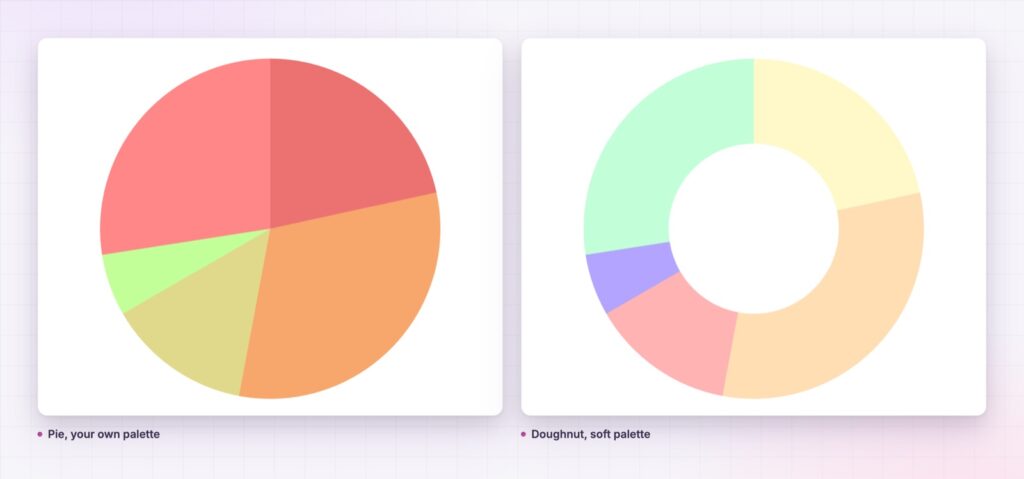
Every slice is its own item. Add a slice and give it a name, a value and its colours: fill, hover fill, border and hover border. There is no fixed number of slices and no preset palette to fight.
A hover that lifts. Each slice has a hover offset, up to twenty pixels, so it steps out of the circle when the pointer touches it. It is a small effect that tells the visitor the chart is alive.
Cleaner or richer, your call. The title, the legend and the tooltips switch on and off. The legend can sit at the top, left, bottom or right, in reverse order if you like, and its colour boxes can be resized.
Motion that fits. Four animation curves, linear, ease in cubic, ease in circ and ease in bounce, and a duration of up to ten seconds. The chart draws as it scrolls into view.
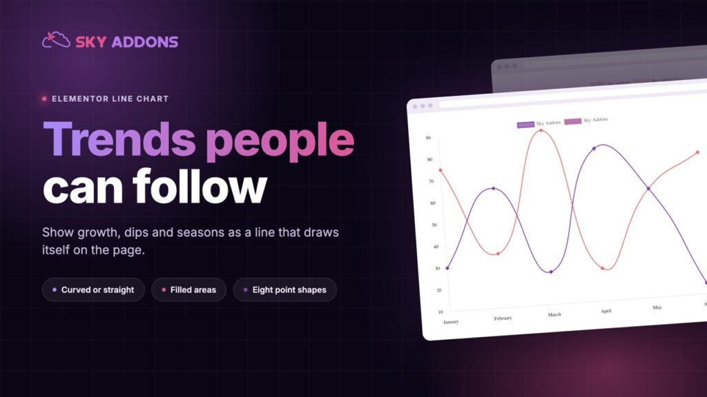
A height for each screen. Chart height is set separately for desktop, tablet and phone. To show change over time instead of shares, the Elementor line chart takes the same kind of data.
A pie chart answers one question: how does the whole divide? If the question is anything else, use a different chart.
A circle is the one shape everyone reads as a whole. Slices are then read as parts of it, and the eye compares their size without any instruction. That is why a pie chart puts a split across faster than a table of the same shares.
The widget draws on the open source Chart.js library, which ships inside Sky Addons Pro. The Chart.js doughnut and pie documentation describes what the library does with offsets, borders and cutouts.
A chart is a picture of data, so say the takeaway in the text beside it for anybody who cannot see the chart. For more detailed data, the W3C guidance on complex images explains how to describe it.
No. The pie chart widget is part of Sky Addons Pro.
Yes. The type setting switches between pie and doughnut, and the data stays the same.
Each slice is one item in the widget’s list, so add as many as the chart can show clearly. Each gets its own name, value and colours.
No. You type the names and values into the widget, and the chart library is included.
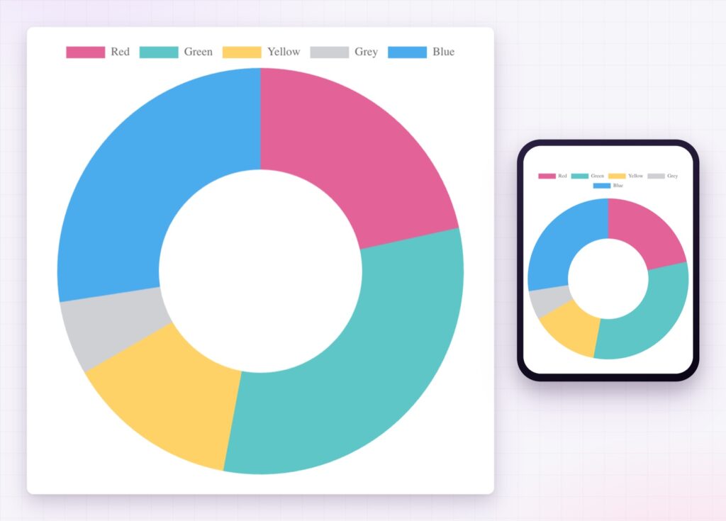
Yes. The chart resizes to its container, and its height can be set separately for desktop, tablet and mobile.
The Elementor pie chart widget turns a short list of values into a circle your visitors read in a second. It runs as a pie or a doughnut, gives every slice its own colours and a hover lift, and draws itself as it scrolls into view. It is the quickest way to answer how the whole divides up.
The Pie and Doughnut demo runs four charts on one page, in different palettes. Every control is listed in the Pie and Doughnut Chart documentation.
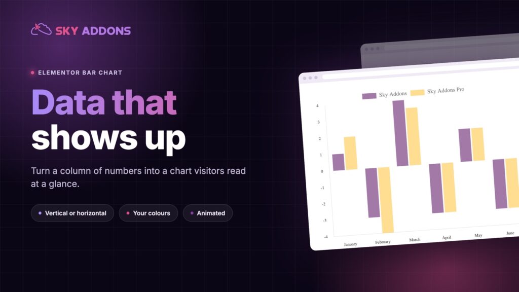
To compare categories side by side rather than shares of a whole, see the Elementor bar chart.
The pie chart is included in Sky Addons Pro, and the free versus Pro page shows where the line falls.

Comments are closed.