
Elementor Pie Chart: Show How the Whole Divides Up in One Look
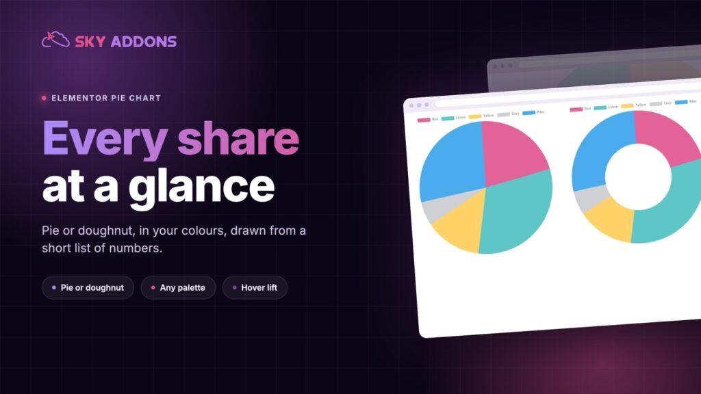
The Elementor pie chart widget draws pie and doughnut charts from a short list of values, in your colours, with a hover lift. No extra plugin needed.
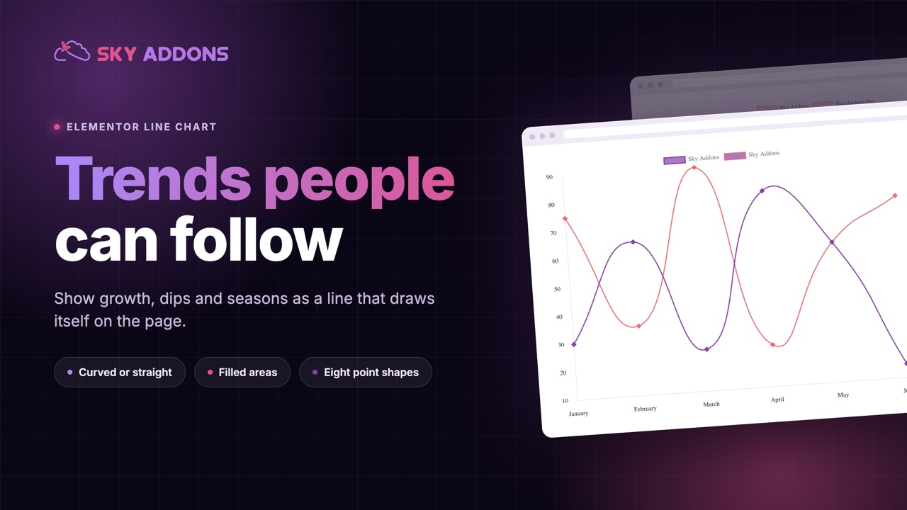
Some numbers are a single fact. Others are a story: sign-ups climbing, costs falling, a quiet summer and a strong autumn. The story lives in the shape, and a table of figures hides the shape completely.
A line chart shows it. The eye follows the line up, down and along, and understands what happened before it has read one number.
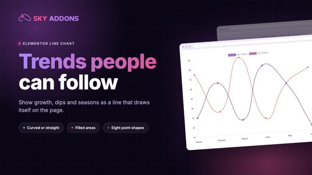
The Elementor line chart widget draws that line on your page from a list of labels and a list of values. It draws itself as the visitor scrolls, and it is part of Sky Addons Pro.
| A table of figures | An Elementor line chart |
|---|---|
| The shape is hidden in rows of digits | The trend is visible in a second |
| Comparing two series means reading two columns | Two lines on one chart, crossing where it matters |
| Peaks and dips are easy to miss | The peak is simply the highest point |
| Static and flat | Draws as it scrolls into view, with values on hover |
| Hard to read on a phone | A chart height set for each device |
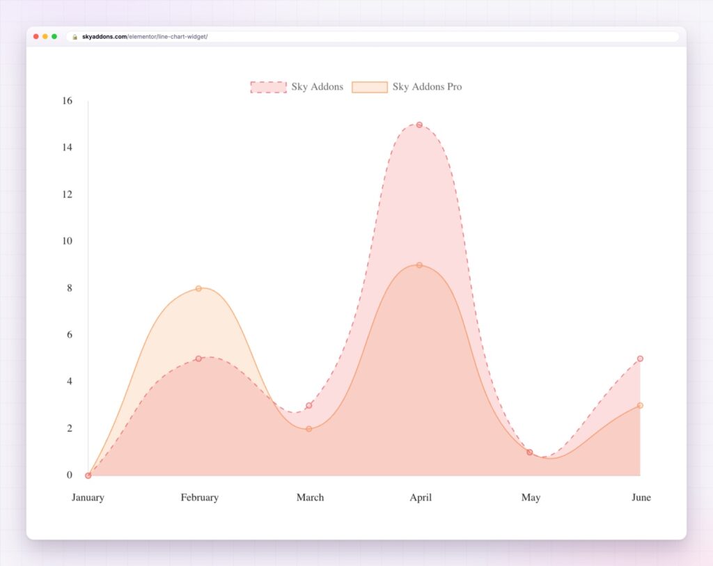
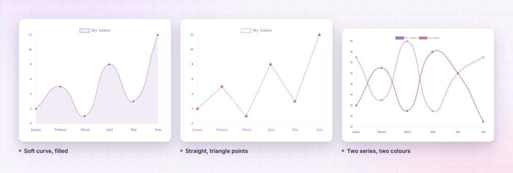
Curved or straight. Line tension runs from a sharp, exact line to a soft curve. Curves suit seasons and growth. Straight segments suit data where every change should look exactly as big as it is.
Filled areas. Each series can fill the space under its line in a colour you choose. It gives one line some weight, and where two series overlap the fills read as layers.
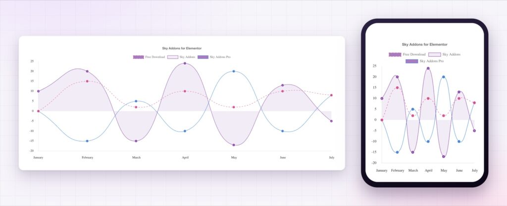
Dashed lines for what is not certain. Give a series a dash pattern and it stops looking like fact. It is the natural way to show a forecast next to actual results.
Points with personality. Eight point shapes are built in: circle, cross, dash, line, rectangle, rounded rectangle, rotated rectangle and triangle. Points have their own colour and border width, so the measured values stand out from the line between them.
As many lines as the story needs. Every series has its own name, values, line colour, point colour and fill. The legend, the title, the axis labels and the tooltips switch on and off, and the animation runs on one of four curves for up to ten seconds.
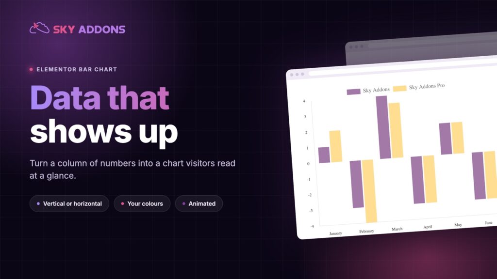
A height for each screen. Chart height is set separately for desktop, tablet and phone. If you also need to compare categories rather than follow a trend, the Elementor bar chart shares the same controls.
Draw the line for the story, not for the decimals. If the reader needs exact figures, put them in a table beside it.
A line joins points into a path, and the eye follows a path without being told to. Slope becomes the message: steep means fast, flat means steady, a dip means something happened. The reader gets the meaning first and the figures second, which is the order people want them in.
The widget draws on the open source Chart.js library, which ships inside Sky Addons Pro. The Chart.js line chart documentation describes what the library does with tension, fills and point styles.
A chart is a picture of data, so state the takeaway in the text beside it for anybody who cannot see it. For more detailed data, the W3C guidance on complex images explains how to describe it.
No. The line chart widget is part of Sky Addons Pro.
Yes. Line tension sets how curved the line is, from straight segments to a soft curve.
Yes. Give the forecast series a dash pattern and its own colour, and put both series on the same chart.
No. You type the labels and values into the widget, and the chart library is included.
Yes. The chart resizes to its container, and its height can be set separately for desktop, tablet and mobile.
The Elementor line chart widget turns a list of numbers into a trend your visitors can follow at a glance. Lines can be curved or straight, filled or dashed, with eight point shapes and as many series as the story needs. It is the fastest way to let the shape of your data do the persuading.
The Line Chart demo runs seven line charts on one page, including filled, dashed and multi series versions. Every control is listed in the Line Chart documentation.
For a story told in dated steps rather than a curve, the Elementor timeline is the matching widget.
The line chart is included in Sky Addons Pro, and the free versus Pro page shows where the line falls.

Comments are closed.