
Post List: 3 Smart Column Layouts for a Blog Feed That Gets Read
The post list widget gives Elementor one, two or three columns, an image beside or above the text, eight content toggles and real pagination. Free.
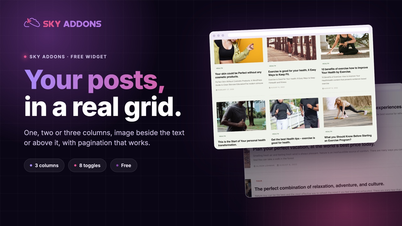
Every WordPress theme ships a blog archive, and most of them look like a blog archive. One column, a big image, a date, an excerpt that runs to exactly fifty five words whether the post needed them or not. It works, and it looks like every other site built on the same theme.
The post list widget takes that feed out of the theme and puts it on the page, where you can decide what a post card actually shows. Three column choices, an image that sits beside the text or above it, and eight switches that turn parts of the card on and off. Nothing about it is exotic. That is the point: a blog feed is a solved problem, and what you want is control over the shape, not another set of effects.
| Theme archive | Post list widget | |
|---|---|---|
| Columns | whatever the theme chose | 1, 2 or 3, set per breakpoint |
| Image position | fixed by the template | beside the text or above it |
| What shows | title, date, excerpt, usually fixed | 8 independent switches |
| Excerpt length | theme constant | a word count you set |
| Query | the archive you are on | any query you build |
| Where it goes | the archive page only | any page, any section |
The archive template is one layout for every list on the site. The widget lets a home page feed, a sidebar feed and a related posts block be three different shapes drawn from the same posts.
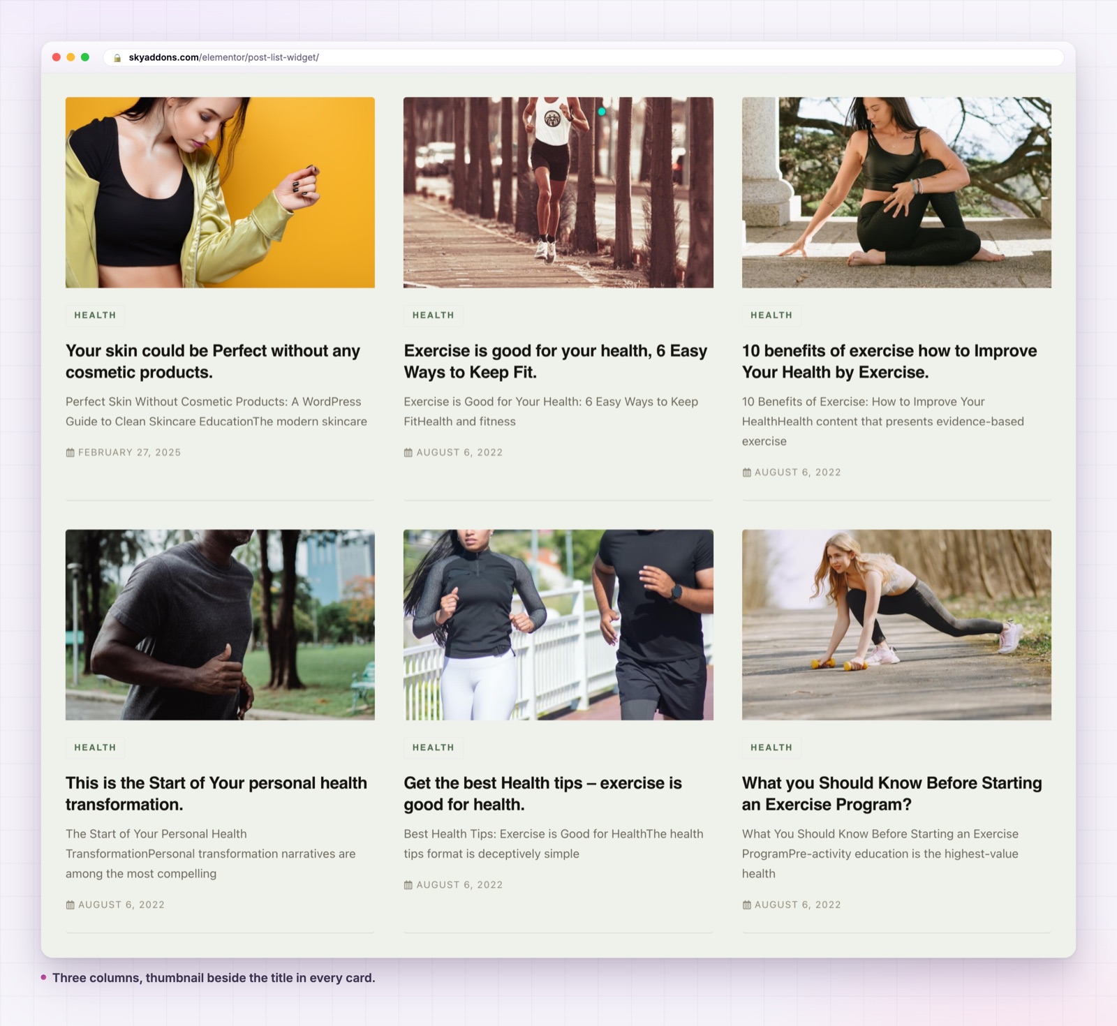
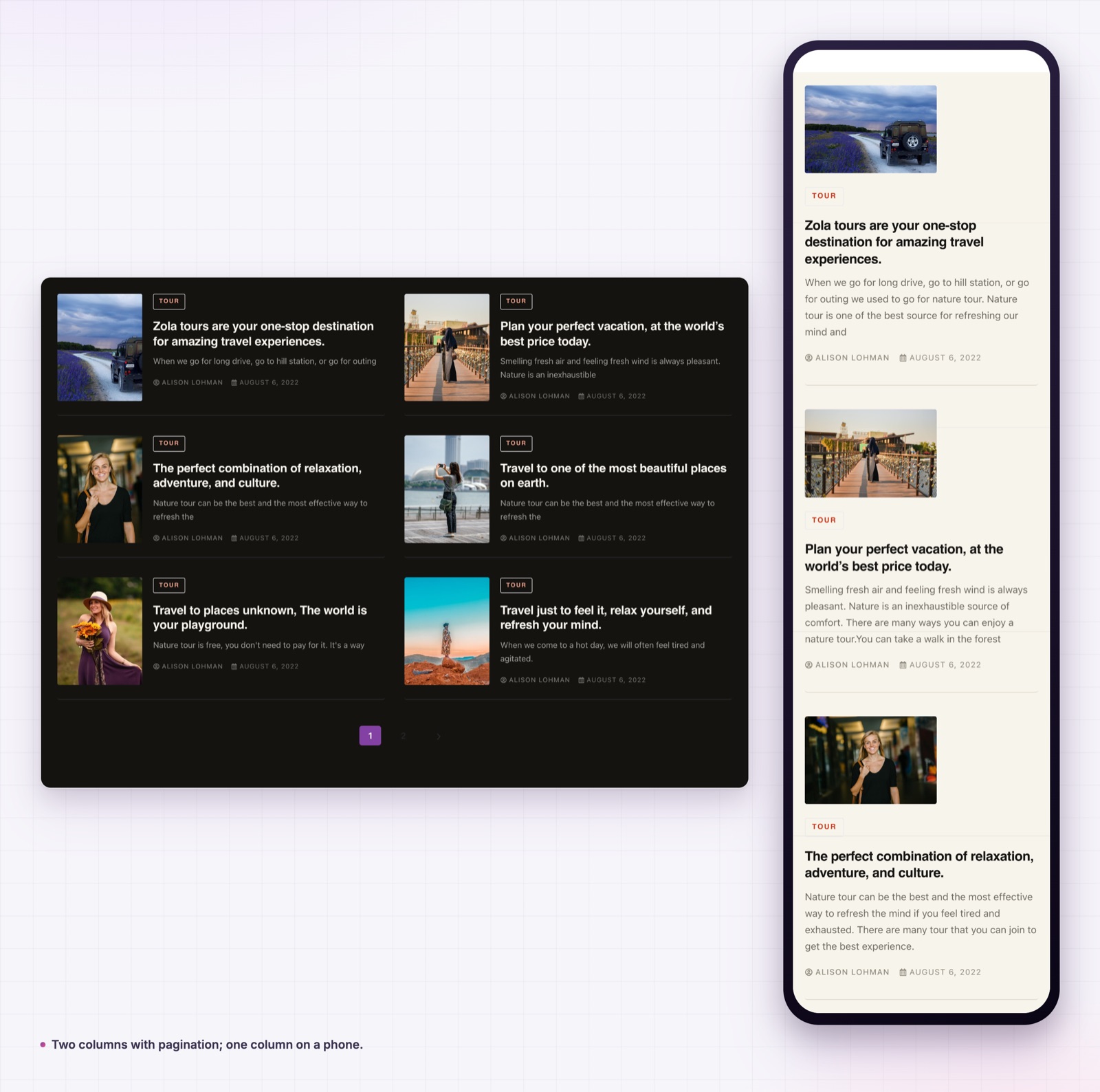
Columns that change per breakpoint. The Columns control is responsive, so three on a desktop, two on a tablet and one on a phone is three clicks, not a media query. The widget lays out on CSS grid, so the cards keep their gaps at every width.
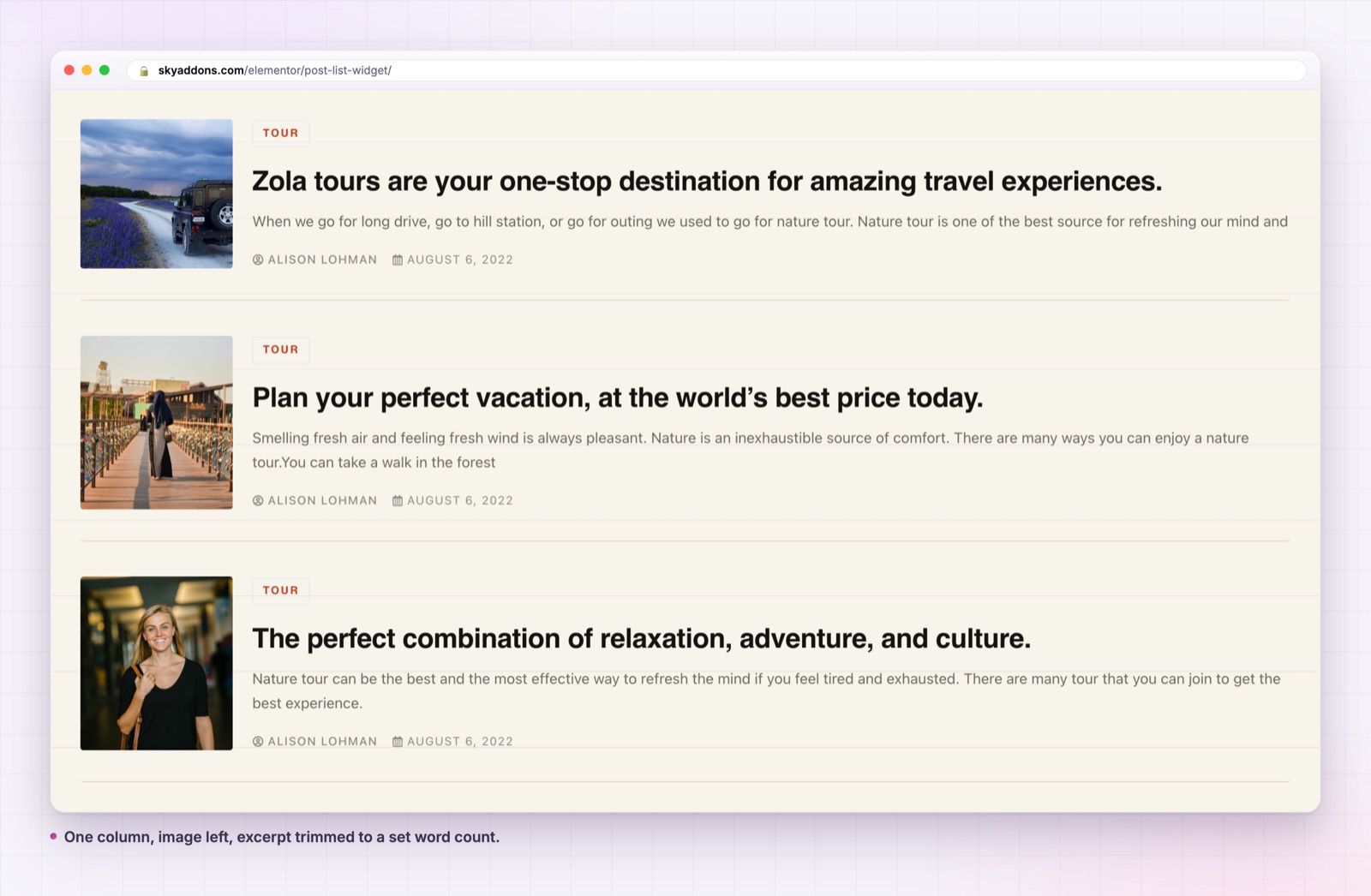
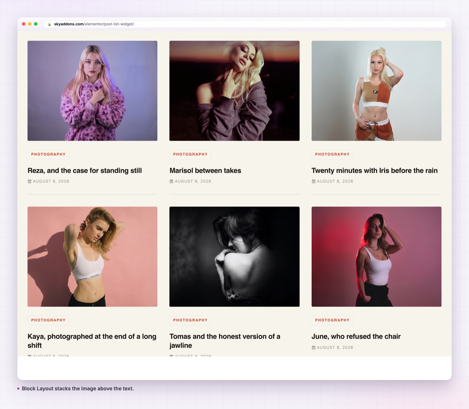
Two content positions, not one. Default puts the image beside the text, which is the shape that works in narrow columns and sidebars. Block Layout stacks the image above, which is the shape that works for a wide feature grid. Both are on the same control.
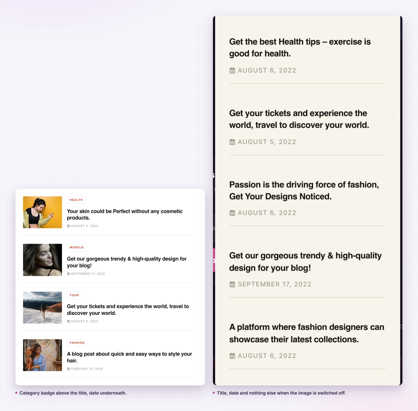
Eight switches for what a card shows. Title, image, category, author, text, date, video and pagination each have their own toggle. A documentation list turns off the image, the author and the excerpt and suddenly fits twenty entries on a screen.
A word count you choose. Text Limit defaults to thirty words and applies to the main content, not to a hand written excerpt. Set it to zero and you get the full text, which is occasionally what a short link blog wants.
A play button for video posts. Show Video adds a play button over the thumbnail and opens the video in a lightbox, so a mixed feed of articles and videos reads as one list instead of two.
Pagination that actually paginates. Show Pagination adds numbered links under the grid, so a long list stays on one page without an endless scroll.
Set the image height rather than leaving it to the natural ratio. Without a real height, the crop never engages and one portrait photograph in the feed will set the row height for every card beside it.
Two things. The first is obvious: the feed stops looking like a theme. The second matters more for a business site, which is that a feed you control can be short. The archive template wants to show everything. A widget that shows the four posts worth reading, with the excerpt trimmed to two lines, turns a blog index into a piece of the page rather than a destination of its own.
There is a measurable side too. A card that shows a category badge gives the visitor a reason to click before they have read the title, and a feed with pagination keeps the page weight predictable instead of loading forty thumbnails into a home page.
The Query tab is the part people skip, and it is where most of the value is. A few patterns worth copying.
For a home page feed, query the post type, set posts per page to three or six, and order by date. Keep it short. A home page feed exists to prove the site is alive, not to replace the blog.
For a related posts block inside a single post template, query the same post type and filter by the current term. Exclude the current post, or the reader will see the article they are already reading sitting at the top of the list.
For a category landing page, query one term and raise posts per page to twelve with pagination on. This is the case where the post list actually replaces an archive, and the one where the pagination toggle earns its keep.
For a resource or documentation index, query the docs post type, turn off the image and the excerpt, and set the title tag to h3 so the headings nest correctly under the section heading. The title tag control exists for exactly this: a list of links inside a page should not be emitting h2 elements that compete with the page structure.
For an author page, query by author and turn the author line off inside the card. Repeating the same name twelve times under twelve titles adds nothing, and the space it frees lets the excerpt run to a useful length.
A last note on ordering. Date descending is the default and it is right most of the time, but a resource index usually reads better ordered by title, and a curated home page strip reads better with a fixed set of IDs in the order you chose. Both are available in the Query tab, and neither needs code.
One trap worth knowing: if your query sets a taxonomy, the widget reads each post’s tags while it loops, which means one extra database query per post. On a feed of eight that is invisible. On a feed of forty it is worth caring about, so keep long lists paginated rather than loading them all at once.
Yes. It ships in the free Sky Addons plugin, with all three column options and pagination included.
No. It needs Elementor and the free Sky Addons plugin. The query builder is part of the free plugin too.
Yes. The Query tab lists every registered public post type, along with its taxonomies for filtering.
It loads no JavaScript of its own. The only script involved is the shared lightbox, and only when the video toggle is on.
Yes. Columns are set per breakpoint, and the card collapses to one column with a smaller image below 1024 pixels.
A blog feed is a shape, and the theme picked yours. The post list widget hands that choice back: columns per breakpoint, an image beside or above the text, eight switches for what a card carries, and a query you write.
Try it on the post list demo, read the documentation, and if you want each card built from a full Elementor template instead, the loop grid widget is the Pro version of the same idea. For reviews rather than articles, see the fancy testimonial widget. What is free and what is not is set out on the free versus Pro page and the pricing page. The query controls map onto WP_Query in the WordPress developer handbook, and the layout uses CSS grid as documented on MDN.

Comments are closed.