
Sapling Grid for Elementor: A Blog Grid That Does Not Need a Theme
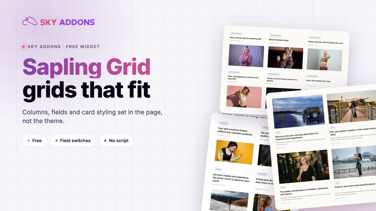
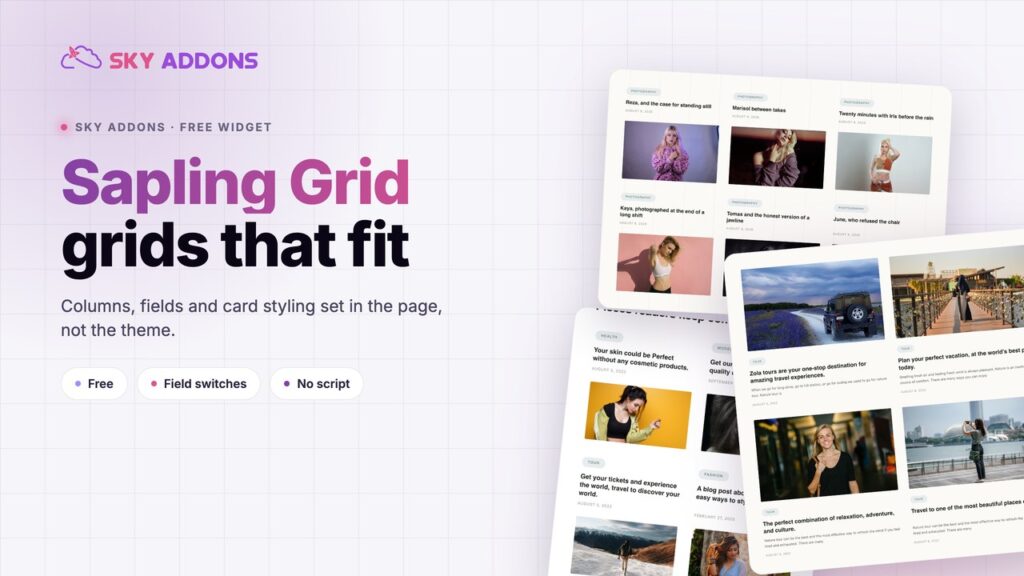
A sapling grid lays posts out in columns with the image, category, author, date and excerpt you choose, styled in Elementor rather than in the theme.
Every theme ships a blog layout, and every theme’s blog layout is slightly wrong for the site it ends up on. The card is too tall, the date is where the category should be, the excerpt runs to forty words when twenty would do. Fixing it means a child theme and a template file.
A sapling grid moves that decision into the page. Columns, gaps, which fields show, how long the excerpt runs and how the card looks are all controls, so the blog section matches the page it sits on instead of the theme it inherited.
| Approach | What it costs you |
|---|---|
| Theme blog template | Styling lives in the theme, so every change is a code change |
| Elementor Posts widget | Fewer field level switches, and the card styling is coarser |
| Hand built cards | They do not update when a post is published |
| Sky Addons sapling grid | Every field switchable, every surface styled, queries stay current |
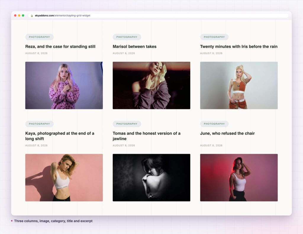
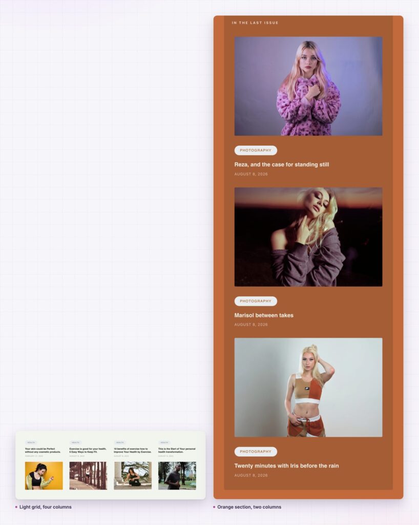
Every field is a switch. Show Title, Show Image, Show Category, Show Author, Show Text, Show Date and Show Pagination turn on independently, so a news list and a photo led grid come from the same widget.
The excerpt is trimmed properly. Text Limit sets the word count, and Strip ShortCode keeps shortcode output from leaking into the summary, which is the usual cause of a card full of stray markup.
Layout is yours. Columns, Row Gap and Column Gap are separate, so a dense archive and an airy feature section are both a few numbers apart.
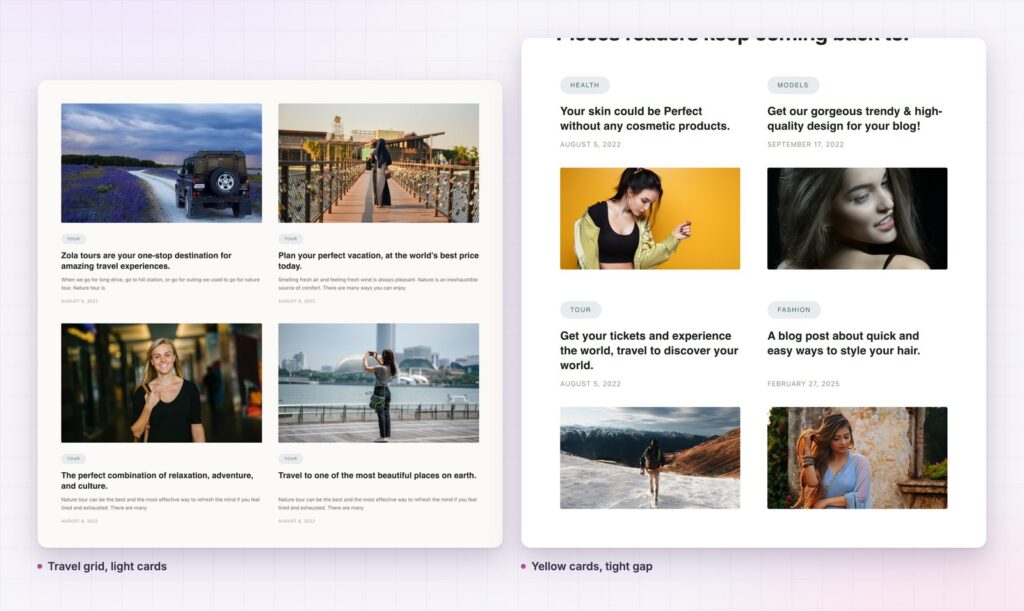
Cards are real surfaces. Padding, content padding, border, border radius, background and box shadow all have Normal and Hover states, so hover can lift a card rather than just tint it.
Video posts are handled. Show Video and the Video Settings section deal with posts whose feature is a video rather than an image, including the play button styling.
A blog section on a sales page has one job: prove the site is alive and that somebody here knows the subject. Three current posts with real titles do that in a band across the page.
Three current posts with real titles prove the site is alive. That is the whole job of a blog section on a sales page.
Because the grid reads a query, it stays true without anybody remembering to update it. The section is written once and keeps being accurate, which is the difference between a blog section that helps and one that quietly ages.

Every field you add makes the cards taller and the grid harder to scan, so the useful question is what the reader loses if it goes.
Category usually earns its place, because it tells a reader whether a post is for them before they read the title. Date earns it on news and release notes, and costs you on evergreen guides, where a year old date reads as stale even when the content is current.
Author earns it on sites where the writer is part of the offer, such as consultancies and agencies, and is noise almost everywhere else. Excerpts are the one people over use: a good title does most of the work, and twenty words of summary underneath often repeats it.
My default for a marketing page is image, category, title, and nothing else. For an archive where people are hunting, add the date and the excerpt.
Uneven card heights are the main way a blog grid looks unfinished, and they come from content rather than from the widget. Two line titles next to one line titles, excerpts that stop mid sentence, and one post without a featured image will all break the rhythm.
Trimming the excerpt to a word count fixes most of it, because the text block becomes a predictable height. Setting a consistent image ratio fixes the rest. Where a post has no featured image, decide deliberately: either enforce one editorially, or switch images off for that grid so the absence is not visible.
Titles are the hard case, since they are written for search rather than for a card. Rather than truncating them, which loses meaning, give the card enough padding that a two line title still sits comfortably against a one line neighbour.
Three is the right number for a home page band, because three cards fill a row and nobody has to scroll to understand what the section is. Six works when the grid is the reason for the page, such as a category landing page, since two rows still read as one block.
Nine and twelve are where grids start to feel like archives, and that is a decision rather than an accident. An archive wants pagination and a full set of fields; a section wants a link to the archive and nothing more.
There is a performance argument too. Each card carries a featured image, and a twelve card grid above the fold is twelve images the browser fetches before anything else finishes. Keeping the count low and the images sized for the card is the cheapest speed work available on most pages.
Where a site publishes rarely, a grid of three exposes that immediately: the newest post is from eight months ago and now it is on the home page. In that case a curated query, limited to evergreen posts, is more honest than a recent one.
The default WordPress archive is a theme template, which means it looks like the theme and not like the rest of the site. Rebuilding it as a page with a sapling grid puts the archive on the same design system as everything else.
The mechanics are straightforward. Build a page, drop the grid, query the post type or category, and turn Show Pagination on so the page behaves as an archive should. Then point the menu at that page rather than the default archive URL.
Two things to watch. The first is that a page based archive is a separate URL from the theme archive, so internal links and any existing search presence should be pointed at one of them, not split across both. The second is ordering: an archive that shows posts in a curated order rather than by date will confuse anyone who arrives expecting the newest first.
The widget queries post types, so it is not limited to blog posts. Case studies, products, events, team members and documentation entries all lay out the same way, and the field switches decide what a card shows for each.
For a grid with layout presets and a read more button, see the ultra grid. For one where the title sits over the image rather than under it, see the luster grid.
Yes. It ships in the free Sky Addons plugin. The free versus Pro page lists what else is included.
No. It reads the posts already in WordPress.
The widget loads no JavaScript of its own. The cost is the query and the images, so keep the post count sensible and size the featured images for the card.
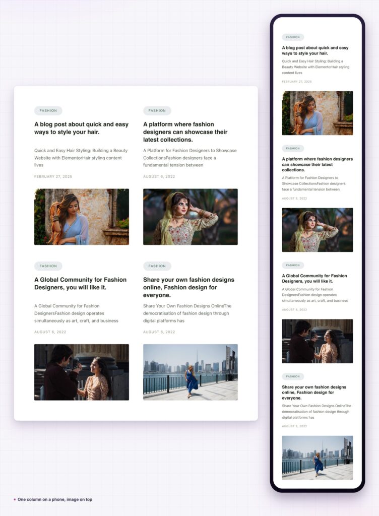
Yes. Set the column count per breakpoint and the grid reflows to a single column at phone width.
Yes. The query settings cover post types, taxonomies and ordering, so any registered type can fill the grid.
A sapling grid is the straightforward answer when a blog section has to match the page rather than the theme. Switch off the fields the reader does not need, trim the excerpt to a word count, keep the image ratio consistent, and let the query keep the section current.
See it on the sapling grid demo, read the sapling grid documentation for every control, and check the plans on the pricing page. The WordPress query documentation explains what the query controls are doing underneath, and MDN on CSS grid covers the layout model the columns rely on.



Comments are closed.