
Panel Slider for Elementor: Vertical Panels That Open Where You Click
A panel slider shows several tall panels at once and opens the one you pick, with titles, text, links and overlay colours set per state in Elementor.

A carousel shows one thing and hides the rest. That is fine when the items are interchangeable and wrong when the reader is choosing between them. Nobody picks a category, a service or a destination from an item that has already slid away.
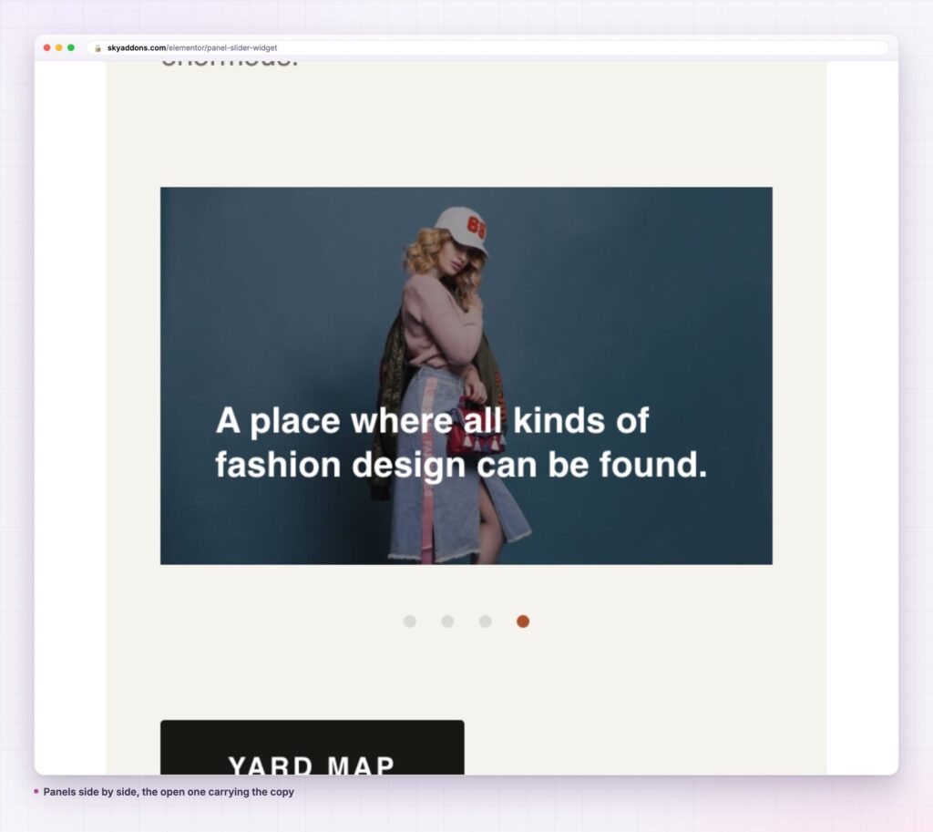
A panel slider keeps everything on screen. Several tall panels sit side by side, each one a slim column with its title, and the one the reader picks opens to show the full image and copy. Nothing disappears, so choosing is possible.
| Approach | What it costs you |
|---|---|
| Standard carousel | Only the current item is visible, so comparison is impossible |
| Grid of cards | Every card competes at the same weight, and the section gets tall |
| Tabs | Labels only, so the images that sell the choice are hidden |
| Sky Addons panel slider | Every option visible, the chosen one opened, images throughout |
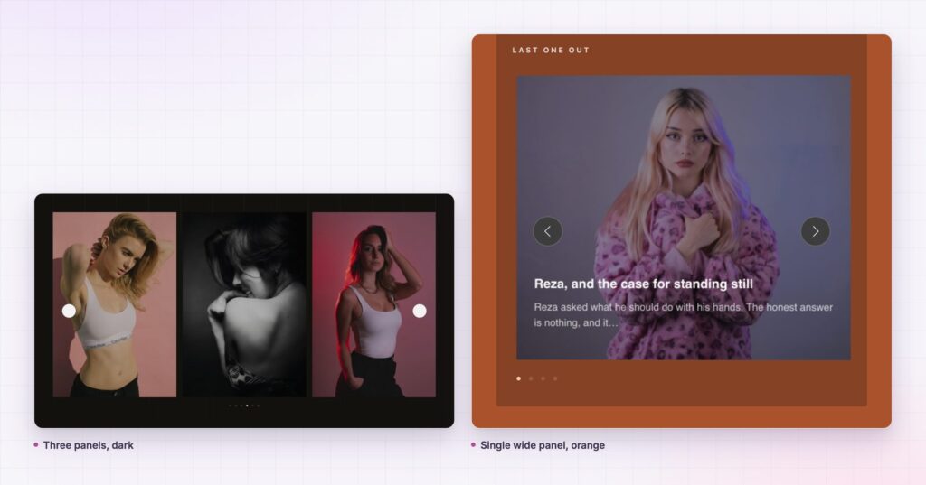
Columns decide how many panels show. Set the count and the widget divides the width, so the same content can be four slim panels or two broad ones.
Content can be written or queried. Source takes hand written panels or a post query, with Content Length trimming the text to a set number of words so no panel runs long.
Each state has its own overlay. Normal, Hover and Active overlay colours are separate controls, which is how a closed panel reads as closed without looking disabled.
The copy is optional per element. Show Title, Show Text and Show Content switch independently, so a panel can be a labelled image or a full card.
Link behaviour is a choice. Link On decides whether the whole panel is clickable or only the button, which matters because a whole panel link makes dragging risky.
A reader deciding between five things needs to see five things. The panel slider gives them that, then rewards the pick with a larger image and the copy. The gesture is the same one they use everywhere: touch the thing you want.
A reader deciding between five things needs to see five things.
It also keeps the section short. Five items as cards is a tall grid; five items as panels is one band across the page. On a long marketing page that difference decides whether the next section is visible.
Panel width is the number that decides everything else. Divide the section width by the panel count and check what a closed panel actually shows: usually a vertical title and a sliver of image. Below about 90 pixels a closed panel is a stripe, and the title has nowhere to go.
Height is the second decision. A tall panel, around 500 to 600 pixels, makes the image the subject and suits destinations and rooms. A shorter panel, 320 to 400, makes the title the subject and suits services, where the words carry more than the picture.
On tablets the count should usually drop by one or two. The widget is responsive, but a five panel layout squeezed into 768 pixels gives every closed panel a stripe of image and no legible label.
A closed panel usually shows its title rotated, running up the column. That changes what makes a good label. Short words read well rotated; long compound phrases do not, because the eye has to track a long vertical line with no word shapes to anchor on.
Aim for one or two words. “Interiors”, “Bathrooms”, “Kitchens” work. “Kitchen design and installation” does not, and it will be the panel everybody notices for the wrong reason.
Avoid articles and connectives entirely. “The Blue Room” becomes “Blue Room” with nothing lost. Numbers and ampersands are fine and often help, because they break a long vertical run into parts.
Case matters more than usual. Capitals set in a vertical line stay even in width, which is why so many panel designs use them. Lower case with descenders looks ragged rotated, and mixed case is the worst of both.
There is a temptation to put everything in the open panel: title, category, two paragraphs, a price, two buttons. It does not work, because the open panel is still a column rather than a page, and the reader opened it to confirm a guess, not to read an article.
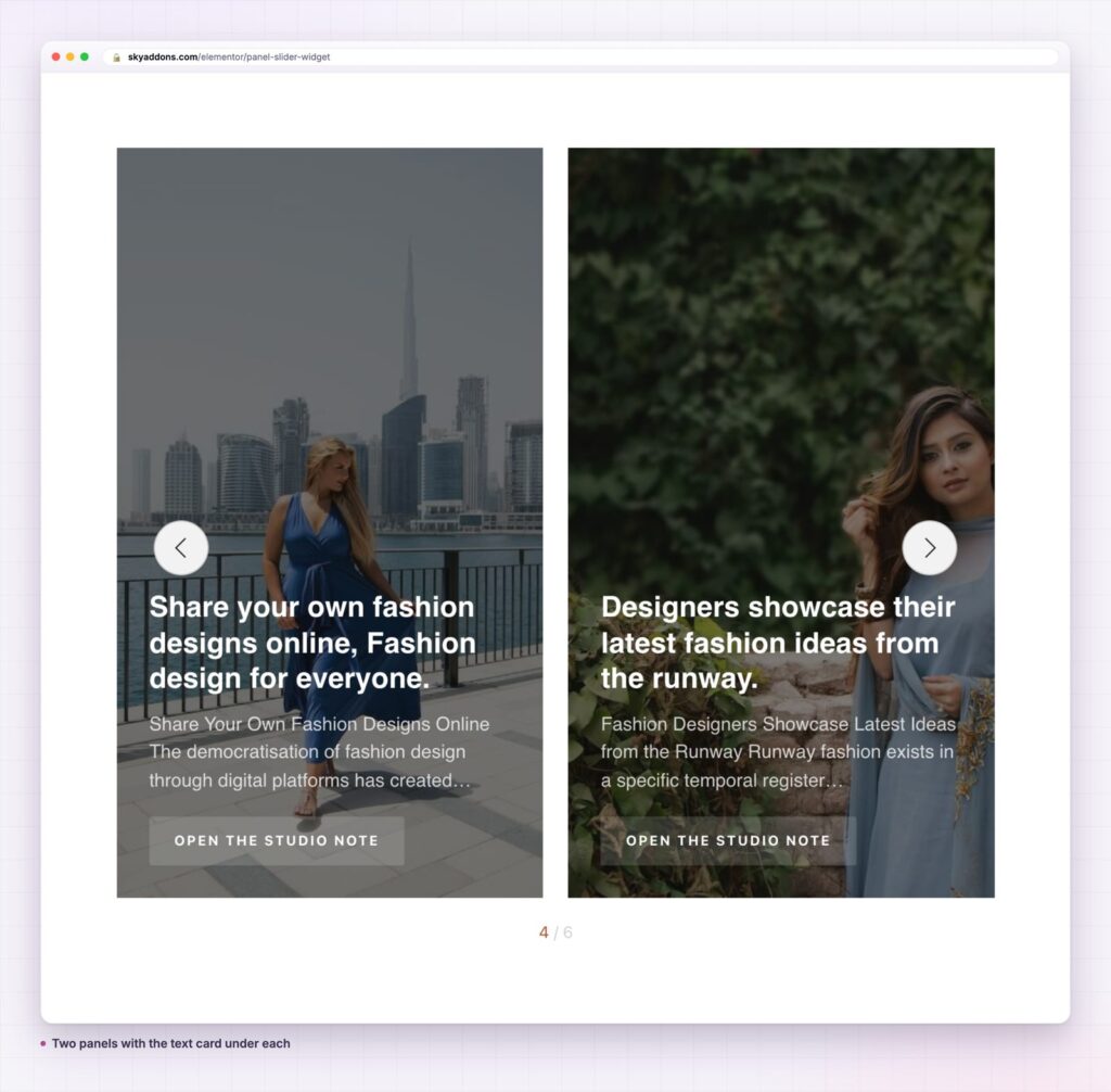
Three elements is usually the limit. The title they already saw, one sentence that adds something the title could not, and a link. The sentence is the one doing real work, so it should answer the question the panel raises rather than restating it.
If the content genuinely needs more room, the panel is the wrong container and should link to a page instead. A panel slider that tries to be an article reader ends up scrolling inside a column, which is the one thing the layout is bad at.
Because the panels take a query, the widget works as a dynamic section: the six newest projects, the services in one category, the current programmes. The image, title, excerpt and link all come from the post, so the section maintains itself.
It also makes a reasonable navigation band. Panels pointing at category archives give a shop a visual entrance that a text menu cannot, and because every option is visible the reader is never guessing what is behind a label.
For a slider where one item takes the full width and a thumbnail rail does the choosing, see the pace slider. For a grid that shows everything at once with no interaction at all, the sapling grid is the simpler answer.

Two situations catch people out. The first is a long list. A panel slider with twelve entries gives every closed panel a stripe barely wider than its own border, and the reader cannot tell one from another. Above about eight options, a grid with real labels beats panels every time.
The second is content that has to be compared field by field. Panels show one item at a time in any detail, so a reader weighing price against capacity against delivery is being asked to remember rather than compare. That is a table’s job, and a table will always do it better.
There is also a softer case against. On a page that already carries a hero slider, a second sliding component competes with the first and teaches the reader that the page moves on its own. One moving section per page is a reasonable budget.
Yes. The panel slider is in the free Sky Addons plugin. The free versus Pro page lists the rest.
No. It uses Swiper, which the plugin bundles.
One small library and the plugin stylesheet. As always, the panel images are the real weight, so export them at the panel width rather than full screen.
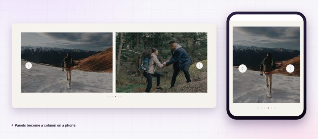
Yes. Panels stack into a column, each keeping its image, title and link.
Yes. Set Source to a query and the panels build themselves from the post title, excerpt, featured image and permalink.
A panel slider is a chooser, not a showreel. Use it when the reader has to pick one of several things and the picture helps them decide. Keep the panel count low enough that closed titles stay legible, set the overlay states so closed reads as closed, and open the first panel by default.
Try it on the panel slider demo, read the panel slider documentation for every control, and see the plans on the pricing page. The Swiper API documents the motion options, and the W3C guidance on carousels covers what any sliding component owes a keyboard user.



Comments are closed.